Michele Coscia - Connecting Humanities

Michele Coscia I am an associate prof at IT University of Copenhagen. I mainly work on algorithms for the analysis of complex networks, and on applying the extracted knowledge to a variety of problems. My background is in Digital Humanities, i.e. the connection between the unstructured knowledge and the coldness of computer science. I have a PhD in Computer Science, obtained in June 2012 at the University of Pisa. In the past, I visited Barabasi's CCNR at Northeastern University, and worked for 6 years at CID, Harvard University.

10 June 2020 ~ 0 Comments

News on Social Media: It’s not Real if I don’t Like it

The spread of misinformation — or “fake news” — is an existential threat for online social media like Facebook and Twitter. Since fake news has the power to influence elections, it has attracted legislative attention. And online social media don’t like legislative attention: Zuck wants to continue doing whatever he is doing. Thus, they need to somehow police content on their platforms before somebody else polices it for them. Unfortunately, the way they chose to do so actually backfires, as I show in “Distortions of Political Bias in Crowdsourced Misinformation Flagging“, a paper I just published with Luca Rossi in the Journal of the Royal Society Interface.

The way fact checking (doesn’t) work on online social media at the moment could be summarized as “semi-supervised crowdsourced flagging”. When a news item is shared on the platform, the system allows the readers to flag it for removal. The idea is that the users know when an item is a case of fake reporting, and will flag it when it is. Flags are then fed to a machine learning algorithm. The task of this algorithm is to filter out noise. Since there are millions of users on Facebook, practically every URL shared on the platform will be flagged at least once. After the algorithm pass, a minority of flagged content will be handed to experts, who will fact-check it*.

Sounds great, right? What could possibly go wrong? That’s what I defiantly asked Luca when he prodded me to look at the data of what was being passed to the expert fact checkers. As Buzzfeed would say, the next thing I saw shocked me. He showed me the top ten websites receiving the highest number of expert fact-checks in Italy — meaning that they received so many flags that they passed the algorithmic test. All major national Italian newspapers were there: Repubblica, Corriere, Sole 24 Ore. These ain’t your Infowars or your Breitbarts. They have clear leanings, but they are not extremist and they usually report genuinely, albeit selectively and with a spin. The fact-checkers did their job and duly found them not guilty.

So what gives? Why are most flags attached to mostly mild leaning, genuine reporting? Luca and I developed a model trying to explain this phenomenon. Our starting point was re-examining how the current system works: users see news, flag the ones that don’t pass the smell test, and those get checked. It’s the smell test that doesn’t pass the smell test. There are a few things impairing our noses: confirmation bias and social homophily.

Image from https://fs.blog/2017/05/confirmation-bias/

Confirmation bias means that a user will give an easier pass to a piece of news if the user and the news share the same ideological bias. Strongly red users will be more lenient with red fake news but might flag a more truthful blue news item, and vice versa. Social homophily means that people tend to be friends with people with a similar ideological leaning. Red people have red friends, blue people have blue friends. It’s homophily that gives birth to filter bubbles and echo chambers.

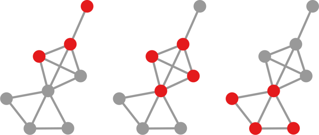
So how do these two things cause flags to go to popular neutral sources? The idea is that extremism is rare — otherwise it wouldn’t be extreme. Thus, most news organizations and users are neutral. Moreover, neutral news items will reach every part of the social network. They are produced by the most popular organizations and, on average, any neutral user reading them has a certain likelihood to reshare them to their friends, which may include more extreme users. On the other hand, extreme content is rare and is limited to its echo chambers.

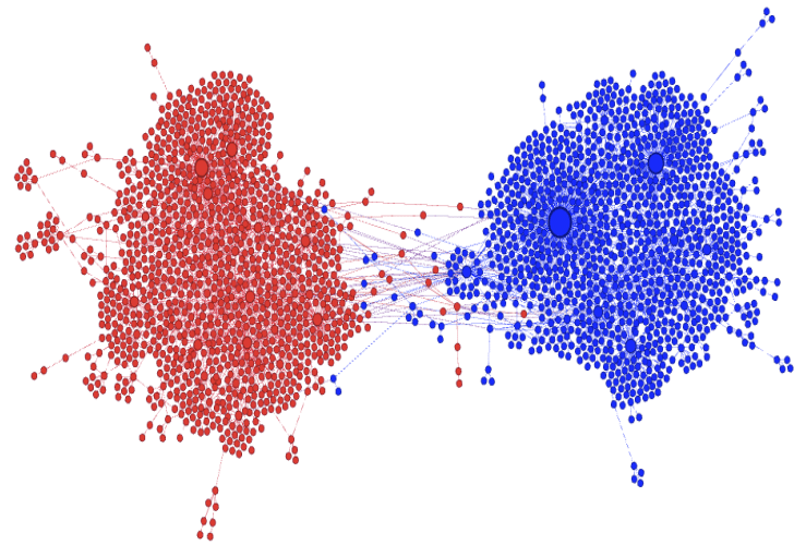
Image from “MIS2: Misinformation and Misbehavior Mining on the Web”

This means that neutral content can reach the red and blue bubbles, but that extreme red and blue content will not get out of those same bubbles. An extreme red/blue factional person will flag the neutral content: it is too far from their worldview. But they will never flag the content of opposite color, because they will never see it. The fraction of neutral users seeing and flagging the extreme content is far too low to compensate.

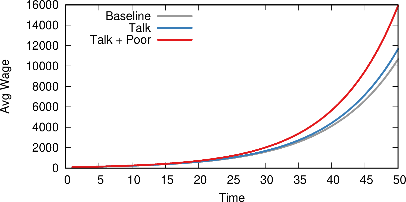
Luca and I built two models. The first has the right ingredients: it takes into account homophily and confirmation bias and it is able to exactly reproduce the flagging patterns we see in real world data. The model confirms that it is the most neutral and most truthful news items that get flagged the most (see image below, to the left). The second model, instead, ignores these elements, just like the current flagging systems. This second model tells us that, if we lived in a perfect world where people objectively evaluate truthfulness without considering their own biased worldview, then only the most fake content would be flagged (see image below, to the right). Sadly, we don’t live in such a world, as the model cannot reproduce the patterns we observe. Sorry, the kumbaya choir practice is to be rescheduled to an unspecified date (also, with COVID still around, it wasn’t a great idea to begin with).

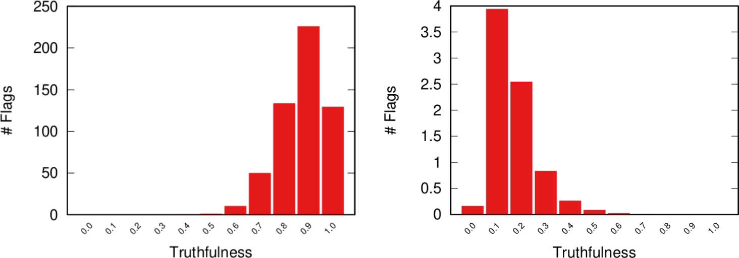
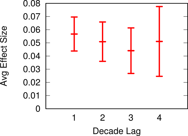
From our paper: the number of flags (y axis) per value of news “truthfulness” (x axis) in the model accounting for factionalism (left) and not accounting for factionalism (right). Most flags go to highly truthful news when accounting for factionalism.

Where to go from here is open to different interpretations. One option is to try and engineer a better flagging mechanism that can take this factionalism into account. Another option would be to give up altogether: if it’s true that the real extreme fake content doesn’t get out of the echo chamber, why bother policing it? The people consuming it wouldn’t believe you anyway. Luca and I will continue exploring the consequences of the current flagging mechanisms. Our model isn’t perfect and requires further tuning. So stay tuned for more research!


* Note that users can flag items for multiple reasons (violence, pornography, etc). This sort of outsourcing is done only for fact-checking, as far as I know.

28 April 2020 ~ 0 Comments

A Worried Look at Economic Convergence

A moral imperative that wealthy communities have — in my opinion — is to ensure economic convergence: to help the poorer economies to have a stronger economic growth so that everyone is lifted out of poverty*. There is a lot of debate on whether economic convergence is actually happening (some say yes, others no) — and, if so, at which scale (global, national, regional?). In my little contribution to the question I show that — if convergence happens — it is not via traditional institutional channels, but via participation in the global social network. Which is terrible news in these days, since we’re experiencing an unprecedented collapse in this web of relations due to the COVID-19 pandemic.

An example of economic divergence: some countries like Singapore are now 6X richer than other countries that had a comparable level of income in the late 1800. Image from EconoTimes.

This message comes from a paper I wrote a while ago with Tim Cheston and Ricardo Hausmann: “Institutions vs. Social Interactions in Driving Economic Convergence: Evidence from Colombia“. I never mentioned it because it is just a working paper, so all conclusions should be taken with a boatload of grains of salt. But it is an interesting perspective on the consequences of these troubling times — plus it foreshadows another post I’m planning for the future, so stay tuned 🙂

The idea is simple: we want to know whether economic convergence happens in Colombia. If it does, we want to show that its driving force is the participation in social networks. In other words, economic growth is a matter of connecting skillful people with people possessing capital. We need to make sure we’re not confusing our “social relationships” explanation with the ability of some states to be better at providing public goods and redistributing wealth from the rich municipalities to the poor ones.

The public institutions hypothesis seems natural: if you have good politicians, they would write good laws which will support their population’s prosperity. Bad politicians would just be inept, or even corrupt. In this hypothesis, poor municipalities in rich (= well managed) regions should grow faster than poor municipalities in poor (= badly managed) regions. Our hypothesis, instead, proposes that poor municipalities with strong social connections to rich municipalities should grow faster than poor municipalities without such connections. For this we need to know two things: in which administrative region a municipality is (easy!) and to which social group of municipalities it belongs.

The latter is tricky, but not if you’re a data hoarder like yours truly. I had already worked with phone call records in Colombia, so you might guess where this is going. I can represent Colombia as a network, where nodes are the municipalities. Municipalities are connected to other municipalities if there is a significant number of residents in the two municipalities that call each other. Once I have this network, I can perform community discovery and find groups of municipalities with tightly knit social relations.

Colombia’s social network at the municipality level. Click to enlarge.

Using data on the municipalities’ GDP (from DANE) and average wage (from PILA), we can now test whether convergence happens — i.e. growth is negatively correlated with starting level, the poorer you are the more you grow. This is false for administrative regions but true for social communities: there is a mildly significant (p < 0.05) negative relationship between a social group’s GDP (and average wage) growth and its initial level. Meaning: economic convergence happens at the social but not at the institutional level. I’d love an even lower p-value, but one can’t do much with such a low number of regions/groups (32 in Colombia).

If social communities are converging, what could be driving the effect? We observe a robust (p < 0.01) positive relationship between the growth of per capita wages in a municipality and the average per capita wage in its social group. Meaning: if you talk to rich municipalities, you grow faster. Even the formality rate converges: if you talk with municipalities with low tax evasion, you start tax-evading less! Such relationships are absent for administrative regions, and survive a number of robustness checks — excluding the capital city Bogotá, excluding particularly small municipalities (in inhabitants, employees, or number of phone calls), using admin region fixed effects, etc. To get a sense of scale: suppose baseline growth is 1%. If you talk to a rich social group you’d grow, instead, by 1.02%. If you you talk to rich municipalities and you are also poor, you grow by 1.09% instead. This might not sound much, but it’s better to have it than not, and it stacks over time, as the picture below shows.

The effect of social relationships on average wage (y axis) over time (x axis). Gray = base growth; blue = growth while talking to rich social communities; red = talking to rich social community *and* being poor.

These results would be great in normal times, because they provide a possible roadmap to fostering economic convergence. One would have to identify places which lack the proper connections in the global knowledge network, and try to plug them in. The problem is that we’re not living in normal times. Lockdowns and quarantines due to the global pandemic have created gigantic obstacles to human mobility almost everywhere in the world. And, as I’ve shown previously, social relationships go hand in hand with mobility. For that reason, physical obstacles are also hampering the tightening of the global social network, one of the main highways of global development.

Don’t get me wrong: those are the correct measures and we should see them through. But we also should be mindful of their possible unintended side effects. Perhaps there are already enough people working on research on better medical devices, and on how to track and forecast outbreaks on the global social network. If this post has a moral, it’s to encourage people to find new ways to make the weaving of such global social network more robust to the black swan events that will follow COVID-19. Because they will happen, and our moral imperative of lifting people out of poverty can’t be the price we pay to survive them.


* This needs to be a structural intervention: simple handouts don’t work and may even make the problem worse.

25 March 2020 ~ 0 Comments

How Quickly is COVID Really Spreading?

I don’t need to introduce to you what the corona virus is: COVID-19 has had a tremendous impact on everyone’s life in the past weeks and months. All of a sudden, our social media feeds have been invaded with new terminology: social distancing, R0, infection rate, exponential growth. Overnight, we turned ourselves into avid consumers of epidemics literature. We learned what the key to prevent the infection from becoming a larger problem is: slow the bugger down. That is why knowing how fast corona is actually moving is such a crucial piece of information. You have seen the pictures many times, they look something like this:

Image courtesy of my data science students: Astrid Machholm, Jacob Kristoffer Hessels, Marie-Louise Tommerup, Simon Breum, Zainab Ali Shaker Khudoir. If anything, it warms my heart knowing that, even during a pandemic, many journalists take their weekends off 🙂

What you’re seeing is the evolution in number of infected people — and how much non-infected people like me blabber about them online. Epidemiologists try to estimate the speed of infection by fitting the real data you see on an SI model. In it, people turn from Susceptible to Infected at a certain rate. These models are usually precise at estimating the number of infected over time, but they lack a key component: they assume that each individual is interchangeable and that anyone has a chance to be infected by anyone in their close proximity. In other words, they ignore the fact that we are embedded in a social network: some people are more central than others, and some have more friends than others.

To properly estimate how fast a disease moves, you need to take the network into account. And this is the focus of a paper of mine: “Generalized Euclidean Measure to Estimate Network Distances“. The paper has been accepted for publication at the 2020 ICWSM conference. The idea of the paper is to create a new measure that estimates the distance between the state of the disease at two moments in time, taking the underlying network topology into account.

The question here is deceptively simple. Suppose you have a set of infected individuals. In the picture above, they are the nodes in red in the leftmost social network. After a while, some people recover, while others catch the disease. You might end up with the set of infected from the network in the middle, or the one in the right. In which case did the disease spread more quickly?

We have a clear intuitive answer: the rightmost network experienced a faster spread, because the infected nodes are farther from the original ones. We need to find a measure that matches this intuition. How do we normally estimate distances in the real world? We use a ruler: we draw a straight line between two points and we measure how long that line is. This is the Euclidean distance. Mathematically, that means representing the two points as vectors of coordinates (p and q), calculating their difference, and then using Pythagoras’ theorem to calculate the length of the straight line between them:

We cannot apply this directly to our network problem. This is because, for silly Euclid, every dimension has the same importance in estimating the distance between points. However, in our case, the points are the states of the disease. They do not live on the plane of Euclidean geometry, but on a network. Some moves in this network space are short and easy: moving between two connected nodes. But other moves are long and hard: between two nodes that are far apart. In other words, nodes that are connected to each other contribute less than unconnected nodes to the distance. The simplest example I can make is:

In the figure, each vector — for instance (1,0,0) — is the representation of the state of the disease of the graph beneath it: the entries equal to one identify the currently infected node. Clearly, the infection closer to the left graph is the middle one, not the right one. However, the Euclidean distance between the three vectors is the same: the square root of two. So how do we fix this problem? There is a distance measure that allows you to weigh dimensions differently. It is my favorite distance metric (yes, I am the kind of person who has a favorite distance metric): the Mahalanobis distance. Mahalanobis simply says that correlated variables should count less in estimating the distance: taller people tend to be heavier — because there’s more person to weigh — so we shouldn’t be surprised if someone taller than me is also heavier. But, if they weigh less, we would find it remarkable.

Now we’re just left with the problem of figuring out how to estimate, mathematically, what “correlated” means in a network. The paper has the full details. For here, suffice to say we augment Pythagoras’ theorem with the pseudoinverted graph Laplacian — a sentence I’m writing only to pretend I’m smart (it’s actually not sophisticated at all, and a super easy thing to calculate). The reason we use the graph Laplacian is because it is a standard instrument to estimate how fast things spread in a network.

In the paper I run a bunch of tests to show that this measure matches our intuition. For instance, as shown above, if we have infected people at the endpoints of a chain graph, the longer the chain (x axis) the higher the estimated distance should be (y axis). GE (= Generalized Euclidean, in red) is my measure, and it behaves as it should: a constantly growing function (the actual values don’t really matter as long as they constantly grow as we move left to right). I compare the measure with few alternatives. The Euclidean (gray) obviously fails because it doesn’t know what a network is. EMD (green) is the Earth-Mover Distance, which is as good as my measure, but computationally more expensive. GFT (blue) is the Graph Fourier Transform, which is less sensitive to longer distances.

More topically, I can simulate different diseases with a SI model on a network. I can randomly change their infectiousness: how likely you (S) are to contract the disease if you’re in contact with an infected (I) individual. By looking at the beginning and at the end of an infection event, my measure can recover that infectiousness parameter, meaning it can distinguish between slow- and fast-moving diseases.

I’m obviously not pretending to be smarter than the thousands of epidemiologists that are doing a terrific job in fighting — and spreading awareness about — the disease. Their models at a global, national, and regional level for sure work extremely well and do not need this little paper of mine. However, this tool might find its use, when you have detailed data about a specific social network, for instance by using phone data to reconstruct a network of physical contacts. It also has a wider applicability to anything you can model as a diffusion process on a network, being a marketing campaign, the exploration of the Product Space by a country, or even computer vision. If you want to play with the code, I implemented a few network distance methods in a Python library.

20 September 2019 ~ 0 Comments

Who will Cluster the Cluster Makers?

If you follow this blog, you know that I periodically talk about community discovery. The problem seems so deceptively simple: finding groups of nodes densely connected in a network. If it is so simple, why have I been talking about it since 2012? The reason is that it isn’t so simple, and people have tried to organize the literature explaining how the thousands of different algorithms work, how they perform, what definition of “community” they use. After all that work, I’m still left with one question. Which two algorithms return the same gosh darned communities in a network? That’s what we’re going to discover today.

What I want to do is to take as many community discovery algorithms as I can, test them on a set of networks, and compare their results to estimate how similar they are. This gives me a similarity matrix of algorithms, which I can transform into a network by keeping only similarities that are statistically significant. Once I have the network, I can discovery groups of algorithms returning a coherent set of results, because they’re all significantly related to each other. How do I find these groups? Well, by ehm…. er… performing… community… discovery? on the… network of… community discovery… algorithms… This is exactly the outline of my paper Discovering Communities of Community Discovery, which I presented at ASONAM last month.

“As many community discovery algorithms as I can” turned out to be 73, all implemented in different languages, taking input in different ways, and providing different output formats. I ran them on more than 1,500 networks (real world ones from ICON and synthetic benchmarks). It was a… difficult month for me. I compared their partitions by estimating their mutual information: given that I know the results of algorithm A, how much can I infer about the results of algorithm B? For each network where two algorithms result in a lot of mutual information, I increase their similarity count by one. Once I have all similarity counts, I can extract the backbone of this matrix, controlling for the fact that some algorithms tend to be more peculiar than others, while others tend to be more mainstream.

And this is the result (click to enlarge):

I love this network, because it has well defined groups and they all make sense. There’s the group of modularity maximization algorithms (in green), there’s the ones based on percolation / random walks (in blue), and the ones using neighbor similarity (in purple) as the guiding principle.

Then there’s a lump of algorithms that allow communities to share nodes (in red). The only thing these algorithms have in common is that they allow communities to share nodes, which is not a good enough common characteristics. The ways they find communities are as diverse as the ones you find in the rest of the network. But that’s the beauty of my approach: I can select a subset of nodes — say all overlapping community discovery algorithms — and re-apply the test of statistical significance with a more stringent threshold. This allows me to zoom in and see if there are meaningful structures inside the community. Lo and behold:

Here you can see meaningful groups of overlapping algorithms. There’s the ones achieving overlap by clustering edges instead of nodes (in blue), and the ones applying the percolation / random walk strategy (in green), but allowing for node sharing.

Why is this work significant? First, because it proves that there really are different — and valid — definitions of what communities are in complex networks. If there weren’t, this network would be more homogeneous, without distinct groups.

Second, as I mentioned, some of the networks I tested the algorithms on are standard benchmarks: LFR networks. These benchmarks grow a network with a planted community structure: the real latent structure the algorithm is supposed to find. Yet, this “ground truth” is well embedded in one of the clusters: the percolation/random walk community (in blue). LFR benchmarks follow that specific definition and not others. If you are developing a new community discovery algorithm which has a different community definition, you should not use the LFR benchmark to test it. Moreover, if you are developing a percolation/random walk algorithm and you’re correctly testing it on an LFR benchmark, you cannot test it against algorithms that are not part of the blue community. Otherwise the test would be unfair, because those algorithms are looking for something else: of course they’ll perform poorly on LFR benchmarks!

You can get the full list of algorithms that I tested, with proper references, from the official page of the project. From there, you can also download the network and use it for your purposes. This is necessarily an eternal work in progress: there are more than 73 community discovery algorithms out there. But I am but a man[citation needed] and I cannot spend my entire time scouting for implementations on the web. I got to put bread (or, preferably, pasta) on the table as well. Thus, if you think I really should have included your algorithm in this structure, you can mail me and send me a working implementation of it, and I’ll gladly run it on my benchmarks.

What’s next? I’d be delighted to inaugurate the field of meta-research. So join me, as I develop new projects such as:

  • Predicting links of link predictors: which link prediction algorithms will become more similar in the future?
  • Spreading epidemics of epidemic spreading: which researchers will cave in to peer pressure and publish a paper studying the diffusion of some phenomenon?
  • Modeling the growth of growth models: how has the Barabasi and Albert model evolved over time? Which features were added? What about Watts & Strogatz’s model?

(In case you were wondering, I’m joking. In network science, sometimes that might be hard to tell.)

(Or am I?)

(It’s settled: the best among these papers will receive the hereby instituted Escher prize, awarded by Douglas Hofstadter himself)

22 August 2019 ~ 0 Comments

Deriving Networks isn’t as Easy as it Looks

Networks are cool because they’re a relatively simple model that allows you to understand complex systems. The problem is that they’re too cool: sometimes they make you want to do network analysis on something that isn’t really a network. For instance, consider Netflix. Here you have people watching movies. You want to know which movies are similar to each other so that you can suggest them to similar users. On the wings of Maslow’s Lawwhen you’re holding a hammer everything starts looking like a nail –, the network scientist would want to build a movie-movie network.

Of course XKCD has something about this.

The problem is that there are many different ways to make a movie-movie network from Netflix data. Each of these different ways will alter the shape of your network in dramatic ways, which will affect the results you’re going to get once you use it for your aims. With Luca Rossi, I started exploring this space. This resulted in the paper “The Impact of Projection and Backboning on Network Topologies“, which I will present next week at the ASONAM conference.

In the paper we take some real-world data and we apply all possible combinations of network building techniques on it. We systematically explore the key topological properties of the resulting networks, and see that they dramatically change depending on which strategy you picked. Meaning that you’re going to get completely different results from the same analysis later on.

Good network analysis is like good art: if you gaze long at the hairball, the hairball will gaze back at you. Image property of the Albright-Knox Art Gallery, Buffalo, NY.

The first thing we need to understand is that, to get to the movie-movie network, we need to perform two major steps. Each movie is a vector, containing information about each user. It could simply be a one if the user watched the movie, or a zero if they didn’t. Thus first we need to apply a similarity measure quantifying how similar two movies are to each other (what I call “projection”). Then we’ll realize that all we got is a hairball. Every movie has a non-zero similarity with any other movie. After all, there are millions of users, but just a handful of movies, so the probability that any two movies were watched by at least one user is pretty high. So you need to filter out your movie-movie similarity, otherwise your resulting network will be too dense.

Comparing two vectors is the oldest profession in the world, assuming your world is completely made up of linear algebra — mine, sadly, is. Thus you can pick and choose dozens of similarity metrics — Euclidean, cosine, I have a soft spot for the Mahalanobis distance myself. However, you’d be better served by the measures that were developed with complex networks in mind. You see, the binary movie-user vectors will have typical broad degree distributions: some movies are very popular — everybody watches them –, some people like me are pathological movie buffs and will watch everything — my watchlist has ~6,500 entries. Thus for this paper we focus on a few of those “bipartite projection” techniques: hyperbolic, resource allocation (ProbS), and my beloved YCN method.

Since I already jumped on the XKCD wagon, I see no harm in continuing down this path…

Then, to filter out connections, you have to have an idea of what’s a “strong, significant” connection and what isn’t. If you’re naive and just think that you should only keep connections with higher weights (what I call “naive thresholding”), boy do I have news for you. Also in this case, we’re going to consider a couple of ways to filter out noisy connections: the disparity filter and my noise corrected backbone.

Ok, the stage is set. If you were paying attention, you’ll figure out what’s coming next: a total mess.

Above (click to enlarge) you see the filtering techniques — top to bottom: naive threshold, disparity filter, noise corrected –, for each projection — line color –, on different network properties. From left to right we see: how many nodes survive the filter step, how much clustered the network is, and how well separated its communities are. The threshold levels (x-axis) attempt to preserve a comparable number of edges for each technique combination.

Yeah, it doesn’t look good. Look at the middle column: there are some versions of this network with perfect clustering, meaning that every common neighbor of a movie is connected to every other; while networks have a transitivity of zero; with almost every possible other values in between. The same holds for modularity, which can span from ~0.2 to practically 1. So there’s no way of saying whether these are properties of the system or just properties of the cleaning procedures you used. Keep in mind that the original data is the same. We could conclude anything by stirring our pile of linear algebra. Want to argue that the movie space doesn’t cluster? Project with YCN and filter with noise corrected method. Want to find strong communities instead? No biggie: project with resource allocation and do a simple threshold of the result.

Famous network scientist and two-time “world’s best mustache” winner Nietzsche once said: “He who fights with hairballs should look to it that he himself does not become a hairball.”

I wish I had a wise message to wrap up this blog post. Something about how to choose the best projection-filtering pair best fitting a specific analysis — one that you cannot tune to obtain the results you want. However, that will have to wait for further research. For now, I just want you to grow suspicious about specific results you see out there from networks that really aren’t network. If your nodes aren’t really connecting directly — like physical connections would do, for instance between neurons –, pretending they do so might lead you down a catastrophic over-confident path.

23 July 2019 ~ 0 Comments

Lipari 2019 Report

Last week I answered the call of duty and attended the complex network workshop in the gorgeous Mediterranean island of Lipari (I know, I’m a selfless hero). I thank the organizers for the invitation, particularly Giancarlo Ruffo, fellow nerd Roberta Sinatra, and Alfredo Ferro. This is my usual report, highlighting the things that most impressed me during the visit. Well, excluding the granitas, the beaches, and the walks, because this is not a blog about tourism, however difficult it might be to tell the difference.

Differently from NetSci, there weren’t parallel sessions, so I was able to attend everything. But I cannot report on everything: I don’t have the space nor the skill. So, to keep this post from overflowing and taking over the entire blog, I need to establish some rules. I will only write about a single talk per session, excluding the session in which I presented — I was too tense mentally preparing for my talk to give justice to the session.

Any overrepresentation of Italian speakers in the following line-up is — quite obviously — part of your imagination.

Get ready for a bunch of sunset pictures. Did you know Lipari is a net exporter of sunsets?

Session 1: Ronaldo Menezes talked about spatial concentration and temporal regularities in crime. Turns out, you can use network and data science to fight the mob. One of Ronaldo’s take-home messages was that police should try to nudge criminals to operate outside the areas where they’re used to work in. The more you can push them to unfamiliar territory, the more mistakes they’ll make.

Session 2: The theme of the workshop was brain research, and Giulia Bassignana‘s talk on multiple sclerosis was the first that caught my eye. Giulia presented some models to study the degeneration of physical connections in the brain. While I love all that is related to the brain, seeing people working on the actual physical connections tickles me more than looking at correlation networks from fMRI data, and Giulia was really spot on.

Session 3: Daniela Paolotti presented a wide array of applications of data science for the greater good. Her talk was so amazing it deserves an entire blog post by itself. So I’ll selfishly only mention a slice of it: a project in which Daniela is able to predict the spread of Zika by analyzing human mobility patterns from cellphone data. Why selfishly? Because I humbly played a small role in it by providing the cellphone data from Colombia.

That on the background is Stromboli. With my proverbial bravery, I did not get any closer than this to that lava-spewing monster.

Session 4: If some of you are looking for an academic job this year, I suggest you to talk with Alessandra Urbinati, who presented some intriguing analysis on scientific migration networks. Alessandra showed which countries are emitters and attractors — or both. My move to Denmark seemed to be spot on, as it ranks highly as an attractor. Among countries of comparable size, only Switzerland does a bit better — that’s probably why my sister works there (always one-upping me!).

Session 6: As her custom, Tina Eliassi-Rad proved yet again she is completely unable to give an uninteresting talk. This time she talked about some extremely smart way to count occurrences of graph motifs without going through the notoriously expensive graph isomorphism problem. Her trick was to use the spectrum of non-backtracking matrices. Tina specializes in finding excellent solutions to complex problems by discovering hidden pathways through apparently unrelated techniques. (Seriously, Tina rocks.)

Session 7: Ciro Cattuto‘s talk on graph embeddings really had it all. Not only did Ciro present an extremely smart way to create graph embeddings for time-evolving networks, but he also schooled everybody on the basics of the embedding technique. Basically graph embeddings boil down to representing nodes as vectors via random walks, which can then be used as input for machine learning. I always love when a talk not only introduces a new technique, but also has pedagogical elements that make you a better researcher.

To be fair, we tried to apply some natural selection and get rid of the weakest network scientists by climbing Vulcano. Turns out, we are all pretty fit, so we’re back to evaluating ourselves via the quality of our work, I guess. *shrugging emoticon*

Session 8: Philipp Hövel spoke about accelerating dynamics of collective attention. Have you ever felt that memes and fads seem to pop in and out of existence faster and faster? Philipp showed it’s not your imagination: we’re getting better and faster at producing popular content on social media. This causes a more rapid exhaustion of humanity’s limited attention and results in faster and faster meme cycles.

Session 9: Only tangentially related to networks, Daniel Fraiman talked about some intriguing auction models. The question is: how do you price a product with zero marginal cost — meaning that, once you have the infrastructure, producing the next item is essentially free? The answer is that you don’t: you have an auction where people state their price freely, and at each new bid the current highest bidder gets the next item. This model works surprisingly well in making the full system converge to the actual value of the product.

Session 10: Andrea Tacchella‘s was another talk that was close to my heart. He taught us a new and better way to build the Product Space. I am the author of the current incarnation of it in the Atlas of Economic Complexity, so I ought to hate Andrea. However, my Product Space is from 2011 and I think it is high time to have a better version. And Andrea’s is that version.

Is this group photo a possible contestant with 1927’s 5th Solvay for the best conference group picture? … No, it isn’t, not even close. Why would anyone even bring that up?

Session 11: Did I mention graph isomorphism before? Did I also mention how fiendishly complex of a problem that is? Good. If you can avoid dealing with it, you’ll be happier. But, when life throws graph isomorphism problems at you, first you make isomorphism lemonade, then you can hardly do better than calling Alfredo Pulvirenti. Alfredo showed a very efficient way to solve the problem for labeled multigraphs.

Session 12: The friendship paradox is a well-known counter-intuitive aspect of social networks: on average your friends are more popular than you. Johan Bollen noticed that there is also a correlation between the number of friends you have and how happy you are. Thus, he discovered that there is a happiness paradox: on average your friends are happier than you. Since we evaluate our happiness by comparison, the consequence is that seeing all these happy people on social media make us miserable. The solution? Unplug from Facebook, for instance. If you don’t want to do that, Johan suggests that verbalizing what makes you unhappy is a great way to feel better almost instantly.

And now I have to go back to Copenhagen? Really?

Now, was this the kind of conference where you find yourself on a boat at 1AM in the morning singing the Italian theme of Daitarn 3 on a guitar with two broken strings? I’m not saying it was, but I am saying that that is an oddly specific mental image. Where was I going with this concluding paragraph? I’m not sure, so maybe I should call it quits. Invite me again, pls.

21 June 2019 ~ 0 Comments

NetSci 2019 Report

NetSci is a conference bringing together everybody interested in network science every year. As usual, I showcase the things that most impressed me during my visit. The usual disclaimer applies: I am but a man[citation needed] and NetSci has so many parallel sessions. If I didn’t mention your talk, chances are that’s because I couldn’t duplicate myself to attend!

Starting from the keynote/plenary talks, I think the one standing our for me this year was Eleanor Power. She presented her field work on the cohesive role played by religion in India. By means of network analysis, she showed that indeed there are some strong effects in the social wiring associated with attending or not attending monthly and seasonal celebrations. This is absolutely superb research not only because it is a great application of network analysis to the real world, nor because it goes beyond the study of WEIRD (Western Educated Industrialized Rich Democratic) culture. It also speaks to me deeply, given my interest in the powerful role memes and culture play in shaping the astounding success — and, possibly, the future apocalyptic failure — of human beings as a species. Think about the best of Joe Henrich, Slate Star Codex, and The Elephant in the Brain all wrapped up in the neat package of a 40 minutes talk.

The Erdös-Rényi prize, awarded to a prominent network scientist under 40, went to Tiago Peixoto. It’s difficult to choose the best among all the great contributions Tiago gave to the field. Since I have a soft spot for practical advances — I’m a computer scientist at heart, after all –, I’m going to mention that Tiago is the engine behind the graph-tool library. graph-tool includes a variety of network algorithms and it’s wicked fast.

Rather than crowning career achievements as the Erdös-Rényi prize, the Euler award goes to a specific discovery. The first awardee was Raissa D’Souza for her discovery of the properties of explosive percolation. This is a big deal, because it shows that a certain class of transitions in network can be abrupt. Think about the collapse of a power grid: you certainly don’t want that to happen at the failure of a single link. Yet, Raissa proved that there are scenarios in which that can happen: failures can propagate without noticeable effects for a while until BAM!: you’re screwed.

And, since we’re talking about prestigious prizes, I shouldn’t forget the Zachary Karate Club Trophy, going to the first researcher including the Zachary Karate Club network in their presentation. The competition gets hotter and hotter at every conference. The new trophy holder is Emma Towlson.

The dinner banquet was special and touching. Emily Bernard shared her experience and inquiry into American culture. You should really check out her book Black is the Body. Sometimes we need a reminder that, when we perform social network analysis, our nodes are actual people. They have dreams, fears and hopes, they’re alive and active human beings. Emily did well in reminding us about that.

Concluding the part about plenary events: lighting talks. It’s getting tiring every year mentioning Max Schich, but the format really suits him like a glove. He’s truly a Herzog in a sea of Al Gores. Al Gore is great, but sometimes your really need something that stands out. Max talked about the origin of network science, reconnecting it not to Euler, but to Leibniz.  Far from being nitpicking, this is just the starting point of the broader adventure into the creation myths of different branches of science and culture. The talk was a sample of the first chapter of his “Cultural Interaction” book and, in case you were wondering, yes: I think you should read it (once it gets out).

Yours truly was at NetSci with the mission of spreading the word about his paper Functional Structures of US State Governments, a collaboration with Laszlo Barabasi, Steve Kosack, Ricardo Hausmann, Kim Albrecht and Evann Smith. If you want to read more about it, you can check my previous post.

As for the contributed talks that caught my eye? Here is a brief summary:

“The hidden constraints on worker mobility” by Morgan Frank. Morgan analyzed data from O-Net, connecting occupations with the skills they require. He showed there are topological constraints that make it hard for people to retrain out of their occupations. (Why would they want to? Oh, I don’t know, maybe because we’re automating and delegating everything to our new AI overlords?)

“Finding Over- and Under-represented Pathways in Higher Order Networks” by Tim Larock. This was only one of a series of talks about higher order networks. Higher order dynamics means dynamics “with memory”: the next state of your system doesn’t depend only on the current state, but also on an arbitrarily long window into the past. Think about passengers in a flight network: the abundance of connecting flights makes it unlikely for paths like A -> B -> A to happen. Tim showed some neat ways to deal with these situations.

“Scale-free Networks Well Done” by Ivan Voitalov. Just like Petter Holme, I’m a sucker for well-executed steak puns in paper titles. Ivan presented a new chapter over the controversy on how to fit power law degree distributions and whether scale free networks are truly as ubiquitous as some of us believe. Ivan provided some evidence leaning on the “yes” side. I’m eager to see what’s next from the other camp.

“Quantifying Data Bias in the U.S. Justice System” by Xindi Wang. Xindi presented an analysis of predictive errors you can get when applying machine learning algorithms to support decision tasks such as predicting recidivism, estimating the risk of child abuse, and more. This was a nice extension to Tina Eliassi-Rad‘s excellent plenary talk about machine learning ethical issues.

With this, I bid you farewell. See you soon in Rome, home of NetSci 2020!

11 December 2018 ~ 0 Comments

How to Sample Networks Using Social Media APIs

If you were a social network analyst in the 1920s, 90% of your work would be to go around bugging people so that they could tell you whom they were friends with — we were, and still are, no fun at parties. Today, instead, we live in the land of plenty: 400 million new Instagram stories per day, 330 million monthly active users on Twitter, a gazillion Facebook profiles! What is there not to love? Well, to start, the fact that you do not have a download button, for very good and real reasons. That means that now 90% of your work is trying to figure out how to interface with these online media to sample the best possible representation of their social networks. So today I’m talking about how to sample a network via a social media API.

Let’s define our terms here. “Sampling a network” means to extract a part of it whose characteristics are as similar as possible to the entire structure. “API” is short for “Application Programming Interface.” It is the program in the server which interacts with the one you wrote to collect data. If you want to know the connections of user X, you ask the API and it will tell you. Most of the time. After a bit of nagging.

A good sample would look like the original network. A good sample like they wanted :’)

There are many approaches to sample networks, and many people have studied them to understand which one works best. But none of these studies actually made an experiment simulating their relationship with the actual API systems they have to work on. The comparisons made so far assume you can know all the connections of a user in one go, and that you can move to the other users as soon as you’re done exploring the current one. Sadly, the real world doesn’t remotely work that way. Thus we need to know how different API systems will influence different sampling methods. With Luca Rossi I wrote a paper about that, “Benchmarking API Costs of Network Sampling Strategies“, which I’ll present this month at the International Conference on Big Data.

An API system will put itself in the way of your noble sampling quest in three ways: (i) by returning only a maximum of n connections per request (i.e. by paginating the results), (ii) by making you wait a certain amount of time between requests, and (iii) by taking some time to respond (i.e. by having latency). The reason why considering the API hurdles is important is that they have a non-trivial relationship with your sampling method.

To illustrate my point consider two API systems. The first system, A1, gives you 100 connections per request, but imposes you to wait two seconds between requests. The second system, A2, gives you only 10 connections per request, but allows you a request per second. A2 is a better system to get all users with fewer than 10 connections — because you are done with only one request and you get one user per second –, and A1 is a better system in all other cases — because you make far fewer requests, for instance only one for a node with 50 connections, while in A2 you’d need five requests.

It seems trivial that A1 is a better system than A2, because it gives you 50 connections per second instead of 10 (we’re ignoring latency here). However, that’s not necessarily the case. Real world networks are far from equal: there are a few superstars with millions of followers, while your average user only has a handful (but I’m catching up with you, Katy!). This means that there are way way way way way way way way more users with 10 or fewer connections than there are with more than 10. In the case represented by the figure, sampling the full network via A2 will actually take half as much time as via A1, even if theoretically we thought we were going to be five times slower.

How many users (y-axis) have this many connections (x-axis). The blue area is where A2 works best — one user per second — while the purple area is where A1 works best. But there are 492.5k users in the blue area (the Michele Coscias), and only 7.5k in the purple (the Katy Perrys)!

With Luca, I created a benchmarking system — which you can freely use — that allows you to simulate network sampling by letting you define:

So now we get to the point of the post where I tell you which sampling method is the very best and you should always use it and it will solve world peace and stuff. And that method is…

…none of them. Unfortunately we realized that, in the world of network sampling, there is no free lunch. The space of possible characteristics of interest, API systems, networks on which you work, and budget constraints is so vast that each sampling method is the best — or worst — in some combinations of these factors. We ran a bazillion tests, but none of them summarizes the results better than these two plots.

On the left you see how badly we get the degree distribution wrong (y-axis, lower is better) at different budget levels (x-axis, from left to right we increase the amount of time we spend sampling the network). If we don’t have much time, the best methods are a variant of Random Walks (MHRW) or Snowball sampling, while the worst method is DFS. But surprise surprise, if we have tons of time, DFS is the best method, and MHRW and Snowball are the worst. By a long margin. No free lunch. On the right we have another instance of the same problem: here we want to know how well we identify central nodes in the network (y-axis, higher is better). The difference at increasing budget levels is ridiculous: the rankings you get when you have a lot of time to sample are practically the opposite of the one you get when you’re in a hurry!

This means that you really need to be careful when you extract networks from social media. You cannot barge in and grab whatever you can, however you can. You need to know which characteristics of the network are important to you. You need to know what the underlying network might look like. You need to know how much time you have to sample the network, compared to its size. You need to know how their APIs work. Otherwise you’re going to run in circles in a very very mad world. And you thought that they had it worse in the 1920s.

08 November 2018 ~ 0 Comments

Using Web Crawling to Map US State Governments

What do governments do? These days, you can answer this question in many ways: the desire for accountability has pushed many governments to publish more and more data online. These efforts are fantastic, but they seem to have a blind spot. The data is flat. By that, I mean that they usually contain tables, budgets, pieces of information that cannot be really connected to each other. As a network scientist, I think inter-actions contain as much information as actions. Where is the dataset that tells me how public agencies interact with each other? Now the answer is simple: we built it!

The US state governments in all their gory tangledness. Click to enjoy it fully.

The question is: how do we map interactions between agencies if they do not publish data about what they do with whom? And, once we’ve done that, how do we know we’re representing the interactions correctly? This is the result of an effort started by Stephen Kosack, which then gathered to accompany me a fantastic team with a diverse set of skills: Evann Smith, Kim Albrecht, Albert-Laszlo Barabasi, and Ricardo Hausmann. It resulted in the paper “Functional structures of US state governments,” recently published (Open Access!) in PNAS.

We realized that there is a place where agencies say what they are doing: their website. And because websites are built around the idea of interconnecting documents, they are a natural place to scout for links. Our fundamental assumption is that, when a school’s website links to its school district, they’re implicitly or explicitly saying: “What that agency says is relevant for what I do, so you should check them out.” In other words, we can and should link them in a network of agencies.

Crawling the web is notoriously complicated. Besides the technical challenges, there’s also the fact that it’s difficult to build a complete index of government websites. We did our best to follow the agency directories published by central state governments, and integrated that with data from Wikipedia and other websites specializing in listing public schools, libraries, city, and county governments.

Obviously, the picture is incomplete and it changes constantly: we did the crawl in 2014 and the web presence of governments ought to look a bit different today. However, we managed to estimate websites’ ages using the Wayback Machine (consider donating!) and we see signs of saturation: the growth of government presence online is significantly slowing down. A hint that the big picture we’re seeing shouldn’t have changed that much. So what’s this big picture? Allow me to introduce you to what we affectionately call “The Cathedral”:

Click to enlarge and cathedralize yourself!

We collapsed each government agency in a two-level classification of activities into government functions. The top level is a generic activity area and the second level is a specialization inside the area. For instance, a top-level function is education. Then “primary/secondary education” and “public libraries” are two possible second level functions inside education. We built this classification by looking at the textual content of each website. Mechanical Turkers validated it. In the cathedral, each node is a function. We connected nodes if agencies, classified under one function, linked themselves to agencies classified under the other. The position of the node is determined by its centrality both horizontally — most central in the middle — and vertically — from top, most central, to bottom. The cathedral confirms our intuition of hierarchicalness: central state and local governments oversee everything and connect to everything.

We could test how much our picture overlaps with actual agency interactions, because the government of Massachusetts mandates some collaborations in its constitution. So we forced Evann to dedicate one year of her life going through the constitution of Massachusetts and noting down when two agencies were mentioned in the same article as in need of interacting. Then it took me a whole five minutes to swoop in to take the credit by testing how much the web network fared compared to the constitutional network (thanks Evann!).

Red is web-constitution overlap, yellow is what the constitution sees and we don’t, blue is what we see and the constitution doesn’t. Click to enlarge.

The answer is “a lot, with a twist.” Agencies that are mandated to collaborate connect to each other on the web much more strongly than we expected — almost eight times as much. The majority of mandated connections are represented in the web. But the overall measure of alignment returned rather low values. How come? Because the internet reveals many more agencies than are mentioned in the constitution. And it reveals many more links too. Although some of that ought to be noise, there are ways to filter it out to end up with a network that is actually more complete than the one you’d get by looking only at the constitution.

One question we wanted to answer with our data was: how can we explain differences in how states decide to implement their functions? We had a few hypotheses. Maybe it’s ideology: red and blue have… different ideas on how to do things — to put it mildly. Or maybe it’s how rich the states are: more $$$ = more complexity. Maybe it’s just their geographical position. It could be a bit of all of that, but there is one thing dominating everything else: economic structure. It’s not the amount of dollars you earn, but how you do it. Hi-tech states look like hi-tech states, agricultural states look like agricultural states, whether they are red, blue, purple, ocher, indigo, rich, or poor.

Each circle here is a state, and we look at three dimensions on how they implement each function: how many agencies they created to serve it, how big they are, how much they talk to each other. Some functions, like education, are consistently implemented the same across states — we can tell because the states’ circles are very clustered –. Others are all over the place, like administrative law. Click to enlarge.

Everything I said can be visualized in all its glory in the official website of the project: http://govmaps.cid.hks.harvard.edu/ (by Kim Albrecht). You have a few interactive visualizations, the paper, and the data. We strongly believe in open data and reproducibility: our data release includes not only the US state government networks, but also a collection of scripts to reproduce the main results of the paper.

I hope this could be a significant step forward in how we understand government actions and effects on society. Nowadays, it feels that there is a gargantuan ideological divide between sides: handing over your state to “the other side” feels like a tragedy. Our results seem to suggest that, actually, it doesn’t make that much of a difference.

11 September 2018 ~ 0 Comments

The Struggle for Existence in the World Market Ecosystem

The global trade market definitely seems red in tooth and claw. Competition is fierce and some claim it has to be that way: only the fittest should survive because the fittest, at least in theory, are the ones satisfying the customers’ needs the best. In a paper with Viviana Viña-Cervantes and Renaud Lambiotte, we explored this metaphor to see if we can say something about how world trade will evolve. The paper will soon appear in PLoS One and it is titled “The Struggle for Existence in the World Market Ecosystem“. In it we create competition networks and we show that positions in these networks are a predictor of future growth: a strong position in a product means that the country will increase its export share in that product in the medium term.

How do we create competition networks? In our view, each slice of the market is an ecological niche. For instance, the car market in the United States or the computer market in Germany. If you can sell a lot of cars in the US, it means you’re fit to occupy that niche. You’re meeting the needs of that set of customers, and thus you can make a profit there, cutting out other exporters who would oh so much like to make a buck there.

An example of data generating one edge in the competition network: Japan emerges beyond 1% of the car market in the US at the same time that Italy plunges below the 1% mark. With this data, we create an edge from Japan to Italy in the US-car 1960 competition network.


Niches are not stable: they change over time. As a consequence of evolution, animals can become fitter to fill their current niche — or a new one. Out of this observation, we create our competition networks. Suppose that you were doing well at selling cars to Americans, like Italy was in the 60s — who doesn’t love a vintage Alfa Romeo?  Then something happens: a mutation, an evolution. Japan’s cars start gaining appeal in North America. All of a sudden, the market share of Italy declines once Japan appears on the scene. In this case, we can create a directed edge going from Japan to Italy, because Japanese firms happened to be successful at the same time that Italian ones lost their, um, edge.* That’s our competition network. We built one per decade: 1960, 1970, 1980, 1990, and 2000.

In the vast majority of cases, when you study a network, the edges have a positive meaning: they imply connections, social relations, friendship. Competition networks tell a fundamentally negative story. The originator of the edge is displacing the receiver of the edge in a market, something definitely not nice. The out-degree tells us something about a country’s fitness: how many competitors it displaced. The in-degree is the other side of the coin: how many times the country’s entrepreneurs were just not good enough. So these two measures should tell us what we want, right? A high out-degree is a sign of strength and growth, a high in-degree a sign of weakness.

The correlation between in- and out-degree is pretty darn high.

Not really. The problem is that big countries produce a lot of stuff and export it everywhere. So they are constantly fighting a lot of battles. Winning some and losing some. The in- and out-degree are highly correlated, and thus they do not give much information. We decided to look at a generalization of in- and out-degree. When displacing a country from a market, quantity is not as important as quality. Displacing a fierce exporter like the US is not the same as tripping up a weaker economy. So we weight the out-degree by counting each displaced country as much as their out-degree. This is a higher-order degree, because it looks at a second hop beyond the displaced. The more this country was a displacer, the more it counts that we were able to displace it. Displacing the displacers is the way to go.

At this point interesting stuff starts emerging. We can use this normalized in- and out-degree to classify countries into three buckets: out-competing (high out-degree), displaced (high in-degree), and transitioning (roughly equivalent in- and out-degree). We do so per decade and per product. Then, we check whether belonging to one cluster has any relationship with how the country will evolve its market share in the decade following the one we used for the classification. If you were a strong out-competitor in the 60s in the car market, your position in the car market in the 70s will get stronger and stronger.

The growth rate the decade after the observation window used for classifying countries. Here: 1 = Displaced, 2 = Transitioning, and 3 = Out-competing countries.

We see these strong relationships for all products and for all decades, with a couple of exceptions. For instance, our method does not work for natural resources. Which is expected: we cannot use this system to predict whether you’re going to find oil in your territory or not. It also does not work in the last decade, the 2000s, because we have very little data for making the prediction: our data runs only until 2013. Thus, it means this method cannot work for short term predictions: it works well when looking at decade-long transitions, not year-long ones. The effect gets a bit weaker if we look at what happens two, three and even four decades after our classification, but it’s still significant.

We also checked the robustness of our results by creating a synthetic trade world. We broke all relationships between countries by generating random trade, maintaining the sparseness — most exporter-importer-product relationships never happen — and the skewed nature of our data — a few high-throughput links constitute most of world trade, and the vast majority of links are low-value ones. In this world with random competition, we see far fewer links in our networks. Using the ratio between in- and out-degree also doesn’t work: as predictor, it returns a much lower result quality.

The average growth rate for out-competing countries when the prediction period is one, two, three or four decades away from the observation one.

So, to wrap up, in the paper we show how to build competition networks, by connecting strong emerging economies to the ones they are out-competing for specific products. Analyzing the higher-order relationships in this networks — i.e. going beyond the simple degree — uncovered a way to estimate the real strength of these emerging countries. A lot of questions remain unanswered. Chief among them: what if we ensured that each edge in the competition networks is truly causal? This will be a quest for another time.


* We’re extremely aware of the fiendish operation we did: these competition networks are absolutely correlational and will never imply causation. However we believe there’s also value in looking at these serendipitous events. If nothing else, at least some econometrician might have had a stroke reading the original sentence.