28 August 2014 ~ 0 Comments

The Curious World of Network Mapping

Complex networks can come in different flavors. As you know if you follow this blog, my signature dish is multilayer/multidimensional networks: networks with multiple edge types. One of the most popular types is bipartite networks. In bipartite networks, you have two types of nodes. For example, you can connect users of Netflix to the movies they like. As you can see from this example, in bipartite networks we allow only edges going from one type of nodes to the other. Users connect to movies, but not to other users, and movies can’t like other movies (movies are notoriously mean to each other).

m1

Many things (arguably almost everything) can be represented as a bipartite network. An occupation can be connected to the skills and/or tasks it requires, an aid organization can be connected to the countries and/or the topics into which it is interested, a politician is connected to the bills she sponsored. Any object has attributes. And so it can be represented as an object-attribute bipartite network. However, most of the times you just want to know how similar two nodes of the same type are. For example, given a movie you like, you want to know a similar movie you might like too. This is called link prediction and there are two ways to do this. You could focus on predicting a new user-movie connection, or focus instead on projecting the bipartite network to discover the previously unknown movie-movie connections. The latter is the path I chose, and the result is called “Network Map”.

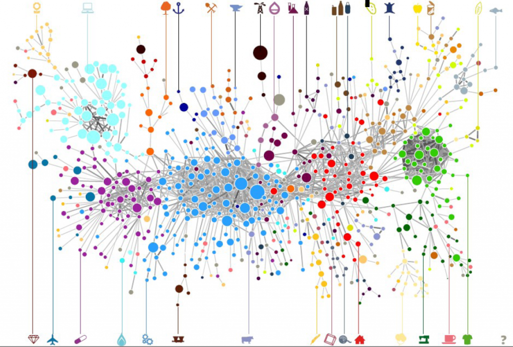
It is clearly the wrong choice, as the real money lies in tackling the former challenge. But if I wanted to get rich I wouldn’t have chosen a life in academia anyway. The network map, in fact, has several advantages over just predicting the bipartite connections. By creating a network map you can have a systemic view of the similarities between entities. The Product Space, the Diseasome, my work on international aid. These are all examples of network maps, where we go from a bipartite network to a unipartite network that is much easier to understand for humans and to analyze for computers.

ps4

Creating a network map, meaning going from a user-movie bipartite network to a movie-movie unipartite network, is conceptually easy. After all, we are basically dealing with objects with attributes. You just calculate a similarity between these attributes and you are done. There are many similarities you can use: Jaccard, Pearson, Cosine, Euclidean distances… the possibilities are endless. So, are we good? Not quite. In a paper that was recently accepted in PLoS One, Muhammed Yildirim and I showed that real world networks have properties that make the general application of any of these measures quite troublesome.

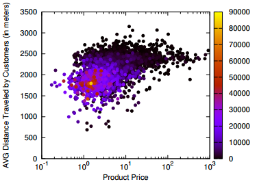
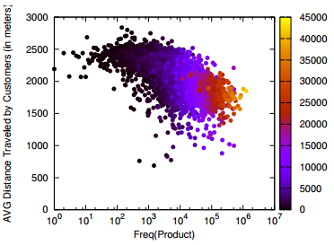
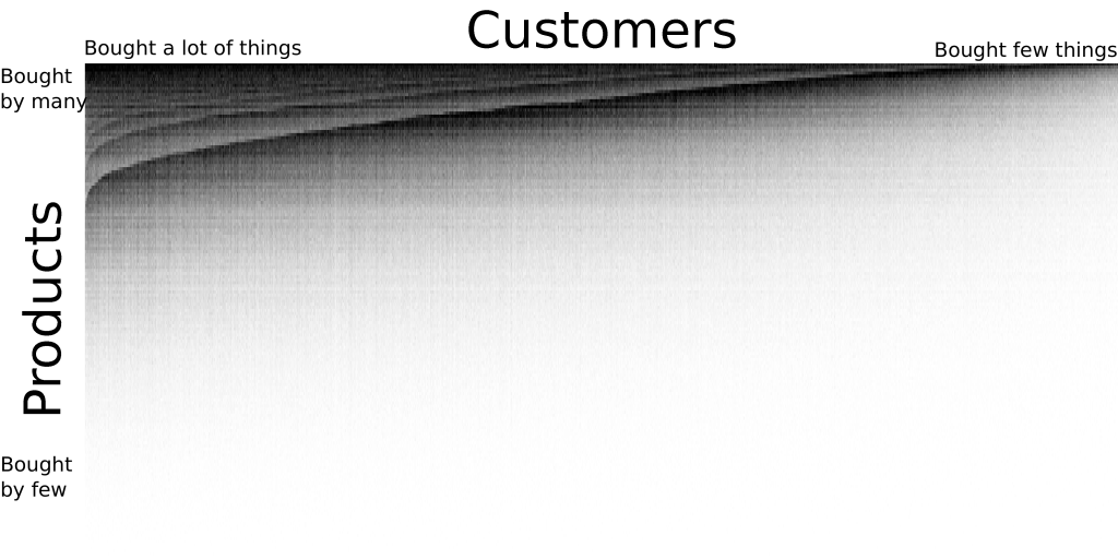
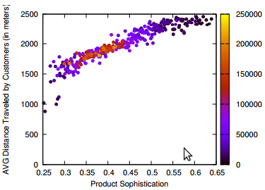
For example, bipartite networks have power-law degree distributions. That means that a handful of attributes are very popular. It also means that most objects have very few attributes. You put the two together and, with almost 100% probability, the many objects with few attributes will have the most popular attributes. This causes a great deal of problems. Most statistical techniques aren’t ready for this scenario. Thus they tend to clutter the network map, because they think that everything is similar to everything else. The resulting network maps are quite useless, made of poorly connected dense areas and lacking properties of real world networks, such as power-law degree distributions and short average path length, as shown in these plots:

m2

m3

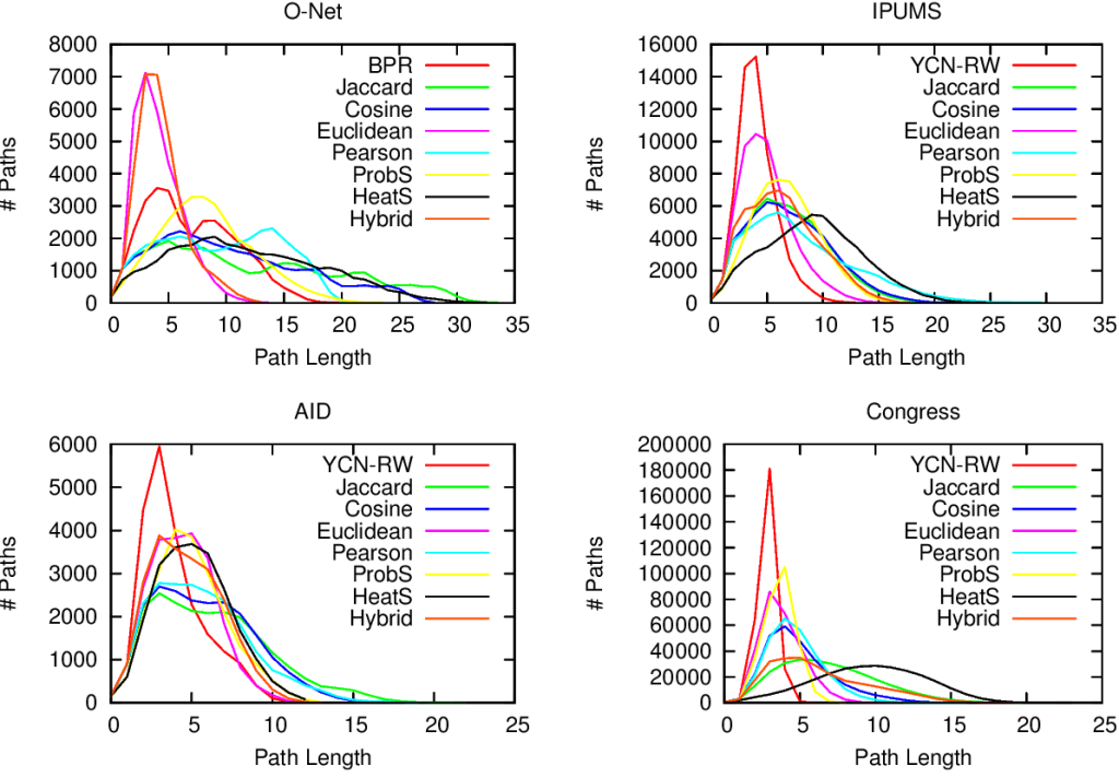
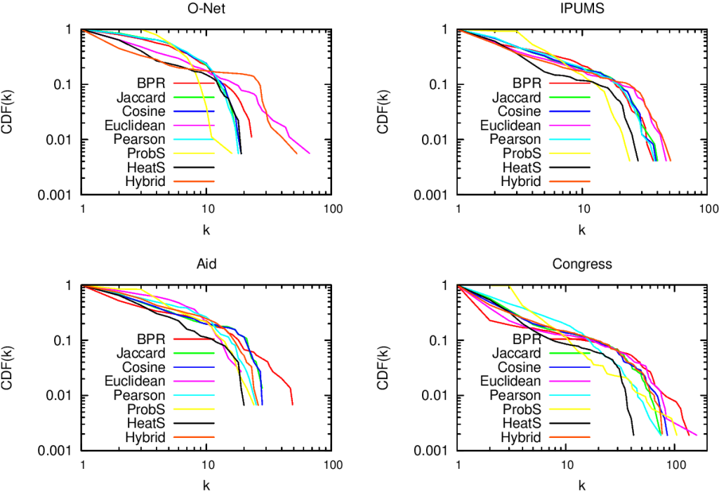
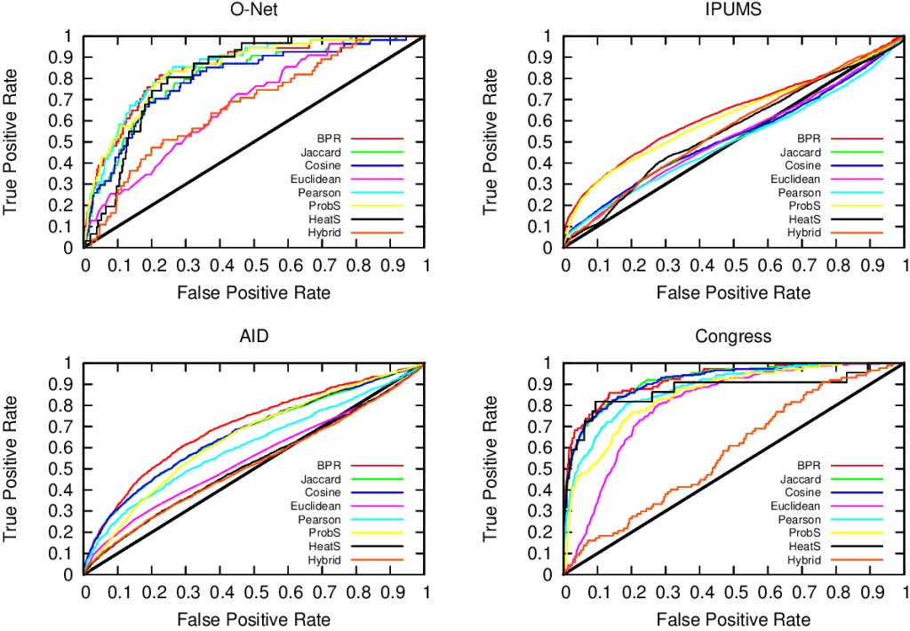
Of course sometimes some measure gets it right. But if you look closely at the pictures above, the only method that consistently give the shortest paths (above, when the peak is on the left we are good) and the broadest degree distributions (below, the rightmost line at the end in the lower-right part of the plot is the best one) is the red line of “BPR”. BPR stands for “Bipartite Projection via Random-walks” and it happens to be the methodology that Muhammed and I invented. BPR is cool not only because its network maps are pretty. It is also achieving higher scores when using the network maps to predict the similarity between objects using ground truth, meaning that it gives the results we expect when we actually already know the answers, that are made artificially invisible to test the methodology. Here we have the ROC plots, where the highest line is the winner:

m4

So what makes BPR so special? It all comes down to the way you discount the popular attributes. BPR does it in a “network intelligent” way. We unleash countless random walkers on the bipartite network. A random walker is just a process that starts from a random object of the network and then it jumps from it to one of its attributes. The target attribute is chosen at random. And then the walker jumps back to an object possessing that attribute, again choosing it at random. And then we go on. At some point, we start from scratch with a new random walk. We note down how many times two objects end up in the same random walk and that’s our similarity measure. Why does it work? Because when the walker jumps back from a very popular attribute, it could essentially go to any object of the network. This simple fact makes the contribution of the very popular attributes quite low.

BPR is just the latest proof that random walks are one of the most powerful tools in network analysis. They solve node ranking, community discovery, link prediction and now also network mapping. Sometimes I think that all of network science is founded on just one algorithm, and that’s random walks. As a final note, I point out that you can create your own network maps using BPR. I put the code online (the page still bears the old algorithm’s name, YCN). That’s because I am a generous coder.

Continue Reading

09 September 2013 ~ 0 Comments

What Motivates a Customer

The Holy Grail of every marketing system is to understand how the mind of the customers works. For example answering the question: “From how far can I attract customers?” To do so means to increase profits. You can deploy your communication and products more efficiently and maximize your returns. Clearly, there is no silver bullet for this task. There is no way that one single aspect is so predominant in a person’s mind at the point of empowering a seller to have perfect control over who will buy her product, where and when. If that would be true, there would be no space left for marketing specialists, demand segmentation and so on. Many little tricks can be deployed in the market.

I am by no means an expert on the field, so my way to frame this problem may sound trivial. In any case, I can list three obvious parameters that affect a customer’s decision in buying or not buying a product. The first is price. Few people want to throw their money senselessly, most of them want to literally maximize the bang for their buck (okay, maybe not that literally). The second is the quantities needed: if I need to buy product X everyday in large bulks and product Y once in a blue moon, then it’s only fair to assume that I’ll consider different parameters to evaluate X and Y.

question

The third is the level of sophistication of a given product. There are things that fewer and fewer people need: birdseed, piña colada flavored lip balm. Narrower customer base means less widespread offer, thus the need of travel more to specialized shops. Intuitively, sophistication is more powerful than price and quantity: a Lamborghini is still a car – also quite useless when doing groceries – like a Panda, but it satisfies very different and much more sophisticated needs. Sophistication is powerful because you can play with it, increasing the perceived sophistication of a product, thus your market: like Jonah Berger‘s  “thee types of ice” bar, that looked more fancy just by inventing a way to make ice sound more sophisticated than it is.

So let’s play and try to use these concepts operatively. Say we want to predict the distance a customer is willing to travel to buy a product. Then, we try to predict such a distance using different variables. The one leading to better predictions of these distances wins as the best variable describing what motivates a customer to travel. We decided to test the three variables I presented before: price, quantity and sophistication. In this theory, higher prices mean longer distances to travel, as if I have to buy an expensive TV I’ll probably go around and check where is the best quality-price ratio. Higher quantities mean shorter distances, as if I have to buy bread everyday I don’t care where the best bakery of the city is if that means traveling ten kilometers everyday. Finally, higher sophistication means longer distances: if I have sophisticated needs I need to travel a lot to satisfy them.

Price and quantity are easy to deal with: they are just numbers. So we can put them on the X axis of a plot and put the distance traveled on the Y axis. And that’s what we did, for price:

scatter1

and for quantity:

scatter2

Here, each dot is a customer buying a product. If the dots had the same distance and the same price/quantity then we merged them together (brighter color = more dots here). We see that our theory, while not perfect, is correct: higher prices means longer distances traveled, higher quantities means shorter distances. Time to test for the level of sophistication! But now we hit a brick wall. How on earth am I suppose to measure the level of sophistication of a person and of a product? Should I split the brain of that person in half? How can I do this for thousands or millions of customers? We need to invent a brain splitting machine.

inside-the-customers-mind1

That’s more or less what we did. In a joint work with Diego Pennacchioli, Salvo Rinzivillo, Fosca Giannotti and Dino Pedreschi, that will appear in the BigData 2013 conference (you can download the paper, if you are interested), we proposed such a brain slice device. Of course I am somewhat scared by all the blood that would result in literally cutting open thousands of skulls, so we implemented a data mining machine that just quantifies with a number the level of sophistication of a customer’s needs and the level of sophistication that a product can satisfy, solving the issue at hand with no bloodshed.

The fundamental question is: is the level of sophistication a number? Intuition would tell us “no”: it’s a complex multidimensional space and my needs are unique like a snowflake. Kind of. But with a satisfying level of approximation, surprisingly, we can describe sophistication with a number. How is that possible? A couple of facts we discovered: customers buying the least sold products also buy everything else (the “simpler” stuff), and products bought just by few customers are bought only by those who also buy everything else. In other words, if you draw a matrix connecting the customers with the products they buy, this matrix is nested, meaning that all purchases are in the top left corner:

matrix

A-ha! Then it’s fair to make this assumption: customers are adding an extra product bought only if they already buy (almost) everything else “before” it. This implies two things: first, is that they add the extra product if all their previous products already satisfied their more basic needs (then, they are more sophisticated); second, is that they are moving on a monodimensional space, adding stuff incrementally. Then, they can be quantified by a number! I won’t go in the boring details about how to calculate this number. Suffice to say that they are very similar to how you calculate a country’s complexity, about which I wrote months ago; and that this number is not the total amount of money they spend, nor the quantity of products they buy.

So, how does this number relate to the distance traveled by customers?

scatter3

The words you are looking for is “astonishingly well”.

So our quantification of the sophistication level has a number of practical applications. In the paper we explore the task of predicting in which shop a customers will go to buy a given product. We are not claiming that this is the only important factor. But it gives a nice boost. Over a base accuracy of around 53%, using the price or the quantity gives you a +6-7% accuracy. Adding the sophistication level gives an additional +6-8% accuracy (plots would suggest more, but they are about continuous numbers, while in reality shop position is fixed and therefore a mistake of a few hundreds meters is less important). Not bad!

Continue Reading

11 October 2012 ~ 0 Comments

The Product Space and Country Prosperity

As reported in different parts of this website, the group I am currently working in is called “Center for International Development”. The mission of this group, in the words of its head Ricardo Hausmann, is quite trivial and unambitious: to eradicate poverty from the world. Knowing how to do it is far from easy and there are different schools of thought about it. The one that Hausmann chose starts with understanding how production and economic growth work, i.e. why some industries are successful in a country and not in another.

To address this question, Hausmann (together with César A. Hidalgo, Bailey Klinger and Albert-Laslo Barabasi) developed the Product Space. The original idea has been published in this paper in 2007, far before I joined the group, but my (overestimated) expertise was heavily exploited to generate its current implementation (the Atlas of Economic Complexity, a book freely available in electronic format). For this reason I feel no shame in writing a post about it in this blog (and to share the Product Space itself in my Dataset page).

The fundamental assumption of the Product Space is the following: countries are able to have a comparative advantage in exporting a given product because they have the capabilities to export it. In abstract, it means: “I do this, because I can“. Quite reasonable. In pictures, with the awesome “A capability is a piece of LEGO” metaphor created by Hidalgo:

From this assumption, it follows that if a country can export two different products, it is because it has the capabilities to export both. Also this step is quite easy. The conclusion is immediate: a country’s development success is lead by its capabilities. The more capabilities the country has (meaning that its LEGO box is big and it contains a lot of pieces), the more capabilities it will be able to acquire, the faster it will grow.

There is a small problem with this conclusion: we can’t observe the capabilities. Of course, if we could then they would be blatantly obvious, so every country could employ its growth strategy based on them. (There is actually another problem: capabilities are tacit knowledge, as Nonaka and Takeuchi would say, so you really can’t teach them, but we will come to this problem later)

What we can observe is simply which countries export what:

But remember: if two products are exported by the same country, then there may be common capabilities needed for their productions; while if two countries export the same products, then they share at least part of the same capabilities. In mathematical terms, it means that the observed country export picture is actually the multiplication of the two halves of the second picture of the post, or:

This is nice because it means that we can collapse the country-product relationships into product-product relationships and then mapping which product is related to which other product, because it requires the same capabilities. The advice for countries is then: if you are exporting product x, then you are likely to have most of the capabilities to export all the products that are connected to x. And this is how the Product Space was born, a single picture expressing all these relationships:

(click on the picture for a higher resolution, or just browse the Atlas website, that is also dynamic).

In the picture the nodes are colored according to the community they belong to (for more information about communities, see a previous post). The communities make sense because they group products that intuitively require the same extended set of capabilities: in cyan we have the electronic products, light blue is machinery, green is garments and so on and so forth.

Is the structure of the Product Space telling us something reliable? Yes, countries are way more likely to start export products that are close, in the Product Space, to the products they already export. Also, it is important to know where the export products of a country are in the Product Space. The more present a country is in the denser cores of the Product Space, the more complex it is said to be. This measure of complexity is a better predictor of GDP growth than classical measures used in political economy like average years of schooling.

Is the structure of the Product Space telling us something interesting? Hell yeah, although it’s not nice to hear. The Product Space has communities, so if you export a product belonging to a community then you have a lot of options to expand inside the community. However, many products are outside the communities, and they are very weakly connected with the rest, often through long chains. The meaning? If you are only exporting those products, you are doomed to not grow, because there is no way that you’ll suddenly start exporting products of a community from nothing (because this would require tacit knowledge that you cannot learn and is not close to what you know). And guess what products the poorest countries are currently exporting.

To conclude, a couple of pictures to provide one proof of the reasoning above. In 1970, Peru had more average years of schooling, more land and twice the GDP per capita of South Korea. Traditional political economy would say that Peru was strong and there was no way that South Korea could catch up. Where South Korea is today is evident. What was the difference between the two countries in terms of Product Space?

(again, click for higher resolution. The black square border indicates which products the country is exporting). There is not a lot of difference in quantities (and this explains why South Korea was poorer). However, South Korea had those two or three products in a very valuable position, while Peru had only products in the branches: a long way to the core. In 2003, this was the result:

Peru is still mainly on the edges, South Korea occupies the center. And that’s all.

Continue Reading