08 November 2018 ~ 0 Comments

Using Web Crawling to Map US State Governments

What do governments do? These days, you can answer this question in many ways: the desire for accountability has pushed many governments to publish more and more data online. These efforts are fantastic, but they seem to have a blind spot. The data is flat. By that, I mean that they usually contain tables, budgets, pieces of information that cannot be really connected to each other. As a network scientist, I think inter-actions contain as much information as actions. Where is the dataset that tells me how public agencies interact with each other? Now the answer is simple: we built it!

The US state governments in all their gory tangledness. Click to enjoy it fully.

The question is: how do we map interactions between agencies if they do not publish data about what they do with whom? And, once we’ve done that, how do we know we’re representing the interactions correctly? This is the result of an effort started by Stephen Kosack, which then gathered to accompany me a fantastic team with a diverse set of skills: Evann Smith, Kim Albrecht, Albert-Laszlo Barabasi, and Ricardo Hausmann. It resulted in the paper “Functional structures of US state governments,” recently published (Open Access!) in PNAS.

We realized that there is a place where agencies say what they are doing: their website. And because websites are built around the idea of interconnecting documents, they are a natural place to scout for links. Our fundamental assumption is that, when a school’s website links to its school district, they’re implicitly or explicitly saying: “What that agency says is relevant for what I do, so you should check them out.” In other words, we can and should link them in a network of agencies.

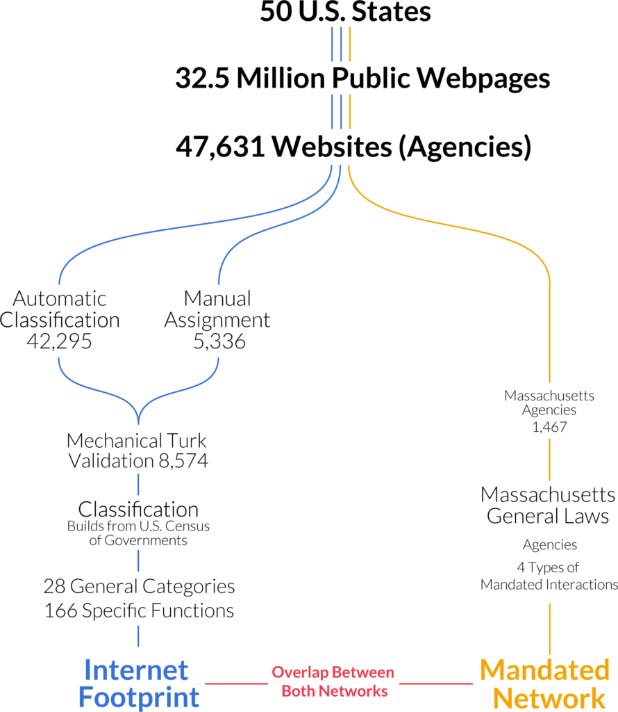
Crawling the web is notoriously complicated. Besides the technical challenges, there’s also the fact that it’s difficult to build a complete index of government websites. We did our best to follow the agency directories published by central state governments, and integrated that with data from Wikipedia and other websites specializing in listing public schools, libraries, city, and county governments.

Obviously, the picture is incomplete and it changes constantly: we did the crawl in 2014 and the web presence of governments ought to look a bit different today. However, we managed to estimate websites’ ages using the Wayback Machine (consider donating!) and we see signs of saturation: the growth of government presence online is significantly slowing down. A hint that the big picture we’re seeing shouldn’t have changed that much. So what’s this big picture? Allow me to introduce you to what we affectionately call “The Cathedral”:

Click to enlarge and cathedralize yourself!

We collapsed each government agency in a two-level classification of activities into government functions. The top level is a generic activity area and the second level is a specialization inside the area. For instance, a top-level function is education. Then “primary/secondary education” and “public libraries” are two possible second level functions inside education. We built this classification by looking at the textual content of each website. Mechanical Turkers validated it. In the cathedral, each node is a function. We connected nodes if agencies, classified under one function, linked themselves to agencies classified under the other. The position of the node is determined by its centrality both horizontally — most central in the middle — and vertically — from top, most central, to bottom. The cathedral confirms our intuition of hierarchicalness: central state and local governments oversee everything and connect to everything.

We could test how much our picture overlaps with actual agency interactions, because the government of Massachusetts mandates some collaborations in its constitution. So we forced Evann to dedicate one year of her life going through the constitution of Massachusetts and noting down when two agencies were mentioned in the same article as in need of interacting. Then it took me a whole five minutes to swoop in to take the credit by testing how much the web network fared compared to the constitutional network (thanks Evann!).

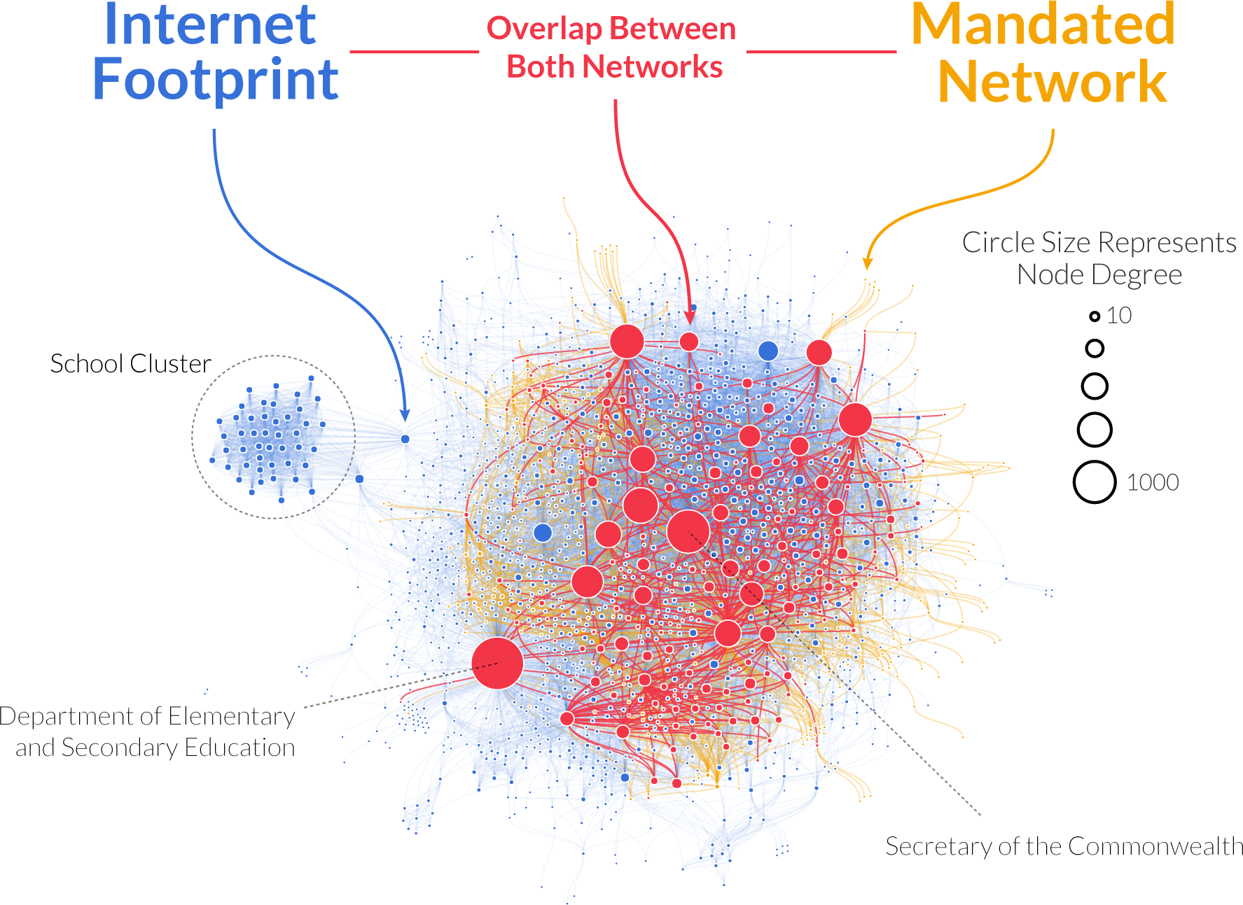
Red is web-constitution overlap, yellow is what the constitution sees and we don’t, blue is what we see and the constitution doesn’t. Click to enlarge.

The answer is “a lot, with a twist.” Agencies that are mandated to collaborate connect to each other on the web much more strongly than we expected — almost eight times as much. The majority of mandated connections are represented in the web. But the overall measure of alignment returned rather low values. How come? Because the internet reveals many more agencies than are mentioned in the constitution. And it reveals many more links too. Although some of that ought to be noise, there are ways to filter it out to end up with a network that is actually more complete than the one you’d get by looking only at the constitution.

One question we wanted to answer with our data was: how can we explain differences in how states decide to implement their functions? We had a few hypotheses. Maybe it’s ideology: red and blue have… different ideas on how to do things — to put it mildly. Or maybe it’s how rich the states are: more $$$ = more complexity. Maybe it’s just their geographical position. It could be a bit of all of that, but there is one thing dominating everything else: economic structure. It’s not the amount of dollars you earn, but how you do it. Hi-tech states look like hi-tech states, agricultural states look like agricultural states, whether they are red, blue, purple, ocher, indigo, rich, or poor.

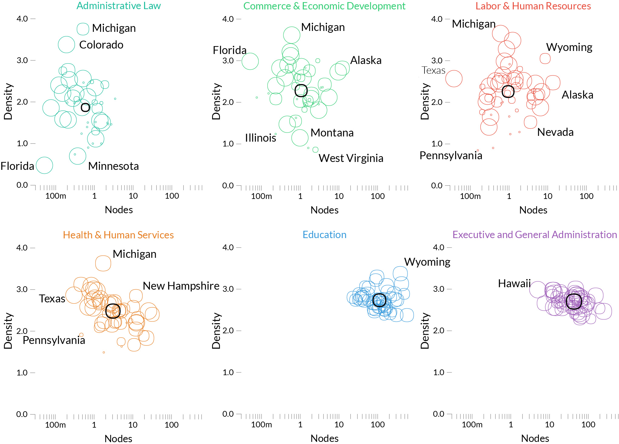
Each circle here is a state, and we look at three dimensions on how they implement each function: how many agencies they created to serve it, how big they are, how much they talk to each other. Some functions, like education, are consistently implemented the same across states — we can tell because the states’ circles are very clustered –. Others are all over the place, like administrative law. Click to enlarge.

Everything I said can be visualized in all its glory in the official website of the project: http://govmaps.cid.hks.harvard.edu/ (by Kim Albrecht). You have a few interactive visualizations, the paper, and the data. We strongly believe in open data and reproducibility: our data release includes not only the US state government networks, but also a collection of scripts to reproduce the main results of the paper.

I hope this could be a significant step forward in how we understand government actions and effects on society. Nowadays, it feels that there is a gargantuan ideological divide between sides: handing over your state to “the other side” feels like a tragedy. Our results seem to suggest that, actually, it doesn’t make that much of a difference.

Continue Reading

28 May 2018 ~ 0 Comments

Mapping the International Aid Community

A few years ago (2013, God I’m old), I was talking to you on how to give a “2.0” flavor to international aid: at CID we created an Aid Explorer to better coordinate the provision of humanitarian work. I’m happy to report that “Aid Explorer” has been adopted — directly or indirectly —  by multiple international organizations, for instance USAID and the European Union. The World Bank’s Independent Evaluation Group contacted me to make an updated version, focused on estimating the World Bank’s position in the global health arena. The result is a paper, “Mapping the international health aid community using web data“, recently published in EPJ Data Science, and the product of a great collaboration with Katsumasa Hamaguchi, Maria Elena Pinglo, and Antonio Giuffrida.

The idea is to collect all the webpages of a hundred international aid organizations, looking for specific keywords and for hyperlinks to the other organizations — differently from the old Aid Explorer in which we relied on the index from Google. The aim is to create different networks of co-occurrences connecting:

  • Aid organizations co-mentioned in the same page;
  • Aid organizations mentioned or linked by another;
  • Issues co-mentioned in the same page;
  • Countries co-mentioned in the same page.

We then analyze these structures to learn something about the community as a whole.

One thing I didn’t expect was that organizations cluster by type. The “type” here is the force behind the organization — private philanthropy, UN system, bilateral (a single country’s aid extension of the foreign ministry), multilateral (international co-operations acting globally), etc. In the picture above (click on the image to enlarge), we encode the agency type in the node color. Organizations are overwhelmingly co-mentioned with organizations of the same type, which is curious because bilaterals often have nothing in common with each other besides the fact they are bilaterals: they work on different issues, with different developed and developing partners.

We can make a similar map connecting issues if they are co-mentioned in a web page. The map is useful as validation because it connects some “synonyms”, for instance “TB” and “Tubercolosis”. However, you can do much more with it. For instance, you can use color to show where an organization is most often cited. Below (click on the image to enlarge) you see the issue map for the World Bank, with the red nodes showing the issues strongly co-mentioned with the World Bank. Basically, the node color is the edge weight in a organization-issue bipartite network, where the organization is the World Bank. To give you an idea, the tiny “Infant Survival” node on the right saw the World Bank mentioned in 9% of the pages in which it was discussed. The World Bank was mentioned in 3.8% of web pages discussing AIDS.

This can lead to interesting discussions. While the World Bank does indeed discuss a lot about some of the red issues above — for instance about “Health Market” and “Health Reform” — its doesn’t say much about “Infant Survival”, relatively speaking at least. It’s intriguing that other organizations mention this particular issue so often in conjunction with the World Bank.

This difference between the global speech about issues and the one specific to another organization allows us to calculate two measures we call “Alignment” and “Impact”. By analyzing how similar the issue co-occurrence network of an organization is with the global one — a simple correlation of edge weights — we can estimate how “Aligned” it is with the global community. On the other hand, an “Impactful” organization is one that, were it to disappear, would dramatically change the global issue network: issues would not be co-mentioned that much.

In the plot above, we have Alignment and Impact on the x and y axis, respectively. The horizontal and vertical lines cutting through the plot above show the median of each measure. The top-right quadrant are organization both impactful and aligned: the organizations that have probably been setting the discourse of the international aid community. No wonder the World Health Organization is there. On the top left we have interesting mavericks, the ones which are not aligned to the community at large, and yet have an impact on it. They are trying to shape the international aid community into something different than what it is now.

A final fun — if a bit loose — analysis regards the potential for an organization to spread a message through the international aid network. What would be the reach of a message if it originated from a specific organization? We can use the Susceptible-Infected model from epidemiology. A message is a “virus” and it is more likely to infect an agency if more than a x% of the agency’s incoming links come from other infected agencies.

This depends on the issue, as shown above. In the figures we see the fraction of “infected” agencies (on the y-axis) given an original “patient zero” organization which starts spreading the message. To the left we see the result of the simulation aggregating all issues. The World Bank reaches saturation faster than UNICEF, and USAID is only heard by a tiny fraction of the network. However, if we only consider web pages talking about “Nurses” (right), then USAID is on par with the top international aid organizations — and UNICEF beats the World Bank. This happens because the discourse on the topic is relatively speaking more concentrated in USAID than average.

As with the Aid Explorer, this is a small step forward improving the provision of international aid. We do not have an interactive website this time, but you can download both the data and the code to create your own maps. Ideally, what we did only for international aid keywords can be extended for all other topics of interest in the humanitarian community: economic development, justice, or disaster relief.

Continue Reading

31 July 2014 ~ 0 Comments

The (Not So) Little Shop of Horrors

For this end of July, I want to report some juicy facts about a work currently under development. Why? Because I think that these facts are interesting. And they are a bit depressing too. So instead of crying I make fun of them, because as the “Panic! At the Disco” would put it: I write sins, not tragedies.

So, a bit of background. Last year I got involved in an NSF project, with my boss Ricardo Hausmann and my good friend/colleague Prof. Stephen Kosack. Our aim is to understand what governments do. One could just pull out some fact-sheets and budgets, but in our opinion those data sources do not tell the whole story. Governments are complex systems and as complex systems we need to understand their emergent properties as collection of interacting parts. Long story short, we decided to collect data by crawling the websites of all public agencies for each US state government. As for why, you’ll have to wait until we publish something: the aim of this post is not to convince you that this is a good idea. It probably isn’t, at least in some sense.

p1

It isn’t a good idea not because that data does not make sense. Au contraire, we already see it is very interesting. No, it is a tragic idea because crawling the Web is hard, and it requires some effort to do it properly. Which wouldn’t be necessarily a problem if there wasn’t an additional hurdle. We are not just crawling the Web. We are crawling government websites. (This is when in a bad horror movie you would hear a thunder nearby).

To make you understand the horror of this proposition is exactly the aim of this post. First, how many government websites are really out there? How to collect them? Of course I was not expecting a single directory for all US states. And I was wrong! Look for yourselves this beauty: http://www.statelocalgov.net/. The “About” page is pure poetry:

State and Local Government on the Net is the onle (sic) frequently updated directory of links to government sponsored and controlled resources on the Internet.

So up-to-date that their footer gets only to 2010 and their news section only includes items from 2004. It also points to:

SLGN Notes, a weblog, [that] was added to the site in June 2004. Here, SLGN’s editors comment on new, redesigned or updated state and local government websites, pointing out interesting or fun features for professional and consumer audiences alike and occasionally cover related news.

Yeah, go ahead and click the link, that is not the only 404 page you’ll see here.

p3

Enough compliments to these guys! Let’s go back to work. I went straight to the 50 different state government’s websites and found in all of them an agency directory. Of course asking that these directories shared the same structure and design is too much. “What are we? Organizations whose aim is to make citizen’s life easier or governments?”. In any case from them I was able to collect the flabbergasting amount of 61,584 URLs. Note that this is six times as much as from statelocalgov.net, and it took me a week. Maybe I should start my own company 🙂

Awesome! So it works! Not so fast. Here we hit the first real wall of government technological incompetence. Out of those 61,584, only 50,999 actually responded to my pings. Please note that I already corrected all the redirects: if the link was outdated but the agency redirected you to the new URL, then that connection is one of the 50,999. Allow me to rephrase it in poetry: in the state government directories there are more than ten thousand links that are pure, utter, hopeless garbage nonsense. More than one out of six links in those directories will land you exactly nowhere.

p2

Oh, but let’s stay positive! Let’s take a look at the ones that actually lead you somewhere:

  • Inconsistent spaghetti-like design? Check. Honorable mention for the good ol’ frameset webdesign of http://colecounty.org/.
  • Making your website an image and use <area> tag for links? Check. That’s some solid ’95 school.
  • Links to websites left to their own devices and purchased by someone else? Check. Passing it through Google Translate, it provides pearls of wisdom like: “To say a word and wipe, There are various wipe up for the wax over it because wipe from”. Maybe I can get a half dozen of haiku from that page. (I have more, if you want it)
  • ??? Check. That’s a Massachusetts town I do not want to visit.
  • Maintenance works due to finish some 500 days ago? Check.
  • Websites mysteriously redirected somewhere else? Check. The link should go to http://www.cityoflaplata.com/, but alas it does not. I’m not even sure what the heck these guys are selling.
  • These aren’t the droids you’re looking for? Check.
  • The good old “I forgot to renew the domain contract”? Check.

Bear in mind that this stuff is part of the 50,999 “good” URLs (these are scare quotes at their finest). At some point I even gave up noting down this stuff. I saw hacked webpages that had been there since years. I saw an agency providing a useful Google Maps of their location, which according to them was the middle of the North Pole. But all those things will be lost in time, like tears in the rain.

Continue Reading

15 April 2013 ~ 0 Comments

Aid 2.0

After the era of large multinational empires (British, Spanish, Portuguese  French), the number of sovereign states exploded. The international community realized that many states were being left behind in their development efforts. A new problem, international development, was created and nobody really had a clue about how to solve it. Eventually, the solution started by international organizations such as the UN or the World Bank culminated on the Millennium Development Goals (MDGs): a set of general objectives that humanity decided to achieve. The MDGs are obviously very noble. Nobody can argue against eradicating hunger or promoting gender equality. The real problem is that the logic that produced them is quite flawed. Some thousands of people met around 2000 and decided that those eight points were the most important global issues. That was probably even true, but what about particular countries, where none of the eight MDGs is crucial, but a ninth is? More importantly: why the hell am I talking about this?

I am talking about this because, not surprisingly, network science can provide a useful perspective on this topic. And it did, in a paper that I co-authored with Ricardo Hausmann and César Hidalgo, at the Center for International Development in Boston. In the paper we explain that the logic behind MDGs is a classical top-down, or strictly hierarchical, one: there are few centers where all information is collected and these centers direct all efforts towards the most important problems. This implies that (see the above picture):

  1. The information generated at the bottom level passes through several steps to get to the top, in a perverted telephone game where some information is lost and some noise is introduced;
  2. If some organization at the bottom level wants to coordinate with somebody else at the same level, it has to pass through several levels even before starting, instead of just creating a direct link.

In this world, if all funds for health are allocated to fighting HIV and child mortality, countries that do not have these problems but face, say, a cholera or a malaria epidemic are doomed to be left behind.

What it is really necessary is a mechanism with which aid organizations can self-organize, by focusing on the issues they are related to and on the places where they are really needed, without broad and inefficient programs. In this world, a small world, everybody can establish a weak link to connect to anybody else, instead of relying on a cumbersome hierarchy. In an editorial in the Financial Times, Ricardo Hausmann used the Encyclopedia Britannica as a metaphor for representing the top-down approach of the MDGs, against the Wikipedia of a self-organized and distributed system.

The question now is: is it really possible to enable the self-organization of international aid? Or: how do we know what country is related to what development issue, and which organization has an expertise on it? Well, it is not an easy question to answer, but in our paper we try to address it. In the paper we describe a system, based on web crawling (i.e. systematically downloading web pages), that capture the number of times each aid organization mentions an issue or a country in its public documents. That is no different from what Google does with the entire web: creating a global knowledge index that is at your fingertips.

Using this strategy, we can create network maps, like the one above (click to see a higher resolution version), to understand what is the current structure of aid development. We are also able to match aid organizations, developing countries and development issues according to how closely they are related to each other. The possible combinations are still quite high, so to actually use our results it is necessary to create a nice visualization tool. And that’s another thing we did: the Aid Explorer (developed and designed by yours truly).

In the Aid Explorer you can confront organizations, countries and issues and see if they are coordinating as they should. For example, you can check what are the issues related to Nordic Fund. Apparently, Microenterprise is a top priority. So, you can check how Nordic Fund relates to countries, according to how they are related to Microenterprise. That’s a good positive correlation! It means that indeed the Nordic Fund really relates most to the countries that are very related to Microenterprise. If we would have found a negative correlation that would have been bad, because it would have meant that Nordic Fund relates with the wrong countries. A general picture over all issues (or over all countries) of Nordic Fund can also be generated. Summing up these general pictures, we can generate rankings of organizations, countries and issues: the more high relevance and high correlation we observe together, the better.

Hopefully, this is the first step toward an ever more powerful Aid Explorer, that can help organizations to get the maximum bang for their buck and countries to get more visibility for their peculiar issues, without being overlooked by the international community because they are not acting in line with the MDG agenda.

Continue Reading