Digital Humanities @ KU: Report
Earlier this month I had the pleasure of being invited to hold a workshop with Isabel Meirelles on complex network visualization and analysis at the Digital Humanities 2014 Forum, held at Kansas University, Lawrence. I figured that this is a good occasion to report on my experience, since it was very interesting and, being quite different from my usual venues, it adds a bit of diversity. The official page of the event is useful to get an overall picture of what was going on. It will be helpful also for everything I will not touch upon in this post.
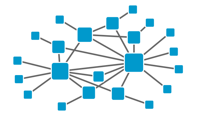
I think that one of the main highlights of the event was the half of our workshop curated by Isabel, with the additional keynote that she gave. Isabel is extremely skilled both in the know-how and in the know-what about information visualization: she is not only able to create wonderful visualizations, but she also has a powerful critical sense of what works and what doesn’t. I think that the best piece of supporting evidence for this statement is her latest book, which you can find here. As for my part of the workshop, it was focused on a very basic introduction to the simplest metrics of network analysis. You can take a glance at the slides here, but if you are already somewhat proficient in network terminology do not expect your world to be shattered by it.
The other two keynotes were equally fascinating. The first one was from Steven Jones. His talk gravitated around the concept of the eversion of the virtual into reality. Many works of science fiction imagined human beings ending up in some more or less well defined “virtual reality”, where everything is possible as long as you can program it. See for example Gibson’s “Neuromancer”, or “The Matrix”, just to give a popular example that most people would know. But what is happening right now, observes Jones, is exactly the opposite. We see more and more examples of virtual reality elements being introduced, mostly playfully, into reality. Think about qonqr, where team of people have to physically “fight” to keep virtual control of an actual neighborhood. A clever artistic way to depict eversion is also:
![]()
The last keynote was from Scott Weingart. Scott is a smart guy and he is particularly interested in studying the history of science. In the (too few!) interactions we had during the forum we touched upon many topics also included in his talk: ethic responsibility of usage of data about people, the influence of the perspective you use to analyze human activities and, a must exchange between a historian of science and yours truly formed as scientist in Pisa, Galileo Galilei. I feel I cannot do justice to his very eloquent and thought-provoking keynote in this narrow space. So I redirect you to its transcript, hosted on Scott’s blog. It’s a good read.

Then, the contributed talks. Among all the papers you can explore from the official forum page, I’d like to focus particularly on two. The first is the Salons project, presented by Melanie Conroy. The idea is to map the cultural exchange happening in Europe during the Enlightenment years. A great role for this exchange was played by Salons, where wealthy people were happy to give intellectuals a place for gathering and discussing. You can find more information on the Salons project page. I liked it because it fits with the idea of knowledge creation and human advancement as a collective process, where an equal contribution is given by both intellect and communication. By basing itself on richly annotated data, projects like these can help us understanding where breakthroughs come from, or to understand that there is no such a thing as a breakthrough, only a progressive interconnection of ideas. Usually, we realize it only after the fact, and that’s why we think it happened all of a sudden.
Another talk I really enjoyed was from Hannah Jacobs. Her talk described a visualization tool to explore the evolution of the concept of “New Woman”, one of the first examples of feminism. I am currently unable to find an online link to the tool. What I liked about it was the seamless way in which different visualizations are used to tell the various points of view on the story. The whole point of information visualization is that when there is too much data to show at the same time, one has to select what to highlight and what to discard. But in this framework, with a wise choice of techniques, one can jump into different magnifying glasses and understand one part of the story of the term “New Woman” at a time.
Many other things were cool, from the usage of the Unity 3D engine to recreate historic view, to the charming visualizations of “Enchanters of Men”. But my time here is up, and I’m left with the hope of being invited also to the 2015 edition of the forum.
