05 March 2024 ~ 0 Comments

My Winter in Cultural Data Analytics

Cultural analytics means using data analysis techniques to understand culture — now or in the past. The aim is to include as many sources as possible: not just text, but also pictures, music, sculptures, performance arts, and everything that makes a culture. This winter I was fairly involved with the cultural analytics group CUDAN in Tallinn, and I wanted to share my experiences.

CUDAN organized the 2023 Cultural Data Analytics Conference, which took place in December 13th to 16th. The event was a fantastic showcase of the diversity and the thriving community that is doing work in the field. Differently than other posts I made about my conference experiences, you don’t have to take my word for its awesomeness, because all the talks were recorded and are available on YouTube. You can find them at the conference page I linked above.

My highlights of the conference were:

  • Alberto Acerbi & Joe Stubbersfield’s telephone game with an LLM. Humans have well-known biases when internalizing stories. In a telephone game, you ask humans to sum up stories, and they will preferably remember some things but not others — for instance, they’re more likely to remember parts of the story that conform to their gender biases. Does ChatGPT do the same? It turns out that it does! (Check out the paper)
  • Olena Mykhailenko’s report on evolving values and political orientations of rural Canadians. Besides being an awesome example of how qualitative analysis can and does fit in cultural analytics, it was also an occasion to be exposed to a worldview that is extremely distant from the one most of the people in the audience are used to. It was a universe-expanding experience at multiple levels!
  • Vejune Zemaityte et al.’s work on the Soviet newsreel production industry. I hardly need to add anything to that (how cool is it to work on Soviet newsreels? Maybe it’s my cinephile soul speaking), but the data itself is fascinating: extremely rich and spanning practically a century, with discernible eras and temporal patterns.
  • Mauro Martino’s AI art exhibit. Mauro is an old friend of mine, and he’s always doing super cool stuff. In this case, he created a movie with Stable Diffusion, recreating the feel of living in Milan without actually using any image from Milan. The movie is being shown in various airports around the world.
  • Chico Camargo & Isabel Sebire made a fantastic analysis of narrative tropes analyzing the network of concepts extracted from TV Tropes (warning: don’t click the link if you want to get anything done today).

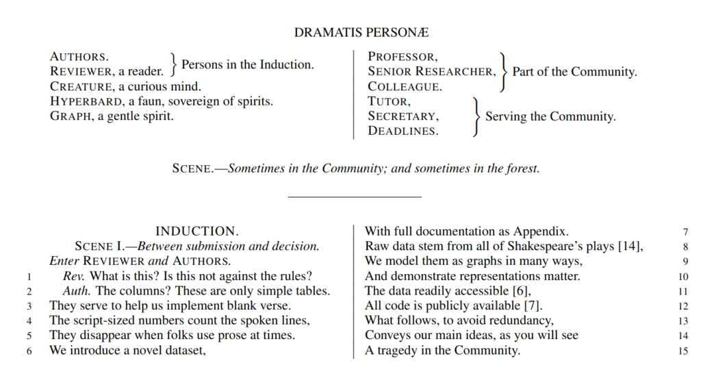
But my absolute favorite can only be: Corinna Coupette et al.’s “All the world’s a (hyper)graph: A data drama”. The presentation is about a relational database on Shakespeare plays, connecting characters according to their co-appearances. The paper describing the database is… well. It is written in the form of a Shakespearean play, with the authors struggling with the reviewers. This is utterly brilliant, bravo! See it for yourself as I cannot make it justice here.

As for myself, I was presenting a work with Camilla Mazzucato on our network analysis of the Turkish Neolithic site of Çatalhöyük. We’re trying to figure out if the material culture we find in buildings — all the various jewels, tools, and other artifacts — tell us anything about the social and biological relationships between the people who lived in those buildings. We can do that because the people at Çatalhöyük used to bury their dead in the foundations of a new building (humans are weird). You can see the presentation here:

After the conference, I was kindly invited to hold a seminar at CUDAN. This was a much longer dive into the kind of things that interest me. Specifically, I focused on how to use my node attribute analysis techniques (node vector distances, Pearson correlations on networks, and more to come) to serve cultural data analytics. You can see the full two hour discussion here:

And that’s about it! Cultural analytics is fun and I look forward to be even more involved in it!
Continue Reading

31 January 2024 ~ 0 Comments

Predictability, Home Advantage, and Fairness in Team Sports

There was a nice paper published a while ago by the excellent Taha Yasseri showing that soccer is becoming more predictable over time: from the early 90s to now, models trying to guess who would win a game had grown in accuracy. I got curious and asked myself: does this hold only for soccer, or is it a general phenomenon across different team sports? The result of this question was the paper: “Which sport is becoming more predictable? A cross-discipline analysis of predictability in team sports,” which just appeared on EPJ Data Science.

My idea was that, as there is more and more money and professionalism in sport, those who are richer will become stronger over time, and dominate for a season, which will make them more rich, and therefore more dominant, and more rich, until you get Juventus, which came in first or second in almost 50% of the 119 soccer league seasons played in Italy.

My first step was to get data about 300,000 matches played across 49 leagues in nine disciplines (baseball, basket, cricket, football, handball, hockey, rugby, soccer, and volleyball). My second step was to blatantly steal the entire methodology from Taha’s paper because, hey, why innovate when you can just copy the best? (Besides, this way I could reproduce and confirm their finding, at least that’s the story I tell myself to fall asleep at night)

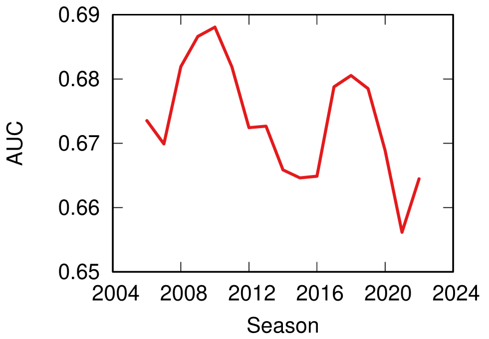
Predictability (y axis, higher means more predictable) over time (x axis) across all disciplines. No clear trend here!

The first answer I got was that Taha was right, but mostly only about soccer. Along with volleyball (and maybe baseball) it is one of the few disciplines that is getting more predictable over time. The rest of the disciplines are a mixed bag of non-significant results and actual decreases in predictability.

One factor that could influence these results is home advantage. Normally, the team playing home has slighter higher odds of winning. And, sometimes, not so slight. In the elite rugby tournament in France, home advantage is something like 80%. To give an idea, 2014 French champions Toulon only won 4 out of their 13 away games, and two of them were against the bottom two teams of the league that got relegated that season.

It’s all in the pilou pilou. Would you really go to Toulon and tell this guy you expect to win? Didn’t think so.

Well, this is something that actually changed almost universally across disciplines: home advantage has been shrinking across the board — from an average of 64% probability of home win in 2011 to 55% post-pandemic. The home advantage did shrink during Covid, but this trend started almost a decade before the pandemic. The little bugger did nothing to help — having matches played behind closed doors altered the dynamics of the games –, but it only sped up the trend, it didn’t create it.

What about my original hypothesis? Is it true that the rich-get-richer effect is behind predictability? This can be tested, because most American sports are managed under a socialist regime: players have unions, the worst performing teams in one season can pick the best rookies for the next, etc. In Europe, players don’t have unions and if you have enough money you can buy whomever you want.

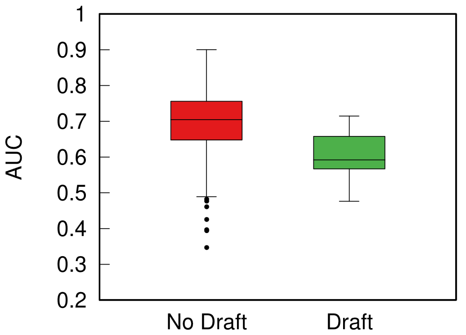
Boxplot with the distributions of predictability for European sports (red) and American ones (green). The higher the box, the more predictable the results.

When I split leagues by the management system they follow, I can clearly see that indeed those under the European capitalistic system tend to be more predictable. So next time you’re talking with somebody preaching laissez-faire anarcho-capitalism tell them that, at least, under socialism you don’t get bored at the stadium by knowing in advance who’ll win.

Continue Reading

17 May 2022 ~ 0 Comments

Node Attribute Distances, Now Available on Multilayer Networks! (Until Supplies Last)

I’ve been a longtime fan of measuring distances between node attributes on networks: I’ve reviewed the methods to do it and even proposed new ones. One of the things bothering me was that no one had so far tried to extend these methods to multilayer networks — networks with more than one type of relationships. Well, it bothers me no more, because I just made the extension myself! It is the basis of my new paper: “Generalized Euclidean Measure to Estimate Distances on Multilayer Networks,” which has been published on the TKDD journal this month.

Image from https://atlas.cid.harvard.edu/

You might be wondering: what does it mean to “measure the distance between node attributes on networks”? Why is it useful? Let’s make a use case. The Product Space is a super handy network connecting products on the global trade network based on their similarity. You can have attributes saying how much of a product a country exported in a given year — in the image above you see what Egypt exported in 2018. This is super interesting, because the ability of a country to spread over all the products in the Product Space is a good predictor of their future growth. The question is: how can we tell how much the country moved in the last ten years? Can we say that country A moved more or less than country B? Yes, we can! Exactly by measuring the distance between the node attributes on the network!

The Product Space is but an example of many. One can estimate distances between node attributes when they tell you something about:

  • When and how much people were affected by a disease in a social network;
  • Which customers purchased how many products in a co-purchase network (à la Amazon);
  • Which country an airport belongs to in a flight network;
  • etc…
Image from https://manliodedomenico.com/

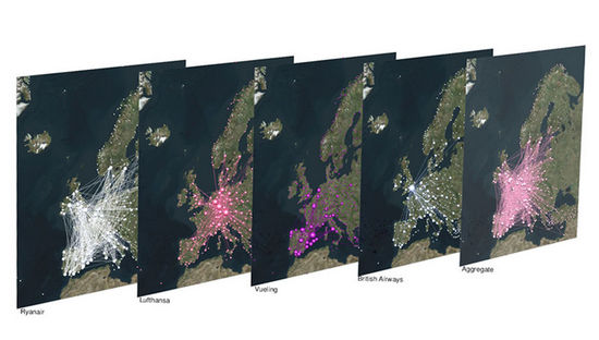
Let’s focus on that last example. In this scenario, each airport has an attribute per country: the attribute is equal to 1 if the airport is located in that country, and 0 otherwise. The network connects airports if there is at least a flight planned between them. In this way, you could calculate the network distance between two countries. But wait: it’s not a given that you can fly seamlessly between two countries even if they are connected by flights across airports. You could get from airport A to airport B using flight company X, but it’s not a given than X provides also a flight to airport C, which might be your desired final destination. You might need to switch to airline Y — the image above shows the routes of four different companies: they can be quite different! Switching between airlines might be far from trivial — as every annoyed traveler will confirm to you –, and it is essentially invisible to the measure.

It becomes visible if, instead of using the simple network I just described, you use a multilayer network. In a multilayer network, you can say that each airline is a layer of the network. The layer only contains the flight routes provided by that company. In this scenario, to go from airport A to airport C, you pay the additional cost of switching between layers X and Y. This cost can be embedded in my Generalized Euclidean measure, and I show how in the paper — I’ll spare you the linear algebra lingo.

Image from yours truly

One thing I’ll say — though — is that there are easy ways to embed such layer-switching costs in other measures, such as the Earth’s Mover Distance. However, these measures all consider edge weights as costs — e.g., how long does it take to fly from A to B. My measure, instead, sees edge weights as capacities — e.g. how many flights the airline has between A and B. This is not splitting hairs, it has practical repercussions: edge weights as costs are ambiguous in linear algebra, because they can be confused with the zeros in the adjacency matrices. The zeros encode absent edges, which are effectively infinite costs. Thus there is an ambiguity* in measures using this approach: as edges get cheaper and cheaper they look more and more like infinitely costly. No such ambiguity exists in my approach. The image above shows you how to translate between weights-as-costs and weights-as-capacities, and you can see how you can get in trouble in one direction but not in the other.

In the paper, I show one useful case study for this multilayer node distance measure. For instance, I am able to quantify how important the national flagship airline company is for the connectivity of its country. It’s usually extremely important for small countries like Belgium, Czechia, or Ireland, and less crucial for large ones like France, the UK, or Italy.

The code I developed to estimate node attribute distances on multilayer networks is freely available as a Python library — along with data and code necessary to replicate the results. So you have no more excuses now: go and calculate distances on your super complex super interesting networks!


* This is not completely unsolvable. I show in the paper how one could get around this. But I’d argue it’s still better not to have this problem at all 🙂

Continue Reading

27 October 2021 ~ 1 Comment

Pearson Correlations for Networks

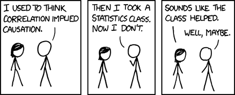
We all know that correlation doesn’t imply causation:

And yet, we calculate correlations all the time. Because knowing when two things correlate is still pretty darn useful. Even if there is no causation link at all. For instance, it’d be great to know whether reading makes you love reading more. Part of the answer could start by correlating the number of books you read with the number of books you want to read.

The very important questions the Pearson correlation coefficient allows you to ask: will consuming cheese bring upon you the doom of dying by suffocating in your bedsheets? source: https://www.tylervigen.com/spurious-correlations

As a network scientist, you might think that you could calculate correlations of variables attached to the nodes of your network. Unfortunately, you cannot do this, because normal correlation measures assume that nodes do not influence each other — the measures are basically assuming the network doesn’t exist. Well, you couldn’t, until I decided to make a correlation coefficient that works on networks. I describe it in the paper “Pearson Correlations on Complex Networks,” which appeared in the Journal of Complex Networks earlier this week.

The formula you normally use to calculate the correlation between two variables is the Pearson correlation coefficient. What I realized is that this formula is the special case of a more general formula that can be applied to networks.

In Pearson, you compare two vectors, which are just two sequences of numbers. One could be the all the numbers of books that the people in our sample have read, and the other one is all of their ages. In the example, you might expect that older people had more time to read more books. To do so, you check each entry in the two vectors in order: every time you consider a new person, if their age is higher than the average person’s, then also the number of books they read should be higher.

If you are in a network, each entry of these vectors is the value of a node. In our book-reading case, you might have a social network: for each person you know who their friends are. Now you shouldn’t look at each person in isolation, because the numbers of books and the ages of people also correlate in different parts of the network — this is known as homophily. Some older people might be pressured into reading more books by their book-addicted older friends. Thus, leaving out the network might cause us to miss something: that a person’s age tells us not just about the number of books they have read, but it also allows us to predict the number of books their friends have read.

This is the type of networks you are forced to work with when you use the Pearson correlation. That’s just silly, isn’t it?

To put it simply, the classical Pearson correlation coefficient assumes that there is a very special network behind the data: a network in which each node is isolated and only connects to itself — see the image above. When we slightly modify the math behind its formula, it can take into account how close two nodes are in the network — for instance, by calculating their shortest path length.

You can interpret the results from this network correlation coefficient the same way you do with the Pearson one. The maximum value of +1 means that there is a perfect positive relation: for every extra year of age you read a certain amount of new books. The minimum of -1 means that there is a perfect negative relationship: a weird world where the oldest people have not read much. The midpoint of 0 means that the two variables have no relation at all.

Is the network correlation coefficient useful? Two answers. First: how dare you, asking me if the stuff I do has any practical application. The nerve of some people. Second: Yes! To begin with, in the paper I build a bunch of artificial cases in which I show how the Pearson coefficient would miss correlations that are actually present in a network. But you’re not here for synthetic data: you’re a data science connoisseur, you want the real deal, actual real world data. Above you can see a line chart, showing the vanilla Pearson (in blue) and the network-flavored (in red) correlations for a social network of book readers as they evolve over time.

The data comes from Anobii, a social network for bibliophiles. The plot is a correlation between number of books read and number of books in the wishlist of a user. These two variables are positively correlated: the more you have read, the more you want to read. However, the Pearson correlation coefficient greatly underestimates the true correlation, at 0.25, while the network correlation is beyond 0.6. This is because bookworms like each other and connect with each other, thus the number of books you have read also correlates with the wishlist size of your friends.

This other beauty of a plot, instead, shows the correlation between the age of a user and the number of tags they used to tag books. What is interesting here is that, for Pearson, there practically isn’t a correlation: the coefficient is almost zero and not statistically significant. Instead, when we consider the network, there is a strong and significant negative correlation at around -0.11. Older users are less inclined to tag the books they read — it’s just a fad kids do these days –, and they are even less inclined if their older friends do not tag either. If you were to hypothesize a link between age and tag activity and all you had was lousy Pearson, you’d miss this relationship. Luckily, you know good ol’ Michele.

If this makes you want to mess around with network correlations, you can do it because all the code I wrote for the paper is open and free to use. Don’t forget to like and subscrib… I mean, cite my paper if you are fed up with the Pearson correlation coefficient and you find it useful to estimate network correlations properly.

Continue Reading

15 March 2021 ~ 0 Comments

Networks in Economics Satellite @ Networks21 Conference

This year’s NetSci conference will be special. For the first time it will be held jointly with the other major network event of the year: Sunbelt, or the main network conference for social sciences. I could not miss an opportunity like this, and so I decided to organize a satellite event with the excellent Morgan Frank and Lingfei Wu. The topic of the satellite will be network applications on research about economic development and innovation.

We’re looking for contributors to send an abstract about their work in the area. If you’re unsure about what area that is, think about my research on the Product Space, or on the impact of business travel on economic growth, or economic convergence in Colombia, etc. Specifically, if you are interested in issues like:

  • Mapping the relationship of complex economic activities at the global, regional, and local level;
  • Tracking flows of knowhow in all its forms;
  • Estimating the relatedness of tasks and skills to estimate knockoff effects and productivity gains of automation;
  • Investigating the dynamics of research and innovation via analysis of patents, inventions, and science;
  • Uncovering scaling laws and other growth trends able to describe the systemic increase in complexity of activities due to agglomeration;

and you study them using networks and the tools of the science of complex systems, then you really should send us your abstract. The submission link is: https://easychair.org/my/conference?conf=cnei21. You should send a one-page one-figure abstract before May 5th, 2021.

We have a fantastic lineup of invited speakers you’ll mingle with:

The event will be held online on Zoom. The exact date is still to be determined, but it will be between June 21st and July 3rd. So stay tuned for updates! You should bookmark the official website of the satellite, to get fresh news about it: https://mrfrank8176.github.io/Complex-Networks-in-Economics-and-Innovation/

I hope to see your abstract in my inbox and then you presenting at the satellite!

Continue Reading

09 February 2021 ~ 0 Comments

The Atlas for the Aspiring Network Scientist v1.1

Last month I put out in public my Atlas for the Aspiring Network Scientist. The reaction to it was very pleasant and people contacted me with a number of corrections, opinions, and comments. I just uploaded to arXiV a version 1.1 of it, doing my best to address whatever could be addressed quickly. The PDF on the official website is also updated and, in fact, that link will always direct you to the most up-to-date version.

Corrections involve mostly some notation, a few references, and the like. One important thing I want to point out is my rephrasing/retraction of some humorous parts. I still stand by my decision of using humor, but not when it comes at the expense of the feeling of inclusiveness in the community. Science is a social process and everyone should feel welcome to it. Using language that opposes that aim is a net loss for society. One example is in the chapter about tools, where some ruvid humor didn’t paint the correct picture: these open source tools are fantastic gifts to the community and should be unequivocally celebrated. All remaining jokes are about the self-deprecation I feel every day from my inability to measure up to the awesome fellows behind these libraries/software.

One thing that was flagged to me but I couldn’t touch was references. There are just too many for me to check them all. I’m asking your help: if you find some issue with references (missing information, or things like editors as authors, etc), please write me flagging the specific reference with the issue: mcos@itu.dk.

I’m also glad to announce that you can buy a physical copy of the book, in case you need it handy for whatever reason. This is only v1, though, so all corrections mentioned above are not included. When v2 will come out, I’ll also make that available for physical purchase. The book was printed via IngramSpark, thus there’s a good chance you can find it for sale & shipping almost everywhere. For instance, it is available on Amazon or, if you’re in Denmark (where I live), on Saxo. You could even buy it on friggin’ Walmart.

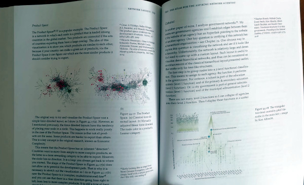
The final object’s quality is… eh. Some of it is by design: I wanted this to be as accessible as possible. You’ll hardly find another 650+ color pages book in US Letter format for less than $40. Compromises needed to be made. However, most of the things making it a clearly amateurish product are my fault. Take a look at the left margin in the back cover:

Eww… Also, since I had to upload the cover separately, I didn’t remember to include a blank page. So the left pages are on the right and vice versa. Which makes page numbers practically invisible in the middle:

That said, if you ignore everything that makes this book ugly, it’s actually pretty nice:

Also, apologies to your backs, but this thing is hyuuuge. It’s as tall as a half-kilo pack of bucatini and twice as thick (packs of bucatini are a standard unit of measure in Italy):

Finally, I would love to give a shout out to everyone I interacted with after the book came out. Everyone was super nice and/or super helpful, most were both. I discovered many things I wasn’t aware of. One of them is NETfrix, a network science podcast by super cool fellow Asaf Shapira. The podcast has transcripts in English available here.

That’s it for now! Hopefully new research posts will follow soon.

Continue Reading

06 January 2021 ~ 1 Comment

The Atlas for the Aspiring Network Scientist

In the past two years, I’ve been working on a textbook for the Network Analysis class I teach at ITU. I’m glad to say that the book is now of passable enough quality to be considered in version 1.0 and so I’m putting it out for anyone to read for free. It appeared on arXiV yesterday. It is available for download on its official website, which contains the solutions to the exercises in the book. Ladies and gentlemen, I present you The Atlas for the Aspiring Network Scientist.

As you might know, there are dozens of awesome network science books. I cannot link them all here, but they are cited in my atlas’ introduction. So why do we need a new one? To explain why the atlas is special, the best way is to talk about the defects of the book, rather than its strengths.

The first distinctive characteristic is that it aims at being broad, not deep. As the title suggests, I wanted this to be an atlas. An atlas is a pointer to the things you need to know, rather than a deep explanation of those things. In the book, I never get tired of pointing out the resources you need to actually understand the nitty-gritty details. When you stumble on a chapter on something you’re familiar with, you’ll probably have the feeling that you know so much more than me — which is true. However, that’s the price to pay if I want to include topics from the Hitting Time Matrix to the Kronecker graph model, from network measurement error to graph embedding techniques. No book I know includes all of these concepts.

The second issue derives from the first: this is a profoundly personal journey of eleven years through network science. No one can, in such a short time, master all the topics I include. Thus there’s an uneven balance: some methods are explained in detail because they’re part of my everyday work. And others are far from my area of expertise. Rather than hiding such a defect, the book wears it on its sleeve. I prefer to include everything I can even if I’m not an expert on it, because the first priority is to let people know that something exists. If I were to wait until I was an expert R programmer before advising you to use iGraph, the book would not exist. If I were to leave out iGraph because I’m not good at it, it would make the book weaker — and give the impression of dishonesty, like the classic Pythonist who ignores R because “it’s the opposing team”.

Finally, the book reads more like a post on this blog than an academic textbook. I use a colorful style and plenty of humor. This is partially as a result of the second point, since the humor is mostly self-deprecating about my limits — for instance, the stabs I take at R are intended as light-hearted jest. In general, I want to avoid being excessively dry and have the readers fall asleep at page 20. This is a risky move, because humor is subjective and heavily culture-dependent. People have been and will be put off by this. If you think I cross the line somewhere in the book, feel free to point that out and ask me to consider your concerns. If, instead, you think that humor in general has no place in academia, then I disagree, but there are plenty alternatives, so you can safely ignore my book.

Given all of the above, it is no surprise that the atlas is imperfect and many things need to be fixed. Trust me that the first draft was significantly worse in all respects. The credit for catching my mistakes goes to my peer reviewers. Every one of their comments was awesome, and every one of the remaining mistakes are only my fault for being unable to address the issues properly. Chief among the reviewers was Aaron Clauset, who read (almost) the entire thing. The others* still donated their time and expertise for free, some of them only asked me to highlight worthwhile charities such as TechWomen and Evidence Action in return.

Given all the errors that remain, consider this a v1.0 of a continuous effort. There are many things to improve: language, concepts, references, figures. Please contact me with any comments. The PDF on the website will reflect changes as soon as is humanely possible. Before I put v1.1 on arXiV, I’ll wait to have a critical mass of changes — I expect to have it maybe for mid to late February.

I also plan to have interactive figures on the website in the future. Version 1.0 was all financed using my research money and time. For the future, I will need some support to do this in my free time. If you feel like encouraging this effort, you can consider becoming a patron on Patreon. A print-on-demand version will be available soon (link will follow), so you could also consider ordering a physical copy — I’ll make 70 juicy cents of profit for every unit sold, because I’m a seasoned capitalist who really knows how to get his money’s worth for two years of labor.

I poured my heart in this. I really hope you’ll enjoy it.


* Special thanks go to Andres Gomez-Lievano. The other peer reviewers are, in alphabetical order: Alexey Medvedev, Andrea Tagarelli, Charlie Brummitt, Ciro Cattuto, Clara Vandeweerdt, Fred Morstatter, Giulio Rossetti, Gourab Ghoshal, Isabel Meirelles, Laura Alessandretti, Luca Rossi, Mariano Beguerisse, Marta Sales-Pardo, Matte Hartog, Petter Holme, Renaud Lambiotte, Roberta Sinatra, Yong-Yeol Ahn, and Yu-Ru Lin.

Continue Reading

23 July 2019 ~ 0 Comments

Lipari 2019 Report

Last week I answered the call of duty and attended the complex network workshop in the gorgeous Mediterranean island of Lipari (I know, I’m a selfless hero). I thank the organizers for the invitation, particularly Giancarlo Ruffo, fellow nerd Roberta Sinatra, and Alfredo Ferro. This is my usual report, highlighting the things that most impressed me during the visit. Well, excluding the granitas, the beaches, and the walks, because this is not a blog about tourism, however difficult it might be to tell the difference.

Differently from NetSci, there weren’t parallel sessions, so I was able to attend everything. But I cannot report on everything: I don’t have the space nor the skill. So, to keep this post from overflowing and taking over the entire blog, I need to establish some rules. I will only write about a single talk per session, excluding the session in which I presented — I was too tense mentally preparing for my talk to give justice to the session.

Any overrepresentation of Italian speakers in the following line-up is — quite obviously — part of your imagination.

Get ready for a bunch of sunset pictures. Did you know Lipari is a net exporter of sunsets?

Session 1: Ronaldo Menezes talked about spatial concentration and temporal regularities in crime. Turns out, you can use network and data science to fight the mob. One of Ronaldo’s take-home messages was that police should try to nudge criminals to operate outside the areas where they’re used to work in. The more you can push them to unfamiliar territory, the more mistakes they’ll make.

Session 2: The theme of the workshop was brain research, and Giulia Bassignana‘s talk on multiple sclerosis was the first that caught my eye. Giulia presented some models to study the degeneration of physical connections in the brain. While I love all that is related to the brain, seeing people working on the actual physical connections tickles me more than looking at correlation networks from fMRI data, and Giulia was really spot on.

Session 3: Daniela Paolotti presented a wide array of applications of data science for the greater good. Her talk was so amazing it deserves an entire blog post by itself. So I’ll selfishly only mention a slice of it: a project in which Daniela is able to predict the spread of Zika by analyzing human mobility patterns from cellphone data. Why selfishly? Because I humbly played a small role in it by providing the cellphone data from Colombia.

That on the background is Stromboli. With my proverbial bravery, I did not get any closer than this to that lava-spewing monster.

Session 4: If some of you are looking for an academic job this year, I suggest you to talk with Alessandra Urbinati, who presented some intriguing analysis on scientific migration networks. Alessandra showed which countries are emitters and attractors — or both. My move to Denmark seemed to be spot on, as it ranks highly as an attractor. Among countries of comparable size, only Switzerland does a bit better — that’s probably why my sister works there (always one-upping me!).

Session 6: As her custom, Tina Eliassi-Rad proved yet again she is completely unable to give an uninteresting talk. This time she talked about some extremely smart way to count occurrences of graph motifs without going through the notoriously expensive graph isomorphism problem. Her trick was to use the spectrum of non-backtracking matrices. Tina specializes in finding excellent solutions to complex problems by discovering hidden pathways through apparently unrelated techniques. (Seriously, Tina rocks.)

Session 7: Ciro Cattuto‘s talk on graph embeddings really had it all. Not only did Ciro present an extremely smart way to create graph embeddings for time-evolving networks, but he also schooled everybody on the basics of the embedding technique. Basically graph embeddings boil down to representing nodes as vectors via random walks, which can then be used as input for machine learning. I always love when a talk not only introduces a new technique, but also has pedagogical elements that make you a better researcher.

To be fair, we tried to apply some natural selection and get rid of the weakest network scientists by climbing Vulcano. Turns out, we are all pretty fit, so we’re back to evaluating ourselves via the quality of our work, I guess. *shrugging emoticon*

Session 8: Philipp Hövel spoke about accelerating dynamics of collective attention. Have you ever felt that memes and fads seem to pop in and out of existence faster and faster? Philipp showed it’s not your imagination: we’re getting better and faster at producing popular content on social media. This causes a more rapid exhaustion of humanity’s limited attention and results in faster and faster meme cycles.

Session 9: Only tangentially related to networks, Daniel Fraiman talked about some intriguing auction models. The question is: how do you price a product with zero marginal cost — meaning that, once you have the infrastructure, producing the next item is essentially free? The answer is that you don’t: you have an auction where people state their price freely, and at each new bid the current highest bidder gets the next item. This model works surprisingly well in making the full system converge to the actual value of the product.

Session 10: Andrea Tacchella‘s was another talk that was close to my heart. He taught us a new and better way to build the Product Space. I am the author of the current incarnation of it in the Atlas of Economic Complexity, so I ought to hate Andrea. However, my Product Space is from 2011 and I think it is high time to have a better version. And Andrea’s is that version.

Is this group photo a possible contestant with 1927’s 5th Solvay for the best conference group picture? … No, it isn’t, not even close. Why would anyone even bring that up?

Session 11: Did I mention graph isomorphism before? Did I also mention how fiendishly complex of a problem that is? Good. If you can avoid dealing with it, you’ll be happier. But, when life throws graph isomorphism problems at you, first you make isomorphism lemonade, then you can hardly do better than calling Alfredo Pulvirenti. Alfredo showed a very efficient way to solve the problem for labeled multigraphs.

Session 12: The friendship paradox is a well-known counter-intuitive aspect of social networks: on average your friends are more popular than you. Johan Bollen noticed that there is also a correlation between the number of friends you have and how happy you are. Thus, he discovered that there is a happiness paradox: on average your friends are happier than you. Since we evaluate our happiness by comparison, the consequence is that seeing all these happy people on social media make us miserable. The solution? Unplug from Facebook, for instance. If you don’t want to do that, Johan suggests that verbalizing what makes you unhappy is a great way to feel better almost instantly.

And now I have to go back to Copenhagen? Really?

Now, was this the kind of conference where you find yourself on a boat at 1AM in the morning singing the Italian theme of Daitarn 3 on a guitar with two broken strings? I’m not saying it was, but I am saying that that is an oddly specific mental image. Where was I going with this concluding paragraph? I’m not sure, so maybe I should call it quits. Invite me again, pls.

Continue Reading

11 December 2018 ~ 0 Comments

How to Sample Networks Using Social Media APIs

If you were a social network analyst in the 1920s, 90% of your work would be to go around bugging people so that they could tell you whom they were friends with — we were, and still are, no fun at parties. Today, instead, we live in the land of plenty: 400 million new Instagram stories per day, 330 million monthly active users on Twitter, a gazillion Facebook profiles! What is there not to love? Well, to start, the fact that you do not have a download button, for very good and real reasons. That means that now 90% of your work is trying to figure out how to interface with these online media to sample the best possible representation of their social networks. So today I’m talking about how to sample a network via a social media API.

Let’s define our terms here. “Sampling a network” means to extract a part of it whose characteristics are as similar as possible to the entire structure. “API” is short for “Application Programming Interface.” It is the program in the server which interacts with the one you wrote to collect data. If you want to know the connections of user X, you ask the API and it will tell you. Most of the time. After a bit of nagging.

A good sample would look like the original network. A good sample like they wanted :’)

There are many approaches to sample networks, and many people have studied them to understand which one works best. But none of these studies actually made an experiment simulating their relationship with the actual API systems they have to work on. The comparisons made so far assume you can know all the connections of a user in one go, and that you can move to the other users as soon as you’re done exploring the current one. Sadly, the real world doesn’t remotely work that way. Thus we need to know how different API systems will influence different sampling methods. With Luca Rossi I wrote a paper about that, “Benchmarking API Costs of Network Sampling Strategies“, which I’ll present this month at the International Conference on Big Data.

An API system will put itself in the way of your noble sampling quest in three ways: (i) by returning only a maximum of n connections per request (i.e. by paginating the results), (ii) by making you wait a certain amount of time between requests, and (iii) by taking some time to respond (i.e. by having latency). The reason why considering the API hurdles is important is that they have a non-trivial relationship with your sampling method.

To illustrate my point consider two API systems. The first system, A1, gives you 100 connections per request, but imposes you to wait two seconds between requests. The second system, A2, gives you only 10 connections per request, but allows you a request per second. A2 is a better system to get all users with fewer than 10 connections — because you are done with only one request and you get one user per second –, and A1 is a better system in all other cases — because you make far fewer requests, for instance only one for a node with 50 connections, while in A2 you’d need five requests.
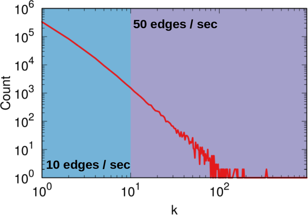
It seems trivial that A1 is a better system than A2, because it gives you 50 connections per second instead of 10 (we’re ignoring latency here). However, that’s not necessarily the case. Real world networks are far from equal: there are a few superstars with millions of followers, while your average user only has a handful (but I’m catching up with you, Katy!). This means that there are way way way way way way way way more users with 10 or fewer connections than there are with more than 10. In the case represented by the figure, sampling the full network via A2 will actually take half as much time as via A1, even if theoretically we thought we were going to be five times slower.

How many users (y-axis) have this many connections (x-axis). The blue area is where A2 works best — one user per second — while the purple area is where A1 works best. But there are 492.5k users in the blue area (the Michele Coscias), and only 7.5k in the purple (the Katy Perrys)!

With Luca, I created a benchmarking system — which you can freely use — that allows you to simulate network sampling by letting you define:

So now we get to the point of the post where I tell you which sampling method is the very best and you should always use it and it will solve world peace and stuff. And that method is…

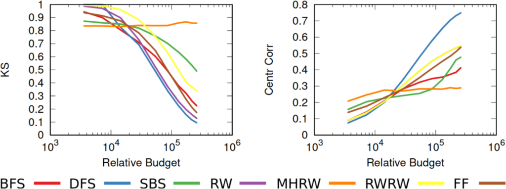
…none of them. Unfortunately we realized that, in the world of network sampling, there is no free lunch. The space of possible characteristics of interest, API systems, networks on which you work, and budget constraints is so vast that each sampling method is the best — or worst — in some combinations of these factors. We ran a bazillion tests, but none of them summarizes the results better than these two plots.

On the left you see how badly we get the degree distribution wrong (y-axis, lower is better) at different budget levels (x-axis, from left to right we increase the amount of time we spend sampling the network). If we don’t have much time, the best methods are a variant of Random Walks (MHRW) or Snowball sampling, while the worst method is DFS. But surprise surprise, if we have tons of time, DFS is the best method, and MHRW and Snowball are the worst. By a long margin. No free lunch. On the right we have another instance of the same problem: here we want to know how well we identify central nodes in the network (y-axis, higher is better). The difference at increasing budget levels is ridiculous: the rankings you get when you have a lot of time to sample are practically the opposite of the one you get when you’re in a hurry!

This means that you really need to be careful when you extract networks from social media. You cannot barge in and grab whatever you can, however you can. You need to know which characteristics of the network are important to you. You need to know what the underlying network might look like. You need to know how much time you have to sample the network, compared to its size. You need to know how their APIs work. Otherwise you’re going to run in circles in a very very mad world. And you thought that they had it worse in the 1920s.

Continue Reading

28 May 2018 ~ 0 Comments

Mapping the International Aid Community

A few years ago (2013, God I’m old), I was talking to you on how to give a “2.0” flavor to international aid: at CID we created an Aid Explorer to better coordinate the provision of humanitarian work. I’m happy to report that “Aid Explorer” has been adopted — directly or indirectly —  by multiple international organizations, for instance USAID and the European Union. The World Bank’s Independent Evaluation Group contacted me to make an updated version, focused on estimating the World Bank’s position in the global health arena. The result is a paper, “Mapping the international health aid community using web data“, recently published in EPJ Data Science, and the product of a great collaboration with Katsumasa Hamaguchi, Maria Elena Pinglo, and Antonio Giuffrida.

The idea is to collect all the webpages of a hundred international aid organizations, looking for specific keywords and for hyperlinks to the other organizations — differently from the old Aid Explorer in which we relied on the index from Google. The aim is to create different networks of co-occurrences connecting:

  • Aid organizations co-mentioned in the same page;
  • Aid organizations mentioned or linked by another;
  • Issues co-mentioned in the same page;
  • Countries co-mentioned in the same page.

We then analyze these structures to learn something about the community as a whole.

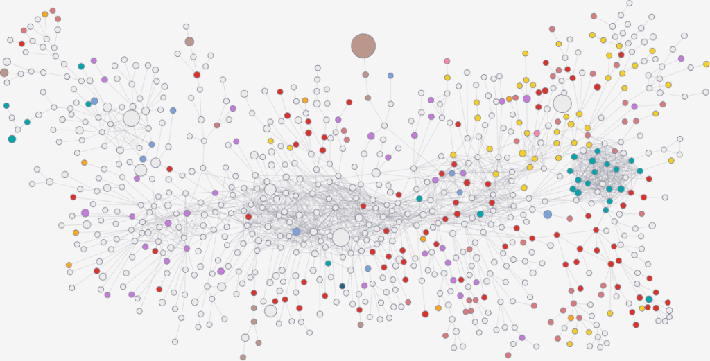
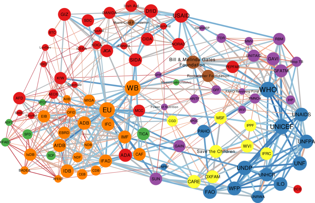
One thing I didn’t expect was that organizations cluster by type. The “type” here is the force behind the organization — private philanthropy, UN system, bilateral (a single country’s aid extension of the foreign ministry), multilateral (international co-operations acting globally), etc. In the picture above (click on the image to enlarge), we encode the agency type in the node color. Organizations are overwhelmingly co-mentioned with organizations of the same type, which is curious because bilaterals often have nothing in common with each other besides the fact they are bilaterals: they work on different issues, with different developed and developing partners.

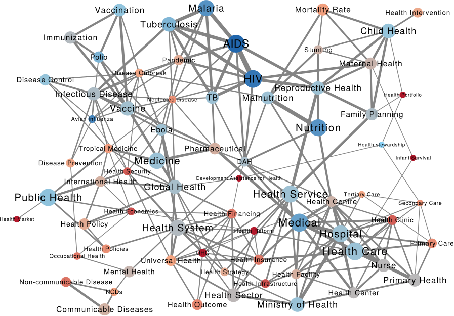
We can make a similar map connecting issues if they are co-mentioned in a web page. The map is useful as validation because it connects some “synonyms”, for instance “TB” and “Tubercolosis”. However, you can do much more with it. For instance, you can use color to show where an organization is most often cited. Below (click on the image to enlarge) you see the issue map for the World Bank, with the red nodes showing the issues strongly co-mentioned with the World Bank. Basically, the node color is the edge weight in a organization-issue bipartite network, where the organization is the World Bank. To give you an idea, the tiny “Infant Survival” node on the right saw the World Bank mentioned in 9% of the pages in which it was discussed. The World Bank was mentioned in 3.8% of web pages discussing AIDS.

This can lead to interesting discussions. While the World Bank does indeed discuss a lot about some of the red issues above — for instance about “Health Market” and “Health Reform” — its doesn’t say much about “Infant Survival”, relatively speaking at least. It’s intriguing that other organizations mention this particular issue so often in conjunction with the World Bank.

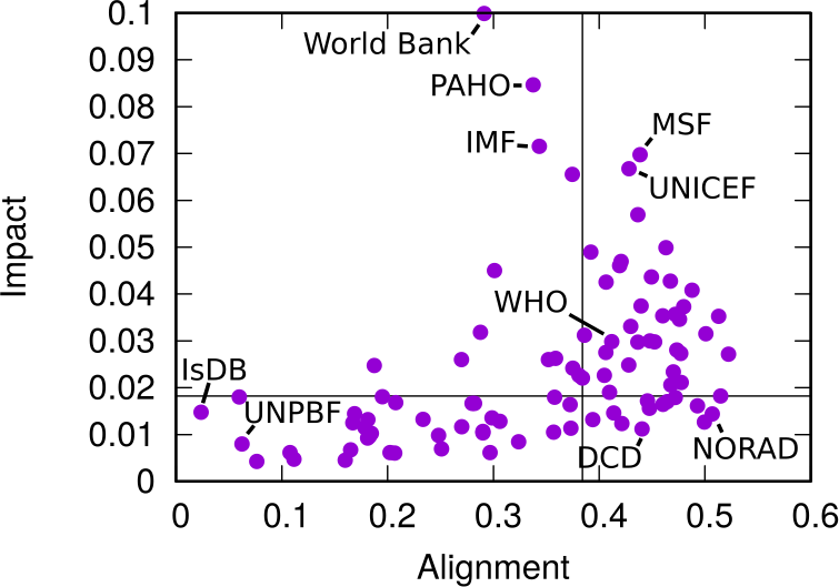
This difference between the global speech about issues and the one specific to another organization allows us to calculate two measures we call “Alignment” and “Impact”. By analyzing how similar the issue co-occurrence network of an organization is with the global one — a simple correlation of edge weights — we can estimate how “Aligned” it is with the global community. On the other hand, an “Impactful” organization is one that, were it to disappear, would dramatically change the global issue network: issues would not be co-mentioned that much.

In the plot above, we have Alignment and Impact on the x and y axis, respectively. The horizontal and vertical lines cutting through the plot above show the median of each measure. The top-right quadrant are organization both impactful and aligned: the organizations that have probably been setting the discourse of the international aid community. No wonder the World Health Organization is there. On the top left we have interesting mavericks, the ones which are not aligned to the community at large, and yet have an impact on it. They are trying to shape the international aid community into something different than what it is now.

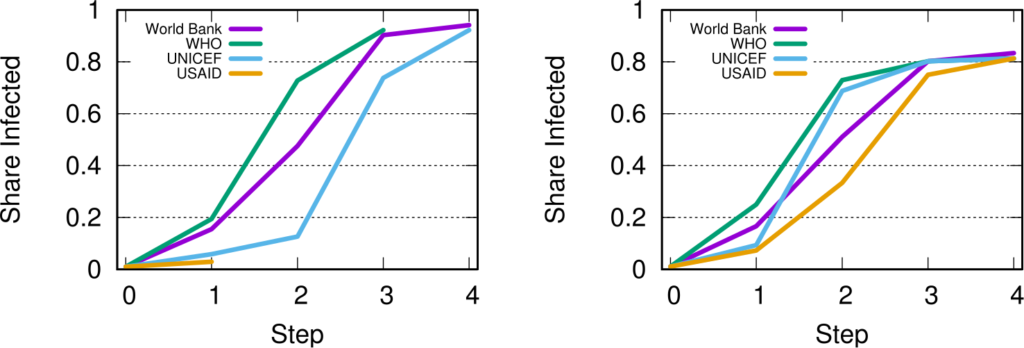
A final fun — if a bit loose — analysis regards the potential for an organization to spread a message through the international aid network. What would be the reach of a message if it originated from a specific organization? We can use the Susceptible-Infected model from epidemiology. A message is a “virus” and it is more likely to infect an agency if more than a x% of the agency’s incoming links come from other infected agencies.

This depends on the issue, as shown above. In the figures we see the fraction of “infected” agencies (on the y-axis) given an original “patient zero” organization which starts spreading the message. To the left we see the result of the simulation aggregating all issues. The World Bank reaches saturation faster than UNICEF, and USAID is only heard by a tiny fraction of the network. However, if we only consider web pages talking about “Nurses” (right), then USAID is on par with the top international aid organizations — and UNICEF beats the World Bank. This happens because the discourse on the topic is relatively speaking more concentrated in USAID than average.

As with the Aid Explorer, this is a small step forward improving the provision of international aid. We do not have an interactive website this time, but you can download both the data and the code to create your own maps. Ideally, what we did only for international aid keywords can be extended for all other topics of interest in the humanitarian community: economic development, justice, or disaster relief.

Continue Reading