Is What Politicians Do Similar to What they Say?

Part of the Italian lore infused on me when growing up is to be disillusioned when it comes to interactions with politicians. Assuming that what a politician promises carries information about what they’re going to do is not the wisest way of living one’s life. This is a gut feeling and it could be completely wrong. It asks for verification and data: is it true that what politicians do in parliament is not similar to how they present themselves to the public?

The data to answer this question is what the excellent Christian Ivert Andersen provided, which eventually led to the publication of the paper “Disconnect between the Public Face and the Voting Behavior of Political Representatives,” which recently appeared in the journal Applied Network Science.

Christian had spotted some promising features about how elections are handled here in Denmark. Like in some other countries in the world, Denmark has a number of voting advice applications. These apps ask politicians for their position on a number of salient issues. This allows them to place the politicians somewhere into a political ideological space. The citizen can answer the same questions and figure out which politician is the closest to them — with the assumption they should vote for them, if they do not want to heed the Italian cautionary tales.

We decided to represent this data as a network: each node is a politician and each pair of politicians is connected if they agree on a significant number of issues. Altinget was kind enough to share their data with us for our work. We’ll get to the why we represent this data as a network, but for now let’s verify whether these networks make sense:

From A to D the networks corresponding to the 2011, 2015, 2019, and 2022 elections.

It seems they do! We clearly see the two blocks (red and blue) that are the ideological coalitions typical of the Danish political environment.

This data by itself is fascinating, but not enough to answer our question. It represents the “public face” of a politician: their explicitly stated position they use to campaign and attract votes. We need a data source for the actions they take once they are elected.

Luckily, Denmark publishes excruciatingly detailed reports of parliament actions in an open format. Unluckily, such an open format is a nightmare to work with, is highly fragmented, and I’m a bit concerned about Christian’s mental health after he had worked with it (get well soon, Christian!). With this data we can build a different network, this time connecting politicians according to their voting behavior similarity in parliament:

From A to D the networks corresponding to the 2011, 2015, 2019, and 2022 legislatures.

By analyzing the connections in these two networks we can create a numerical score which summarizes the ideology of a politician, depending on the politicians they’re connected to in the network — and who they are connected to and so on. I’ve been using such score as the node color in the network pictures in this post.

So: why networks? “Why not?” I would reply as a person whose obsession with networks has now reached pathological levels. But I know that’s not going to cut it. The reason we use networks is that they allow to calculate the distance between the two ideological scores we just built — one based on the politicians’ words, the other on their actions — in a more nuanced way.

Trivially, with two ideological scores, one would simply check their difference. However, the difference between ideological scores matters most for those politicians that are supposed to be ideologically close. It matters a lot if you’re shifting your position relative to the other members of your own party, more than if you do it relatively to parties that are not ideologically similar to you.

This nuanced distance estimation can be achieved by calculating the good old network distance measure I’ve been working with for the past few years. The only issue with it is that we just get a distance value and we need to contextualize it. To do so, we compare it with a null model: we calculate the same distance but we randomly shuffle the ideological scores on the networks. This way, we know what distance we should be seeing when there is no connection between the two ideological scores on the network.

In red, the number of null models (y axis) with a given words-to-actions distance (x axis). In green, the observed distance in the real data. From A to D corresponding to the 2011, 2015, 2019, and 2022 legislatures, above row for distances calculated on the networks based on campaign words, below for distances on the parliament action networks.

Above you see the distribution of expected distances in the null model in red, and the distance we observe as the green bar. Distressingly, the green bar is to the right of the expectation, and almost always significantly so. This means that the distance we observe — the actual difference between promises and actions — is larger than what we would expect in the scenario in which the two are randomly picked! To put it bluntly: how politicians present themselves during a campaign is significantly different from what they do in parliament once elected. Looks like my Italian guts were right.

But we shouldn’t put it bluntly, not yet at least. This study is just the first step and it does require substantial robustness checks. The most important of which is that the topics representatives in parliament vote on are not necessarily the same issues they’re asked about during the campaign. The most blatant case for this is that no one had asked anything about COVID during the 2019 campaign, but we all know what politicians had to deal with starting from early 2020. We should match the votes with specific questions and use only votes sufficiently similar to at least one question to build the parliament networks. We can do this, using some natural language processing magic, so that will come next.

From these very preliminary results, the most cautious lesson learned should be: maybe be wary of making your voting decisions based on a voting advice app. There are a number or reasons — not necessarily shady, as the COVID case exemplifies — that make them not exactly a faithful representation of what you’re voting for.

Node Attribute Distances, Now Available on Multilayer Networks! (Until Supplies Last)

I’ve been a longtime fan of measuring distances between node attributes on networks: I’ve reviewed the methods to do it and even proposed new ones. One of the things bothering me was that no one had so far tried to extend these methods to multilayer networks — networks with more than one type of relationships. Well, it bothers me no more, because I just made the extension myself! It is the basis of my new paper: “Generalized Euclidean Measure to Estimate Distances on Multilayer Networks,” which has been published on the TKDD journal this month.

Image from https://atlas.cid.harvard.edu/

You might be wondering: what does it mean to “measure the distance between node attributes on networks”? Why is it useful? Let’s make a use case. The Product Space is a super handy network connecting products on the global trade network based on their similarity. You can have attributes saying how much of a product a country exported in a given year — in the image above you see what Egypt exported in 2018. This is super interesting, because the ability of a country to spread over all the products in the Product Space is a good predictor of their future growth. The question is: how can we tell how much the country moved in the last ten years? Can we say that country A moved more or less than country B? Yes, we can! Exactly by measuring the distance between the node attributes on the network!

The Product Space is but an example of many. One can estimate distances between node attributes when they tell you something about:

  • When and how much people were affected by a disease in a social network;
  • Which customers purchased how many products in a co-purchase network (à la Amazon);
  • Which country an airport belongs to in a flight network;
  • etc…
Image from https://manliodedomenico.com/

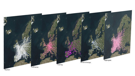
Let’s focus on that last example. In this scenario, each airport has an attribute per country: the attribute is equal to 1 if the airport is located in that country, and 0 otherwise. The network connects airports if there is at least a flight planned between them. In this way, you could calculate the network distance between two countries. But wait: it’s not a given that you can fly seamlessly between two countries even if they are connected by flights across airports. You could get from airport A to airport B using flight company X, but it’s not a given than X provides also a flight to airport C, which might be your desired final destination. You might need to switch to airline Y — the image above shows the routes of four different companies: they can be quite different! Switching between airlines might be far from trivial — as every annoyed traveler will confirm to you –, and it is essentially invisible to the measure.

It becomes visible if, instead of using the simple network I just described, you use a multilayer network. In a multilayer network, you can say that each airline is a layer of the network. The layer only contains the flight routes provided by that company. In this scenario, to go from airport A to airport C, you pay the additional cost of switching between layers X and Y. This cost can be embedded in my Generalized Euclidean measure, and I show how in the paper — I’ll spare you the linear algebra lingo.

Image from yours truly

One thing I’ll say — though — is that there are easy ways to embed such layer-switching costs in other measures, such as the Earth’s Mover Distance. However, these measures all consider edge weights as costs — e.g., how long does it take to fly from A to B. My measure, instead, sees edge weights as capacities — e.g. how many flights the airline has between A and B. This is not splitting hairs, it has practical repercussions: edge weights as costs are ambiguous in linear algebra, because they can be confused with the zeros in the adjacency matrices. The zeros encode absent edges, which are effectively infinite costs. Thus there is an ambiguity* in measures using this approach: as edges get cheaper and cheaper they look more and more like infinitely costly. No such ambiguity exists in my approach. The image above shows you how to translate between weights-as-costs and weights-as-capacities, and you can see how you can get in trouble in one direction but not in the other.

In the paper, I show one useful case study for this multilayer node distance measure. For instance, I am able to quantify how important the national flagship airline company is for the connectivity of its country. It’s usually extremely important for small countries like Belgium, Czechia, or Ireland, and less crucial for large ones like France, the UK, or Italy.

The code I developed to estimate node attribute distances on multilayer networks is freely available as a Python library — along with data and code necessary to replicate the results. So you have no more excuses now: go and calculate distances on your super complex super interesting networks!


* This is not completely unsolvable. I show in the paper how one could get around this. But I’d argue it’s still better not to have this problem at all 🙂

Pearson Correlations for Networks

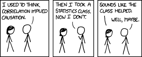
We all know that correlation doesn’t imply causation:

And yet, we calculate correlations all the time. Because knowing when two things correlate is still pretty darn useful. Even if there is no causation link at all. For instance, it’d be great to know whether reading makes you love reading more. Part of the answer could start by correlating the number of books you read with the number of books you want to read.

The very important questions the Pearson correlation coefficient allows you to ask: will consuming cheese bring upon you the doom of dying by suffocating in your bedsheets? source: https://www.tylervigen.com/spurious-correlations

As a network scientist, you might think that you could calculate correlations of variables attached to the nodes of your network. Unfortunately, you cannot do this, because normal correlation measures assume that nodes do not influence each other — the measures are basically assuming the network doesn’t exist. Well, you couldn’t, until I decided to make a correlation coefficient that works on networks. I describe it in the paper “Pearson Correlations on Complex Networks,” which appeared in the Journal of Complex Networks earlier this week.

The formula you normally use to calculate the correlation between two variables is the Pearson correlation coefficient. What I realized is that this formula is the special case of a more general formula that can be applied to networks.

In Pearson, you compare two vectors, which are just two sequences of numbers. One could be the all the numbers of books that the people in our sample have read, and the other one is all of their ages. In the example, you might expect that older people had more time to read more books. To do so, you check each entry in the two vectors in order: every time you consider a new person, if their age is higher than the average person’s, then also the number of books they read should be higher.

If you are in a network, each entry of these vectors is the value of a node. In our book-reading case, you might have a social network: for each person you know who their friends are. Now you shouldn’t look at each person in isolation, because the numbers of books and the ages of people also correlate in different parts of the network — this is known as homophily. Some older people might be pressured into reading more books by their book-addicted older friends. Thus, leaving out the network might cause us to miss something: that a person’s age tells us not just about the number of books they have read, but it also allows us to predict the number of books their friends have read.

This is the type of networks you are forced to work with when you use the Pearson correlation. That’s just silly, isn’t it?

To put it simply, the classical Pearson correlation coefficient assumes that there is a very special network behind the data: a network in which each node is isolated and only connects to itself — see the image above. When we slightly modify the math behind its formula, it can take into account how close two nodes are in the network — for instance, by calculating their shortest path length.

You can interpret the results from this network correlation coefficient the same way you do with the Pearson one. The maximum value of +1 means that there is a perfect positive relation: for every extra year of age you read a certain amount of new books. The minimum of -1 means that there is a perfect negative relationship: a weird world where the oldest people have not read much. The midpoint of 0 means that the two variables have no relation at all.

Is the network correlation coefficient useful? Two answers. First: how dare you, asking me if the stuff I do has any practical application. The nerve of some people. Second: Yes! To begin with, in the paper I build a bunch of artificial cases in which I show how the Pearson coefficient would miss correlations that are actually present in a network. But you’re not here for synthetic data: you’re a data science connoisseur, you want the real deal, actual real world data. Above you can see a line chart, showing the vanilla Pearson (in blue) and the network-flavored (in red) correlations for a social network of book readers as they evolve over time.

The data comes from Anobii, a social network for bibliophiles. The plot is a correlation between number of books read and number of books in the wishlist of a user. These two variables are positively correlated: the more you have read, the more you want to read. However, the Pearson correlation coefficient greatly underestimates the true correlation, at 0.25, while the network correlation is beyond 0.6. This is because bookworms like each other and connect with each other, thus the number of books you have read also correlates with the wishlist size of your friends.

This other beauty of a plot, instead, shows the correlation between the age of a user and the number of tags they used to tag books. What is interesting here is that, for Pearson, there practically isn’t a correlation: the coefficient is almost zero and not statistically significant. Instead, when we consider the network, there is a strong and significant negative correlation at around -0.11. Older users are less inclined to tag the books they read — it’s just a fad kids do these days –, and they are even less inclined if their older friends do not tag either. If you were to hypothesize a link between age and tag activity and all you had was lousy Pearson, you’d miss this relationship. Luckily, you know good ol’ Michele.

If this makes you want to mess around with network correlations, you can do it because all the code I wrote for the paper is open and free to use. Don’t forget to like and subscrib… I mean, cite my paper if you are fed up with the Pearson correlation coefficient and you find it useful to estimate network correlations properly.