17 May 2022 ~ 0 Comments

Node Attribute Distances, Now Available on Multilayer Networks! (Until Supplies Last)

I’ve been a longtime fan of measuring distances between node attributes on networks: I’ve reviewed the methods to do it and even proposed new ones. One of the things bothering me was that no one had so far tried to extend these methods to multilayer networks — networks with more than one type of relationships. Well, it bothers me no more, because I just made the extension myself! It is the basis of my new paper: “Generalized Euclidean Measure to Estimate Distances on Multilayer Networks,” which has been published on the TKDD journal this month.

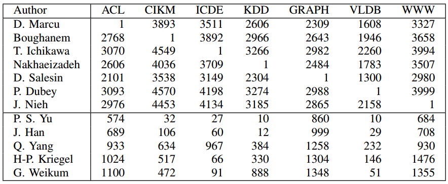
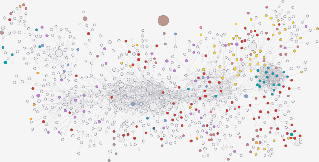
Image from https://atlas.cid.harvard.edu/

You might be wondering: what does it mean to “measure the distance between node attributes on networks”? Why is it useful? Let’s make a use case. The Product Space is a super handy network connecting products on the global trade network based on their similarity. You can have attributes saying how much of a product a country exported in a given year — in the image above you see what Egypt exported in 2018. This is super interesting, because the ability of a country to spread over all the products in the Product Space is a good predictor of their future growth. The question is: how can we tell how much the country moved in the last ten years? Can we say that country A moved more or less than country B? Yes, we can! Exactly by measuring the distance between the node attributes on the network!

The Product Space is but an example of many. One can estimate distances between node attributes when they tell you something about:

  • When and how much people were affected by a disease in a social network;
  • Which customers purchased how many products in a co-purchase network (à la Amazon);
  • Which country an airport belongs to in a flight network;
  • etc…
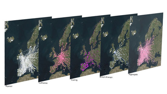
Image from https://manliodedomenico.com/

Let’s focus on that last example. In this scenario, each airport has an attribute per country: the attribute is equal to 1 if the airport is located in that country, and 0 otherwise. The network connects airports if there is at least a flight planned between them. In this way, you could calculate the network distance between two countries. But wait: it’s not a given that you can fly seamlessly between two countries even if they are connected by flights across airports. You could get from airport A to airport B using flight company X, but it’s not a given than X provides also a flight to airport C, which might be your desired final destination. You might need to switch to airline Y — the image above shows the routes of four different companies: they can be quite different! Switching between airlines might be far from trivial — as every annoyed traveler will confirm to you –, and it is essentially invisible to the measure.

It becomes visible if, instead of using the simple network I just described, you use a multilayer network. In a multilayer network, you can say that each airline is a layer of the network. The layer only contains the flight routes provided by that company. In this scenario, to go from airport A to airport C, you pay the additional cost of switching between layers X and Y. This cost can be embedded in my Generalized Euclidean measure, and I show how in the paper — I’ll spare you the linear algebra lingo.

Image from yours truly

One thing I’ll say — though — is that there are easy ways to embed such layer-switching costs in other measures, such as the Earth’s Mover Distance. However, these measures all consider edge weights as costs — e.g., how long does it take to fly from A to B. My measure, instead, sees edge weights as capacities — e.g. how many flights the airline has between A and B. This is not splitting hairs, it has practical repercussions: edge weights as costs are ambiguous in linear algebra, because they can be confused with the zeros in the adjacency matrices. The zeros encode absent edges, which are effectively infinite costs. Thus there is an ambiguity* in measures using this approach: as edges get cheaper and cheaper they look more and more like infinitely costly. No such ambiguity exists in my approach. The image above shows you how to translate between weights-as-costs and weights-as-capacities, and you can see how you can get in trouble in one direction but not in the other.

In the paper, I show one useful case study for this multilayer node distance measure. For instance, I am able to quantify how important the national flagship airline company is for the connectivity of its country. It’s usually extremely important for small countries like Belgium, Czechia, or Ireland, and less crucial for large ones like France, the UK, or Italy.

The code I developed to estimate node attribute distances on multilayer networks is freely available as a Python library — along with data and code necessary to replicate the results. So you have no more excuses now: go and calculate distances on your super complex super interesting networks!


* This is not completely unsolvable. I show in the paper how one could get around this. But I’d argue it’s still better not to have this problem at all 🙂
Continue Reading

16 October 2020 ~ 0 Comments

Ruling your Network

When you’re studying complex systems, one of the most important questions you might have is: how will this system evolve in the future? If you’re modeling your system as a network — as I like to do in my spare time — this boils down to predicting the arrival of new nodes and links. This is the realm of link prediction. In this post, I’ll describe one advancement in the field that I developed with fellow NERD Michael Szell in the paper “Multiplex Graph Association Rules for Link Prediction“, to appear next year at the ICWSM conference.

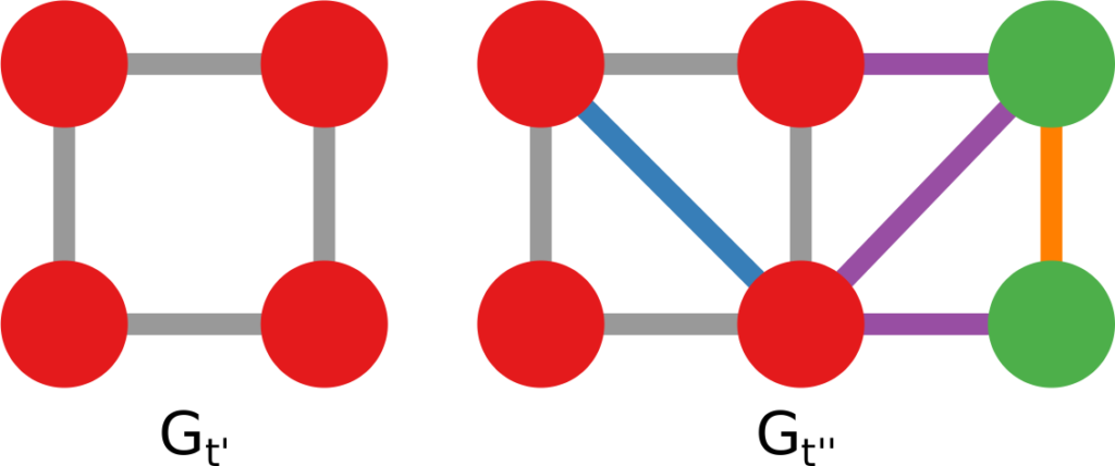
A graph evolving: the green nodes and non-gray links are added over time.

There are many ways to predict new links in a network, but most of these methods have a disadvantage: they can only give you a score for potential future connections between two nodes that are already in the network when you observe it. In other words, they cannot predict new incoming nodes. But with a technique called “graph association rules”, used by the GERM algorithm published in 2009, we can predict new nodes. How is that possible?

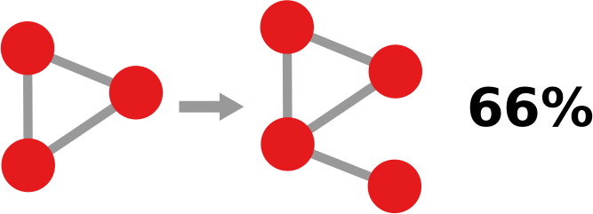
In simple terms, a “graph association rule” is a rule that tells you: every time you see in your network a pattern A, it will turn into pattern B, with a certain degree of confidence. The rule is extracted by counting how many times patterns A and B appear. For instance, in the image below, if pattern A (the triangle) appears 9 times and pattern B (the triangle with a dangling node) appears 6 times, the confidence of the rule is 2/3. 66% of the time, a triangle has attracted a dangling node. Note that pattern B must include pattern A, otherwise it’s difficult to hypothesize that A evolved into B.

GERM has a problem of its own, which Michael and I set out to solve: it can predict incoming nodes and links, but it cannot distinguish between different link types. In other words, every predicted link is the same to GERM. However, many real world networks have link types: nodes can connect in different ways. For instance, on social media, you connect to the people you know in different ways: via Facebook, Twitter, Linkedin, etc.

You’d model such system with a multiplex network, which allows for link types. If you have a multiplex network, you need multiplex graph association rules for link prediction. Which is exactly the title of our paper! What a crazy coincidence!

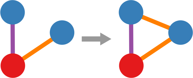
In the paper we re-purpose Moss, a graph pattern miner that can extract multiplex patterns, to build such rules. We created a pre- and post-processor of Moss that can construct the rules based on the patterns it finds. Now we can give colors to the links that are featured in our rules, as the figure below shows. This is a generalization of the signed link predictor I already wrote about a long time ago (the second ever post on this blog. I feel old).

Doing so isn’t painless though. We made sacrifices. For instance, our rule extractor doesn’t really understand the passage of time. It knows that the input network is in the past and spits out the rules to predict its evolution, but it doesn’t know how long a rule will take to complete. Unlike GERM, which can tell you that a rule will take n timesteps to complete.

This downside is minor though. Our link predictor performs well, as witnessed by the ROC curves below (our method in red). The comparisons are other multiplex link predictors. Not only are they worse at predicting links, but they have the added disadvantage of being unable to predict the arrival of new nodes. They also have issues with memory consumption, because they generate a score for each pair of nodes that is not connected in the training data — which, for sparse networks, is a lot of scores. Our predictor, instead, only gives scores to the links that are valid consequences of the rules that we found, usually way fewer than all unconnected node pairs.

If you want to play with our link predictor, you can do so by downloading the code I made public for the replication of the paper’s results. The code is very academic — meaning: badly written, unreasonably fragile, and horribly inefficient. I have in the works an extension with more efficient and robust code, and a generalization from multiplex to fully multilayer networks. Stay tuned!

Continue Reading

11 September 2018 ~ 0 Comments

The Struggle for Existence in the World Market Ecosystem

The global trade market definitely seems red in tooth and claw. Competition is fierce and some claim it has to be that way: only the fittest should survive because the fittest, at least in theory, are the ones satisfying the customers’ needs the best. In a paper with Viviana Viña-Cervantes and Renaud Lambiotte, we explored this metaphor to see if we can say something about how world trade will evolve. The paper will soon appear in PLoS One and it is titled “The Struggle for Existence in the World Market Ecosystem“. In it we create competition networks and we show that positions in these networks are a predictor of future growth: a strong position in a product means that the country will increase its export share in that product in the medium term.

How do we create competition networks? In our view, each slice of the market is an ecological niche. For instance, the car market in the United States or the computer market in Germany. If you can sell a lot of cars in the US, it means you’re fit to occupy that niche. You’re meeting the needs of that set of customers, and thus you can make a profit there, cutting out other exporters who would oh so much like to make a buck there.

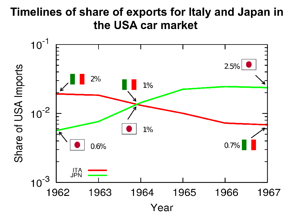
An example of data generating one edge in the competition network: Japan emerges beyond 1% of the car market in the US at the same time that Italy plunges below the 1% mark. With this data, we create an edge from Japan to Italy in the US-car 1960 competition network.


Niches are not stable: they change over time. As a consequence of evolution, animals can become fitter to fill their current niche — or a new one. Out of this observation, we create our competition networks. Suppose that you were doing well at selling cars to Americans, like Italy was in the 60s — who doesn’t love a vintage Alfa Romeo?  Then something happens: a mutation, an evolution. Japan’s cars start gaining appeal in North America. All of a sudden, the market share of Italy declines once Japan appears on the scene. In this case, we can create a directed edge going from Japan to Italy, because Japanese firms happened to be successful at the same time that Italian ones lost their, um, edge.* That’s our competition network. We built one per decade: 1960, 1970, 1980, 1990, and 2000.

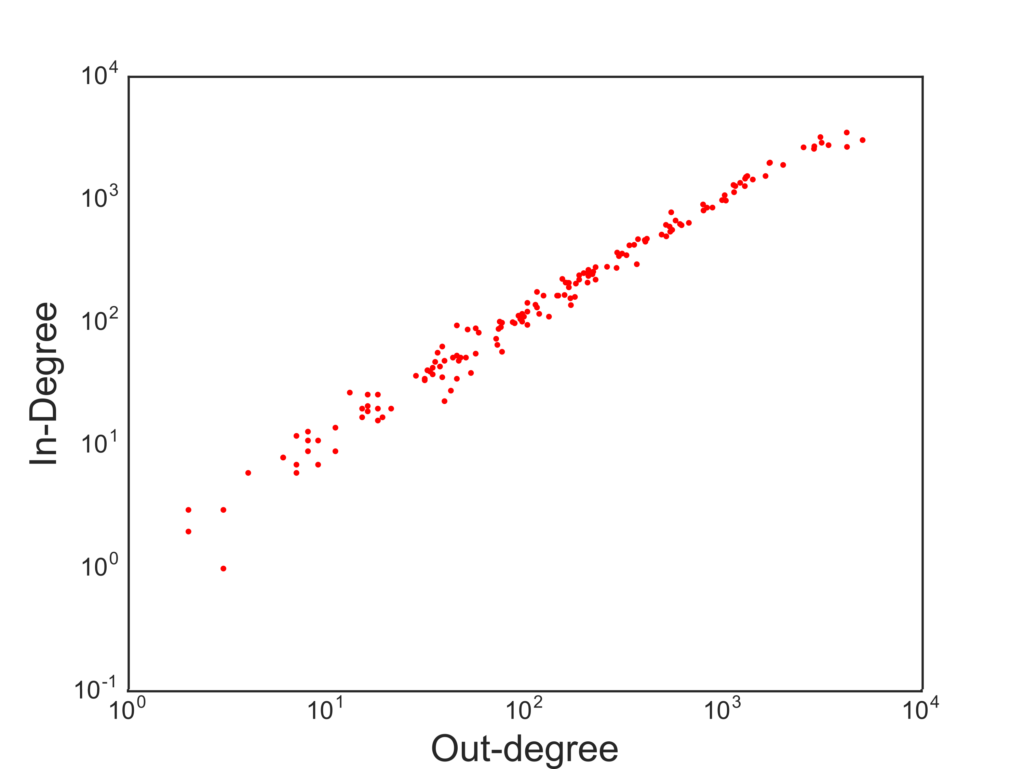
In the vast majority of cases, when you study a network, the edges have a positive meaning: they imply connections, social relations, friendship. Competition networks tell a fundamentally negative story. The originator of the edge is displacing the receiver of the edge in a market, something definitely not nice. The out-degree tells us something about a country’s fitness: how many competitors it displaced. The in-degree is the other side of the coin: how many times the country’s entrepreneurs were just not good enough. So these two measures should tell us what we want, right? A high out-degree is a sign of strength and growth, a high in-degree a sign of weakness.

The correlation between in- and out-degree is pretty darn high.

Not really. The problem is that big countries produce a lot of stuff and export it everywhere. So they are constantly fighting a lot of battles. Winning some and losing some. The in- and out-degree are highly correlated, and thus they do not give much information. We decided to look at a generalization of in- and out-degree. When displacing a country from a market, quantity is not as important as quality. Displacing a fierce exporter like the US is not the same as tripping up a weaker economy. So we weight the out-degree by counting each displaced country as much as their out-degree. This is a higher-order degree, because it looks at a second hop beyond the displaced. The more this country was a displacer, the more it counts that we were able to displace it. Displacing the displacers is the way to go.

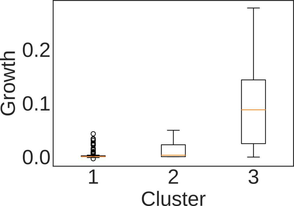
At this point interesting stuff starts emerging. We can use this normalized in- and out-degree to classify countries into three buckets: out-competing (high out-degree), displaced (high in-degree), and transitioning (roughly equivalent in- and out-degree). We do so per decade and per product. Then, we check whether belonging to one cluster has any relationship with how the country will evolve its market share in the decade following the one we used for the classification. If you were a strong out-competitor in the 60s in the car market, your position in the car market in the 70s will get stronger and stronger.

The growth rate the decade after the observation window used for classifying countries. Here: 1 = Displaced, 2 = Transitioning, and 3 = Out-competing countries.

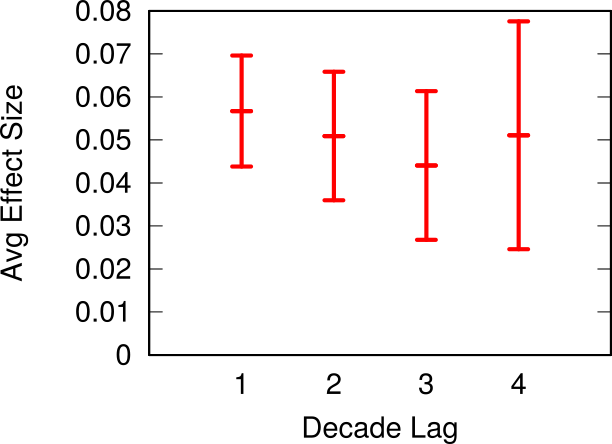
We see these strong relationships for all products and for all decades, with a couple of exceptions. For instance, our method does not work for natural resources. Which is expected: we cannot use this system to predict whether you’re going to find oil in your territory or not. It also does not work in the last decade, the 2000s, because we have very little data for making the prediction: our data runs only until 2013. Thus, it means this method cannot work for short term predictions: it works well when looking at decade-long transitions, not year-long ones. The effect gets a bit weaker if we look at what happens two, three and even four decades after our classification, but it’s still significant.

We also checked the robustness of our results by creating a synthetic trade world. We broke all relationships between countries by generating random trade, maintaining the sparseness — most exporter-importer-product relationships never happen — and the skewed nature of our data — a few high-throughput links constitute most of world trade, and the vast majority of links are low-value ones. In this world with random competition, we see far fewer links in our networks. Using the ratio between in- and out-degree also doesn’t work: as predictor, it returns a much lower result quality.

The average growth rate for out-competing countries when the prediction period is one, two, three or four decades away from the observation one.

So, to wrap up, in the paper we show how to build competition networks, by connecting strong emerging economies to the ones they are out-competing for specific products. Analyzing the higher-order relationships in this networks — i.e. going beyond the simple degree — uncovered a way to estimate the real strength of these emerging countries. A lot of questions remain unanswered. Chief among them: what if we ensured that each edge in the competition networks is truly causal? This will be a quest for another time.


* We’re extremely aware of the fiendish operation we did: these competition networks are absolutely correlational and will never imply causation. However we believe there’s also value in looking at these serendipitous events. If nothing else, at least some econometrician might have had a stroke reading the original sentence.

Continue Reading

22 August 2016 ~ 0 Comments

It’s Not All in the Haka: Networks Matter in Rugby Too

If there is a thing that I love more than looking at silly pictures on the Interwebz for work is to watch rugby for work. I love rugby: in my opinion it is the most beautiful team sport out there. It tingles my network senses: 15 men on the field have to coordinate like a single organism to achieve their goal — crossing the goal line with the ball by passing it backwards instead of forward. When Optasports made available some data collected during 18 rugby matches I felt I could not miss the opportunity for some hardcore network nerding on them. The way teams weave their collaboration networks during a match must have some relationship with their performance, and I was going to find out what this relationship might be.

1443058137058

For my quest I teamed up with Luca Pappalardo and Paolo Cintia, two friends of mine who are making an impact on network and big data sports analytics, both in soccer and in cycling. The result was “The Haka Network: Evaluating Rugby Team Performance with Dynamic Graph Analysis“, a paper recently presented at the DyNo workshop in San Francisco. Our questions were:

  1. Is there a relationship between the topology of the network of passes and the success of the team?
  2. Is there a relationship between disruptions made by tackles and territorial gains?
  3. If we want to predict a team’s success, is it better to build networks of passes and disruptions for each action separately or for the entire match?
  4. Can we use these relationships to “predict” the outcome of the match?

rugby1

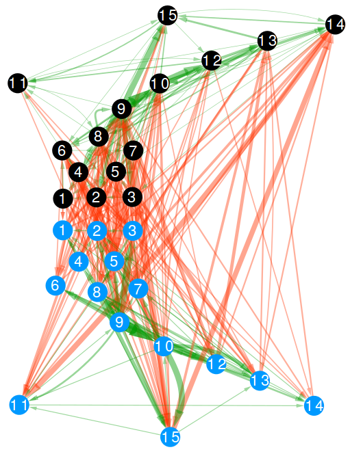
A passage network is simply a network whose nodes are the players of a team and the directed connections go from the player originating a pass to the player receiving the ball. We consider only completed passages: the ones that did not result in an error or lost possession. In the above picture, those are the green edges and they are always established between players belonging to the same team. In rugby, players are allowed to tackle the current ball carrier of the opponent team. When that happens, we create another directed edge, this time in what we call “disruption network”. The aim of a tackle is to prevent the opponent team from gaining meters. These are the red edges in the above picture and can only be established between players belonging to opposite teams. The picture you see is the collection of all passes and tackles which happened in the Italy vs New Zealand match in 2012. It is a multilayer network as it contains edges of two different types: passes and tackles.

Once we have pass and disruption networks we can calculate a collection of network measures. I’ll give a brief idea here, but if you are looking for more formal definitions you’ll have to search for them in the paper:

  • Connectivity: how many pass connections you have to remove to isolate players;
  • Assortativity: the tendency of players to pass the ball to players with a similar number of connections — in high assortativity central players pass to other central players and marginal players to other marginal players;
  • Components: how many “sinks” there are, in that the ball never goes back to the bulk of the team when it is passed to a player in a sink;
  • Clustering: how many triangles there are, meaning that the team can be decomposed in many different smaller sub-teams of three players.

These are the features we calculated for the pass networks. The disruption case is slightly different. We calculated the same features for the team when removing the tackled player, weighted on the relative number of tackles. If 50% of the tackles hit player number 11, then 50% of the disrupted connectivity is the connectivity value of the pass network when removing player 11. The reason is that the tackled player is temporarily removed from the game, so we need to know how the team performs without him, weighted on the number of times this occurrence happens.

So, it is time to give some answers. Shall we?

1. Is there a relationship between the topology of the network of passes and the success of the team?

rugby2

Yes, there is. We calculate “success” as the number of meters gained, ball in hand, by the team. The objective of rugby is to cross the goal line carrying the ball, so meters made is a pretty good indicator. We control for two things. First, the total number of passes: it simply means the team was able to hold onto the ball longer, so it is trivially expected to result in more meters. Second, the home advantage, which is a huge factor in rugby: Italy won only 12 out of 85 matches in the European “Six Nations” tournament, and 11 of them were in Italy. After these controls, we find that two features have good correlations with meters made: connectivity and components. The more edges are needed to isolate a player, the more meters a team is expected to make (p < .01, R2 = 47%). More sinks in a team is associated with lower gains in meters.

2. Is there a relationship between disruptions made by tackles and territorial gains?

rugby3

Again: yes. In this case it seems that all calculated features matter to predict meters made. The strongest factor is again leftover connectivity. It means that if the connectivity of the pass network increases after the tackled player is removed from it then the team is able to advance more. Simplifying: if you are able to tackle only low connectivity players, then your opponent is able to gain more territory (p < .01, R2 = 48%).

3. Is it better to build networks of passes and disruptions for each action separately or for the entire match?

The answer to the previous two questions were made by calculating the features on the global match networks. The global network uses all the data from a match, exactly like the pass and disruption edges depicted in the above figure. In principle, one could calculate these features as the match unfolds: sequence by sequence. In fact, networks features at the action level work very well in soccer, as Luca and Paolo already proved. Does that work also in rugby?

Surprisingly, the answer is no. We recalculated the features for each passage of play. A passage of play is the part of a match from when a team gets into possession of the ball until it loses it, scores, or the game flow stops for an infraction. When we calculate features at this level, we find very weak correlations: almost nothing is significant and, when it is, the predictive power is very low. We think that this is because in rugby our definition of sequence is too strict. While soccer is a tactical game — where each sequence counts for itself — rugby is a grand strategy game: sequences build cumulative advantage which pays off after a series of them — or only in the match as a whole.

4. Can we use these relationships to “predict” the outcome of the match?

mca_3099866b

This is the real queen question of the post, and we do not fully answer it, unfortunately. However, we have a very good reason to think that the answer could be positive. We created a predictor which trains on 17 matches and then, given the global multi-layer network, will pick the winner. You can see the problem of the approach here: we use the network of the match as it happened to “predict” the outcome. However, we did that only because we did not have enough matches for each individual team: we believe we can first predict how pass and disruption networks will shape in a new match using historic data and then use that to predict the outcome. That will be future works, maybe if some team is intrigued by networks and wants to contact us for a collaboration… (wink wink).

The reason I still like to report on our predictor is that it has a very promising property. Its accuracy was 83%. We compared with a prediction made with official rugby rankings, whose performance is worse: 76% accuracy. We also tested against bookmakers, who are better than us with their 86% accuracy. However, historic data on bets only cover more important matches — only 14 out of 18 — and matches between minor teams are usually less predictable. The fact that we are on par on a more difficult task is remarkable. More importantly, bookies tend to just “choose the best team”. For instance, they always predict a New Zealand win. The Haka, however, is not always enough and our networks caught that. New Zealand lost to England in a big upset on December 1st 2012. The bookmakers didn’t see that coming, but our network approach could have.

Continue Reading

02 April 2015 ~ 0 Comments

A Marriage of Networks

My personal quest as ambassador of multiple networks at NetSci (previous episodes here and here) is continuing also this year. And, as every year, there are new exciting things coming along. This year, the usual satellite I organize is marrying another satellite. We are in fact merging our multiple networks with the Networks of Networks crowd. Networks of Networks is a society holding its own satellite at NetSci since quite a while. They are also interested in networks with multiple node and edge types, with more attention to infrastructure-flavored networks: computer networks, power grids, water infrastructure and so on. We are very excited to see what the impact between multiple networks and networks of networks, directed in particular by Antonio Scala and Gregorio D’Agostino, will generate.

The marriage is a promising one because, when talking about multiple networks and infrastructure, technical knowledge is dispersed among experts of different sectors – system operators from different industries (electric, gas, telecommunication, food chain, water supply, etc) – while researchers from different fields developed a number of different strategies to deal with these complex objects – from computer science to physics, from economics to humanities. To be exposed to these approaches and to confront one’s understanding of the potentialities of the analysis of multiple interdependent networks is key for the development of a common language to integrate the knowledge from all sectors. Complex Networks can be a common language for the needed federated approaches at both microscopic and macroscopic level. This satellite is here exactly to foster the development of such common language.

The usual practical information you might find useful:

  • The satellite will take place on June 2nd, 2015. It will be held, as usual, jointly with the other NetSci satellites. The location will be Zaragoza, Spain. The information about how to get there is included in the NetSci website.
  • The official website of the satellite is hosted by the Net-o-Nets parent website. The official page is this one. Information about the satellite is pretty bare-bones at the moment, but we’ll flesh it out in the following weeks.
  • We are open to submissions! You can send in your abstract and we’ll consider you for a contributed talk. The submission system goes through EasyChair, and this is the official link. The deadline for submission is April 19th, 2015 and we will notify you on April 29th.

Sadly, I will not be present in person to the event due to conflicting schedules. So I will not be able to write the usual report. I’ll leave you in the best hands possible. Submit something, and stop by in Zaragoza: you’ll find an exciting and stimulating crowd!

Continue Reading

22 May 2014 ~ 0 Comments

The NetSci Multiple Networks Menu

Friends, scientists, network fanatics, lend me your eyes: I come to announce the program of the Multiple Network Modeling, Analysis and Mining symposium, introduced some months ago on these pages. To give you a quick recap: this is a satellite event which will happen at the 2014 edition of NetSci, a major network science event of the year. The symposium will take place on Monday June 2nd, while the conference itself will start on June 4th and it will last until the end of the week. Differently from last year, we now have space for contributed talks and I like the program we were able to set up. So, I’ll boast about it here.

You can find the overview of the entire event on the official website, but let me give you the highlights.

We have four invited speakers: Frank Schweitzer, Renaud LambiotteNitesh Chawla and Mason Porter. They come from different backgrounds (System Design, Mathematics and Computer Science) which is a great plus for the event. They are going to:

  • Tackle the mathematical foundations of multiple networks;
  • Describe models for multiple networks;
  • Analyse them, both in the flavour of bipartite temporal social networks and in the extension of the classic link prediction problem. Usually in link prediction we are interested in evaluating the likelihood of seeing “a” connection between two nodes. Since in multiple networks there are different types of connections, we are also interested in predicting “which” connection we will observe.

As for the contributed talks, we have a pretty good team, including (but not limited to) works signed by David Lazer from Northeastern University, Juyong Park from KAIST, Eugene Stanley from Boston University and many more. We had such a positive reaction to our call for papers, that we had to increase the slots for contributed talks from 5 to 7 and still reject presentations that we really wanted to see. Among my favourites works there are:

  • Multiple network applications to study the productivity of countries and predicting their growth;
  • The study of evolution of different relations among almost 2000 students from 14 US universities;
  • A network-based approach for ranking the performances of sport teams;
  • Novel way to classify nodes in complex networks where multiple different relations are present;
  • … and more!

For completeness, here’s the detailed schedule, I hope to see many of you there!

Session I

9.00 – 9.30 Registration / Set Up
9.30 – 9.50 Introduction: Welcome from the organizers, presentation of the program
9.50 – 10.30 Keynote I: Frank Schweitzer, Professor for Systems Design at ETH Zurich
Analysing temporal bipartite social networks
10.30- 11.00 Coffee Break

Session II

11.00 – 11.40 Keynote II: Renaud Lambiotte, Associate Professor, Department of Mathematics at University of Namur
Non-Markovian Models of Networked Systems
11.40 – 12.00 Daniel Romero, Nina Mishra and Panayiotis Tsaparas
Estimating the Relative Utility of Networks for Predicting User Activities
12.00- 13.30 Lunch

Session III

13.30 – 14.10 Keynote III: Nitesh Chawla, Associate Professor, Department of Computer Science & Engineering at the University of Notre Dame
Predicting links in heterogeneous social networks
14.10 – 14.30 Katherine Ognyanova, David Lazer, Michael Neblo, Brian Rubineau and William Minozzi
Ties that bind across contexts: personality and the evolution of multiplex networks
14.30 – 14.50 Neave O’Clery
A Multi-slice Approach to Understanding the Evolution of Industrial Complexity and Growth
14.50 – 15.30 Coffee Break

Session IV

15.30 – 16.10 Keynote IV: Mason Porter, Associate Professor at the Oxford Centre for Industrial and Applied Mathematics
Mathematical Formulation of Multilayer Networks
16.10 – 16.30 Seungkyu Shin, Sebastian Ahnert and Juyong Park
Degree-Neutralizing Weighted Random Walk Ranking in Competition Networks
16.30 – 16.50 Tomasz Kajdanowicz, Adrian Popiel, Marcin Kulisiewiecz, Przemysław Kazienko and Bolesław Szymański
Node classification in multiplex networks
16.50 – 17.10 Francesco Sorrentino
Stability of the synchronous solutions for networks with connections of different types
17.10 – 17.30 Andreas Joseph, Irena Vodenska, Eugene Stanley and Guangron Chen
MLR Fit-Networks: Global Balance of Payments

Conclusion and final announcements

17.30 – 18.00

Continue Reading

24 April 2014 ~ 1 Comment

Data: the More, the Merrier. Right? Of Course Not

You need to forgive me for the infamous click-bait title I gave to the post. You literally need to, because you have to save your hate for the actual topic of the post, which is Big Data. Or whatever you want to call the scenario in which scientists are flooded with so much data that traditional approaches break, for one reason or another. I like to use the Big Data label just because it saves time. One of the advantages of Big Data is that it’s useful. Once you can manage it, simple analysis will yield great profits. Take Google Translate: it does not need very sophisticated language models because millions of native speakers will contribute better translations, and simple Bayesian updates make it works nicely.

Of course there are pros and cons. I am personally very serious about the pros. I like Big Data. Exactly because of that love, honesty pushes me to find the limits and scrutinize the cons of Big Data. And that’s today’s topic: “yet another person telling you why Big Data is not such a great thing (even if it is, sometimes)” (another very good candidate for a click-bait title). The occasion for such a shameful post is the recent journal version of my work on human mobility borders (click for the blog post where I presented it). In that work we analysed the impact of geographic resolution on mobility data to locate the real borders of human mobility. In this updated version, we also throw temporal resolution in the mix. The new paper is “Spatial and Temporal Evaluation of Network-Based Analysis of Human Mobility“. So what does the prediction of human mobility have to do with my blabbering about Big Data?

Big Data is founded on the idea that more data will increase the quality of results. After all, why would you gather so much data at the point of not knowing how to manage them if it was not for the potential returns? However, sometimes adding data will actually decrease the research quality. Take again the Google Translate example: a non native speaker could add noise, providing incorrect translations. In this case the example does not really hold, because it’s likely that the vast majority of contributions comes from people who are native speakers in one of the two languages involved. But in my research question about human mobility it still holds. Remember what was the technique in the paper: we have geographical areas and we consider them nodes in a network. We connect nodes if people travel from an area to another.

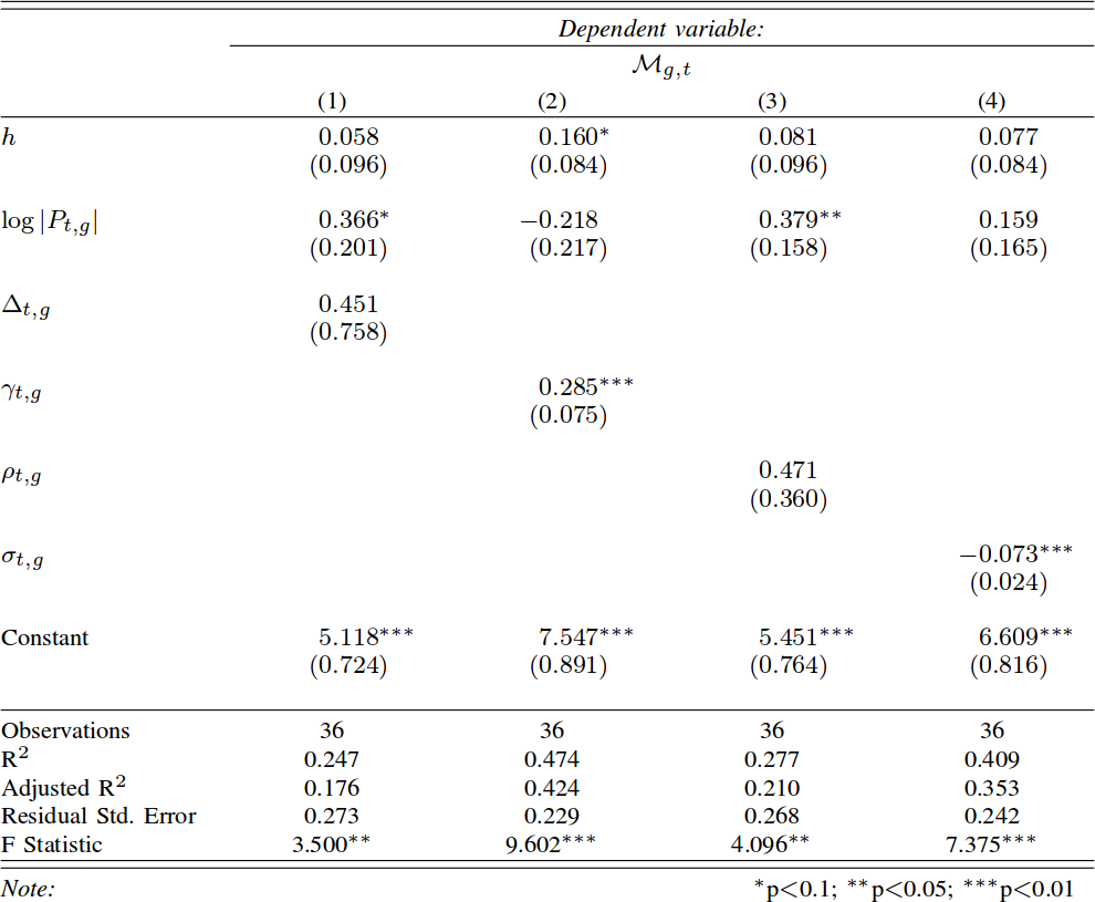
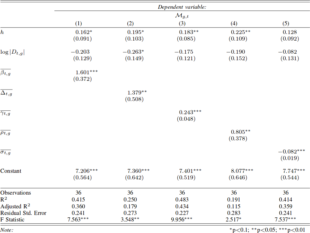
Let’s start from a trivial observation. Weekends are different from weekdays. There’s sun, there’s leisure time, there are all those activities you dream about when you are stuck behind your desk Monday to Friday. We expect to find large differences in the networks of weekdays and in the networks of weekends. Above you see three examples (click for larger resolution). The number of nodes and edges tells us how many areas are active and connected: there are much fewer of them during weekends. The number of connected components tells us how many “islands” there are, areas that have no flow of people between them. During weekends, there are twice as much. The average path length tells us how many connected areas you have to hop through on average to get from any area to any other area in the network: higher during weekdays. So far, no surprises.

If you recall, our objective was to define the real borders of the macro areas. In practice, this is done by grouping together highly connected nodes and say that they form a macro area. This grouping has the practical scope of helping us predict within which border an area will be classified: it’s likely that it won’t change much from a day to another. The theory is that during weekends, for all the reasons listed before (sun’n’stuff), there will be many more trips outside of a person’s normal routine. By definition, these trips are harder to predict, therefore we expect to see lower prediction scores when using weekend data.

The first part of our theory is proven right: there are indeed much less routine trips during weekends. Above we show the % of routine trips over all trips per day. The consequences for border prediction hold true too. If you use the whole week data for predicting the borders of the next week you get poorer prediction scores. Poorer than using weekday data for predicting weekday borders. Weekend borders are in fact much more volatile, as you see below (the closer the dots to the upper right corner, the better the prediction, click for higher resolution):

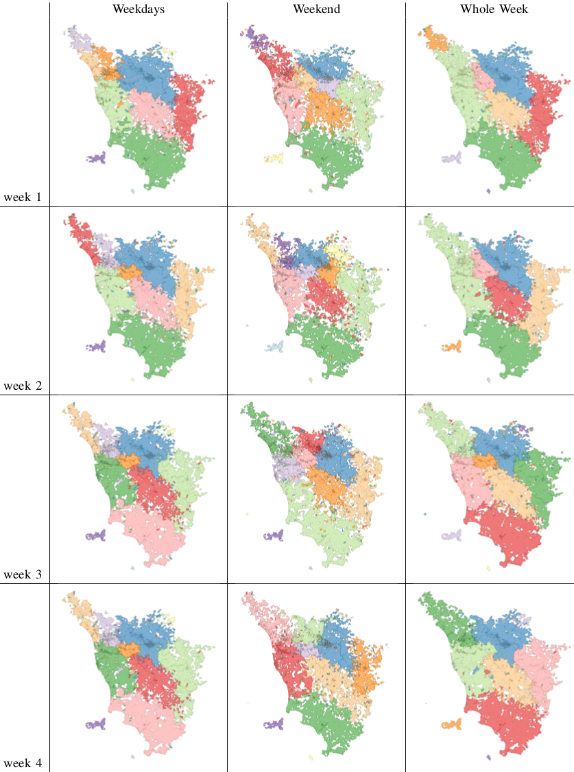
In fact we see that the borders are much crazier during weekends and this has a heavy influence on the whole week borders (see maps below, click for enjoying its andywarholesque larger resolution). Weekends have a larger effect on our data (2/7), much more than our example in Google Translate.

maps

The conclusion is therefore a word of caution about Big Data. More is not necessarily better: you still need theoretical grounds when you add data, to be sure that you are not introducing noise. Piling on more data, in my human mobility study, actually hides results: the high predictability of weekday movements. It also hides the potential interest of more focused studies about the mobility during different types of weekends or festivities. For example, our data involves the month of May, and May 1st is a special holiday in Italy. To re-ignite my Google Translate example: correct translations in some linguistic scenarios are incorrect otherwise. Think about slang. A naive Big Data algorithm could be caught in between a slang war, with each faction claiming a different correct translation. A smarter, theory-driven, algorithm will realize that there are slangs, so it will reduce its data intake to solve the two tasks separately. Much better, isn’t it?

Continue Reading

20 March 2014 ~ 0 Comments

When Dimensions Collide

The literature about community discovery, which deals with the problem of finding related groups of nodes in a network, is vast, interesting and full of potential practical applications. However, if I would have to give one critique of it, it would be about its self referential character. Most community discovery papers I read in computer science and physics journals are mainly about finding communities. Not much time is spent thinking about what to do with them, or what they mean. My first post in this blog was about a community discovery algorithm. Recently, an extended version of that paper has been accepted in a computer science journal. Since that first post, I (mainly) added some crucial modifications and features to the algorithm. I don’t want to talk about those here: they are boring. I also didn’t bring up this paper to boast about it. Okay, maybe a little. I did it because the paper touches upon the issue I am talking about here: it tries to do something with communities, it tries to explain something about them. Namely, it asks: why do communities overlap?

First of all: communities do overlap. When trying to detect them, many researchers realized that hard partitions, where each node can belong to one and only one community, are not always a good idea. Most of them found this a problem. Others were actually very happy: the problem gets harder! Nice! (Researchers are weird). Blinded by their enthusiasm, they started developing algorithms to deal with this overlap. Not many asked the question I am trying to answer here: why do communities overlap? As a result, some of these algorithms detect this overlap, but using approaches that do not really mean anything in real life, it’s just a mathematical trick. Others, instead, build the algorithm around a core hypothesis.

This hypothesis is nothing unheard of. Communities overlap because people have complex lives. Some of your college mates also attend your yoga class. And you know your significant other’s colleagues, which puts you in their community. All these communities have you as common member, and probably some more people too. The beauty of this is that it is not only intuitive: it works well in finding communities in real world social networks. So well that it is the assumption of my approach and of many others outstanding algorithms (this and this are the first two that pop into my mind, but there are probably many more). Another beautiful thing about it is that it is almost obvious, and so it is probably true. But here we hit a wall.

The fact that it is simple, reasonable and it works well in practice proves nothing about its property of being true. There are things that are not simple nor reasonable, but nevertheless true (hello quantum physics!). And there is practical knowledge that does not quite correspond to how things work (in my opinion, most computer science is a patch and nobody really knows why it works). Unless we test it, we cannot say that this nice practical principle actually corresponds to something happening in reality. So how do we go on and prove it? In the paper I proposed a first step.

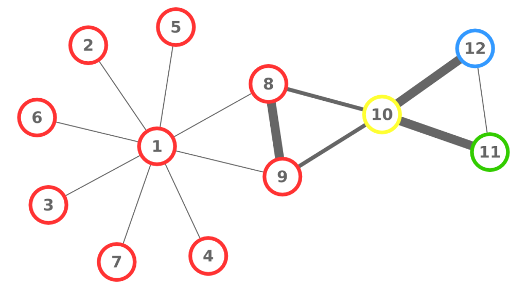
This brings me back to another old love of mine. Multidimensional networks. They are networks in which we put multiple relations in a cage together in mating season and see what happens (research is fun). The idea behind the paper is that multidimensional networks give us the perfect tool to test the hypothesis. In monodimensional networks you have no clue why two people are connecting besides the obvious “they know each other”. In a multidimensional network, you know why they know each other, it’s information embedded in the type of the relation. So, the hypothesis is that different types of relations are the cause of the community overlap, and with multidimensional networks we can look at how communities distribute over relations. First, let us take a look at what two overlapping communities look like in a multidimensional network.

We collected a multidimensional social network putting together relationships between users in Facebook, Twitter and Foursquare. We then used DEMON to extract overlapping communities from each dimension. We then took two communities with extensive overlap in the Facebook dimension (picture below).

We then looked at the very same set of nodes, but now in the Foursquare network. In the picture below, we kept the edges, and the node positioning, of the Facebook network to make the comparison easier, but keep in mind that the edges in the Foursquare dimension are different, and they are the ones that decide to what community the nodes belong.

Very interesting. The communities look a lot alike, although the shared (and non shared) nodes are slightly different. Now node 7369 is shared (it wasn’t in Facebook) while node 8062 isn’t (whereas it was before). Let’s put another nail on the coffin and see the communities these nodes belong in Twitter (same disclaimer applies):