15 April 2021 ~ 0 Comments

A Bayesian Framework for Online Social Network Sampling

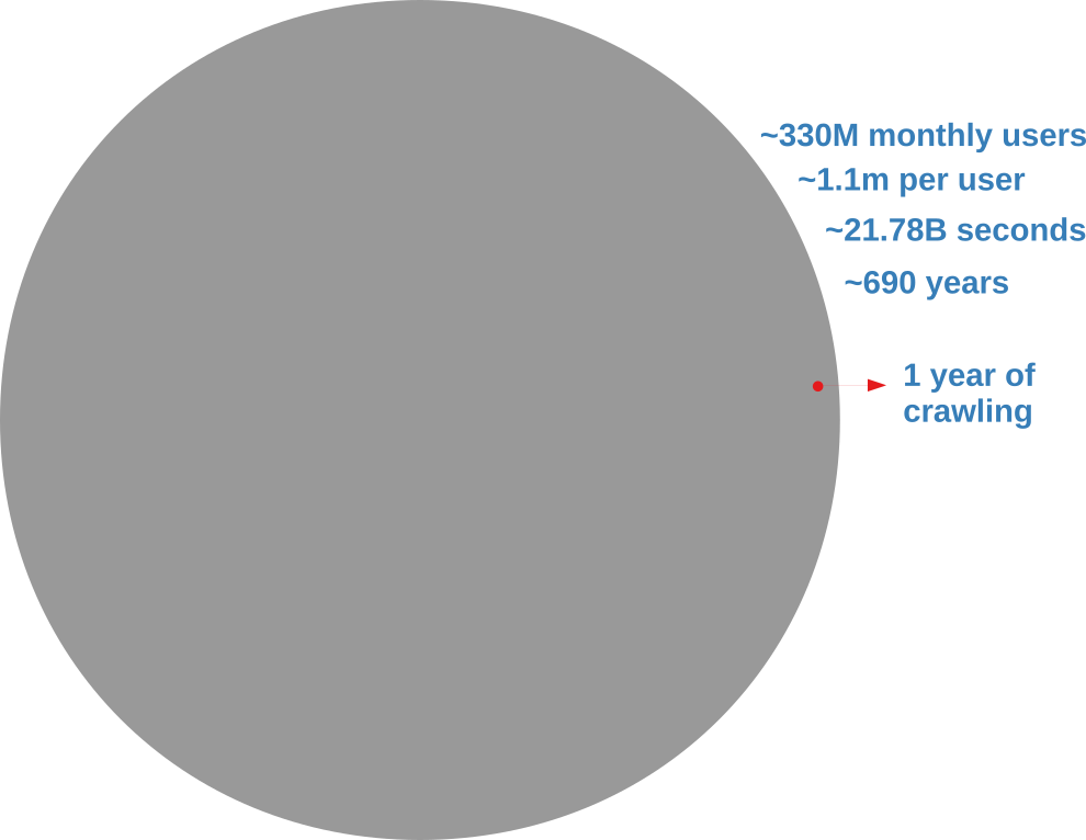
Analyzing an online social network is hard because there’s no “download” button to get the data. In the best case scenario, you have to query an API (Application Program Interface) system. You have to tell the API which user you want to see the connections of, and you can’t just ask for all users at the same time. With the current API rate limits, downloading the Twitter graph would take seven centuries, as the picture below explains.

The gray circle represents the totality of Twitter’s users. The red one is what you’d get with a continuous crawl of one year.

I don’t know about you, but I don’t have seven centuries to publish my papers. I want to become a famous scientist now. If you’re like me, you’re forced to extract only a sample. In this post, I’ll describe a network sampling algorithm that works with social media APIs to maximize the amount of information you get from your sample. The method has been published in the paper “Noise Corrected Sampling of Online Social Networks“, which recently appeared in the journal Transactions on Knowledge Discovery from Data.

My Noise Corrected sampling (NC) is a topological method. This means that you start from one (or more) user IDs that are known, and then you gather new user IDs from their friends, then you move on to the friends’ friends and so on, following the connections in the graph you’re sampling. This is the usual approach, because there is no way to know the user IDs beforehand — unless you have inside knowledge about how the social media platform works.

The underlying common question behind a topological sampler is: how do we pick the best user to explore next? Different samplers answer this question differently. A Random Walk sampler says: “Screw it! Thinking is too hard! I’m gonna get a random node from the friends of the currently explored node! Then, with the time I saved, I’m gonna get some ice cream.” The Metropolis-Hastings Random Walk — the nerd’s answer to the jock’s Random Walk — wants to preserve the degree distribution, so it penalizes high-degree nodes — since they’re more likely to be oversampled. Alternatively, we could use classical graph exploration techniques such as Depth-First and Breadth-First Search — and, again, you can enhance them so that you can preserve some properties of the network, for instance its clustering coefficient.

A random walk on a graph. It looks like a drunk going around. I don’t drink and sample, and neither should you.

My NC departs from all these approaches in a fundamental way. The thing they all have in common is that they don’t use information from the sample they have currently gathered. They only look at the potential next users and make a decision on whom to explore based on their characteristics alone. For instance Metropolis-Hastings Random Walk checks the user’s popularity in number of connections. NC, instead, looks at the entire collected sample and asks a straightforward question: “which of these next users is most likely to give me the most information about the whole structure, given what I explored so far?”

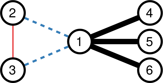
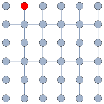
It does so with a Bayesian framework. The gory math is in the paper, but the underlying philosophy is that you can calculate a z-score for each edge of the network. It tells you how surprising it is that this edge is there. In probability theory, “surprise” is a good thing: it is directly related to how much information something gives you. Probability theorists are a bunch of jolly folks, always happy to discover jacks-in-a-box. If you always pick the most surprising edge in the network to explore the next user, you’re maximizing the amount of information you’re going to get back. The picture below unravels what this entails on a simple example.

In this example, the green nodes are explored, the blue nodes are known — because they’re friends of an explored node — but not explored yet. The red nodes are unknown.

The first figure (a) is the start of the process, where we have a network and we pick a random starting point, node 7. I use the edge thickness to show its z-score: we always follow the widest edge. Initially, you only pick a random edge, because all edges have the same z-score in a star. However, once I pick node 3, all z-scores change as we discover new edges (b). In this case, first we prioritize the star around node 7 (c), then we start following the path from node 3 until node 9 (d-e), then we explore the star around node 9 until there are no more nodes nor edges to discover in this toy network (f). Note how edges exhaust their surprise as you learn more about the neighborhoods of the nodes they connect.

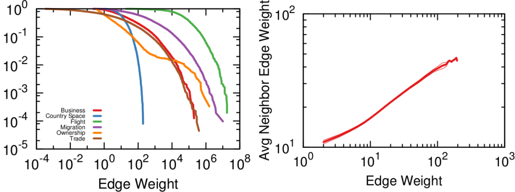
Our toy example is an unweighted network, where all edges have the same weight, but this method thrives if you have information about how strong a connection is. The edge weight is additional information that can be taken into account to measure its surprise value. Under the hood, NC estimates the expected weight of an edge given the average edge weights of the two nodes it connects. In an unweighted network this is equivalent to the degree, because all edges have the same weight. But in a weighted network you actually have meaningful differences between nodes that tend to have strong/weak connections.

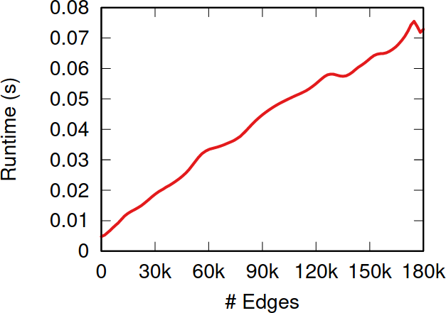
So, the million dollar question: how does NC fare when tested against the alternatives I presented before? The first worry you might have is that it takes too much time to calculate the z-scores. After all, to do so you need to look at the entire sampled network so far, while the other methods only look at a local neighborhood. NC is indeed slower than them—it has to be. But it doesn’t matter. The figure above shows how much time it takes to calculate the z-scores for more and more edges. Those runtimes (less than a tenth of a second) are puny when compared to the multi-second wait times due to the APIs’ rate limits — or even to simple network latency. After all, NC is a simplification of the Noise-Corrected Backbone algorithm I developed with Frank Neffke, and we showed in the original paper that it was pretty darn fast.

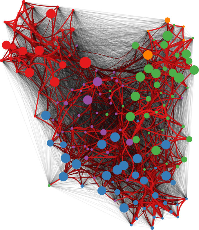
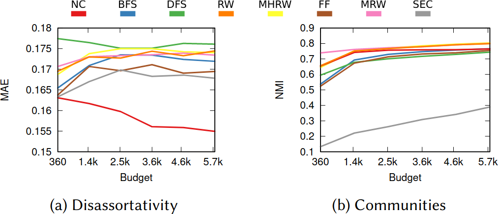
What about the quality of the samples? This is a question with a million answers, because it depends on what you want to do with the sample, besides what are the characteristics of the original graph and of the API system you’re wrestling against, and how much time you have to gather your sample. For instance, in the figure below we see that NC is the best method when you want to estimate the assortativity value of a disassortative attribute (think gender in a dating network), but it is a boring middle-of-the-pack method when you want to reconstruct the original communities of a network.

Left: the Mean Absolute Error between the sample’s and the original graph’s assortativity values (lower is better). Right: the Normalized Mutual Information between the sample’s and the original graph’s communities (higher is better). NC in red.

NC ranks between the 3rd and 4th position on average across a wide range of applications, network topologies, API systems, and budget levels. This is good because I test eight alternatives, thus the expectation is that NC will practically always be better than average. Among all eight methods tested, in fact, no other method has a better rank average. The second best method is Depth-First Search, which ranks 4th three out of four times, against NC’s one out of two.

I have shared some code allowing to replicate my results. If you speak Python better than you speak academiquese, you could use that code to infer how to implement an NC sampling strategy next time you need to download Twitter.

Continue Reading

25 January 2017 ~ 0 Comments

Network Backboning with Noisy Data

Networks are a fantastic tool for understanding an interconnected world. But, to paraphrase Spider Man, with networks’ expressive power come great headaches. Networks lure us in with their promise of clearly representing complex phenomena. However, once you start working with them, all you get is a tangled mess. This is because, most of the time, there’s noise in the data and/or there are too many connections: you need to weed out the spurious ones. The process of shaving the hairball by keeping only the significant connections — the red ones in the picture below —  is called “network backboning”. The network backbone represents the true relationships better and will play much nicer with other network algorithms. In this post, I describe a backboning method I developed with Frank Neffke, from the paper “Network Backboning with Noisy Data” accepted for publication in the International Conference on Data Engineering (the code implementing the most important backbone algorithms is available here).

bb1

Network backboning is as old as network analysis. The first solution to the problem was to keep edges according to their weight. If you want to connect people who read the same books, pairs who have few books in common are out. Serrano et al. pointed out that edge weight distributions can span many orders of magnitude — as shown in the figure below (left). Even with a small threshold, we are throwing away a lot of edges. This might not seem like a big deal — after all we’re in the business of making the network sparser — except that the weights are not distributed randomly. The weight of an edge is correlated with the weights of the edges sharing a node with it — as shown by the figure below (right). It is easy to see why: if you have a person who read only one book, all its edges can have at most weight one.

Their weights might be low in comparison with the rest of the network, but they are high for their nodes, given their propensity to connect weakly. Isolating too many nodes because we accidentally removed all their edges is a no-no, so Serrano and coauthors developed the Disparity Filter (DF): a technique to estimate the significance of one node’s connections given its typical edge weight, regardless of what the rest of the network says.

bb2

This sounds great, but DF and other network backboning approaches make imprecise assumptions about the possibility of noise in our estimate of edge weights. In our book example, noise means that a user might have accidentally said that she read a book she didn’t, maybe because the titles were very similar. One thing DF gets wrong is that, when two nodes are not connected in the raw network data, it would say that measurement error is absent. This is likely incorrect, and it screams for a more accurate estimate of noise. I’m going to leave the gory math details in the paper, but the bottom line is that we used Bayes’ rule. The law allows us to answer the question: how surprising is the weight of this edge, given the weights of the two connected nodes? How much does it defy my expectation?

The expectation here can be thought of as an extraction without replacement, much like Bingo (which statisticians — notorious for being terrible at naming things — would call a “hypergeometric” one). Each reader gets to extract a given number of balls (n, the total number of books she read), drawing from a bin in which all balls are the other users. If a user read ten books, then there are ten balls representing her in the bin. This is a good way to have an expectation for zero edge weights (nodes that are not connected), because we can estimate the probability of never extracting a ball with a particular label.

bb4

I highlighted the words one and two, because they’re a helpful key to understand the practical difference between the approaches. Consider the toy example below. In it, each edge’s thickness is proportional to its weight. Both DF and our Noise Corrected backbone (NC) select the black edges: they’re thick and important. But they have different opinions about the blue and red edges. DF sees that nodes 2 and 3 have mostly weak connections, meaning their thick connection to node 1 stands out. So, DF keeps the blue edges and it drops the red edge. It only ever looks at one node at a time.

bb5

NC takes a different stance. It selects the red edge and drops the blue ones. Why? Because for NC what matters more is the collaboration between the two nodes. Sure, the blue connection is thicker than the red one. But node 1 always has strong connections, and its blue edges are actually particularly weak. On the other hand, node 3 usually has weak connections. Proportionally speaking, the red edge is more important for it, and so it gets saved.

To sum up, NC:

  1. Refines our estimate of noise in the edge weights;
  2. Sees an edge as the collaboration between two nodes rather that an event happening to one of them;
  3. Uses a different model exploiting Bayes’ law to bake these aspects together.

bb6

How does that work for us in practice? Above you see some simulations made with artificial networks, of which we know the actual underlying structure, plus some random noise — edges thrown in that shouldn’t exist. The more noise we add the more difficult it is to recover the original structure. When there is little noise, DF (in blue) is better. NC (in red) starts to shine as we increase the amount of noise, because that’s the scenario we were targeting.

In the paper we also show that NC backbones have a comparable stability with DF, meaning that extracting the backbone from different time snapshots of the same phenomenon usually does not yield wildly different results. Coverage — the number of nodes that still have at least one edge in the network — is also comparable. Then we look at quality. When we want to predict some future relationship among the nodes, we expect noisy edges to introduce errors in the estimates. Since a backbone aims at throwing them away, it should increase our predictive power. The table below (click it to enlarge) shows that, in different country-country networks, the predictive quality (R2) using an NC backbone is higher than the one we get using the full noisy network. The quality of prediction can get as high as twice the baseline (the table reports the quality ratio: R2 of the backbone over R2 of the full network, for different methods).

bb8

The conclusion is that, when you are confident about the measurement of your network, you should probably extract its backbone using DF. However, in cases of uncertainty, NC is the better option. You can test it yourself!

Continue Reading

24 April 2014 ~ 1 Comment

Data: the More, the Merrier. Right? Of Course Not

You need to forgive me for the infamous click-bait title I gave to the post. You literally need to, because you have to save your hate for the actual topic of the post, which is Big Data. Or whatever you want to call the scenario in which scientists are flooded with so much data that traditional approaches break, for one reason or another. I like to use the Big Data label just because it saves time. One of the advantages of Big Data is that it’s useful. Once you can manage it, simple analysis will yield great profits. Take Google Translate: it does not need very sophisticated language models because millions of native speakers will contribute better translations, and simple Bayesian updates make it works nicely.

Of course there are pros and cons. I am personally very serious about the pros. I like Big Data. Exactly because of that love, honesty pushes me to find the limits and scrutinize the cons of Big Data. And that’s today’s topic: “yet another person telling you why Big Data is not such a great thing (even if it is, sometimes)” (another very good candidate for a click-bait title). The occasion for such a shameful post is the recent journal version of my work on human mobility borders (click for the blog post where I presented it). In that work we analysed the impact of geographic resolution on mobility data to locate the real borders of human mobility. In this updated version, we also throw temporal resolution in the mix. The new paper is “Spatial and Temporal Evaluation of Network-Based Analysis of Human Mobility“. So what does the prediction of human mobility have to do with my blabbering about Big Data?

Big Data is founded on the idea that more data will increase the quality of results. After all, why would you gather so much data at the point of not knowing how to manage them if it was not for the potential returns? However, sometimes adding data will actually decrease the research quality. Take again the Google Translate example: a non native speaker could add noise, providing incorrect translations. In this case the example does not really hold, because it’s likely that the vast majority of contributions comes from people who are native speakers in one of the two languages involved. But in my research question about human mobility it still holds. Remember what was the technique in the paper: we have geographical areas and we consider them nodes in a network. We connect nodes if people travel from an area to another.

Let’s start from a trivial observation. Weekends are different from weekdays. There’s sun, there’s leisure time, there are all those activities you dream about when you are stuck behind your desk Monday to Friday. We expect to find large differences in the networks of weekdays and in the networks of weekends. Above you see three examples (click for larger resolution). The number of nodes and edges tells us how many areas are active and connected: there are much fewer of them during weekends. The number of connected components tells us how many “islands” there are, areas that have no flow of people between them. During weekends, there are twice as much. The average path length tells us how many connected areas you have to hop through on average to get from any area to any other area in the network: higher during weekdays. So far, no surprises.

If you recall, our objective was to define the real borders of the macro areas. In practice, this is done by grouping together highly connected nodes and say that they form a macro area. This grouping has the practical scope of helping us predict within which border an area will be classified: it’s likely that it won’t change much from a day to another. The theory is that during weekends, for all the reasons listed before (sun’n’stuff), there will be many more trips outside of a person’s normal routine. By definition, these trips are harder to predict, therefore we expect to see lower prediction scores when using weekend data.

The first part of our theory is proven right: there are indeed much less routine trips during weekends. Above we show the % of routine trips over all trips per day. The consequences for border prediction hold true too. If you use the whole week data for predicting the borders of the next week you get poorer prediction scores. Poorer than using weekday data for predicting weekday borders. Weekend borders are in fact much more volatile, as you see below (the closer the dots to the upper right corner, the better the prediction, click for higher resolution):

In fact we see that the borders are much crazier during weekends and this has a heavy influence on the whole week borders (see maps below, click for enjoying its andywarholesque larger resolution). Weekends have a larger effect on our data (2/7), much more than our example in Google Translate.

maps

The conclusion is therefore a word of caution about Big Data. More is not necessarily better: you still need theoretical grounds when you add data, to be sure that you are not introducing noise. Piling on more data, in my human mobility study, actually hides results: the high predictability of weekday movements. It also hides the potential interest of more focused studies about the mobility during different types of weekends or festivities. For example, our data involves the month of May, and May 1st is a special holiday in Italy. To re-ignite my Google Translate example: correct translations in some linguistic scenarios are incorrect otherwise. Think about slang. A naive Big Data algorithm could be caught in between a slang war, with each faction claiming a different correct translation. A smarter, theory-driven, algorithm will realize that there are slangs, so it will reduce its data intake to solve the two tasks separately. Much better, isn’t it?

Continue Reading