The Effect of Shutting Down International Travels
Face-to-face interactions are a key component of knowledge transfer. Learning-by-doing, imitation, and tutoring are necessary tools for the acquisition of tacit knowledge: everything you need to know that cannot be encoded in a tool or in a manual. If you want to create something, the best way to do so is to be in direct contact with the people who can already do it. The proof is in business travels. Why would businesses spend a fortune — 1 trillion dollars in 2017 — to send their employees around the world ignoring the fact that we’re living in a telecommunication golden era? Because remote meetings don’t work. There are no substitutes for direct interactions. We cannot do without them. Except now we are forced to. So what’s the effect of shutting down international travels?
This is a question I set out to answer together with Frank Neffke and Ricardo Hausmann in the paper “Knowledge Diffusion in the Network of International Business Travel“, which has been published on Nature Human Behaviour. Of course, none of us took the hypothetical “international travel screeching to a halt” scenario seriously: we’re not precogs, it was merely an academic thought experiment. I must have, at some point, accidentally knocked over the lever that switched from simulation to reality. Oops.

We wanted to understand the effect of business travel on the development of new industrial activities in the countries receiving them. We did so by partnering with the MasterCard Center for Inclusive Growth, which provided access to aggregated and anonymized data based on foreign corporate card expenditures. The data allowed us to see how many corporate-issued spending cards were observed making transactions abroad in the 2011-2016 period. If a corporate card issued in Mexico made an expenditure in Colombia we can infer that it was due to a business travel — after some important data cleaning steps.*
Our problem was that we needed to gauge how many travelers from an industry reached a country, but we only had information about the country of origin. We solved this with a simple mathematical trick. We just assumed that the industries of a country were all equally likely to send out business travelers. Thus, if 20% of firms in Japan are car manufacturing plants, then 20% of business travelers from Japan are associated with the car manufacturing industry. This is rather naive and probably wrong — some industries are more likely to send travelers. But — if anything — this would dampen our results: we’re confident that, if we see any signal, that would actually be an underestimation of what’s really going on.
So, are business travels really contributing to the development of new industries in the country of destination? Yes! Our estimates show that, if we were to double the number of business travelers, we would expect a growth in industrial activity of around 6-14%. We have good reasons to believe that this effect is causal: it’s not simply that business travels happen because of a blossoming industrial activity in the destination. We test this by comparing different pairs of countries with different visa regimes between them — full details in the paper.

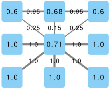
Click figure for a high resolution version.
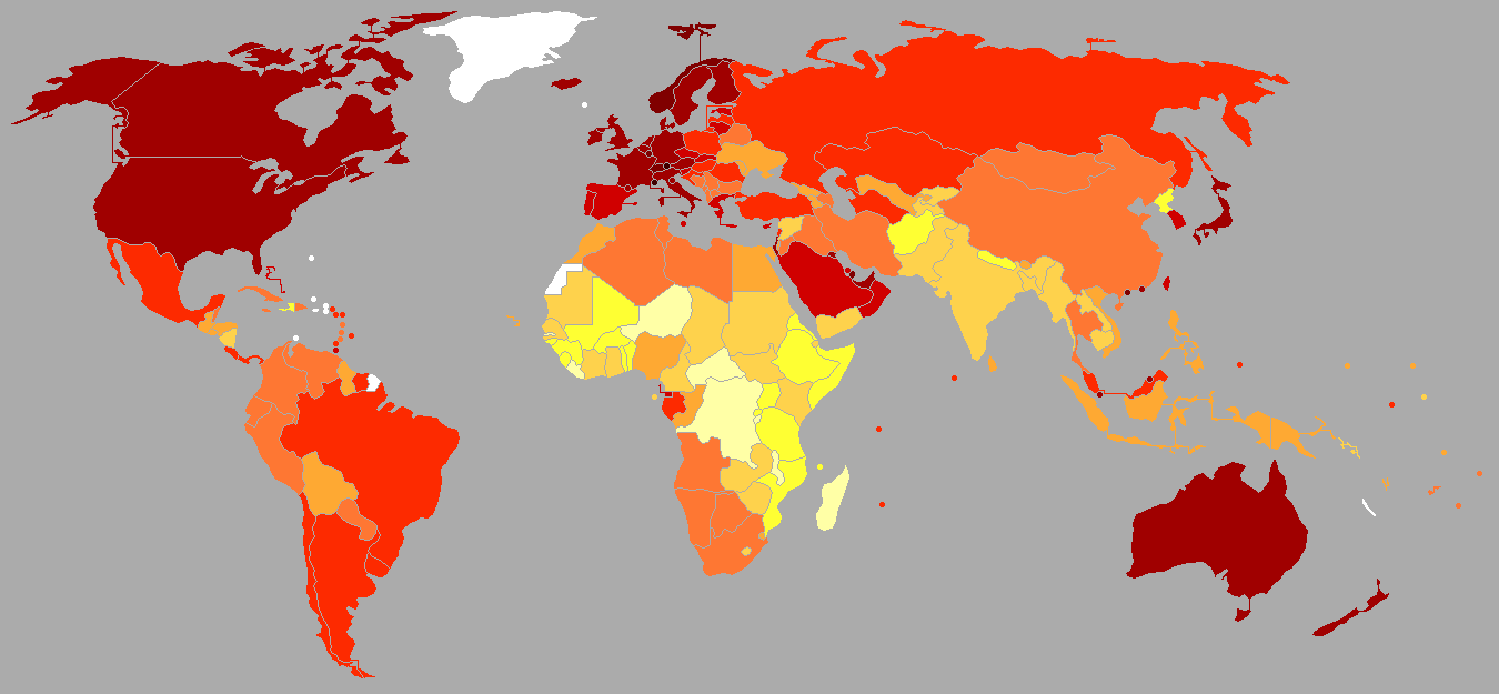
Who are the largest contributors to this growth? To answer this question we ran that hypothetical scenario: how much would global GDP shrink if a country would completely cease to send out business travelers forever? We found out that the most impactful country would be Germany, contributing a staggering 4.82% of global GDP with its business travelers (see image above). Canada and the US are in second and third place, both impacting more than 1%. Not great news in light of renewed travel bans that are making this nightmare scenario all too real.
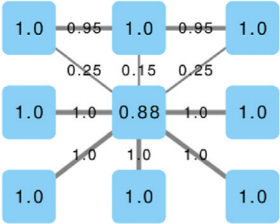
Click figure for a high resolution version.
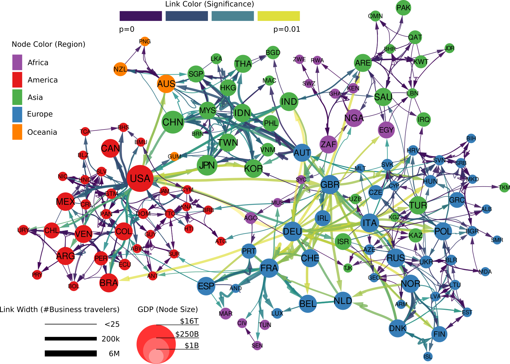
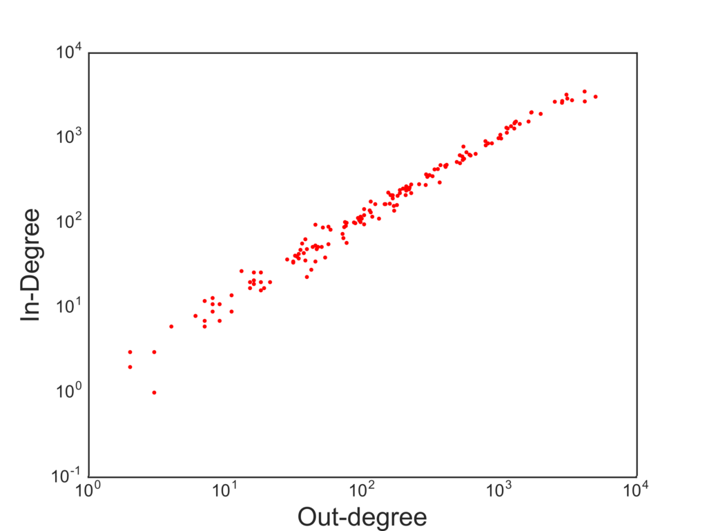
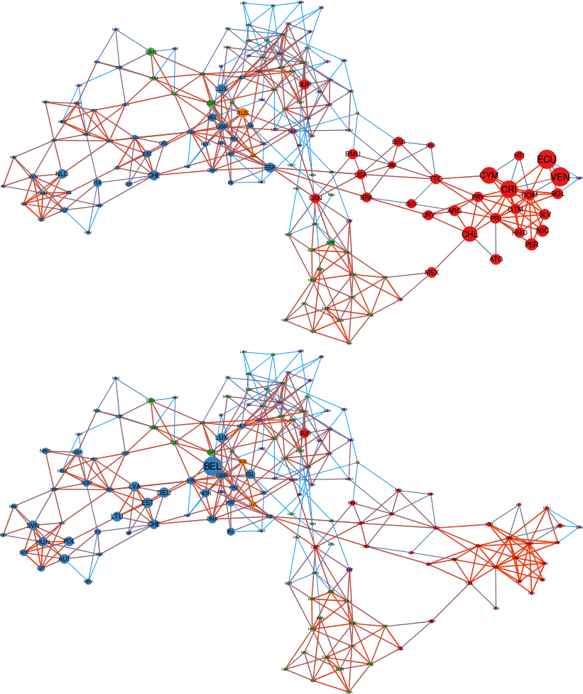
Who benefits the most from the knowledge flowing with business travelers? This is where our study unveils some uncomfortable truths. To answer our question we should first see how the global network of business travel looks like (figure above). Its most striking feature is how geographically clustered it looks. You can clearly see an Americas cluster. The European cluster includes some countries in the near East and North Africa. Asia is split in middle and far East. This isn’t great news. Current patterns of economic inequality hint at the fact that tacit knowledge is concentrated in some rich countries. If that’s true, such strong geographical clustering of business travel means that tacit knowledge will find a hard time spreading globally.
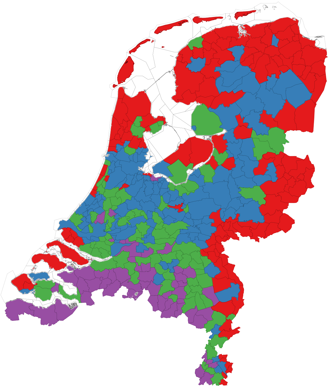
The map below shows which countries are comparatively receiving more knowledge,. Western Europe and North America are clear winners, because they tap into the large reservoirs of knowhow that are Germany, Canada, the US, the UK. The rest of the world, outside these tightly-knit clusters, is left scrambling for scraps.
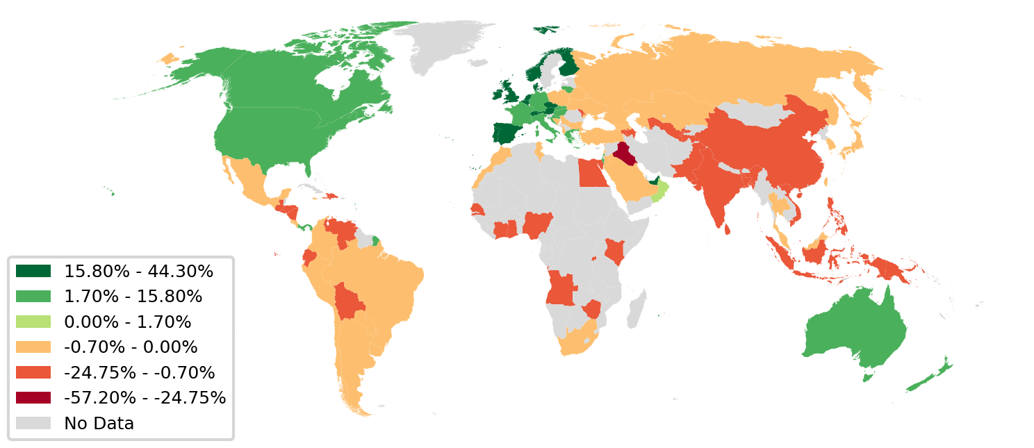
Click figure for a high resolution version.
So what are the lessons learned from this exercise? First, we need to solve the pandemic crisis effectively and put in place some solid countermeasures for future ones. We cannot do without business travel. If we could, we would have saved a trillion dollars in 2017, and kept plenty of CO2 from entering the atmosphere. Like it or not, Zoom calls are — for the moment — not substitutes for face-to-face interactions. Second, we need to figure out how to break the geographical compartmentalization of international knowledge transfer. If we want to achieve economic convergence and lift developing countries out of poverty, we need such countries to access what they lack to make the leap to become developed economies: the otherwise immobile tacit knowledge.
You can read more and access to interactive visualizations on the webpage of the paper, and request access to the data for result replication.
* There are countries in which the company doesn’t issue cards, or wasn’t able to grant access to data at the necessary level of granularity due to privacy regulations. Some countries simply are cash societies and thus don’t use cards. Such countries are not represented in our study.


