18 November 2015 ~ 0 Comments

Evaluating Prosperity Beyond GDP

When reporting on economics, news outlets very often refer to what happens to the GDP. How is policy X going to affect our GDP? Is the national debt too high compared to GDP? How does my GDP compare to yours? The concept lurking behind those three letters is the Gross Domestic Product, the measure of the gross value added by all domestic producers in a country. In principle, the idea of using GDP to take the pulse of an economy isn’t bad: we count how much we can produce, and this is more or less how well we are doing. In practice, today I am jumping on the huge bandwagon of people who despise GDP for its meaningless, oversimplified and frankly suspicious nature. I will talk about a paper in which my co-authors and I propose to use a different measure to evaluate a country’s prosperity. The title is “Going Beyond GDP to Nowcast Well-Being Using Retail Market Data“, my co-authors are Riccardo Guidotti, Dino Pedreschi and Diego Pennacchioli, and the paper will be presented at the Winter edition of the Network Science Conference.

GDP is gross for several reasons. What Simon Kuznets said resonates strongly with me, as already in the 30s he was talking like a complexity scientist:

The valuable capacity of the human mind to simplify a complex situation in a compact characterization becomes dangerous when not controlled in terms of definitely stated criteria. With quantitative measurements especially, the definiteness of the result suggests, often misleadingly, a precision and simplicity in the outlines of the object measured. Measurements of national income are subject to this type of illusion and resulting abuse, especially since they deal with matters that are the center of conflict of opposing social groups where the effectiveness of an argument is often contingent upon oversimplification.

cdp1

In short, GDP is an oversimplification, and as such it cannot capture something as complex as an economy, or the multifaceted needs of a society. In our paper, we focus on some of its specific aspects. Income inequality skews the richness distribution, so that GDP doesn’t describe how the majority of the population is doing. But more importantly, it is not possible to quantify well-being just with the number of dollars in someone’s pocket: she might have dreams, aspirations and sophisticated needs that bear little to no correlation with the status of her wallet. And even if GDP was a good measure, it’s very hard to calculate: it takes months to estimate it reliably. Nowcasting it would be great.

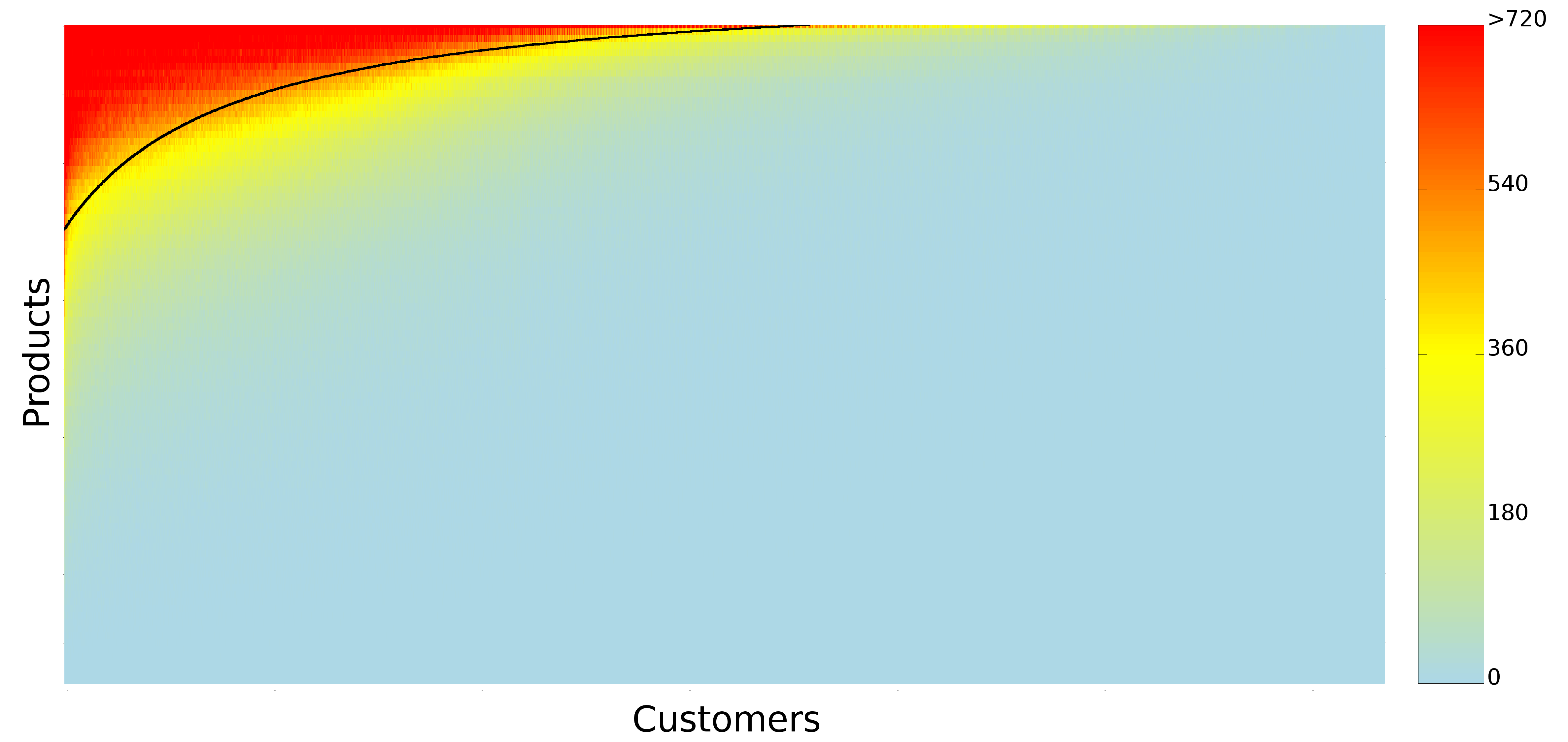
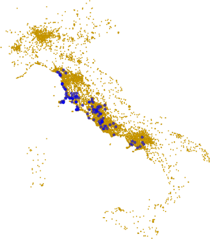
And so we tried to hack our way out of GDP. The measure we decided to use is the one of customer sophistication, that I presented several times in the past. In practice, the measure is a summary of the connectivity of a node in a bipartite network*. The bipartite network connects customers to the products they buy. The more variegated the set of products a customer buys, the more complex she is. Our idea was to create an aggregated version at the network level, and to see if this version was telling us something insightful. We could make a direct correlation with the national GDP of Italy, because the data we used to calculate it comes from around a half million customers from several Italian regions, which are representative of the country as a whole.

gdp2

The argument we made goes as follows. GDP stinks, but it is not 100% bad, otherwise nobody would use it. Our sophistication is better, because it is connected to the average degree with which a person can satisfy her needs**. Income inequality does not affect it either, at least not in trivial ways as it does it with GDP. Therefore, if sophistication correlates with GDP it is a good measure of well-being: it captures part of GDP and adds something to it. Finally, if the correlation happens with some anticipated temporal shift it is even better, because GDP pundits can just use it as instantaneous nowcasting of GDP.

We were pleased when our expectations met reality. We tested several versions of the measure at several temporal shifts — both anticipating and following the GDP estimate released by the Italian National Statistic Institute (ISTAT). When we applied the statistical correction to control for the multiple hypothesis testing, the only surviving significant and robust estimate was our customer sophistication measure calculated with a temporal shift of -2, i.e. two quarters before the corresponding GDP estimate was released. Before popping our champagne bottles, let me write an open letter to the elephant in the room.

gdp3

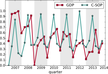
As you see from the above chart, there are some wild seasonal fluctuations. This is rather obvious, but controlling for them is not easy. There is a standard approach — the X-13-Arima method — which is more complicated than simply averaging out the fluctuations. It takes into account a parameter tuning procedure including information we simply do not have for our measure, besides requiring observation windows longer than what we have (2007-2014). It is well possible that our result could disappear. It is also possible that the way we calculated our sophistication index makes no sense economically: I am not an economist and I do not pretend for a moment that I can tell them how to do their job.

What we humbly report is a blip on the radar. It is that kind of thing that makes you think “Uh, that’s interesting, I wonder what it means”. I would like someone with a more solid skill set in economics to take a look at this sophistication measure and to do a proper stress-test with it. I’m completely fine with her coming back to tell me I’m a moron. But that’s the risk of doing research and to try out new things. I just think that it would be a waste not to give this promising insight a chance to shine.


* Even if hereafter I talk only about the final measure, it is important to remark that it is by no means a complete substitute of the analysis of the bipartite network. Meaning that I’m not simply advocating to substitute a number (GDP) for another (sophistication), rather to replace GDP with a fully-blown network analysis.

** Note that this is a revealed measure of sophistication as inferred by the products actually bought and postulating that each product satisfies one or a part of a “need”. If you feel that the quality of your life depends on you being able to bathe in the milk of a virgin unicorn, the measure will not take into account the misery of this tacit disappointment. Such are the perils of data mining.

Continue Reading

16 October 2015 ~ 0 Comments

Central Places and Sophistication

601px-US_population_map

Looking at a population map, one may wonder why sometimes you find metropoles in the middle of nowhere — I’m looking at you, Phoenix. Or why cities are distributed the way they are. When in doubt, you should always refer to your favorite geographer. She would probably be very happy to direct your interest to the Central Place Theory (CPT), developed by Walter Christaller in the 30s. The theory simply states that cities provide services to the surrounding areas. As a consequence, the big cities will provide many services and small cities a few, therefore the small cities will gravitate around larger settlements. This smells like complexity science to me and this post is exactly about connecting CPT with my research on retail customer sophistication and mobility. But first I need to convince you that CPT actually needs this treatment.

CPT explains why sometimes you will need a big settlement in the middle of the desert. That is because, for most of history, civilizations relied on horses instead of the interwebz for communication and, with very long stretches of nothing, that system would fall apart. That is why Phoenix has been an obsolete city since 1994 at the very least, and people should just give it up and move on. You now might be tempted to take a look at the Wikipedia page of the Central Place Theory to get some more details. If you do, you might notice a few “simplifications” used by Christaller when developing the theory. And if you don’t, let me spoil it for you. Lo and behold, to make CPT work we need:

  • An infinite flat Earth — easy-peasy-lemon-squeezy compared to what comes next;
  • Perfectly homogeneous distribution of people and resources;
  • Perfectly equidistant cities in a grid much like the one of Civilization 5;
  • The legendary perfect competition and rational market conjured by economists out of thin air;
  • Only one mode of transportation;
  • A completely homogeneous population, all equal in desires and income.

In short, the original CPT works in a world that is no more real than Mordor.

48958238

And here where’s sophistication comes into play. I teamed up with Diego Pennacchioli and Fosca Giannotti with the objective of discovering the relationship between CPT and our previous research on sophistication — the result is in the paper Product Assortment and Customer Mobility, just published on EPJ Data Science. In the past, we showed that the more sophisticated the needs of a customer, the further the customer is willing to travel to satisfy those. And our sophistication measure worked better than other product characteristics, such as the price and its average selling volume.

Now, to be honest, geographers did not sleep for 80 years, and they already pointed out the problems of CPT. Some of them developed extensions to get rid of many troubling assumptions, others tested the predictions of these models, others just looked at Phoenix in baffled awe. However, without going too in depth (I’m not exactly qualified to do it) these new contributions are either very theoretical in nature, or they haven’t used larger and more detailed data validation. Also, the way central places are defined is unsatisfactory to me. Central places are either just very populous cities, or cities with a high variety of services. For a person like me trained in complexity science, this is just too simple. I need to bring sophistication into the mix.

cpt1

Focusing on my supermarket data, variety is the number of different products provided. Two supermarkets selling three items have the same variety. Sophistication requires the products not only to be different, but also to satisfy different needs. Suppose shop #1 sells water, juice and soda, and shop #2 sells water, bread and T-shirts. Even if the shops have the same variety, one is more sophisticated than the other. And indeed the sophistication of a shop explains better the “retention rate” of a shop, its ability to preserve its customer base even for customers who live far away from the shop. That is what the above table reports: controlling for distance (which causes a 2.6 percentage point loss of customer base per extra minute of travel), each standard deviation increase in sophistication strengthens the retention rate by 11 percentage points. Variety of products does not matter, the volume of the shop (its sheer size) matters just a bit.

In practice, what we found is that CPT holds in our data where big supermarkets play the role of big cities and provide more sophisticated “services”. This is a nice finding for two reasons. First, it confirms the intuition of CPT in a real world scenario, making us a bit wiser about the world in which we live — and maybe avoiding mistakes in the future, such as creating a new Phoenix. This is non-trivial: the space in our data is not infinite, homogeneous, with a perfect market and it has differentiated people. Yet, CPT holds, using our sophistication measure as driving factor. Second, it validates our sophistication measure in a theoretical framework, potentially giving it the power to be used more widely than what we have done so far. However, both contributions are rather theoretical. I’m a man of deeds, so I asked myself: are there immediate applications of this finding?

cpt2

There might be one, with caveats. Remember we are analyzing hundreds of supermarkets in Italy. We know things about these supermarkets. First, we have a shop type, which by accident correlates with sophistication very well. Then, we know if the shop was closed down during the multi-year observation period. We can’t know the reason, thus everything that follows is a speculation to be confirmed, but we can play with this. We can compare the above mentioned retention rate of closing and non-closing shops. We can also define a catch rate. While “retention” meant how many of your closest customers you can keep, catch means how many of the non-closest customers you can get. The above plots show retention and catch ratios. The higher the number the more the ratio is in favor of the non-closing shop.

For the retention rate, the average sophistication shops (green) have by far the largest spread between shops that are still open and the ones which got shut down. It means that these medium shops survive if they can keep their nearby customers. For the catch rate, the very sophisticated shops (red) are always on top, regardless of distance. It means that large shops survive if they really can attract customers, even if they are not the closest shop. The small shops (blue) seem to obey neither logic. The application of this finding is now evident: sophistication can enlighten us as to the destiny of different types of shops. If medium shops fail to retain their nearby customers, they’re likely to shut down. If large shops don’t catch a wider range of customers, they will shut down. This result talks about supermarkets, but there are likely connections with settlements too, replacing products with various services. Once we calculate a service sophistication, we could know which centers are aptly placed and which ones are not and should be closed down. I know one for sure even without running regressions: Phoenix.

tumblr_n5lo16gWQC1ra6yclo1_500

Continue Reading

18 December 2014 ~ 0 Comments

The Supermarket is an Ecosystem

There are few things that you would consider less interesting than doing groceries at the supermarket. For some it’s a chore, others probably like it. But for sure you don’t see much of a meaning behind it. It’s not that you sense around you a grave atmosphere, the kind of mysterious background radiance you perceive when you feel part of Something Bigger. Just buy the bloody noodles already. Well, to some extent you are wrong.

Of course the reality is less mystical than what I tried to led you to believe in this opening paragraph. But it turns out that customers of a supermarket chain behave as if they were playing a specific role. These roles are the focus of the paper I recently authored with Diego Pennacchioli, Salvatore Rinzivillo, Dino Pedreschi and Fosca Giannotti. It has been published on the journal EPJ Data Science, and you can read it for free.

So what are these roles? The title of the paper is very telling: the retail market is a complex system. So the first thing to clear out is what the heck a complex system is. This is not so easily explained – otherwise it wouldn’t be complex, duh. The precise physics definition of complex systems might be too sophisticated. For this post, it will be sufficient to use the following one: a complex system is a collection of interacting parts and its behavior cannot be expressed as a sum of the behaviors of its parts. A good example of complexity is Earth’s ecosystem: there are so many interacting animals and phenomena that having a perfect description of it by just listing all interactions is just impossible.

lake-ecosystem-1_438x0_scale

And a supermarket is basically the same. In the paper we propose several proofs of it, but the one that goes best with the chosen example involves the esoteric word “nestedness”. When studying different ecosystems, some smart dudes decided to record their observations in matrix form. For each different island (ecosystem) they recorded if a particular species was present or not. When they looked at the resulting matrix they noticed a particular pattern. The islands with few species had only the species that were found in all islands, and at the same time the most rare species were present exclusively in those islands which were hosting all the observed species. If you reordered the islands by species count and the species by island count, the matrix had a particular triangular shape. They called matrices like that “nested”.

We did the same thing with customers and products. There are customers who buy only a handful of products: milk, water, bread. And those products are the products that everybody buys. Then there are those customers who, over a year, buy basically everything you can see in a supermarket. And they are the only ones buying the least sold products. The customers X products matrix ends up looking exactly like an ecosystem nested matrix (you probably already saw it over a year ago on this blog – in fact, this work builds on the one I wrote about back then, but the matrix picture is much prettier, thanks to Diego Pennacchioli):

matrix

Since we have too many products and customers, this is a compressed view and the color tells you how many observations we have per pixel (click for full resolution). One observation is simply a pairing of a customer and a product, indicating that the customer bought that product in significant quantities over a year. Ok, where does this bring us? First, as parts of a complex system, customers are not so easily classifiable. Marketing is all about finding uniformly behaving groups of people. The consequence of being complex parts is that this task is hopeless. You cannot really put people into bins. People are part of a continuous space, as shown in the picture, and every cut-off you propose is necessarily arbitrary.

The solution to this problem is represented by that black line you see on the matrix. That line is trying to divide the matrix in two parts: a part where we mostly have ones, and a part where we mostly have zeroes. The line does not match reality perfectly. It is a hyperbola that we told to fit itself as snugly to the data as possible. Once estimated, the function of the black line enables a neat application: to predict the next product a customer is interested in buying.

Remember that the matrix has its columns and rows sorted. The first customer is the one who bought the most products, the second bought a little less product and so on with increasing ranks. Same thing with products: the highest ranked (1st) is sold to most customers, the lowest ranked is sold to just one customer. This means that if you have the black line formula and the rank of a customer, you can calculate the rank of a corresponding product. Given that the black line divides the ones from the zeros, this product is a zero that can most easily become a one or, in other words, the supermarket’s best bet of what product the customer is most likely to want to buy next. You do not need customer segmentation any more: since the matrix is and will always be nested you just have to fill it following the nested pattern, and the black line is your roadmap.

pyramid

We can use the ranks of the products for a description of customer’s needs. The highest ranked products are bought by everyone, so they are satisfying basic needs.  We decided to depict this concept borrowing Maslow’s pyramid of needs. The one reported above is interesting (again, click for full resolution), although it applies only to the supermarket area our data is coming from. In any case it is interesting how some things that are on the basis of Maslow’s pyramid are on top of our, for example having a baby. You could argue that many people do not buy those products in a supermarket, but we address these concerns in the paper.

So next time you are pondering whether buying or not buying that box of six donuts remember: you are part of a gigantic system and the little weight you might gain is insignificant compared to the beautiful role you are playing. So go for it, eat the hell out of those bad boys.

Continue Reading

16 January 2014 ~ 2 Comments

The Eternal Struggle between Partitions and Overlapping Coverages

New year, old topic. I could make a lot of resolutions for this new year, but for sure to stop talking about community discovery is not among them. At least this time I tried to turn it up a notch in the epicness of the title. My aim is to give some substance to one of the many typical filler phrases in science writing. The culprit sentence in this case is “different application scenarios demand different approaches”. Bear with me for a metaphoric example.

When presenting a new toaster, it is difficult to prove that it toasts everything better under any point of view, under any circumstances. It usually does most toasts okay, and for one kind of toasts it really shines. Or its toasts really suck, but it can toast underwater. That’s fine. We are all grown up here, we don’t believe in the fairy tales of the silver bullets any more. At this point, our toaster salesman is forced to say it. “Different application scenarios demand different approaches”. In some cases this is a shameful fig leaf, but in many others it is simply true. Problem is: nobody really checks.

domo_toaster

I decided to check. At least one of them. Teaming up with Diego Pennacchioli and Dino Pedreschi, I put the spotlight on one of the strongest dichotomies in community discovery.  As you may remember, community discovery algorithms can force every node to belong to just one community, or allow them to be in many of them. The former approach is called “graph partitioning”, whilst the latter aims to find an “overlapping coverage”. Are these two strategies yielding interesting, yet completely different, results? This question has been dissected in the paper: “Overlap Versus Partition: Marketing Classification and Customer Profiling in Complex Networks of Products“, that will be presented in one workshop of the 2014 edition of the International Conference of Data Engineering.  Let me refresh your mind about overlaps and partitions.

Above you have the nec plus ultra scenario for a partitioning algorithm. If a partitioning algorithm sees the graph on the left, it would just die of happiness. In the graph, in fact, it appears very clearly that each node belongs to a very specific community. And it can’t belong to any other. If we assume that our algorithm works on edge strength (e.g. the inverse of the edge betweenness), then what the algorithm really sees is the graph on the right. It then proceeds to group together the nodes for which the edge strength is maximal, et voilà.

Here we have an example that’s a bit more complex. The picture has too many overlapping parts, so let me describe the connection pattern. In the graph on the left there are several groups of 6 nodes, each node connected to all other members of the group. In practice, each diagonal is completely connected to the two neighbouring diagonals. Clearly, here there is no way we can put each node in a disjoint group. Why put together nodes 0,1,2 with 3,4,5 and not with 9,10,11? But at that point, why 9,10,11 should be in a community with them and not with 6,7,8? The correct approach is just to allow every completely connected group to be a community, thus letting nodes to be part of more than a community. Some overlapping algorithms see the graph as it has been depicted on the right, with an edge colour per densely connected group.

Time to test which one of these approaches is The Right One! For our data quest we focused on supermarket transactions. We created a network of products that you can buy in supermarkets. To be connected, two products have to be bought together by the same customers in a significant number of times. What does that mean? By pure intuition, bread and water aren’t going to be connected: both of them are bought very frequently, but they have little to do with each other, thus they are expected to be in the same shopping cart by chance. Eggs and flour are too very popular, but probably more than chance, since there are a lot of things you can do with them together. Therefore they are connected. Other specific pairs of products, say bacon flavoured lipstick and liquorice shoelaces, may ended up in the same, quite weird, shopping cart. But we don’t connect them, as their volume of sales is too low (or at least I hope so).

Here are some of the facts we found. First. The overlapping approach* tends to return relatively more communities with a larger amount of nodes than the partition approach**. In absolute terms that’s obvious, since the same node is counted more than once, but here the key term is “relatively”. See the plot above on the right, where we graph the probability (y axis) of finding a community with a given number of nodes (x axis). Second. The overlapping approach returns more “messy” communities. Our messiness measure checks how many different product categories are grouped together on average in the same community. Again, larger communities are expected to be messier, but the messiness measure that we used controls for community size. See the plot on the right, again the probability (y axis) of finding a community with a given entropy (x axis, “entropy” is the fancy scientific term for “messiness”). Third. The partition approach returned denser communities, whose link strength (the number of people buying the products together) is higher.

What is the meaning of all this? In our opinion, the two algorithms are aiming to do something completely different. The partition approach is aiming to create a new marketing classification. It more or less coincides with the established one (thus lower messiness), most customers buy those products together (high link strength) and there are very few giant categories (most communities are small). The overlapping approach, instead, wants to do customer profiling. A customer rarely buys all products of a marketing category (thus increasing its messiness), it has specific needs (that not many people have, thus lowering edge weight) and she usually needs a bunch of stuff (thus larger communities, on average).

Who’s right? That’s the catch: both. The fact that two results are incompatible, in this case, does not mean that one is right and one is wrong. They are just different applications. Which was exactly what I wanted to prove, in this narrow and very specific, probably unsurprising, scenario. Now you should feel better: I gave you a small proof that the hours you spend to choose the perfect toaster for you are really worth your time!


* As overlapping approach, we used the Hierarchical Link Clustering.

** As partitioning approach, we used Infomap.


Continue Reading