Quantifying Affective Polarization on Social Media

A couple of years ago, I worked with Marilena Hohmann and Karel Devriendt on a method to estimate ideological polarization on social media: the tendency of people to have more extreme opinions and to avoid contact with people holding a different opinion. Studying ideological polarization is interesting, but it misses a crucial piece of the puzzle: what happens when differing opinions – which may or may not be trying to avoid each other – collide? Are people actually having a debate and an exchange of ideas, or are they escalating to name-calling and generally toxic behavior?

Answering that question requires a method to estimate affective polarization, rather than merely ideological polarization. Once Marilena and I were done working with the latter, we rolled up our sleeves to work on the former. The result is the paper “Estimating affective polarization on a social network“, which appeared a few days ago on PLoS One.

The objective appears simple: to try and quantify what people with differing opinions do when they interact. Unpacking this objective requires some care, though. One could think that this is a simple correlation test: if the more people disagree the more they use toxic language, then affective polarization is high.

Such an approach, however, ignores that people might hate each other so much that they refuse to communicate altogether, or they are forcibly separated. An example is r/the_donald. For a time, it was one of the most active subreddits on Reddit, creating a strong polarized environment. At some point, the Reddit admins decided to ban the subreddit altogether, which resulted in an exodus of users. In the data, one would see a decrease in affective polarization, because there was less toxicity. In reality, discourse had become so toxic it had to stop, which we argue is a sign of a growing, nor decreasing, affective polarization.

The two components of affective polarization: above, the higher the correlation between disagreement and toxicity, the higher affective polarization. Below, the more separated the camps are, the higher affective polarization is.

So we still need to track the network of interactions, just like we did for ideological polarization, because ideology and affect are intertwined. Marilena and I spent a lot of blood and tears trying to be smart about finding a solution, but in the end – as is often the case – the simple route was the best one. We decided to add the affective component to the ideological polarization measure we already had. The older measure captures the social separation, while the correlation between disagreement and toxicity captures the affective component.

Once we had such a measure, we made a case study, analyzing the evolution of the social discourse on former Twitter (RIP) on COVID-19. We used data from February to July 2020, filtered using a set of keywords used in the early pandemic debate. Initially, the results were a bit confusing. While we did find a modest rise in the affective polarization levels, it seemed that affective polarization was mostly a flat line.

The overall level of affective polarization (y axis) over time (x axis).

This went a bit counter our expectation, but analyzing the social separation and the affective components separately told an insightful story (thanks reviewer #1 for prodding us in this direction, we owe you big time 🙂 ).

Above: the affective component. Below: the social segregation component.

The clear pattern was that, in the first couple of weeks, there was low social segregation but a high affective component. After this initial shock, social segregation skyrocketed and by week 9 it plateaued, while the affective component went down.

This is consistent with a narrative of a new topic coming to scene. As the topic is new, no one knows where they stand exactly, so everyone tends to interact with everyone (low social segregation). However, feelings run high, both because of the emergency itself and – possibly – because of previous conflicts between the users, which lead to renewed toxicity. As people get used to the new scenario and the clear factions emerge and stabilize, social segregation suddenly kicks in, and the factions stop talking, which also reduces the chances of using toxic language against the opposing side.

I think this exemplifies beautifully why the measure is useful. If we didn’t have a network measure, we would conclude that affective polarization was low after the first few weeks of the pandemic, because there was no correlation between disagreement and toxicity. Instead, affective polarization was still growing, and we failed to see the correlation because polarization was so high people weren’t event talking to each other any more.

There’s more work to do, of course, because we only tested a tiny scenario. Marlena and I are working on the final piece of our polarization trilogy, where all these great tools we built are finally put to use. Stay tuned!

Predictability, Home Advantage, and Fairness in Team Sports

There was a nice paper published a while ago by the excellent Taha Yasseri showing that soccer is becoming more predictable over time: from the early 90s to now, models trying to guess who would win a game had grown in accuracy. I got curious and asked myself: does this hold only for soccer, or is it a general phenomenon across different team sports? The result of this question was the paper: “Which sport is becoming more predictable? A cross-discipline analysis of predictability in team sports,” which just appeared on EPJ Data Science.

My idea was that, as there is more and more money and professionalism in sport, those who are richer will become stronger over time, and dominate for a season, which will make them more rich, and therefore more dominant, and more rich, until you get Juventus, which came in first or second in almost 50% of the 119 soccer league seasons played in Italy.

My first step was to get data about 300,000 matches played across 49 leagues in nine disciplines (baseball, basket, cricket, football, handball, hockey, rugby, soccer, and volleyball). My second step was to blatantly steal the entire methodology from Taha’s paper because, hey, why innovate when you can just copy the best? (Besides, this way I could reproduce and confirm their finding, at least that’s the story I tell myself to fall asleep at night)

Predictability (y axis, higher means more predictable) over time (x axis) across all disciplines. No clear trend here!

The first answer I got was that Taha was right, but mostly only about soccer. Along with volleyball (and maybe baseball) it is one of the few disciplines that is getting more predictable over time. The rest of the disciplines are a mixed bag of non-significant results and actual decreases in predictability.

One factor that could influence these results is home advantage. Normally, the team playing home has slighter higher odds of winning. And, sometimes, not so slight. In the elite rugby tournament in France, home advantage is something like 80%. To give an idea, 2014 French champions Toulon only won 4 out of their 13 away games, and two of them were against the bottom two teams of the league that got relegated that season.

It’s all in the pilou pilou. Would you really go to Toulon and tell this guy you expect to win? Didn’t think so.

Well, this is something that actually changed almost universally across disciplines: home advantage has been shrinking across the board — from an average of 64% probability of home win in 2011 to 55% post-pandemic. The home advantage did shrink during Covid, but this trend started almost a decade before the pandemic. The little bugger did nothing to help — having matches played behind closed doors altered the dynamics of the games –, but it only sped up the trend, it didn’t create it.

What about my original hypothesis? Is it true that the rich-get-richer effect is behind predictability? This can be tested, because most American sports are managed under a socialist regime: players have unions, the worst performing teams in one season can pick the best rookies for the next, etc. In Europe, players don’t have unions and if you have enough money you can buy whomever you want.

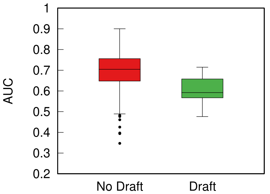
Boxplot with the distributions of predictability for European sports (red) and American ones (green). The higher the box, the more predictable the results.

When I split leagues by the management system they follow, I can clearly see that indeed those under the European capitalistic system tend to be more predictable. So next time you’re talking with somebody preaching laissez-faire anarcho-capitalism tell them that, at least, under socialism you don’t get bored at the stadium by knowing in advance who’ll win.

How Quickly is COVID Really Spreading?

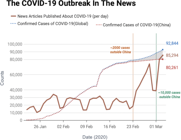
I don’t need to introduce to you what the corona virus is: COVID-19 has had a tremendous impact on everyone’s life in the past weeks and months. All of a sudden, our social media feeds have been invaded with new terminology: social distancing, R0, infection rate, exponential growth. Overnight, we turned ourselves into avid consumers of epidemics literature. We learned what the key to prevent the infection from becoming a larger problem is: slow the bugger down. That is why knowing how fast corona is actually moving is such a crucial piece of information. You have seen the pictures many times, they look something like this:

Image courtesy of my data science students: Astrid Machholm, Jacob Kristoffer Hessels, Marie-Louise Tommerup, Simon Breum, Zainab Ali Shaker Khudoir. If anything, it warms my heart knowing that, even during a pandemic, many journalists take their weekends off 🙂

What you’re seeing is the evolution in number of infected people — and how much non-infected people like me blabber about them online. Epidemiologists try to estimate the speed of infection by fitting the real data you see on an SI model. In it, people turn from Susceptible to Infected at a certain rate. These models are usually precise at estimating the number of infected over time, but they lack a key component: they assume that each individual is interchangeable and that anyone has a chance to be infected by anyone in their close proximity. In other words, they ignore the fact that we are embedded in a social network: some people are more central than others, and some have more friends than others.

To properly estimate how fast a disease moves, you need to take the network into account. And this is the focus of a paper of mine: “Generalized Euclidean Measure to Estimate Network Distances“. The paper has been accepted for publication at the 2020 ICWSM conference. The idea of the paper is to create a new measure that estimates the distance between the state of the disease at two moments in time, taking the underlying network topology into account.

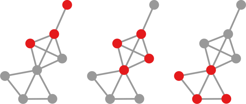
The question here is deceptively simple. Suppose you have a set of infected individuals. In the picture above, they are the nodes in red in the leftmost social network. After a while, some people recover, while others catch the disease. You might end up with the set of infected from the network in the middle, or the one in the right. In which case did the disease spread more quickly?

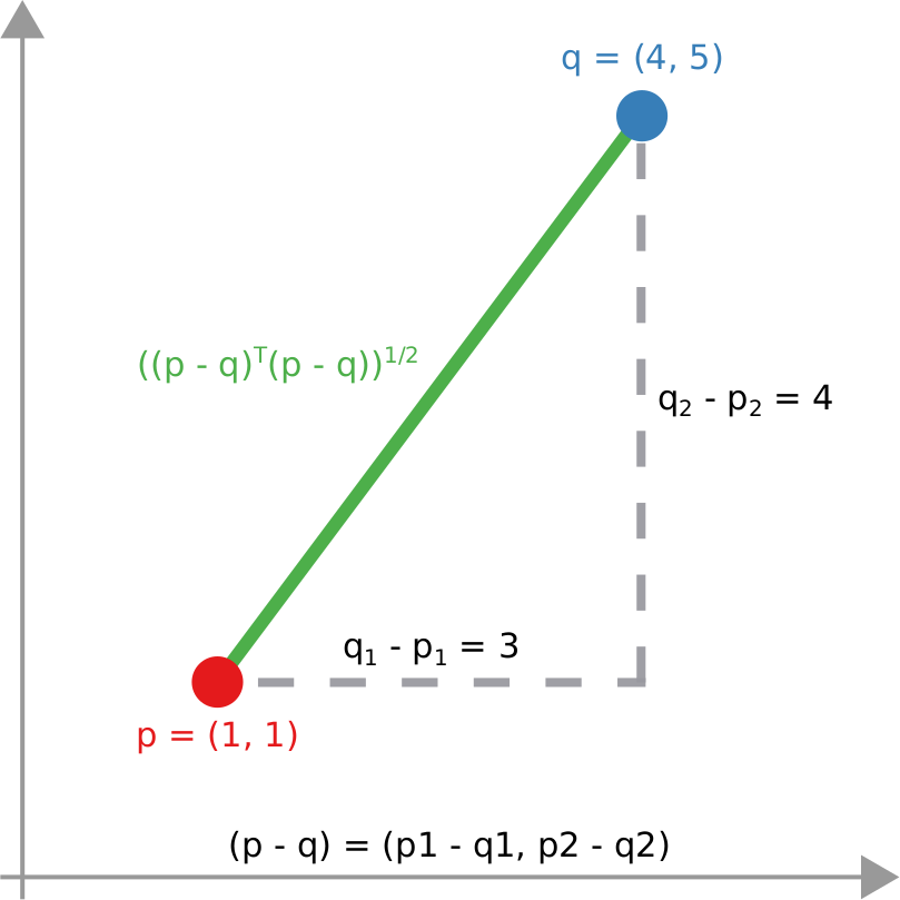
We have a clear intuitive answer: the rightmost network experienced a faster spread, because the infected nodes are farther from the original ones. We need to find a measure that matches this intuition. How do we normally estimate distances in the real world? We use a ruler: we draw a straight line between two points and we measure how long that line is. This is the Euclidean distance. Mathematically, that means representing the two points as vectors of coordinates (p and q), calculating their difference, and then using Pythagoras’ theorem to calculate the length of the straight line between them:

We cannot apply this directly to our network problem. This is because, for silly Euclid, every dimension has the same importance in estimating the distance between points. However, in our case, the points are the states of the disease. They do not live on the plane of Euclidean geometry, but on a network. Some moves in this network space are short and easy: moving between two connected nodes. But other moves are long and hard: between two nodes that are far apart. In other words, nodes that are connected to each other contribute less than unconnected nodes to the distance. The simplest example I can make is:

In the figure, each vector — for instance (1,0,0) — is the representation of the state of the disease of the graph beneath it: the entries equal to one identify the currently infected node. Clearly, the infection closer to the left graph is the middle one, not the right one. However, the Euclidean distance between the three vectors is the same: the square root of two. So how do we fix this problem? There is a distance measure that allows you to weigh dimensions differently. It is my favorite distance metric (yes, I am the kind of person who has a favorite distance metric): the Mahalanobis distance. Mahalanobis simply says that correlated variables should count less in estimating the distance: taller people tend to be heavier — because there’s more person to weigh — so we shouldn’t be surprised if someone taller than me is also heavier. But, if they weigh less, we would find it remarkable.

Now we’re just left with the problem of figuring out how to estimate, mathematically, what “correlated” means in a network. The paper has the full details. For here, suffice to say we augment Pythagoras’ theorem with the pseudoinverted graph Laplacian — a sentence I’m writing only to pretend I’m smart (it’s actually not sophisticated at all, and a super easy thing to calculate). The reason we use the graph Laplacian is because it is a standard instrument to estimate how fast things spread in a network.

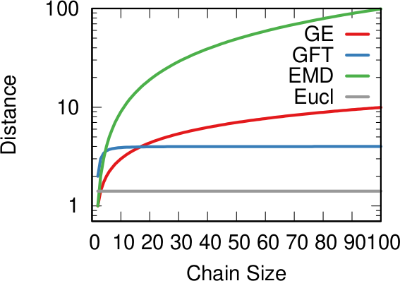
In the paper I run a bunch of tests to show that this measure matches our intuition. For instance, as shown above, if we have infected people at the endpoints of a chain graph, the longer the chain (x axis) the higher the estimated distance should be (y axis). GE (= Generalized Euclidean, in red) is my measure, and it behaves as it should: a constantly growing function (the actual values don’t really matter as long as they constantly grow as we move left to right). I compare the measure with few alternatives. The Euclidean (gray) obviously fails because it doesn’t know what a network is. EMD (green) is the Earth-Mover Distance, which is as good as my measure, but computationally more expensive. GFT (blue) is the Graph Fourier Transform, which is less sensitive to longer distances.

More topically, I can simulate different diseases with a SI model on a network. I can randomly change their infectiousness: how likely you (S) are to contract the disease if you’re in contact with an infected (I) individual. By looking at the beginning and at the end of an infection event, my measure can recover that infectiousness parameter, meaning it can distinguish between slow- and fast-moving diseases.

I’m obviously not pretending to be smarter than the thousands of epidemiologists that are doing a terrific job in fighting — and spreading awareness about — the disease. Their models at a global, national, and regional level for sure work extremely well and do not need this little paper of mine. However, this tool might find its use, when you have detailed data about a specific social network, for instance by using phone data to reconstruct a network of physical contacts. It also has a wider applicability to anything you can model as a diffusion process on a network, being a marketing campaign, the exploration of the Product Space by a country, or even computer vision. If you want to play with the code, I implemented a few network distance methods in a Python library.