09 December 2020 ~ 0 Comments

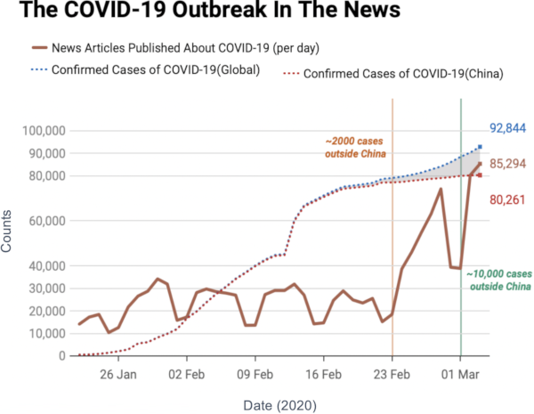
Speed-Check your Diseases on a Social Network

Back in March I wrote a blog post — and a paper — showing a technique to estimate the distance covered by a propagation event on a network between two moments in time. A propagation event could be the failure of a power grid, a word-of-mouth campaign on social media, or — more topically these days — a disease infecting people in a social network. The limitation of that paper was in taking only a single perspective. However, this problem could be solved in at least a dozen different ways. To give justice to such complexity, I recently co-authored the paper “The Node Vector Distance Problem in Complex Networks” with Andres Gomez, James McNerney, and Frank Neffke. The paper was published this month in the ACM Computing Surveys journal and it’s the main focus of this blog post.

Estimating the spreading speed of something in our normal geographical space is important, but relatively trivial. However, networks are complex spaces. You cannot estimate the speed of COVID by looking at the geographical areas it has covered, because what really connects places is not our physical space, but a complex network of relations among regions. In other words, the places closest to China are not necessarily countries like Mongolia or Nepal — both of which share a border with China — but Iran and Italy, because of the many direct flights connecting them.

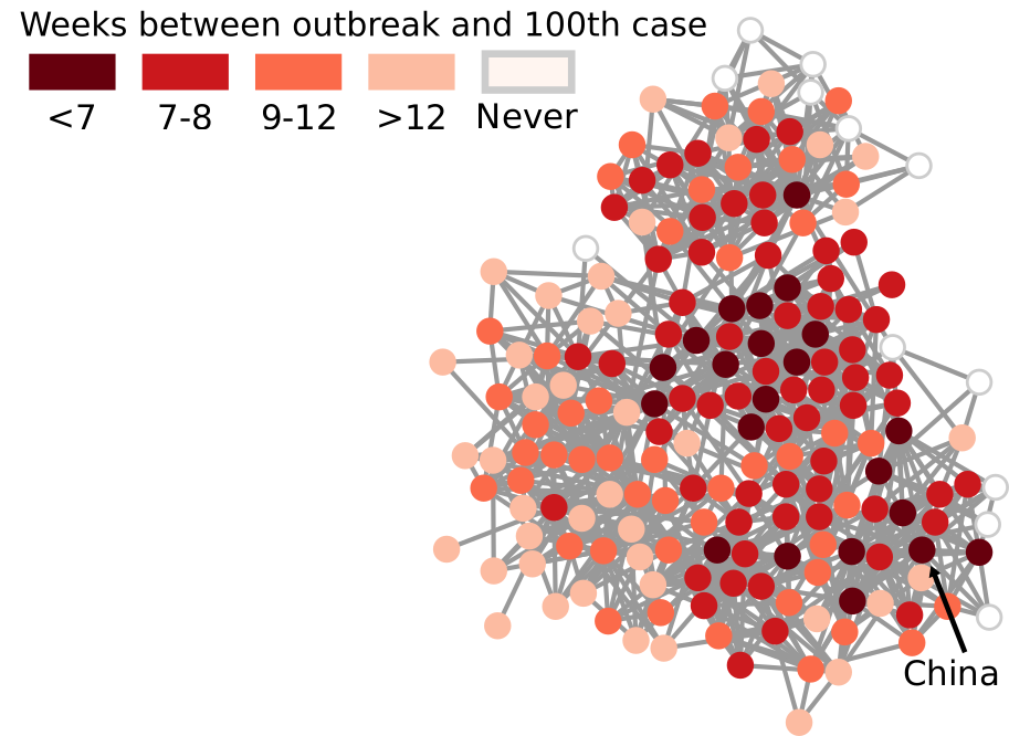
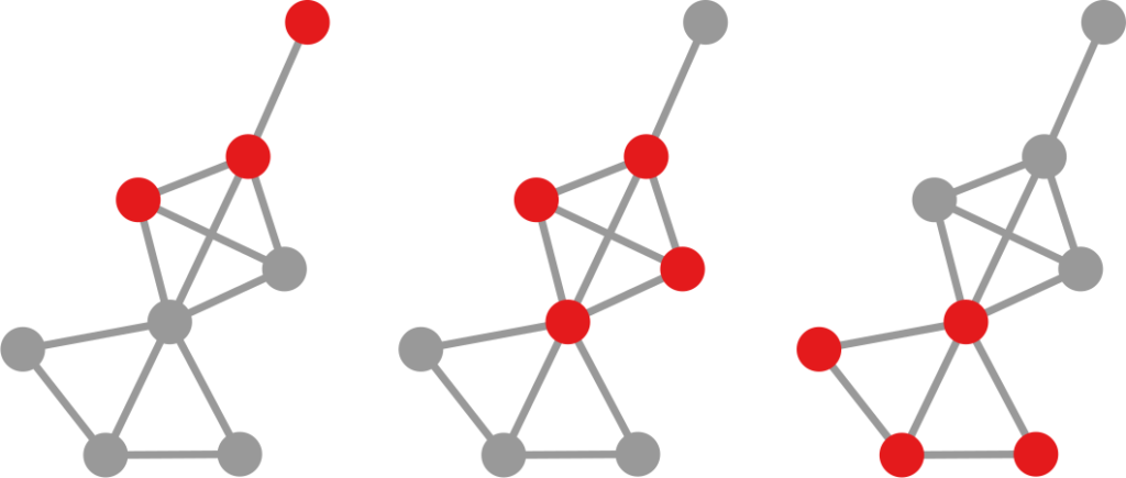
My paper in March found a way to transform our notion of Euclidean distance — a straight line in physical space — to networks. It basically defined what a “straight line” means when all you have is nodes and edges. In the figure above, I connect countries if they have a significant number of direct flights between their airports. Darker nodes represent countries that were hit earlier, and nodes get progressively lighter the later they were first hit. My generalized Euclidean measure allows you to calculate a number describing how fast this process went. This means you could compare it with other pandemics, or you could use it to estimate the moment when a still-developing pandemic will cover a given fraction of the world.

Was mine the only way to translate the concept of “straight line”? No. For starters, it uses an indirect metaphor to define “straightness”. In my generalized Euclidean, every node is a “dimension” of a multidimensional space and, when COVID infects it, it means that the virus had traveled a certain amount of distance in that dimension. If you’re staring dumbfounded at the previous sentence, yeah, that’s pretty much what I expected. A more intuitive way of defining the distance covered in a network would be simply to count how many edges the disease crossed via the calculation of shortest paths.

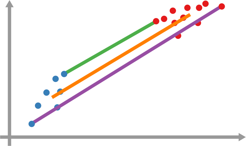
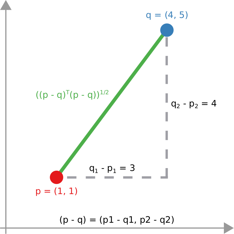
However, it’s still not that easy: how far is each newly infected node from the set of previous infected nodes? And how do we combine all those path lengths into one new measure? In the paper, we explain various ways to do so. One option is to apply linking strategies from hierarchical clustering, as I show in the figure above. The distance between the group of red points from the blue points can be the distance of their closest pair — green line, called single linkage –; the distance of their centers of mass — orange line, average linkage –; or the distance between their farthest pair — purple line, complete linkage. Another option is to simulate an agent optimizing the movement of “packets” from the nodes in the origin to the nodes in the destination — the popular Earth Mover’s Distance measure.

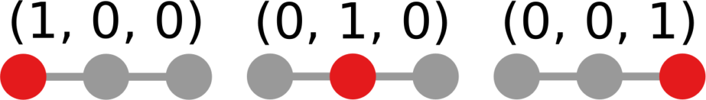
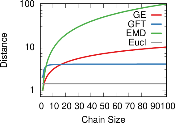
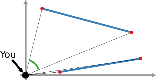
And that still doesn’t cover the space of possibilities! Even in our simple geographical world, we can have different perspectives on what “distance” means. For instance, a popular distance measure is cosine distance. In it, it doesn’t matter how far two points are in the space: if they are on the same line from your point of view, you consider them close together. Now, “distance” becomes the angle by which you have to turn to go from looking straight at one point, to looking at the other. In the figure below, the Euclidean (straight line) distance between two red points is in blue. The cosine distance is the thick green line, showing in the point pair below that it could be quite small even for points that Euclid would say are very far away in the plane. Many measures adopt this distance philosophy for networks, for instance the Mean Markov Chain and the Graph Fourier Transform approaches.

That is more or less where we stop in the paper. I think that there are plenty more network distance measures to be discovered, but the work still needs to be done.

As a companion for the paper, I have developed an open source Python library implementing the majority of network distance measures that we discuss. You can use it to calculate network distances in your data, or to better understand how these measures work. Hopefully, you’ll make my job harder by discovering new measures and forcing me to publish an updated paper on the topic.

Continue Reading

25 March 2020 ~ 0 Comments

How Quickly is COVID Really Spreading?

I don’t need to introduce to you what the corona virus is: COVID-19 has had a tremendous impact on everyone’s life in the past weeks and months. All of a sudden, our social media feeds have been invaded with new terminology: social distancing, R0, infection rate, exponential growth. Overnight, we turned ourselves into avid consumers of epidemics literature. We learned what the key to prevent the infection from becoming a larger problem is: slow the bugger down. That is why knowing how fast corona is actually moving is such a crucial piece of information. You have seen the pictures many times, they look something like this:

Image courtesy of my data science students: Astrid Machholm, Jacob Kristoffer Hessels, Marie-Louise Tommerup, Simon Breum, Zainab Ali Shaker Khudoir. If anything, it warms my heart knowing that, even during a pandemic, many journalists take their weekends off 🙂

What you’re seeing is the evolution in number of infected people — and how much non-infected people like me blabber about them online. Epidemiologists try to estimate the speed of infection by fitting the real data you see on an SI model. In it, people turn from Susceptible to Infected at a certain rate. These models are usually precise at estimating the number of infected over time, but they lack a key component: they assume that each individual is interchangeable and that anyone has a chance to be infected by anyone in their close proximity. In other words, they ignore the fact that we are embedded in a social network: some people are more central than others, and some have more friends than others.

To properly estimate how fast a disease moves, you need to take the network into account. And this is the focus of a paper of mine: “Generalized Euclidean Measure to Estimate Network Distances“. The paper has been accepted for publication at the 2020 ICWSM conference. The idea of the paper is to create a new measure that estimates the distance between the state of the disease at two moments in time, taking the underlying network topology into account.

The question here is deceptively simple. Suppose you have a set of infected individuals. In the picture above, they are the nodes in red in the leftmost social network. After a while, some people recover, while others catch the disease. You might end up with the set of infected from the network in the middle, or the one in the right. In which case did the disease spread more quickly?

We have a clear intuitive answer: the rightmost network experienced a faster spread, because the infected nodes are farther from the original ones. We need to find a measure that matches this intuition. How do we normally estimate distances in the real world? We use a ruler: we draw a straight line between two points and we measure how long that line is. This is the Euclidean distance. Mathematically, that means representing the two points as vectors of coordinates (p and q), calculating their difference, and then using Pythagoras’ theorem to calculate the length of the straight line between them:

We cannot apply this directly to our network problem. This is because, for silly Euclid, every dimension has the same importance in estimating the distance between points. However, in our case, the points are the states of the disease. They do not live on the plane of Euclidean geometry, but on a network. Some moves in this network space are short and easy: moving between two connected nodes. But other moves are long and hard: between two nodes that are far apart. In other words, nodes that are connected to each other contribute less than unconnected nodes to the distance. The simplest example I can make is:

In the figure, each vector — for instance (1,0,0) — is the representation of the state of the disease of the graph beneath it: the entries equal to one identify the currently infected node. Clearly, the infection closer to the left graph is the middle one, not the right one. However, the Euclidean distance between the three vectors is the same: the square root of two. So how do we fix this problem? There is a distance measure that allows you to weigh dimensions differently. It is my favorite distance metric (yes, I am the kind of person who has a favorite distance metric): the Mahalanobis distance. Mahalanobis simply says that correlated variables should count less in estimating the distance: taller people tend to be heavier — because there’s more person to weigh — so we shouldn’t be surprised if someone taller than me is also heavier. But, if they weigh less, we would find it remarkable.

Now we’re just left with the problem of figuring out how to estimate, mathematically, what “correlated” means in a network. The paper has the full details. For here, suffice to say we augment Pythagoras’ theorem with the pseudoinverted graph Laplacian — a sentence I’m writing only to pretend I’m smart (it’s actually not sophisticated at all, and a super easy thing to calculate). The reason we use the graph Laplacian is because it is a standard instrument to estimate how fast things spread in a network.

In the paper I run a bunch of tests to show that this measure matches our intuition. For instance, as shown above, if we have infected people at the endpoints of a chain graph, the longer the chain (x axis) the higher the estimated distance should be (y axis). GE (= Generalized Euclidean, in red) is my measure, and it behaves as it should: a constantly growing function (the actual values don’t really matter as long as they constantly grow as we move left to right). I compare the measure with few alternatives. The Euclidean (gray) obviously fails because it doesn’t know what a network is. EMD (green) is the Earth-Mover Distance, which is as good as my measure, but computationally more expensive. GFT (blue) is the Graph Fourier Transform, which is less sensitive to longer distances.

More topically, I can simulate different diseases with a SI model on a network. I can randomly change their infectiousness: how likely you (S) are to contract the disease if you’re in contact with an infected (I) individual. By looking at the beginning and at the end of an infection event, my measure can recover that infectiousness parameter, meaning it can distinguish between slow- and fast-moving diseases.

I’m obviously not pretending to be smarter than the thousands of epidemiologists that are doing a terrific job in fighting — and spreading awareness about — the disease. Their models at a global, national, and regional level for sure work extremely well and do not need this little paper of mine. However, this tool might find its use, when you have detailed data about a specific social network, for instance by using phone data to reconstruct a network of physical contacts. It also has a wider applicability to anything you can model as a diffusion process on a network, being a marketing campaign, the exploration of the Product Space by a country, or even computer vision. If you want to play with the code, I implemented a few network distance methods in a Python library.

Continue Reading