16 February 2016 ~ 0 Comments

Data Trips Diary: Bogotá

My last post on this blog was about mobility in Colombia. For that study, I had the opportunity of dunking my hands into a bag filled with interesting data. To do so, I traveled to Bogotá. It is a fascinating place and I decided to dedicate this post to it: what the city looks like under the lens of some simple mobility and economic data analysis. If in the future I will repeat the experience somewhere else I will be more than happy to make this a recurrent column of this blog.

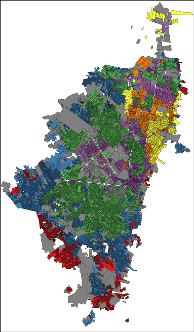
The cliché would demand from me a celebration of the chaos in Bogotá. After all, we are talking about one of the top five largest capitals in Latin America, the chaos continent par excellence. Yet, your data goggles would tell you a different story. Bogotá is extremely organized. Even at the point of being scary. There is a very strict division of social strata: the city government assigns each block a number from 1 (poorest) to 6 (richest) according to its level of development and the blocks are very clustered and homogeneous:

sisben_strata

In the picture: red=1, blue=2, green=3, purple=4, yellow=5 and orange=6 (grey = not classified). That map doesn’t seem very chaotic to me, rather organized and clustered. One might feel uneasy about it, but that is how things are. The clustering is not only on the social stratum of the block, but also in where people work. If you take a taxi ride, you will find entire blocks filled with the very same economic activities. Not knowing that, during one of my cab rides I thought in Bogotá everybody was a car mechanic… until we got passed that block.

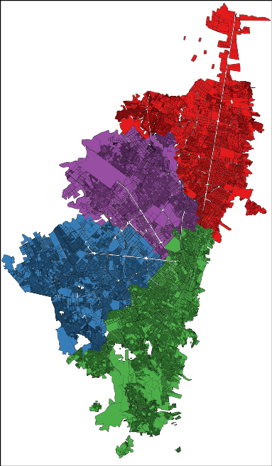
The order emerges also when you look at the way the people use the city. My personal experience was of incredulity: I went from the city hall to the house of a co-worker and it felt like moving to a different city. After a turn left, the big crowded highway with improvised selling stands disappeared into a suburb park with no cars and total quiet. In fact, Bogotá looks like four different cities:

bogota_mobilityclusters

Here I represented each city block as a node in a network and I connected blocks if people commute to the two places. Then I ran a community discovery algorithm, and plotted on the map the result. Each color represents an area that does not see a lot of inter-commutes with the other areas, at least compared with its own intra-commutes.

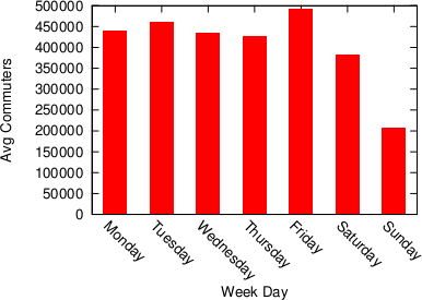
Human mobility is interesting because it gives you an idea of the pulse of a place. Looking at the commute data we discovered that a big city like Bogotá gets even bigger during a working day. Almost half a million people pour inside the capital every day to work and use its services, which means that the population of the city increases, in a matter of hours, by more than 5%.

bogota1

It’s unsurprising to see that this does not happen during a typical Sunday. The difference is not only in volume, but also in destination: people go to different places on weekends.

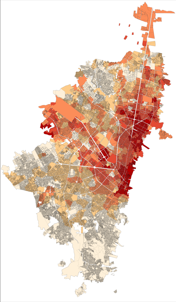
cell_avgdaycommuters_weekdaydifference

Here, the red blocks are visited more during weekdays, the white blocks are visited more in weekends. It seems that there is an axis that is more popular during weekdays — that is where the good jobs are. The white is prevalently residential.

Crossing this commute information with the data on establishments from the chamber of commerce (camara de comercio), we can also know which businesses types are more visited during weekends, because many commuters are stopping in areas hosting such businesses. There is a lot of shopping going on (comercio al por menor) and of course visits to pubs (Expendio De Bebidas Alcoholicas Para El Consumo Dentro Del Establecimiento). It matches well with my personal experience as, once my data quests were over, my local guide (Andres Gomez) lead me to Andres Carne de Res, a bedlam of music, food and lights, absolutely not to be missed if you find yourself in Bogotá. My personal advice is to be careful about your beverage requests: I discovered too late that a mojito there is served in a soup bowl larger than my skull.

Most of what I wrote here (minus the mojito misadventure) is included in a report I put together with my travel companion (Frank Neffke) and another local (Eduardo Lora). You can find it in the working paper collection of the Center for International Development. I sure hope that my data future will bring me to explore other places as interesting as the capital of Colombia.
Continue Reading

04 January 2013 ~ 2 Comments

Data-Driven Borders

What defines the human division of territory? Think about it: cities are placed in particular areas for a number of good reasons: communication routes, natural resources, migration flows. But once cities are located in a given spot, who decides where one city ends and another begins? Likewise, who decides on the borders of a region or a nation and how? This decision, more often than not, is quite random.

Sometimes administrative borders are defined by natural barriers like mountains and rivers. This makes practical sense, although it is not always clear why the border should be that particular mountain or that particular river. In fact, the main criterion is usually historical: it’s because some dynasty of dudes conquered that area and then got lazy and didn’t go on (this may be the official version: unofficially, maybe, it’s because they found somebody who kicked their asses all day long, just like the complicated relationship of the Romans with the Parthians).

Of course, the borders of states or regions are sometimes re-arranged to better fit practical administrative purposes. In any case, these are nothing else than sub-optimal adjustments of a far-from-optimal process. Network analysis can be useful in this context, because it can provide an objective way to divide the territory according to a particular theory (and it can provide pretty pictures too).

The theory here is very simple: two territories are related if a lot of people travel regularly from one to the other. If people constantly travel back and forth between two territories, then it probably makes sense to combine these territories into one administrative unit. So, how do we determine which territories should be merged, and which shouldn’t be? This problem is easily solvable in network theory, because it contains a network in its very basic definition: two areas are strongly connected if many people travel from one to the other. What we aim for is a grouping of territories. This looks really familiar to the eyes of some readers of this website: grouping nodes in a network. Yes! Community discovery!

I am not claiming to be the first one to see the problem this way. There is a number of people who already worked on it: the two most important that I can think of are Brockmann et al. and Ratti et al. However, I am reporting this because I also have a paper on the topic. And, of course, I think it’s better than the alternatives, for a number of reasons that I won’t report because it’s boring for non nerd people. But then again, I am a narcissist, so I can’t resist giving you the short list:

  • The previous works are based on not so perfect data: Brockmann et al. work with the banknotes trajectories recorded by the “Where’s George?” website (an awesome idea, take a look at it), while Ratti et al. use cellphone mobility data. Both are not exact representations about how people move and contain critical error terms. In our work, we use GPS trajectories with very high frequency and precision: we are studying the real thing.
  • The previous works use outdated methods for community discovery which cannot detect small communities: we use a more up-to-date method that is considered the state-of-the-art of community discovery. For example, in Brockmann et al. the entire west part of the United States is apparently one single area, grouping California and Montana and creating a region of 60-something million people.
  • We actually create a framework that establishes the correct methodology to approach the problem in general, instead of just studying one particular case.

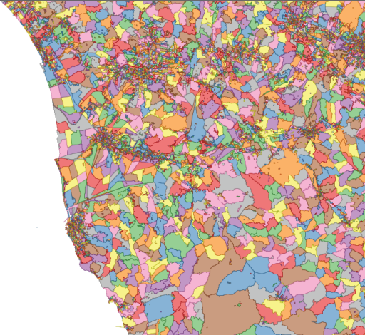
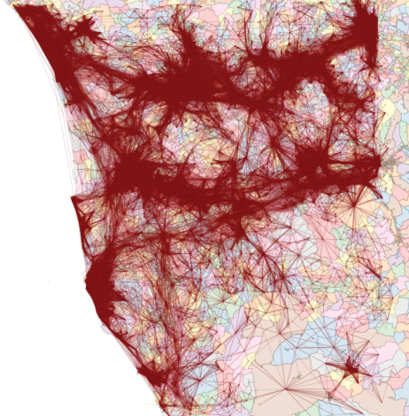
But enough blabbering! I promised pretty pictures and I’ll give you pretty pictures. The general shared methodology is the following (in the pictures, the example of  mobility in Tuscany, Italy):

1) We divide the territory in cells (either a regular grid or very fine grained census cells);

2) We connect the nodes according to how many cars went from one cell to the other;

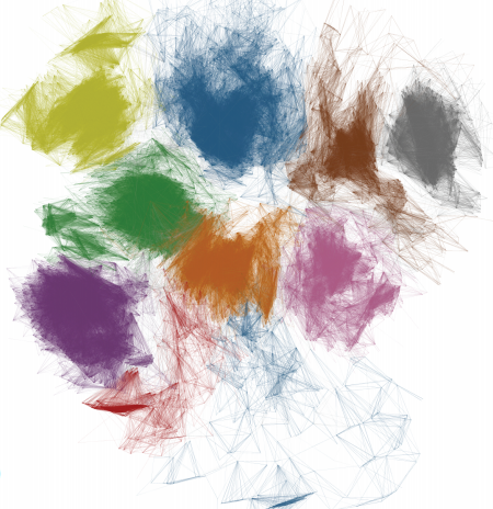
3) We forget about geography and we obtain a complex network (here, the node layout has nothing to do with their location on the map);

4) We apply community discovery, grouping set of nodes (territories) that are visited by the same people;

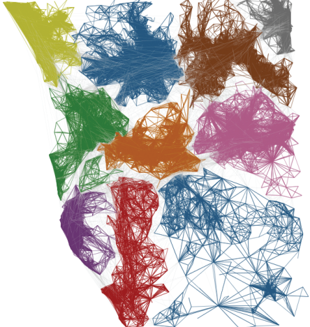
5) We put the nodes back in their geographical positions, obtaining the borders we were yearning for.

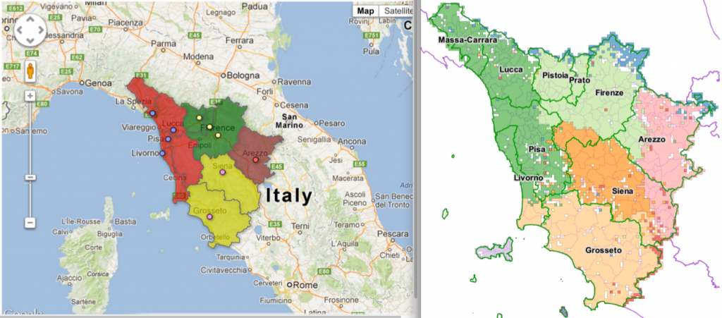
Funnily enough, Italy is undergoing a re-organization process of its regions and provinces. The results in Tuscany are very similar to the insights of our work (not perfectly similar, as the current process is just a merge of the existing provinces and not a real re-design):

On the left the new provinces (colors) on top of the old ones (lines), on the right our clusters (click for a larger resolution).

The match suggests that our data-driven borders follow the general intuition about what the borders should look like. However, they are not just a blind merge of the existing provinces, such as the one made by the policy-makers, making them more connected with reality. Hurrah for network analysis!

Continue Reading