08 March 2023 ~ 0 Comments

Quantifying Ideological Polarization on Social Media

Ideological polarization is the tendency of people to hold more extreme political opinions over time while being isolated from opposing points of view. It is not a situation we would like to get out of hand in our society: if people adopt mutually incompatible worldviews and cannot have a dialogue with those who disagree with them, bad things might happen — violence, for instance. Common wisdom among scientists and laymen alike is that, at least in the US, polarization is on the rise and social media is to blame. There’s a problem with this stance, though: we don’t really have a good measure to quantify ideological polarization.

This motivated Marilena Hohmann and Karel Devriendt to write a paper with me to provide such a measure. The result is “Quantifying ideological polarization on a network using generalized Euclidean distance,” which appeared on Science Advances earlier this month.

The components of our polarization definition, from top to bottom: (a) ideology, (b) dialogue, and (c) ideology-dialogue interplay. The color hue shows the opinion of a node, and its intensity is how strongly the opinion is held.

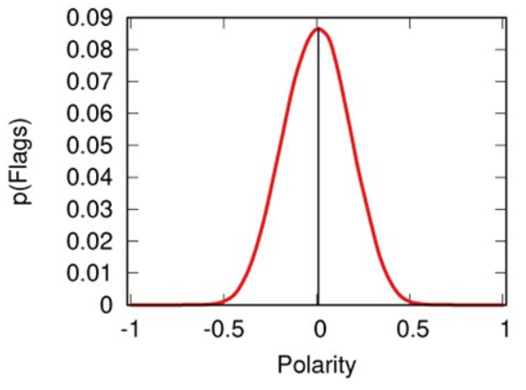
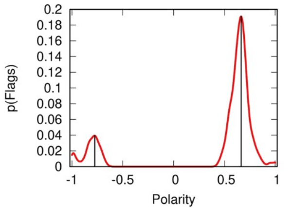
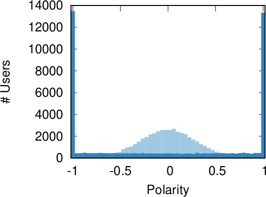
Our starting point was to stare really hard at the definition of ideological polarization I provided at the beginning of this post. The definition has two parts: stronger separation between opinions held by people and lower level of dialogue between them. If we look at the picture above we can see how these two parts might look. In the first row (a) we show how to quantify a divergence of opinion. Suppose each of us has an opinion from -1 (maximally liberal) to +1 (maximally conservative). The more people cluster in the middle the less polarization there is. But if everyone is at -1 or +1, then we’re in trouble.

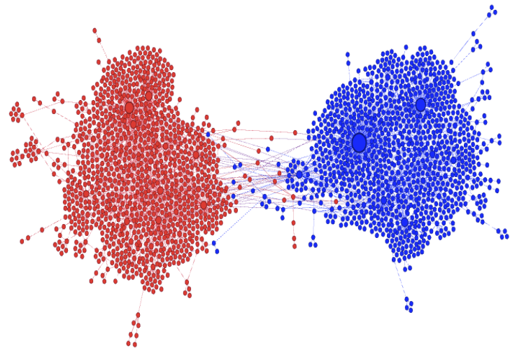
The dialogue between parts can be represented as a network (second row, b). A network with no echo chambers has a high level of dialogue. As soon as communities of uniform opinions arise, it is more difficult for a person of a given opinion to hear the other side. This dialogue is doubly difficult if the communities themselves organize in the network as larger echo chambers (third row, c): if all communities talk to each other we have less polarization than if communities only engage with other communities that hold more similar opinions.

In this image, time flows from left to right: the first column is the initial condition with the node color proportional to its temperature, then we let heat flow through the edges. The plot on the second row shows the temperature distribution of the nodes.

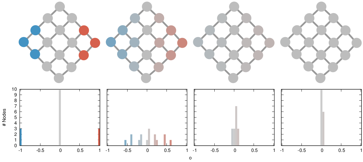
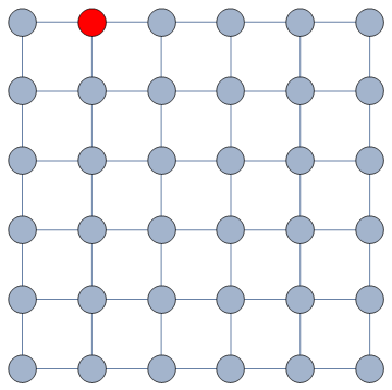
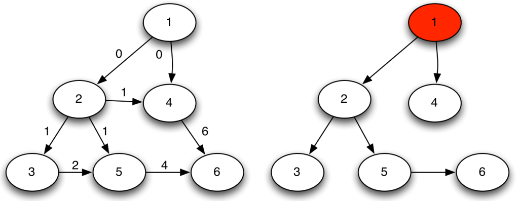
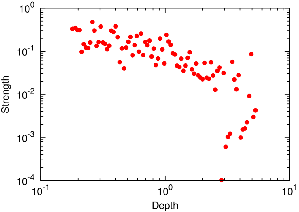
The way we decided to approach the problem was to rely on the dark art spells of Karel, the Linear Algebra Wizard to simulate the process of opinion spreading. In practice, you can think the opinion value of each person to be a certain temperature, as the image above shows. Heat can flow through the connections of the network: if two nodes are at different temperatures they can exchange some heat per unit of time, until they reach an equilibrium. Eventually all nodes converge to the average temperature of the network and no heat can flow any longer.

The amount of time it takes to reach equilibrium is the level of polarization of the network. If we start from more similar opinions and no communities, it takes little to converge because there is no big temperature difference and heat can flow freely. If we have homogeneous communities at very different temperature levels it takes a lot to converge, because only a little heat can flow through the sparse connections between these groups. What I describe is a measure called “generalized Euclidean distance”, something I already wrote about.

Each node is a Twitter user reacting to debates and the election night. Networks on the top row, opinion distributions in the middle, polarization values at the bottom.

There are many measures scientists have used to quantify polarization. Approaches range from calculating homophily — the tendency of people to connect to the individuals who are most similar to them –, to using random walks, to simulating the spread of opinions as if they were infectious diseases. We find that all methods used so far are blind and/or insensitive to at least one of the parts of the definition of ideological polarization. We did… a lot of tests. The details are in the paper and I will skip them here so as not to transform this blog post into a snoozefest.

Once we were happy with a measure of ideological polarization, we could put it to work. The image above shows the levels of polarization on Twitter during the 2020 US presidential election. We can see that during the debates we had pretty high levels of polarization, with extreme opinions and clear communities. Election night was a bit calmer, due to the fact that a lot of users engaged with the factual information put out by the Associated Press about the results as they were coming out.

Each node is a congressman. One network per US Congress in the top row, DW-NOMINATE scores distributions in the middle row, and timeline of polarization levels in the bottom.

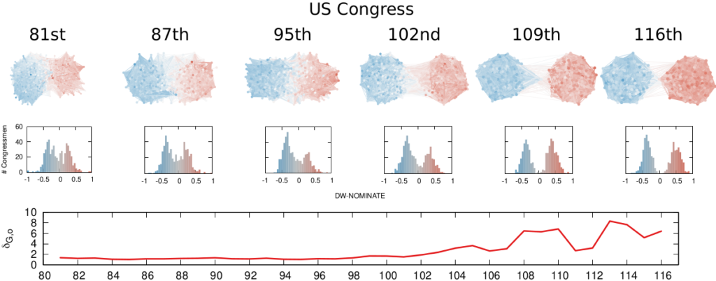
We are not limited to social media: we can apply our method to any scenario in which we can record the opinions of a set of people and their interactions. The image above shows the result for the US House of Representatives. Over time, congresspeople have drifted farther away in ideology and started voting across party lines less and less. The network connects two congresspeople if they co-voted on the same bill a significant number of times. The most polarized House in US history (until the 116th Congress) was the 113th, characterized by a debt-ceiling crisis following the full application of the Affordable Care Act (Obamacare), the 2014 Russo-Ukrainian conflict, strong debates about immigration reforms, and a controversial escalation of US military action in Syria and Iraq against ISIS.

Of course, our approach has its limitations. In general, it is difficult to compare two polarization scores from two systems if the networks are not built in the same way and the opinions are estimated using different measures. For instance, in our work, we cannot say that Twitter is more polarized than the US Congress (even though it has higher scores), because the edges represent different types of relations (interacting on Twitter vs co-voting on a bill) and the measures of opinions are different.

We feel that having this measure is a step in the right direction, because at least it is more accurate than anything we had so far. All the data and code necessary to verify our claims is available. Most importantly, the method to estimate ideological polarization is included. This means you can use it on your own networks to quantify just how fu**ed we are the healthiness of our current political debates.

Continue Reading

29 September 2022 ~ 0 Comments

Meritocracy vs Topocracy

The world isn’t always fair. Perhaps you know the frustration of pouring your heart into making something extraordinary, only to see it almost completely ignored by the crowd. On the other hand, celebrities are constantly talked about, even when they are ostensibly doing very little — if anything at all. Your clever lyrics and innovative musical composition lie in the obscure shadow of a pop idol singing “let’s go party” over the same riff used by dozens of clones. Is it just you, or is there an actual force causing this to happen? This is an interesting question I decided to study together with Clara Vandeweerdt.

The result was a paper titled “Posts on central websites need less originality to be noticed,” recently published on Scientific Reports. The attempt here is to try and disentangle the roles of meritocracy and topocracy. Meritocracy is a regime in which success is determined by merit: the best products win on the market. Topocracy is a term coined by Borondo et al. to signify the situation in which your position in the market determines success. If you are a central hub — a celebrity — what you do is already watched by a lot of people. Getting those eyeballs is arguably the hardest part of succeeding, and if you’re famous you have inherited them from the past. Topocracy explains why, for instance, many fields are crowded with the offspring of a past celebrity — e.g. 8 out of 20 current Formula 1 drivers are sons of professional or amateur drivers (the rest are mostly sons of generic rich people, another form of topocracy).

Image from here.

To study the tension between meritocracy and topocracy, we needed to narrow down the scope to make a scientific experiment possible. We decided to focus on tens of millions Reddit posts. The objective was two-fold. First, we asked what was the role of meritocracy and topocracy in influencing probability of either being noticed by somebody — i.e. attracting at least one upvote on Reddit. Second, we asked the same question about succeeding — i.e. ending up in the top 10% most upvoted posts on Reddit. To do this, we needed to define what “meritocracy” and “topocracy” meant on the platform.

To us “meritocracy” on social media means to produce quality content. Estimating the quality of a Reddit post independently from its upvotes is hard. We decided to focus on originality, under the assumption that original content should catch the audience’s attention. In practice, we measured how surprising the words in the post’s title are. More surprising = more original.

In their paper, Borondo et al. show that, the sparser the network, the more topocracy (blue line) dominates over meritocracy (red line). Of course, real social systems are super sparse 🙂

“Topocracy” on Reddit would involve how central in the network of content-creation a post is. Reddit (fortunately?) does not have an underlying social network, so we had to look at the website used to make the post: is this funny GIF coming from imgur.com or gfycat.com? This is convenient, because websites live on a network of hyperlinks, and this makes us able to estimate their centrality.

The results were interesting. Our first question is about getting noticed. Here we see that, if you are not using a central website to make your content, you need to be original — outsiders need to put that extra effort to see their merits rewarded (faint red line in the image below, left panel). The opposite is true for central players: here originality is actually harmful (dark red line). If you’re central, you need to play it safe.

These results do not hold when it comes to the quest of becoming part of the top scoring posts in Reddit. In this case, originality doesn’t play a role no matter the centrality of your platform (right panel in the image below, all lines are equal and flat, showing no effect no matter the centrality).

Our main result: the effect of originality (x axis) on success (y axis) for different levels of platform centrality (line color). (Left) The probability of getting one upvote; (Right) the probability of being in the top 10% upvoted posts.

There are tons of caveats in our research. It is not a given that originality means quality — especially since we measure originality via linguistic analysis. A title in complete gibberish is highly original, but likely of low quality. Moreover, you need to assume that original content (the thing linked by the Reddit post) comes with an original title (the text the user writes to describe the linked content). Then there is the questionable relationship between the centrality of the website you used versus your own centrality as a potential superstar poster on Reddit — Gallowboob comes to mind. We detail in the paper why we think these concerns are valid, but they do not undermine the interpretation of our results too much.

This is relevant for the broad community studying the success of viral ideas on social media. The accepted wisdom is that the content of a post doesn’t play that much of a role in its success in spreading — other factors like its starting position in the network, its timing, etc. are the only things that matter. I’ve struggled with this notion in the past. With this paper we show a much more complex picture. Maybe the role of the content is underestimated, because it interacts in complex ways with the other studied factors, and it is linked not with success per se, but with the ability to avoid failure — being completely overlooked.

In summary, if you’re a celebrity it’s good and desirable not to put too much effort into making highly original content. Your fan-base is the reason you’ll be successful, and they already liked you for what you did in the past — straying from it might be more damaging than not. On the other hand, if you start from the periphery, you need to put in extra effort to distinguish yourself from everything else out there. The problem is that this striving for originality and high-quality content will not guarantee you success. At most, it will guarantee you’ll not be completely overlooked.

Continue Reading

17 August 2022 ~ 0 Comments

Social Media’s Intolerance Death Spiral

We’ve all been on social media for far too long and it’s changed some of us. We started as starry-eyed enthusiasts: “surely the human race will be able recognize when I explain the One True Right Way of Doing Things” — whatever that might be — “so I’ll be nice to everyone as I’m helping them to reach the Light”. But now, when we read about hollow Earths or the Moon not existing for the 42nd time, we think “ugh, not this moron again”. And that’s the best-case scenario: we’ve seen examples of widespread harassment from people who, in principle, would propose philosophies of love and acceptance. It’s a curious effect, so it’s worthwhile to take a step back and ask ourselves: why does it happen?

This is what Camilla Westermann and I asked ourselves during her thesis project, which turned into the paper “A potential mechanism for low tolerance feedback loops in social media flagging systems,” published a couple of months ago on Plos One. We hypothesized there is a systemic issue: social media is structured in a way that leads people to quickly run out of tolerance. This is not a new idea: many people already pointed out that an indifferent algorithm sees “enragement” and thinks “engagement”, and thus it will actively recommend you the things most likely to make you mad, because anger will keep you on the platform.

Source: https://xkcd.com/386/

While likely true, this is an incomplete explanation. Profiting off radicalization doesn’t sound… nice? Thus it might be bad for business on the long run — if people with pitchforks start knocking at the shiny glass door of your social media behemoth. So, virtually all mainstream platforms have put systems into place to limit the spread of inflammatory content: moderation, flagging, and the like. So why isn’t it working? Why is online discourse apparently becoming worse and worse?

Our proposed answer is that these moderation systems — even if implemented in good faith — are the symptom of a haphazard understanding of the problem. To make our case we created a simple Agent-Based Model. In it, people read content shared by their friends and flag it when it is too far away from their worldview. This is regulated by a tolerance parameter: the higher your tolerance, the more ideological distance a news item requires to trigger your flagging finger.

The proportion of flags (y axis) for a given opinion value (x axis). In this instance of the model, everyone has equally low tolerance (0.1).

This is a model I already talked about in the past and its results were pretty bleak. From the picture above you can see that neutral news sources get flagged the most. This is due to the characteristics of real-world social media — echo chambers, confirmation bias, and the like. In the end, we punish content producers for being moderate.

The thing I didn’t say that time was that the model only shows that pattern for low values in the tolerance parameter. For high tolerance, things are pretty ok. So, if everyone started as a starry-eyed optimist, how did we end up with *gestures in the general direction of Twitter*?

Our explanation is made of a simple ingredient: people think they’re right and want to convince others to behave accordingly because it’s Good — “go to church more!”; “use the correct pronouns!” –, so they do whatever they think will achieve that objective.

We started the model with the two sides having the same tolerance, set at very high levels, because we are incurable optimists. At each time step, one of the two sides will change their tolerance level. They will search for the tolerance level that will push news sources the most to their side — which, mind you, can also be a higher tolerance level, not necessarily a lower one.

Same interpretation as the previous figure, but here the left side is less tolerant, so the right side gets flagged more. Tolerance is still quite high on both sides (0.8 vs 0.9).

The image above shows that, in the beginning, lowering tolerance is a winnning strategy. The news sources on the more tolerant side get flagged more by the people from the other, less tolerant, side. Since they don’t like being flagged, they are incentivized to find whatever opinion that will minimize the number of flags received — see this other previous work. This happens to pull them to the intolerant side. The problem is that, in our model, no one wants to be a sucker. “If they are attracting people to their side by being intolerant, why can’t I?” is the subconscious mantra we see happening. An intolerance death spiral kicks in, where both sides progressively push the other to even lower tolerance levels, because… it just works.

This happens until the system stabilizes to a relatively low — but non-zero — level of tolerance. Below a certain level, intolerance is so high it doesn’t attract any more. Too low tolerance only repulses, because people would flag you anyway, so what would be the point of moving closer to the intolerant side?

The line shows the tolerance level of two sides (y axis), red and blue, as it evolves when the model runs (x axis).

Of course, this is only the result of a simulation, so it should be taken with the usual boatload of grains of salt. The real world is a much more complex place, with many different dynamics, and humans aren’t blind optimizers of functions[citation needed]. However, it is a simulation using more realistic starting conditions than what social media flagging systems assume, and the low tolerance value for the parameter happens to be extremely close to our best guess estimation of what it is consistent with observed data. So ours might be a guess, but at least it’s decently educated.

What can we take from this research? If you own a social media platform, the advice would be not to implement poorly-thought-out flagging moderation systems: create models with more realistic assumptions (like ours) and use them to guide your solutions. Otherwise, you might be making the problem worse.

And if you’re a regular user? Well, maybe sometimes, being nice is better than making your side win. I’m looking forward to read on Twitter what some people think about this philosophy. I’m sure it will go great.

Continue Reading

28 January 2022 ~ 0 Comments

Avoiding Conflicts on Social Media Might Make Things Worse

Look, I get it. Sometimes you really don’t want to get mired in a Facebook discussion with that uncle of yours who thinks that the moon doesn’t exist. It’s easier to block, unfriend, ignore, rather than engage. However, have you considered that avoiding conflicts might make things worse? This is a question Luca Rossi and I asked ourselves as a part of our research on polarization on social media. Part of the answer comes from an Agent Based Model (ABM) we have recently published on Plos One in the paper “How Minimizing Conflicts Could Lead to Polarization on Social Media: an Agent-Based Model Investigation.”

You sit on a throne of lies.

Specifically, we were interested in looking at how news sources react when they get attacked on social media with backlash and flagging. This is a followup to our previous paper, where we found — surprisingly — that this backlash and flagging is mostly directed at neutral and factual news sources. The reason why these sources are magnets for controversies is because their stories are widely read, and thus attract the ire of all sorts of quacks. Quackery, instead, is only read by quacks agreeing with it, and thus they don’t quack at it so much.

So now the question is: what does this negative attention from quacks do to a neutral news source? To answer the question we updated our ABM. In the original version, each news source and user had a fixed political position — a numerical value between -1 (extreme left) and +1 (extreme right), with 0 as perfect neutrality. In the new version, their position can change. People get attracted by similar points of view and repulsed by opinions that are too far from their position. For instance, a +1 user might get attracted if they read a +0.9 news item (moving to, say, a +0.95 position), but will be repulsed again if they read a -0.5 item next (moving back to, say, a +0.98 position).

Our starting assumption is that users and sources are mostly neutral. Here you can see the initial distributions of how many agents (y axis) have a given opinion (x axis). News sources in red and users in blue.

If a user is repulsed, they will also flag the news source. A news source doesn’t want to be flagged. A flag is a bad omen: too many flags and the news source might get banned by the social media platform, or be subject to big scary fact-checking banners. They might even — gasp! — make Mark Zuckerberg leak a tear. Social media are too important for news sources to let this happen. So they will try to avoid conflict. Since they know flags come from people with a different opinion from their own, the only thing they can do is to change their stance. The safest bet is to average the opinions of all their readers. Taking the average of their neighbors in most cases would lead to settle in the middle of the polarity spectrum, but this is not guaranteed.

One example of the strategy social media have tried to use to combat misinformation online.

Four factors together create the rules of the game: how much users feel the need to share new articles on social media; how tolerant they are with diverse viewpoints; how much news sources will try to resist the pressure to change their spin; and how quickly users change their own opinion following what they read. Having an ABM allows you to run a lot of simulations and see what the effect of each of this aspect is on the final system.

We find that:

  • The more people share, the more news sources will be pushed away from neutrality and become partisan;
  • The less tolerant users are, the more they will increase polarization;
  • The resistance a news organization puts up against such a pressure is irrelevant to the final state of the system;
  • If users change their opinions easily, they will be attracted to the extreme ends of the polarity spectrum.
The difference between low tolerance (left) and high tolerance (right) in the opinion distributions of the users after the model has run for a while. Notice the extremist peaks in the left distribution.

Some of this is unsurprising — intolerance breeds polarization –, while other things might be worth looking at a second time. For instance, we think polarization is a bigger deal nowadays exactly because social media helps sharing in a way newspapers, radio, and television do not. Our results say that this oversharing exacerbates polarization. But a nagging question remains: is our ABM just a theoretical toy, or can it reproduce reality?

We think the latter is true, because we tested it against a real world Twitter network. We have a network topology of who talks with whom, and a polarity score for each user based on the news sources they cite in their tweets. The parameter combination that best reproduces real world data is this: high sharing, high opinion volatility, and low tolerance. Which in our model is the exact recipe for escalating conflict. And all of this just because news sources eschew conflict and don’t want to be flagged. Ouch.

This is what happens to the polarity distribution of the users when we try to fit our ABM model on real data from Twitter. Double ouch.

The same grains of salt that you should take our previous paper with also apply here. The model is based on assumptions, and thus it is only as good as those assumptions. Moreover, reality is more complicated than our ABM. For instance, we assume tolerance is uncorrelated with one own political opinion. But what if some political opinions tend to go together with being less tolerant of other points of view? And what if users don’t genuinely flag what they think is outrageous, but make a more strategic use of the flag button to advance their own agenda? These are questions we will explore in further developments of our work.

Continue Reading

15 April 2021 ~ 0 Comments

A Bayesian Framework for Online Social Network Sampling

Analyzing an online social network is hard because there’s no “download” button to get the data. In the best case scenario, you have to query an API (Application Program Interface) system. You have to tell the API which user you want to see the connections of, and you can’t just ask for all users at the same time. With the current API rate limits, downloading the Twitter graph would take seven centuries, as the picture below explains.

The gray circle represents the totality of Twitter’s users. The red one is what you’d get with a continuous crawl of one year.

I don’t know about you, but I don’t have seven centuries to publish my papers. I want to become a famous scientist now. If you’re like me, you’re forced to extract only a sample. In this post, I’ll describe a network sampling algorithm that works with social media APIs to maximize the amount of information you get from your sample. The method has been published in the paper “Noise Corrected Sampling of Online Social Networks“, which recently appeared in the journal Transactions on Knowledge Discovery from Data.

My Noise Corrected sampling (NC) is a topological method. This means that you start from one (or more) user IDs that are known, and then you gather new user IDs from their friends, then you move on to the friends’ friends and so on, following the connections in the graph you’re sampling. This is the usual approach, because there is no way to know the user IDs beforehand — unless you have inside knowledge about how the social media platform works.

The underlying common question behind a topological sampler is: how do we pick the best user to explore next? Different samplers answer this question differently. A Random Walk sampler says: “Screw it! Thinking is too hard! I’m gonna get a random node from the friends of the currently explored node! Then, with the time I saved, I’m gonna get some ice cream.” The Metropolis-Hastings Random Walk — the nerd’s answer to the jock’s Random Walk — wants to preserve the degree distribution, so it penalizes high-degree nodes — since they’re more likely to be oversampled. Alternatively, we could use classical graph exploration techniques such as Depth-First and Breadth-First Search — and, again, you can enhance them so that you can preserve some properties of the network, for instance its clustering coefficient.

A random walk on a graph. It looks like a drunk going around. I don’t drink and sample, and neither should you.

My NC departs from all these approaches in a fundamental way. The thing they all have in common is that they don’t use information from the sample they have currently gathered. They only look at the potential next users and make a decision on whom to explore based on their characteristics alone. For instance Metropolis-Hastings Random Walk checks the user’s popularity in number of connections. NC, instead, looks at the entire collected sample and asks a straightforward question: “which of these next users is most likely to give me the most information about the whole structure, given what I explored so far?”

It does so with a Bayesian framework. The gory math is in the paper, but the underlying philosophy is that you can calculate a z-score for each edge of the network. It tells you how surprising it is that this edge is there. In probability theory, “surprise” is a good thing: it is directly related to how much information something gives you. Probability theorists are a bunch of jolly folks, always happy to discover jacks-in-a-box. If you always pick the most surprising edge in the network to explore the next user, you’re maximizing the amount of information you’re going to get back. The picture below unravels what this entails on a simple example.

In this example, the green nodes are explored, the blue nodes are known — because they’re friends of an explored node — but not explored yet. The red nodes are unknown.

The first figure (a) is the start of the process, where we have a network and we pick a random starting point, node 7. I use the edge thickness to show its z-score: we always follow the widest edge. Initially, you only pick a random edge, because all edges have the same z-score in a star. However, once I pick node 3, all z-scores change as we discover new edges (b). In this case, first we prioritize the star around node 7 (c), then we start following the path from node 3 until node 9 (d-e), then we explore the star around node 9 until there are no more nodes nor edges to discover in this toy network (f). Note how edges exhaust their surprise as you learn more about the neighborhoods of the nodes they connect.

Our toy example is an unweighted network, where all edges have the same weight, but this method thrives if you have information about how strong a connection is. The edge weight is additional information that can be taken into account to measure its surprise value. Under the hood, NC estimates the expected weight of an edge given the average edge weights of the two nodes it connects. In an unweighted network this is equivalent to the degree, because all edges have the same weight. But in a weighted network you actually have meaningful differences between nodes that tend to have strong/weak connections.

So, the million dollar question: how does NC fare when tested against the alternatives I presented before? The first worry you might have is that it takes too much time to calculate the z-scores. After all, to do so you need to look at the entire sampled network so far, while the other methods only look at a local neighborhood. NC is indeed slower than them—it has to be. But it doesn’t matter. The figure above shows how much time it takes to calculate the z-scores for more and more edges. Those runtimes (less than a tenth of a second) are puny when compared to the multi-second wait times due to the APIs’ rate limits — or even to simple network latency. After all, NC is a simplification of the Noise-Corrected Backbone algorithm I developed with Frank Neffke, and we showed in the original paper that it was pretty darn fast.

What about the quality of the samples? This is a question with a million answers, because it depends on what you want to do with the sample, besides what are the characteristics of the original graph and of the API system you’re wrestling against, and how much time you have to gather your sample. For instance, in the figure below we see that NC is the best method when you want to estimate the assortativity value of a disassortative attribute (think gender in a dating network), but it is a boring middle-of-the-pack method when you want to reconstruct the original communities of a network.

Left: the Mean Absolute Error between the sample’s and the original graph’s assortativity values (lower is better). Right: the Normalized Mutual Information between the sample’s and the original graph’s communities (higher is better). NC in red.

NC ranks between the 3rd and 4th position on average across a wide range of applications, network topologies, API systems, and budget levels. This is good because I test eight alternatives, thus the expectation is that NC will practically always be better than average. Among all eight methods tested, in fact, no other method has a better rank average. The second best method is Depth-First Search, which ranks 4th three out of four times, against NC’s one out of two.

I have shared some code allowing to replicate my results. If you speak Python better than you speak academiquese, you could use that code to infer how to implement an NC sampling strategy next time you need to download Twitter.

Continue Reading

10 June 2020 ~ 0 Comments

News on Social Media: It’s not Real if I don’t Like it

The spread of misinformation — or “fake news” — is an existential threat for online social media like Facebook and Twitter. Since fake news has the power to influence elections, it has attracted legislative attention. And online social media don’t like legislative attention: Zuck wants to continue doing whatever he is doing. Thus, they need to somehow police content on their platforms before somebody else polices it for them. Unfortunately, the way they chose to do so actually backfires, as I show in “Distortions of Political Bias in Crowdsourced Misinformation Flagging“, a paper I just published with Luca Rossi in the Journal of the Royal Society Interface.

The way fact checking (doesn’t) work on online social media at the moment could be summarized as “semi-supervised crowdsourced flagging”. When a news item is shared on the platform, the system allows the readers to flag it for removal. The idea is that the users know when an item is a case of fake reporting, and will flag it when it is. Flags are then fed to a machine learning algorithm. The task of this algorithm is to filter out noise. Since there are millions of users on Facebook, practically every URL shared on the platform will be flagged at least once. After the algorithm pass, a minority of flagged content will be handed to experts, who will fact-check it*.

Sounds great, right? What could possibly go wrong? That’s what I defiantly asked Luca when he prodded me to look at the data of what was being passed to the expert fact checkers. As Buzzfeed would say, the next thing I saw shocked me. He showed me the top ten websites receiving the highest number of expert fact-checks in Italy — meaning that they received so many flags that they passed the algorithmic test. All major national Italian newspapers were there: Repubblica, Corriere, Sole 24 Ore. These ain’t your Infowars or your Breitbarts. They have clear leanings, but they are not extremist and they usually report genuinely, albeit selectively and with a spin. The fact-checkers did their job and duly found them not guilty.

So what gives? Why are most flags attached to mostly mild leaning, genuine reporting? Luca and I developed a model trying to explain this phenomenon. Our starting point was re-examining how the current system works: users see news, flag the ones that don’t pass the smell test, and those get checked. It’s the smell test that doesn’t pass the smell test. There are a few things impairing our noses: confirmation bias and social homophily.

Image from https://fs.blog/2017/05/confirmation-bias/

Confirmation bias means that a user will give an easier pass to a piece of news if the user and the news share the same ideological bias. Strongly red users will be more lenient with red fake news but might flag a more truthful blue news item, and vice versa. Social homophily means that people tend to be friends with people with a similar ideological leaning. Red people have red friends, blue people have blue friends. It’s homophily that gives birth to filter bubbles and echo chambers.

So how do these two things cause flags to go to popular neutral sources? The idea is that extremism is rare — otherwise it wouldn’t be extreme. Thus, most news organizations and users are neutral. Moreover, neutral news items will reach every part of the social network. They are produced by the most popular organizations and, on average, any neutral user reading them has a certain likelihood to reshare them to their friends, which may include more extreme users. On the other hand, extreme content is rare and is limited to its echo chambers.

Image from “MIS2: Misinformation and Misbehavior Mining on the Web”

This means that neutral content can reach the red and blue bubbles, but that extreme red and blue content will not get out of those same bubbles. An extreme red/blue factional person will flag the neutral content: it is too far from their worldview. But they will never flag the content of opposite color, because they will never see it. The fraction of neutral users seeing and flagging the extreme content is far too low to compensate.

Luca and I built two models. The first has the right ingredients: it takes into account homophily and confirmation bias and it is able to exactly reproduce the flagging patterns we see in real world data. The model confirms that it is the most neutral and most truthful news items that get flagged the most (see image below, to the left). The second model, instead, ignores these elements, just like the current flagging systems. This second model tells us that, if we lived in a perfect world where people objectively evaluate truthfulness without considering their own biased worldview, then only the most fake content would be flagged (see image below, to the right). Sadly, we don’t live in such a world, as the model cannot reproduce the patterns we observe. Sorry, the kumbaya choir practice is to be rescheduled to an unspecified date (also, with COVID still around, it wasn’t a great idea to begin with).

From our paper: the number of flags (y axis) per value of news “truthfulness” (x axis) in the model accounting for factionalism (left) and not accounting for factionalism (right). Most flags go to highly truthful news when accounting for factionalism.

Where to go from here is open to different interpretations. One option is to try and engineer a better flagging mechanism that can take this factionalism into account. Another option would be to give up altogether: if it’s true that the real extreme fake content doesn’t get out of the echo chamber, why bother policing it? The people consuming it wouldn’t believe you anyway. Luca and I will continue exploring the consequences of the current flagging mechanisms. Our model isn’t perfect and requires further tuning. So stay tuned for more research!


* Note that users can flag items for multiple reasons (violence, pornography, etc). This sort of outsourcing is done only for fact-checking, as far as I know.

Continue Reading

11 December 2018 ~ 0 Comments

How to Sample Networks Using Social Media APIs

If you were a social network analyst in the 1920s, 90% of your work would be to go around bugging people so that they could tell you whom they were friends with — we were, and still are, no fun at parties. Today, instead, we live in the land of plenty: 400 million new Instagram stories per day, 330 million monthly active users on Twitter, a gazillion Facebook profiles! What is there not to love? Well, to start, the fact that you do not have a download button, for very good and real reasons. That means that now 90% of your work is trying to figure out how to interface with these online media to sample the best possible representation of their social networks. So today I’m talking about how to sample a network via a social media API.

Let’s define our terms here. “Sampling a network” means to extract a part of it whose characteristics are as similar as possible to the entire structure. “API” is short for “Application Programming Interface.” It is the program in the server which interacts with the one you wrote to collect data. If you want to know the connections of user X, you ask the API and it will tell you. Most of the time. After a bit of nagging.

A good sample would look like the original network. A good sample like they wanted :’)

There are many approaches to sample networks, and many people have studied them to understand which one works best. But none of these studies actually made an experiment simulating their relationship with the actual API systems they have to work on. The comparisons made so far assume you can know all the connections of a user in one go, and that you can move to the other users as soon as you’re done exploring the current one. Sadly, the real world doesn’t remotely work that way. Thus we need to know how different API systems will influence different sampling methods. With Luca Rossi I wrote a paper about that, “Benchmarking API Costs of Network Sampling Strategies“, which I’ll present this month at the International Conference on Big Data.

An API system will put itself in the way of your noble sampling quest in three ways: (i) by returning only a maximum of n connections per request (i.e. by paginating the results), (ii) by making you wait a certain amount of time between requests, and (iii) by taking some time to respond (i.e. by having latency). The reason why considering the API hurdles is important is that they have a non-trivial relationship with your sampling method.

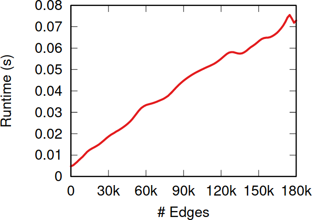
To illustrate my point consider two API systems. The first system, A1, gives you 100 connections per request, but imposes you to wait two seconds between requests. The second system, A2, gives you only 10 connections per request, but allows you a request per second. A2 is a better system to get all users with fewer than 10 connections — because you are done with only one request and you get one user per second –, and A1 is a better system in all other cases — because you make far fewer requests, for instance only one for a node with 50 connections, while in A2 you’d need five requests.

It seems trivial that A1 is a better system than A2, because it gives you 50 connections per second instead of 10 (we’re ignoring latency here). However, that’s not necessarily the case. Real world networks are far from equal: there are a few superstars with millions of followers, while your average user only has a handful (but I’m catching up with you, Katy!). This means that there are way way way way way way way way more users with 10 or fewer connections than there are with more than 10. In the case represented by the figure, sampling the full network via A2 will actually take half as much time as via A1, even if theoretically we thought we were going to be five times slower.

How many users (y-axis) have this many connections (x-axis). The blue area is where A2 works best — one user per second — while the purple area is where A1 works best. But there are 492.5k users in the blue area (the Michele Coscias), and only 7.5k in the purple (the Katy Perrys)!

With Luca, I created a benchmarking system — which you can freely use — that allows you to simulate network sampling by letting you define:

So now we get to the point of the post where I tell you which sampling method is the very best and you should always use it and it will solve world peace and stuff. And that method is…

…none of them. Unfortunately we realized that, in the world of network sampling, there is no free lunch. The space of possible characteristics of interest, API systems, networks on which you work, and budget constraints is so vast that each sampling method is the best — or worst — in some combinations of these factors. We ran a bazillion tests, but none of them summarizes the results better than these two plots.

On the left you see how badly we get the degree distribution wrong (y-axis, lower is better) at different budget levels (x-axis, from left to right we increase the amount of time we spend sampling the network). If we don’t have much time, the best methods are a variant of Random Walks (MHRW) or Snowball sampling, while the worst method is DFS. But surprise surprise, if we have tons of time, DFS is the best method, and MHRW and Snowball are the worst. By a long margin. No free lunch. On the right we have another instance of the same problem: here we want to know how well we identify central nodes in the network (y-axis, higher is better). The difference at increasing budget levels is ridiculous: the rankings you get when you have a lot of time to sample are practically the opposite of the one you get when you’re in a hurry!

This means that you really need to be careful when you extract networks from social media. You cannot barge in and grab whatever you can, however you can. You need to know which characteristics of the network are important to you. You need to know what the underlying network might look like. You need to know how much time you have to sample the network, compared to its size. You need to know how their APIs work. Otherwise you’re going to run in circles in a very very mad world. And you thought that they had it worse in the 1920s.

Continue Reading

10 October 2013 ~ 0 Comments

The Paradox of Social Controllability

“It’s a bit sad that some among the most brilliant minds of our generation are working tirelessly on strategies to increase clicks on online ads” popped up on my Facebook stream some days ago (I don’t remember who wrote it, so you are welcome to contact me to restore credit where credit is due 🙂 ). But the point still remains. I actually don’t find it that bad. Yes, it’s bad, but it could be worse. It reminds me of other “wrong” reasons to do incredible improvements in science and stuff. For example, war is responsible for many technology advancements. Even if the aim of online marketing is just to increase revenues, what it actually requires is to understand human psychology, behavior and social interactions. In practice, that’s philosophy of the human mind at its best: how does the brain work? How does a collection of brains work? What drives our behavior and needs?

When you put together many minds in the real world, you have to deal with complex networks. We are not connected with one another at random, and the eyes of our friends are the channel through which we observe the world. This fact is studied in complex network analysis, in the sub-branch of cascade behaviors. Cascade behaviors happen when a person in a social network decides to modify her behavior according to the behavior of the people she is connected to. As a consequence, there are some people in the network who are in a very particular position: given the people they know and their prominence among them, they can modify their behavior and they will modify their friends’ behavior and so on an so forth, changing forever how every node in the network behaves. And that’s the cascade. If you find a way to identify these prominent actors in the network, you can control the behavior of the entire system. Now you can see why there is a mountain of work about it. In the computer science approach, we have threshold models simulating the cascade for many starting nodes and thus identify the practical leaders (for example Jon Kleinberg’s work); in physics we have models, aiming at understanding the degree of controllability of complex systems (I’ll go with Laszlo Barabasi in this).


Visualization of network cascade, from my good friend Mauro Martino. The red dots at the bottom are the “drivers”, who influence the collection of green nodes they are attached to.

Genuinely curious about the topic, I started my own track of research on it. One thing that Diego Pennacchioli, Giulio Rossetti, Luca Pappalardo, Dino Pedreschi, Fosca Giannotti and me found curious is that everybody working on social prominence was looking at it from a monodimensional perspective. That means: the only thing they are interested in is how to maximize the number of nodes influenced by the leaders. The bigger this number, the better. All fun and games, but why? I can think about several scenarios where the final total number is not the most important thing. For example:

  • What if I want people to buy a product? The total number of people knowing about the product is nice, but I want them to be strongly committed, strongly enough to buy it.
  • What if I am actually looking to reach a particular person? Then I care how deeply my message can go through the network.
  • What if I just care about my friends? Then screw their friends (and everybody else), as long as I can influence a wide range of my direct connections!

toy
To calculate our measure we need to infer the diffusion trees. So from the left, where the number on each arrow gives you the action time of the node at the base of the arrow, we go to the right by selecting the lowest possible combination of arrows.

Strength, depth and width of social prominence. That’s why our paper is called “The Three Dimensions of Social Prominence” (check it out). Strength is how committed the people you influenced are to keep doing what you influenced them to do. Depth is how many degrees of separation (or, how far) the cascade of influence that you triggered can go. Width is simply the ratio of your friends that you are able to influence. By analyzing how much a user in Last.fm (a social website based on music) is able to influence her friends in listening to new artists, we found a collection of very interesting facts.

For example, it is well known that in social networks there are some nodes that are structurally very important. They are the central users, the ones that keep the network connected. Intuitively, they are the only way, or the easiest way, through which a signal (in our case social influence) can go from one part of the network to the other. Guess what: they can’t do it. We found a significant anti-correlation between centrality and width and depth. That is bad news, because those nodes are the ones in the only position with a theoretical ability of controlling the network and a practical inability in doing so. I like to call it “The Paradox of Social Controllability” (hence, the post title).

ds
The anti-correlation between depth and strength.

Another piece of food for thought is the trade off between strength and depth. While width is unrelated to both, we found that if you want to go deeply into the network, then you can’t expect that the people you touch will be extremely committed to your message.

The third big thing is the distribution of connections per leader. We found that the leaders showing highest values of strength, depth and width were those who used Last.fm with average frequency. The highly connected and very active users (hubs, in network lingo) scored poorly, as we saw. So did the occasional users, the ones with just two or three connections (that is the majority of the system). The people who have control over the network are the mildly engaged. They are you, in practice: chances are that you are not a record label, nor a music fanatic, but just a person with her tastes and preferences. So you have control. Problem is, the control is scattered equally on the vast set of people like you.

To conclude, we saw what wonderful things network cascades are: they could empower us to do a lot of good. We also saw how there are theoretical results about the possibility of identifying people who can trigger them. But my unfortunate conclusion is about the paradox between theory and practice. Those who theoretically should, apparently can’t.

Continue Reading

15 July 2013 ~ 0 Comments

ICWSM 2013 Report

The second half of the year, for me, is conference time. This year is no exception and, after enjoying NetSci in June, this month I went to ICWSM: International Conference on Weblogs and Social Media. Those who think little of me (not many, just because nobody knows me) would say that I went there just because it was organized close to home. It’s the first conference for which I travel not via plane, but via bike (and lovin’ it). But those people are just haters: I was there because I had a glorious paper, the one about internet memes I wrote about a couple of months ago.

In any case, let’s try to not be so self-centered now (good joke to read in a personal website, with my name in the URL, talking about my work). The first awesome thing coming to my mind are the two very good keynotes. The first one, by David Lazer, was about bridging the gap between social scientists and computer scientists, which is one of the aims of the conference itself. Actually, I have been overwhelmed by the amount of the good work presented by David, not being able to properly digest the message. I was struck with awe by the ability of his team to get great insights from any source of data about politics and society (one among the great works was about who and how people contact other people after a shock, like the recent Boston bombings).

For the second keynote, the names speak for themselves: Fernanda Viégas and Martin Wattenberg. They are the creators of ManyEyes, an awesome website where you can upload your data, in almost any form, and visualize it with many easy-to-use tools. They constantly do a great job in infographics, data visualization and scientific design. They had a very easy time pleasing the audience with examples of their works: from the older visualizations of Wikipedia activities to the more recent wind maps that I am including below because they are just mesmerizing (they are also on the cover of an awesome book about data visualization by Isabel Meirelles). Talks like this are the best way to convince you of the importance of a good communication in every aspect of your work, whether it is scientific or not.

As you know, I was there to present my work about internet memes, trying to prove that they indeed are proper memes and they are characterized by competition, collaboration, high-order organization and, maybe I’ll be able to prove in the future, mutation and evolution. I knew I was not alone in this and I had the pleasure to meet Christian Bauckhage, who shares with me an interest in the subject and a scientific approach to it. His presentation was a follow-up to his 2011 paper and provides even more insights about how we can model the life-span of an internet meme. Too bad we are up against a very influential person, who recently stated his skepticism about internet memes. Or maybe he didn’t, as the second half of his talk seems to contradict part of the first, and his message goes a bit deeper:

Other great works from the first day include a great insight about how families relate to each other on Facebook, from Adamic’s group. Alice Marwick also treated us to a sociological dive into the world of fashion bloggers, in the search of the value and the meaning of authenticity in this community. But I have to say that my personal award for the best presentation of the conference goes to “The Secret Life of Online Moms” by Sarita Yardi Schoenebeck. It is a hilarious exploration of YouBeMom, a discussion platform where moms can discuss with each other preserving their complete anonymity. It is basically a 4chan for moms. For those who know 4chan, I mean that literally. For those who don’t, you can do on of two things to understand it: taking a look or just watching this extract from 30 Rock, that is even too vanilla in representing the reality:

I also really liked the statistical study about emoticon usage in Twitter across different cultures, by Meeyoung Cha‘s team. Apparently, horizontal emoticons with a mouth, like “:)”, are very Western, while vertical emoticons without a mouth are very Eastern (like “.\/.”, one of my personal favorites, seen in a South Korean movie). Is it possible that this is a cultural trait due to different face recognition routines of Western and Eastern people? Sadly, the Western emoticon variation that includes a nose “:-)”, and that I particularly like to use, apparently is correlated with age. I’m an old person thrown in a world where young people are so impatient that they can’t lose time pressing a single key to give a nose to their emoticons :(

My other personal honorable mention goes to Morstatter et al.’s work. These guys had the privilege to access the Twitter Firehouse APIs, granting them the possibility of analyzing the entire Twitter stream. After that, they crawled Twitter using also the free public APIs, which give access to 1% of all Twitter streams. They shown that the sampling of this 1% is not random, is not representative, is not anything. Therefore, all studies that involve data gathering through the public APIs have to focus on phenomena that include less than 1% of the tweets (because in that case even the public APIs return all results), otherwise the results are doomed to be greatly biased.

Workshops and tutorials, held after the conference, were very interesting too. Particularly one, I have to say: Multiple Network Models. Sounds familiar? That would be because it is the tutorial version of the satellite I did with Matteo Magnani. Luca Rossi and others at NetSci. Uooops! This time I am not to blame, I swear! Matteo and Luca organized the thing all by themselves and they did a great job in explaining details about how to deal with these monstrous multiple networks, just like I did in an older post here.

I think this sums up pretty much my best-of-the-best picks from a very interesting conference. Looking forward to trying to be there also next year!

Continue Reading

20 May 2013 ~ 3 Comments

Memetics, or: How I can spend my entire day on Reddit claiming that I’m working

In his 1976 book “The Selfish Gene“, Richard Dawkins proposed a shift in the way we look at evolution: instead of considering the organisms as the center of evolution, Dawkins proposed (providing tons of evidence) to consider single genes as the fundamental evolution unit. I am not a biologist nor interested in genetics, so this idea should not concern me. However, Dawkins added one chapter to his book. He felt that it could be possible that culture, too, is made out of self-replicating units, just like genes, that can compete and/or collaborate with each other in forming “cultural organisms”. He decided to call these units “memes”.

The idea of memes was mostly in the realm of intellectual and serious researchers (not like me); you can check out some pretty serious books like “Metamagical Themas” by Hofstadter or “Thought Contagion: How Belief Spreads Through Society” by Lynch. But then something terrible was brought to the world. Then, the World Wide Web happened, bringing with itself a nexus of inside jokes, large communities, mind hives, social media, 2.0s, God knows what. Oh and cats. Have one, please:

With the WWW, studying memes became easier, because on the Internet every piece of information has to be stored somehow somewhere. This is not something I discovered by myself, there are plenty of smart guys out there doing marvelous research. I’ll give just three examples out of possibly tens or hundreds:

  • Studies about memes competing for the attention of people in a social network like “Clash of the contagions: Cooperation and competition in information diffusion” or “Competition among memes in a world with limited attention” ;
  • Studies about the adoption of conventions and behaviors by people, like “The emergence of conventions in online social networks”or “Cooperative behavior cascades in human social networks”;
  • Studies about how information diffuses in networks, like “Virality and susceptibility in information diffusions” or “Mining the temporal dimension of the information propagation” which, absolutely incidentally, is a paper of mine.

There is one thing that I find to be mostly missing in the current state of the research on memes. Many, if not all, of the above mentioned works are focused in understanding how memes spread from one person to another and they ask what the dynamics are, given that human minds are connected through a social network. In other words, what we have been studying is mostly the network of connections, regardless of what kinds of messages are passing through it. Now, most of the time these “messages” are about penguins that don’t know how to talk to girls:

and in that case I give you that you can fairly ignore it. But my reasoning is that if we want to really understand memes and memetics, we can’t put all of our effort in just analyzing the networks they live in. It is like trying to understand genes and animals and analyzing only the environment they inhabit. If you want to know how to behave in front of a “tiger” without ever having met one, it is possibly useful to understand something about the forest it is dwelling in, but I strongly advise you to also take a look at its claws, teeth and how fast it can run or climb.

That is exactly what I study in a paper that I got accepted at the ICWSM conference, titled “Competition and Success in the Meme Pool: a Case Study on Quickmeme.com” (click to download). What I did was fairly simple: I downloaded a bunch of memes from Quickmeme.com and I studied the patterns of their appearances and upvotes across a year worth of data. Using some boring data analysis techniques borrowed from ecology, I was able to understand which memes compete (or collaborate) with which other ones, what are the characteristics of memes that make them more likely to survive and whether there are hints as the existence of “meme organisms” (there are. One of my favorites is the small nerd-humor cluster:

).

One of the nicest products of my paper was a simple visualization to help us understand the effect of some of the characteristics of memes that are associated with successful memes. As characteristics I took the number of memes in competition and in collaboration with the meme, whether the meme is part of a coherent group of memes (an “organism”) and if the meme had a very large popularity peak or not. The result, in the picture below (click to enlarge), tells us an interesting story. In the picture, the odds of success are connected by arrows that represent the filters I used to group the memes, based on their characteristics.

This picture is saying: in general, memes have a 35.47% probability of being successful (given the definition of “successful” I gave in the paper). If a meme has a popularity peak that is larger than the average, then its probability of success decreases. This means that, my dear meme*, if you want to survive you have to keep a low profile. And, if you really can’t keep a low profile, then don’t make too many enemies (or your odds will go down to 6.25%). On the other hand, if you kept a low profile, then make as many enemies as you can, but only if you can count on many friends too, especially if you can be in a tightly connected meme organism (80.3%!). This is an exciting result that seems to suggest that memes are indeed collaborating together in complex cultural organisms because that’s how they can survive.

What I did was just scratching the surface of meme-centered studies, as opposed to the network-centered meme studies. I am planning to study more deeply the causal effect between a meme and its fitness to survive in the World Wild Web and to understand the mechanics of how memes evolve and mutate. Oh, and if you feel like, I am also releasing the data that I collected for my study. It is in the “Quickmeme” entry under the Datasets tab (link for the lazies).


* I deeply apologize to Dawkins, any readers (luckily they are few) and to the scientific community as a whole, for my personification of memes. I know that memes have not a mind, therefore they can’t “decide” to do anything, but it really makes it so much easier to write!

Continue Reading