Michele Coscia - Connecting Humanities

Michele Coscia I am an associate prof at IT University of Copenhagen. I mainly work on algorithms for the analysis of complex networks, and on applying the extracted knowledge to a variety of problems. My background is in Digital Humanities, i.e. the connection between the unstructured knowledge and the coldness of computer science. I have a PhD in Computer Science, obtained in June 2012 at the University of Pisa. In the past, I visited Barabasi's CCNR at Northeastern University, and worked for 6 years at CID, Harvard University.

05 March 2024 ~ 0 Comments

My Winter in Cultural Data Analytics

Cultural analytics means using data analysis techniques to understand culture — now or in the past. The aim is to include as many sources as possible: not just text, but also pictures, music, sculptures, performance arts, and everything that makes a culture. This winter I was fairly involved with the cultural analytics group CUDAN in Tallinn, and I wanted to share my experiences.

CUDAN organized the 2023 Cultural Data Analytics Conference, which took place in December 13th to 16th. The event was a fantastic showcase of the diversity and the thriving community that is doing work in the field. Differently than other posts I made about my conference experiences, you don’t have to take my word for its awesomeness, because all the talks were recorded and are available on YouTube. You can find them at the conference page I linked above.

My highlights of the conference were:

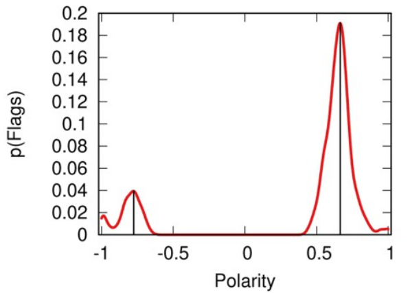
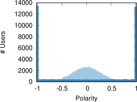
  • Alberto Acerbi & Joe Stubbersfield’s telephone game with an LLM. Humans have well-known biases when internalizing stories. In a telephone game, you ask humans to sum up stories, and they will preferably remember some things but not others — for instance, they’re more likely to remember parts of the story that conform to their gender biases. Does ChatGPT do the same? It turns out that it does! (Check out the paper)
  • Olena Mykhailenko’s report on evolving values and political orientations of rural Canadians. Besides being an awesome example of how qualitative analysis can and does fit in cultural analytics, it was also an occasion to be exposed to a worldview that is extremely distant from the one most of the people in the audience are used to. It was a universe-expanding experience at multiple levels!
  • Vejune Zemaityte et al.’s work on the Soviet newsreel production industry. I hardly need to add anything to that (how cool is it to work on Soviet newsreels? Maybe it’s my cinephile soul speaking), but the data itself is fascinating: extremely rich and spanning practically a century, with discernible eras and temporal patterns.
  • Mauro Martino’s AI art exhibit. Mauro is an old friend of mine, and he’s always doing super cool stuff. In this case, he created a movie with Stable Diffusion, recreating the feel of living in Milan without actually using any image from Milan. The movie is being shown in various airports around the world.
  • Chico Camargo & Isabel Sebire made a fantastic analysis of narrative tropes analyzing the network of concepts extracted from TV Tropes (warning: don’t click the link if you want to get anything done today).

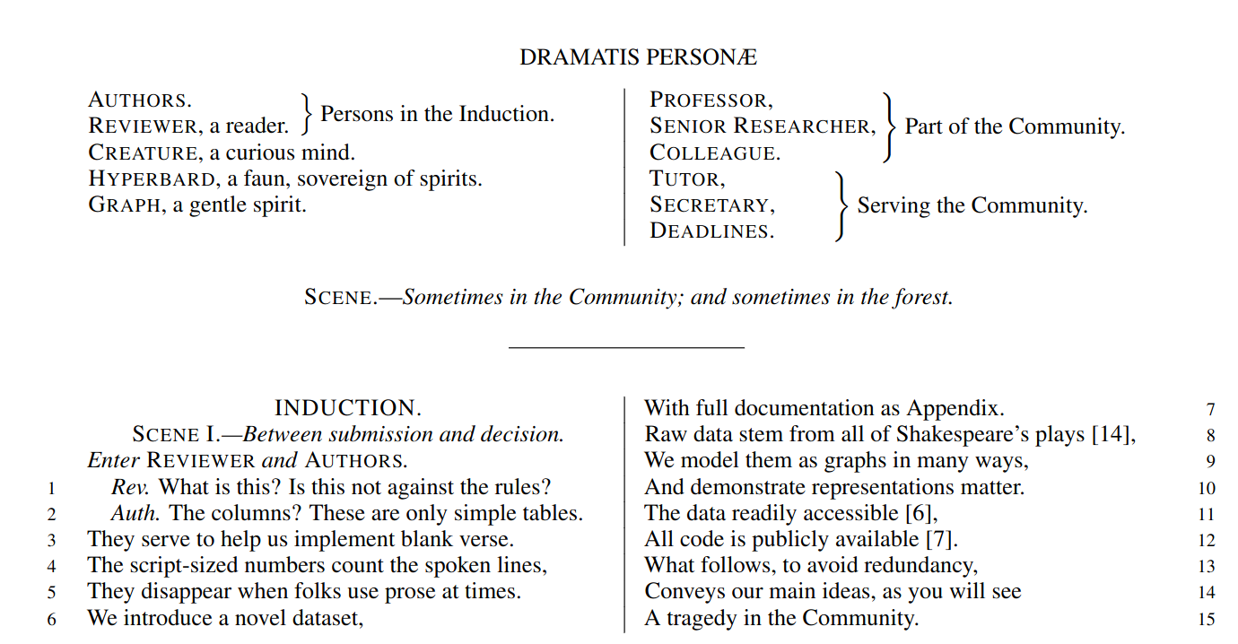
But my absolute favorite can only be: Corinna Coupette et al.’s “All the world’s a (hyper)graph: A data drama”. The presentation is about a relational database on Shakespeare plays, connecting characters according to their co-appearances. The paper describing the database is… well. It is written in the form of a Shakespearean play, with the authors struggling with the reviewers. This is utterly brilliant, bravo! See it for yourself as I cannot make it justice here.

As for myself, I was presenting a work with Camilla Mazzucato on our network analysis of the Turkish Neolithic site of Çatalhöyük. We’re trying to figure out if the material culture we find in buildings — all the various jewels, tools, and other artifacts — tell us anything about the social and biological relationships between the people who lived in those buildings. We can do that because the people at Çatalhöyük used to bury their dead in the foundations of a new building (humans are weird). You can see the presentation here:

After the conference, I was kindly invited to hold a seminar at CUDAN. This was a much longer dive into the kind of things that interest me. Specifically, I focused on how to use my node attribute analysis techniques (node vector distances, Pearson correlations on networks, and more to come) to serve cultural data analytics. You can see the full two hour discussion here:

And that’s about it! Cultural analytics is fun and I look forward to be even more involved in it!

31 January 2024 ~ 0 Comments

Predictability, Home Advantage, and Fairness in Team Sports

There was a nice paper published a while ago by the excellent Taha Yasseri showing that soccer is becoming more predictable over time: from the early 90s to now, models trying to guess who would win a game had grown in accuracy. I got curious and asked myself: does this hold only for soccer, or is it a general phenomenon across different team sports? The result of this question was the paper: “Which sport is becoming more predictable? A cross-discipline analysis of predictability in team sports,” which just appeared on EPJ Data Science.

My idea was that, as there is more and more money and professionalism in sport, those who are richer will become stronger over time, and dominate for a season, which will make them more rich, and therefore more dominant, and more rich, until you get Juventus, which came in first or second in almost 50% of the 119 soccer league seasons played in Italy.

My first step was to get data about 300,000 matches played across 49 leagues in nine disciplines (baseball, basket, cricket, football, handball, hockey, rugby, soccer, and volleyball). My second step was to blatantly steal the entire methodology from Taha’s paper because, hey, why innovate when you can just copy the best? (Besides, this way I could reproduce and confirm their finding, at least that’s the story I tell myself to fall asleep at night)

Predictability (y axis, higher means more predictable) over time (x axis) across all disciplines. No clear trend here!

The first answer I got was that Taha was right, but mostly only about soccer. Along with volleyball (and maybe baseball) it is one of the few disciplines that is getting more predictable over time. The rest of the disciplines are a mixed bag of non-significant results and actual decreases in predictability.

One factor that could influence these results is home advantage. Normally, the team playing home has slighter higher odds of winning. And, sometimes, not so slight. In the elite rugby tournament in France, home advantage is something like 80%. To give an idea, 2014 French champions Toulon only won 4 out of their 13 away games, and two of them were against the bottom two teams of the league that got relegated that season.

It’s all in the pilou pilou. Would you really go to Toulon and tell this guy you expect to win? Didn’t think so.

Well, this is something that actually changed almost universally across disciplines: home advantage has been shrinking across the board — from an average of 64% probability of home win in 2011 to 55% post-pandemic. The home advantage did shrink during Covid, but this trend started almost a decade before the pandemic. The little bugger did nothing to help — having matches played behind closed doors altered the dynamics of the games –, but it only sped up the trend, it didn’t create it.

What about my original hypothesis? Is it true that the rich-get-richer effect is behind predictability? This can be tested, because most American sports are managed under a socialist regime: players have unions, the worst performing teams in one season can pick the best rookies for the next, etc. In Europe, players don’t have unions and if you have enough money you can buy whomever you want.

Boxplot with the distributions of predictability for European sports (red) and American ones (green). The higher the box, the more predictable the results.

When I split leagues by the management system they follow, I can clearly see that indeed those under the European capitalistic system tend to be more predictable. So next time you’re talking with somebody preaching laissez-faire anarcho-capitalism tell them that, at least, under socialism you don’t get bored at the stadium by knowing in advance who’ll win.

08 March 2023 ~ 0 Comments

Quantifying Ideological Polarization on Social Media

Ideological polarization is the tendency of people to hold more extreme political opinions over time while being isolated from opposing points of view. It is not a situation we would like to get out of hand in our society: if people adopt mutually incompatible worldviews and cannot have a dialogue with those who disagree with them, bad things might happen — violence, for instance. Common wisdom among scientists and laymen alike is that, at least in the US, polarization is on the rise and social media is to blame. There’s a problem with this stance, though: we don’t really have a good measure to quantify ideological polarization.

This motivated Marilena Hohmann and Karel Devriendt to write a paper with me to provide such a measure. The result is “Quantifying ideological polarization on a network using generalized Euclidean distance,” which appeared on Science Advances earlier this month.

The components of our polarization definition, from top to bottom: (a) ideology, (b) dialogue, and (c) ideology-dialogue interplay. The color hue shows the opinion of a node, and its intensity is how strongly the opinion is held.

Our starting point was to stare really hard at the definition of ideological polarization I provided at the beginning of this post. The definition has two parts: stronger separation between opinions held by people and lower level of dialogue between them. If we look at the picture above we can see how these two parts might look. In the first row (a) we show how to quantify a divergence of opinion. Suppose each of us has an opinion from -1 (maximally liberal) to +1 (maximally conservative). The more people cluster in the middle the less polarization there is. But if everyone is at -1 or +1, then we’re in trouble.

The dialogue between parts can be represented as a network (second row, b). A network with no echo chambers has a high level of dialogue. As soon as communities of uniform opinions arise, it is more difficult for a person of a given opinion to hear the other side. This dialogue is doubly difficult if the communities themselves organize in the network as larger echo chambers (third row, c): if all communities talk to each other we have less polarization than if communities only engage with other communities that hold more similar opinions.

In this image, time flows from left to right: the first column is the initial condition with the node color proportional to its temperature, then we let heat flow through the edges. The plot on the second row shows the temperature distribution of the nodes.

The way we decided to approach the problem was to rely on the dark art spells of Karel, the Linear Algebra Wizard to simulate the process of opinion spreading. In practice, you can think the opinion value of each person to be a certain temperature, as the image above shows. Heat can flow through the connections of the network: if two nodes are at different temperatures they can exchange some heat per unit of time, until they reach an equilibrium. Eventually all nodes converge to the average temperature of the network and no heat can flow any longer.

The amount of time it takes to reach equilibrium is the level of polarization of the network. If we start from more similar opinions and no communities, it takes little to converge because there is no big temperature difference and heat can flow freely. If we have homogeneous communities at very different temperature levels it takes a lot to converge, because only a little heat can flow through the sparse connections between these groups. What I describe is a measure called “generalized Euclidean distance”, something I already wrote about.

Each node is a Twitter user reacting to debates and the election night. Networks on the top row, opinion distributions in the middle, polarization values at the bottom.

There are many measures scientists have used to quantify polarization. Approaches range from calculating homophily — the tendency of people to connect to the individuals who are most similar to them –, to using random walks, to simulating the spread of opinions as if they were infectious diseases. We find that all methods used so far are blind and/or insensitive to at least one of the parts of the definition of ideological polarization. We did… a lot of tests. The details are in the paper and I will skip them here so as not to transform this blog post into a snoozefest.

Once we were happy with a measure of ideological polarization, we could put it to work. The image above shows the levels of polarization on Twitter during the 2020 US presidential election. We can see that during the debates we had pretty high levels of polarization, with extreme opinions and clear communities. Election night was a bit calmer, due to the fact that a lot of users engaged with the factual information put out by the Associated Press about the results as they were coming out.

Each node is a congressman. One network per US Congress in the top row, DW-NOMINATE scores distributions in the middle row, and timeline of polarization levels in the bottom.

We are not limited to social media: we can apply our method to any scenario in which we can record the opinions of a set of people and their interactions. The image above shows the result for the US House of Representatives. Over time, congresspeople have drifted farther away in ideology and started voting across party lines less and less. The network connects two congresspeople if they co-voted on the same bill a significant number of times. The most polarized House in US history (until the 116th Congress) was the 113th, characterized by a debt-ceiling crisis following the full application of the Affordable Care Act (Obamacare), the 2014 Russo-Ukrainian conflict, strong debates about immigration reforms, and a controversial escalation of US military action in Syria and Iraq against ISIS.

Of course, our approach has its limitations. In general, it is difficult to compare two polarization scores from two systems if the networks are not built in the same way and the opinions are estimated using different measures. For instance, in our work, we cannot say that Twitter is more polarized than the US Congress (even though it has higher scores), because the edges represent different types of relations (interacting on Twitter vs co-voting on a bill) and the measures of opinions are different.

We feel that having this measure is a step in the right direction, because at least it is more accurate than anything we had so far. All the data and code necessary to verify our claims is available. Most importantly, the method to estimate ideological polarization is included. This means you can use it on your own networks to quantify just how fu**ed we are the healthiness of our current political debates.

29 September 2022 ~ 0 Comments

Meritocracy vs Topocracy

The world isn’t always fair. Perhaps you know the frustration of pouring your heart into making something extraordinary, only to see it almost completely ignored by the crowd. On the other hand, celebrities are constantly talked about, even when they are ostensibly doing very little — if anything at all. Your clever lyrics and innovative musical composition lie in the obscure shadow of a pop idol singing “let’s go party” over the same riff used by dozens of clones. Is it just you, or is there an actual force causing this to happen? This is an interesting question I decided to study together with Clara Vandeweerdt.

The result was a paper titled “Posts on central websites need less originality to be noticed,” recently published on Scientific Reports. The attempt here is to try and disentangle the roles of meritocracy and topocracy. Meritocracy is a regime in which success is determined by merit: the best products win on the market. Topocracy is a term coined by Borondo et al. to signify the situation in which your position in the market determines success. If you are a central hub — a celebrity — what you do is already watched by a lot of people. Getting those eyeballs is arguably the hardest part of succeeding, and if you’re famous you have inherited them from the past. Topocracy explains why, for instance, many fields are crowded with the offspring of a past celebrity — e.g. 8 out of 20 current Formula 1 drivers are sons of professional or amateur drivers (the rest are mostly sons of generic rich people, another form of topocracy).

Image from here.

To study the tension between meritocracy and topocracy, we needed to narrow down the scope to make a scientific experiment possible. We decided to focus on tens of millions Reddit posts. The objective was two-fold. First, we asked what was the role of meritocracy and topocracy in influencing probability of either being noticed by somebody — i.e. attracting at least one upvote on Reddit. Second, we asked the same question about succeeding — i.e. ending up in the top 10% most upvoted posts on Reddit. To do this, we needed to define what “meritocracy” and “topocracy” meant on the platform.

To us “meritocracy” on social media means to produce quality content. Estimating the quality of a Reddit post independently from its upvotes is hard. We decided to focus on originality, under the assumption that original content should catch the audience’s attention. In practice, we measured how surprising the words in the post’s title are. More surprising = more original.

In their paper, Borondo et al. show that, the sparser the network, the more topocracy (blue line) dominates over meritocracy (red line). Of course, real social systems are super sparse 🙂

“Topocracy” on Reddit would involve how central in the network of content-creation a post is. Reddit (fortunately?) does not have an underlying social network, so we had to look at the website used to make the post: is this funny GIF coming from imgur.com or gfycat.com? This is convenient, because websites live on a network of hyperlinks, and this makes us able to estimate their centrality.

The results were interesting. Our first question is about getting noticed. Here we see that, if you are not using a central website to make your content, you need to be original — outsiders need to put that extra effort to see their merits rewarded (faint red line in the image below, left panel). The opposite is true for central players: here originality is actually harmful (dark red line). If you’re central, you need to play it safe.

These results do not hold when it comes to the quest of becoming part of the top scoring posts in Reddit. In this case, originality doesn’t play a role no matter the centrality of your platform (right panel in the image below, all lines are equal and flat, showing no effect no matter the centrality).

Our main result: the effect of originality (x axis) on success (y axis) for different levels of platform centrality (line color). (Left) The probability of getting one upvote; (Right) the probability of being in the top 10% upvoted posts.

There are tons of caveats in our research. It is not a given that originality means quality — especially since we measure originality via linguistic analysis. A title in complete gibberish is highly original, but likely of low quality. Moreover, you need to assume that original content (the thing linked by the Reddit post) comes with an original title (the text the user writes to describe the linked content). Then there is the questionable relationship between the centrality of the website you used versus your own centrality as a potential superstar poster on Reddit — Gallowboob comes to mind. We detail in the paper why we think these concerns are valid, but they do not undermine the interpretation of our results too much.

This is relevant for the broad community studying the success of viral ideas on social media. The accepted wisdom is that the content of a post doesn’t play that much of a role in its success in spreading — other factors like its starting position in the network, its timing, etc. are the only things that matter. I’ve struggled with this notion in the past. With this paper we show a much more complex picture. Maybe the role of the content is underestimated, because it interacts in complex ways with the other studied factors, and it is linked not with success per se, but with the ability to avoid failure — being completely overlooked.

In summary, if you’re a celebrity it’s good and desirable not to put too much effort into making highly original content. Your fan-base is the reason you’ll be successful, and they already liked you for what you did in the past — straying from it might be more damaging than not. On the other hand, if you start from the periphery, you need to put in extra effort to distinguish yourself from everything else out there. The problem is that this striving for originality and high-quality content will not guarantee you success. At most, it will guarantee you’ll not be completely overlooked.

17 August 2022 ~ 0 Comments

Social Media’s Intolerance Death Spiral

We’ve all been on social media for far too long and it’s changed some of us. We started as starry-eyed enthusiasts: “surely the human race will be able recognize when I explain the One True Right Way of Doing Things” — whatever that might be — “so I’ll be nice to everyone as I’m helping them to reach the Light”. But now, when we read about hollow Earths or the Moon not existing for the 42nd time, we think “ugh, not this moron again”. And that’s the best-case scenario: we’ve seen examples of widespread harassment from people who, in principle, would propose philosophies of love and acceptance. It’s a curious effect, so it’s worthwhile to take a step back and ask ourselves: why does it happen?

This is what Camilla Westermann and I asked ourselves during her thesis project, which turned into the paper “A potential mechanism for low tolerance feedback loops in social media flagging systems,” published a couple of months ago on Plos One. We hypothesized there is a systemic issue: social media is structured in a way that leads people to quickly run out of tolerance. This is not a new idea: many people already pointed out that an indifferent algorithm sees “enragement” and thinks “engagement”, and thus it will actively recommend you the things most likely to make you mad, because anger will keep you on the platform.

Source: https://xkcd.com/386/

While likely true, this is an incomplete explanation. Profiting off radicalization doesn’t sound… nice? Thus it might be bad for business on the long run — if people with pitchforks start knocking at the shiny glass door of your social media behemoth. So, virtually all mainstream platforms have put systems into place to limit the spread of inflammatory content: moderation, flagging, and the like. So why isn’t it working? Why is online discourse apparently becoming worse and worse?

Our proposed answer is that these moderation systems — even if implemented in good faith — are the symptom of a haphazard understanding of the problem. To make our case we created a simple Agent-Based Model. In it, people read content shared by their friends and flag it when it is too far away from their worldview. This is regulated by a tolerance parameter: the higher your tolerance, the more ideological distance a news item requires to trigger your flagging finger.

The proportion of flags (y axis) for a given opinion value (x axis). In this instance of the model, everyone has equally low tolerance (0.1).

This is a model I already talked about in the past and its results were pretty bleak. From the picture above you can see that neutral news sources get flagged the most. This is due to the characteristics of real-world social media — echo chambers, confirmation bias, and the like. In the end, we punish content producers for being moderate.

The thing I didn’t say that time was that the model only shows that pattern for low values in the tolerance parameter. For high tolerance, things are pretty ok. So, if everyone started as a starry-eyed optimist, how did we end up with *gestures in the general direction of Twitter*?

Our explanation is made of a simple ingredient: people think they’re right and want to convince others to behave accordingly because it’s Good — “go to church more!”; “use the correct pronouns!” –, so they do whatever they think will achieve that objective.

We started the model with the two sides having the same tolerance, set at very high levels, because we are incurable optimists. At each time step, one of the two sides will change their tolerance level. They will search for the tolerance level that will push news sources the most to their side — which, mind you, can also be a higher tolerance level, not necessarily a lower one.

Same interpretation as the previous figure, but here the left side is less tolerant, so the right side gets flagged more. Tolerance is still quite high on both sides (0.8 vs 0.9).

The image above shows that, in the beginning, lowering tolerance is a winnning strategy. The news sources on the more tolerant side get flagged more by the people from the other, less tolerant, side. Since they don’t like being flagged, they are incentivized to find whatever opinion that will minimize the number of flags received — see this other previous work. This happens to pull them to the intolerant side. The problem is that, in our model, no one wants to be a sucker. “If they are attracting people to their side by being intolerant, why can’t I?” is the subconscious mantra we see happening. An intolerance death spiral kicks in, where both sides progressively push the other to even lower tolerance levels, because… it just works.

This happens until the system stabilizes to a relatively low — but non-zero — level of tolerance. Below a certain level, intolerance is so high it doesn’t attract any more. Too low tolerance only repulses, because people would flag you anyway, so what would be the point of moving closer to the intolerant side?

The line shows the tolerance level of two sides (y axis), red and blue, as it evolves when the model runs (x axis).

Of course, this is only the result of a simulation, so it should be taken with the usual boatload of grains of salt. The real world is a much more complex place, with many different dynamics, and humans aren’t blind optimizers of functions[citation needed]. However, it is a simulation using more realistic starting conditions than what social media flagging systems assume, and the low tolerance value for the parameter happens to be extremely close to our best guess estimation of what it is consistent with observed data. So ours might be a guess, but at least it’s decently educated.

What can we take from this research? If you own a social media platform, the advice would be not to implement poorly-thought-out flagging moderation systems: create models with more realistic assumptions (like ours) and use them to guide your solutions. Otherwise, you might be making the problem worse.

And if you’re a regular user? Well, maybe sometimes, being nice is better than making your side win. I’m looking forward to read on Twitter what some people think about this philosophy. I’m sure it will go great.

08 June 2022 ~ 0 Comments

Give Me Some Space!, or: the Slow Descent into Unicode Madness

My wife is the literal embodiment of this comic strip:

Laptop Issues
Source: https://xkcd.com/2083/

She has to overcome the weirdest code golfing issues to get through her research. The other day her issue was: “I have a bunch of text and I want to surround every unicode emoticon with spaces” — the idea being to treat each emoji like a full word.

Sounds easy enough until you get to the word “unicode” and you start hearing helicopters in the background, a Doors song comes on, and you flash memories of going upstream in a jungle river on a barge.

My problem is that, instead, I am the embodiment of the victim in this comic strip:

Nerd Sniping
Source: https://xkcd.com/356/

When confronted with something seemingly simple but with an interesting level of complexity behind it, I just have to drop everything I’m doing for my actual job for an hour, until I solve it.

At first glance, it seems easy enough: find a dictionary of emoticons and use it as the basis of a regular expression. The emoji package can take care of the first part. A naive solution could be the following:

import re
from emoji import unicode_codes

allemojis = "".join(unicode_codes.UNICODE_EMOJI['en'])
searcher = re.compile(u'([%s])' % allemojis)
spacemoji = {key: searcher.sub(r' \1 ', texts[key]) for key in texts}

This assumes that “texts” is a dictionary with a collection of texts we’re interested in. The “searcher” wraps a bunch of characters in between square brackets, which means that any matching characters will be found. The the “.sub” method will replace whatever matched (“\1“) with its content surrounded by spaces.

Easy enough. Let’s test it with some example strings:

Wonderful
Everything works as it should and is awesome
Say what now?
I wonder if they still hire at McDonald’s

A passing knowledge of unicode, or a quick Google search about the mysterious \u200d code popping out of nowhere in example #3, leads to a relatively quick diagnosis. Emoticons are not single characters: they can combine multiple unicode characters to modify the appearance of a single glyph. In my case, the baseline turban emoticon is of a male with the baseline yellow emoticon skin tone. To obtain a white lady with a turban you need to combine the turban emoticon with the white color and the woman symbol.

Same goes for numbers: some emoticons contain raw digit characters, and thus those will match even when not “inside” an emoticon.

So here’s a step-by-step cure for our unicode woes:

  1. Don’t work with string or unicode string objects. Always work with bytestrings by calling “.encode("utf-8")“. This way you can see what the machine actually sees. It’s not ““. it’s “\xf0\x9f\x91\xb3\xf0\x9f\x8f\xbb\xe2\x80\x8d\xe2\x99\x80” (easy, right?).
  2. Don’t use square brackets for your regular expression, because it will only match one character. Emoticons aren’t characters, they are words. Use the pipe, which allows for matching groups of characters.
  3. Store your emoticons in a list and sort by descending length. The regular expression will stop at the first match, and is longer than , because the first one is a modified version. The simple turban emoticon is actually “\xf0\x9f\x91\xb3” (note how these are the first four bytes of the previous emoticon). So the regular expression will not match the “man with a turban” inside the “white woman with a turban“.
  4. Escape your regular expression’s special characters. Some emoticons contain the raw character “*“, which will make your compiler scream offensive things at you.
  5. Remember to encode your input text and then to decode your output, so that you obtain back a string and not a byte sequence — assuming you’re one of those basic people who want to be able to read the outputs of their pile of code.

If we put all of this together, here’s the result of my hour of swearing at the screen in Italian 🤌:

import re
from emoji import unicode_codes

allemojis = [x.encode("utf-8") for x in unicode_codes.UNICODE_EMOJI['en']]
allemojis = sorted(allemojis, key = len, reverse = True)
allemojis = b"|".join(allemojis)

searcher = re.compile(b'(%s)' % allemojis.replace(b'*', b'\*'))
spacemoji = {key: searcher.sub(rb' \1 ', texts[key].encode("utf-8")).decode("utf-8") for key in texts}

Which restores some of my sanity:

I’m sure better programmers than me can find better solutions (in less time) and that there are infinite edge cases I’m not considering here, but this was good enough for me. At least I can now go back and do the stuff my employer is actually paying me to do, and I don’t feel I’m in a Francis Ford Coppola masterpiece any more.

17 May 2022 ~ 0 Comments

Node Attribute Distances, Now Available on Multilayer Networks! (Until Supplies Last)

I’ve been a longtime fan of measuring distances between node attributes on networks: I’ve reviewed the methods to do it and even proposed new ones. One of the things bothering me was that no one had so far tried to extend these methods to multilayer networks — networks with more than one type of relationships. Well, it bothers me no more, because I just made the extension myself! It is the basis of my new paper: “Generalized Euclidean Measure to Estimate Distances on Multilayer Networks,” which has been published on the TKDD journal this month.

Image from https://atlas.cid.harvard.edu/

You might be wondering: what does it mean to “measure the distance between node attributes on networks”? Why is it useful? Let’s make a use case. The Product Space is a super handy network connecting products on the global trade network based on their similarity. You can have attributes saying how much of a product a country exported in a given year — in the image above you see what Egypt exported in 2018. This is super interesting, because the ability of a country to spread over all the products in the Product Space is a good predictor of their future growth. The question is: how can we tell how much the country moved in the last ten years? Can we say that country A moved more or less than country B? Yes, we can! Exactly by measuring the distance between the node attributes on the network!

The Product Space is but an example of many. One can estimate distances between node attributes when they tell you something about:

  • When and how much people were affected by a disease in a social network;
  • Which customers purchased how many products in a co-purchase network (à la Amazon);
  • Which country an airport belongs to in a flight network;
  • etc…
Image from https://manliodedomenico.com/

Let’s focus on that last example. In this scenario, each airport has an attribute per country: the attribute is equal to 1 if the airport is located in that country, and 0 otherwise. The network connects airports if there is at least a flight planned between them. In this way, you could calculate the network distance between two countries. But wait: it’s not a given that you can fly seamlessly between two countries even if they are connected by flights across airports. You could get from airport A to airport B using flight company X, but it’s not a given than X provides also a flight to airport C, which might be your desired final destination. You might need to switch to airline Y — the image above shows the routes of four different companies: they can be quite different! Switching between airlines might be far from trivial — as every annoyed traveler will confirm to you –, and it is essentially invisible to the measure.

It becomes visible if, instead of using the simple network I just described, you use a multilayer network. In a multilayer network, you can say that each airline is a layer of the network. The layer only contains the flight routes provided by that company. In this scenario, to go from airport A to airport C, you pay the additional cost of switching between layers X and Y. This cost can be embedded in my Generalized Euclidean measure, and I show how in the paper — I’ll spare you the linear algebra lingo.

Image from yours truly

One thing I’ll say — though — is that there are easy ways to embed such layer-switching costs in other measures, such as the Earth’s Mover Distance. However, these measures all consider edge weights as costs — e.g., how long does it take to fly from A to B. My measure, instead, sees edge weights as capacities — e.g. how many flights the airline has between A and B. This is not splitting hairs, it has practical repercussions: edge weights as costs are ambiguous in linear algebra, because they can be confused with the zeros in the adjacency matrices. The zeros encode absent edges, which are effectively infinite costs. Thus there is an ambiguity* in measures using this approach: as edges get cheaper and cheaper they look more and more like infinitely costly. No such ambiguity exists in my approach. The image above shows you how to translate between weights-as-costs and weights-as-capacities, and you can see how you can get in trouble in one direction but not in the other.

In the paper, I show one useful case study for this multilayer node distance measure. For instance, I am able to quantify how important the national flagship airline company is for the connectivity of its country. It’s usually extremely important for small countries like Belgium, Czechia, or Ireland, and less crucial for large ones like France, the UK, or Italy.

The code I developed to estimate node attribute distances on multilayer networks is freely available as a Python library — along with data and code necessary to replicate the results. So you have no more excuses now: go and calculate distances on your super complex super interesting networks!


* This is not completely unsolvable. I show in the paper how one could get around this. But I’d argue it’s still better not to have this problem at all 🙂

19 April 2022 ~ 0 Comments

Complex Networks in Economics Satellite @ NetSci22

For NetSci22, I will join forces once again with the great Morgan Frank to bring you the second edition of the “Complex Networks in Economics and Innovation” satellite (post and official website of the first edition).

Once again, we’re looking for contributed talks, giving you an opportunity to showcase your work. Topics that are more than welcome include:

  • Mapping the relationship of complex economic activities at the global, regional, and local level;
  • Tracking flows of knowhow in all its forms;
  • Creating networks of related tasks and skills to estimate knockoff effects and productivity gains of automation;
  • Investigating the dynamics of research and innovation via analysis of patents, inventions, and science;
  • Uncovering scaling laws and other growth trends able to describe the systemic increase in complexity of activities due to agglomeration;
  • In general, any application of network analysis that can be used to further our understanding of economics.

The submission link is: https://easychair.org/my/conference?conf=cnei22. The full call text is here. And this is the official website. You should send a one-page one-figure abstract before May 13th, 2022.

We have a fantastic lineup of invited speakers you’ll mingle with:

The event will be held online on Zoom. The organization details are still pending confirmation, but we should have secured the date of July 18th, 2022. We should start at 8AM Eastern time (2PM Europe time) and have a 6-hour program. This could still change, so stay tuned for updates!

I hope to see your abstract in my inbox and then you presenting at the satellite!

28 January 2022 ~ 0 Comments

Avoiding Conflicts on Social Media Might Make Things Worse

Look, I get it. Sometimes you really don’t want to get mired in a Facebook discussion with that uncle of yours who thinks that the moon doesn’t exist. It’s easier to block, unfriend, ignore, rather than engage. However, have you considered that avoiding conflicts might make things worse? This is a question Luca Rossi and I asked ourselves as a part of our research on polarization on social media. Part of the answer comes from an Agent Based Model (ABM) we have recently published on Plos One in the paper “How Minimizing Conflicts Could Lead to Polarization on Social Media: an Agent-Based Model Investigation.”

You sit on a throne of lies.

Specifically, we were interested in looking at how news sources react when they get attacked on social media with backlash and flagging. This is a followup to our previous paper, where we found — surprisingly — that this backlash and flagging is mostly directed at neutral and factual news sources. The reason why these sources are magnets for controversies is because their stories are widely read, and thus attract the ire of all sorts of quacks. Quackery, instead, is only read by quacks agreeing with it, and thus they don’t quack at it so much.

So now the question is: what does this negative attention from quacks do to a neutral news source? To answer the question we updated our ABM. In the original version, each news source and user had a fixed political position — a numerical value between -1 (extreme left) and +1 (extreme right), with 0 as perfect neutrality. In the new version, their position can change. People get attracted by similar points of view and repulsed by opinions that are too far from their position. For instance, a +1 user might get attracted if they read a +0.9 news item (moving to, say, a +0.95 position), but will be repulsed again if they read a -0.5 item next (moving back to, say, a +0.98 position).

Our starting assumption is that users and sources are mostly neutral. Here you can see the initial distributions of how many agents (y axis) have a given opinion (x axis). News sources in red and users in blue.

If a user is repulsed, they will also flag the news source. A news source doesn’t want to be flagged. A flag is a bad omen: too many flags and the news source might get banned by the social media platform, or be subject to big scary fact-checking banners. They might even — gasp! — make Mark Zuckerberg leak a tear. Social media are too important for news sources to let this happen. So they will try to avoid conflict. Since they know flags come from people with a different opinion from their own, the only thing they can do is to change their stance. The safest bet is to average the opinions of all their readers. Taking the average of their neighbors in most cases would lead to settle in the middle of the polarity spectrum, but this is not guaranteed.

One example of the strategy social media have tried to use to combat misinformation online.

Four factors together create the rules of the game: how much users feel the need to share new articles on social media; how tolerant they are with diverse viewpoints; how much news sources will try to resist the pressure to change their spin; and how quickly users change their own opinion following what they read. Having an ABM allows you to run a lot of simulations and see what the effect of each of this aspect is on the final system.

We find that:

  • The more people share, the more news sources will be pushed away from neutrality and become partisan;
  • The less tolerant users are, the more they will increase polarization;
  • The resistance a news organization puts up against such a pressure is irrelevant to the final state of the system;
  • If users change their opinions easily, they will be attracted to the extreme ends of the polarity spectrum.
The difference between low tolerance (left) and high tolerance (right) in the opinion distributions of the users after the model has run for a while. Notice the extremist peaks in the left distribution.

Some of this is unsurprising — intolerance breeds polarization –, while other things might be worth looking at a second time. For instance, we think polarization is a bigger deal nowadays exactly because social media helps sharing in a way newspapers, radio, and television do not. Our results say that this oversharing exacerbates polarization. But a nagging question remains: is our ABM just a theoretical toy, or can it reproduce reality?

We think the latter is true, because we tested it against a real world Twitter network. We have a network topology of who talks with whom, and a polarity score for each user based on the news sources they cite in their tweets. The parameter combination that best reproduces real world data is this: high sharing, high opinion volatility, and low tolerance. Which in our model is the exact recipe for escalating conflict. And all of this just because news sources eschew conflict and don’t want to be flagged. Ouch.

This is what happens to the polarity distribution of the users when we try to fit our ABM model on real data from Twitter. Double ouch.

The same grains of salt that you should take our previous paper with also apply here. The model is based on assumptions, and thus it is only as good as those assumptions. Moreover, reality is more complicated than our ABM. For instance, we assume tolerance is uncorrelated with one own political opinion. But what if some political opinions tend to go together with being less tolerant of other points of view? And what if users don’t genuinely flag what they think is outrageous, but make a more strategic use of the flag button to advance their own agenda? These are questions we will explore in further developments of our work.

27 October 2021 ~ 1 Comment

Pearson Correlations for Networks

We all know that correlation doesn’t imply causation:

And yet, we calculate correlations all the time. Because knowing when two things correlate is still pretty darn useful. Even if there is no causation link at all. For instance, it’d be great to know whether reading makes you love reading more. Part of the answer could start by correlating the number of books you read with the number of books you want to read.

The very important questions the Pearson correlation coefficient allows you to ask: will consuming cheese bring upon you the doom of dying by suffocating in your bedsheets? source: https://www.tylervigen.com/spurious-correlations

As a network scientist, you might think that you could calculate correlations of variables attached to the nodes of your network. Unfortunately, you cannot do this, because normal correlation measures assume that nodes do not influence each other — the measures are basically assuming the network doesn’t exist. Well, you couldn’t, until I decided to make a correlation coefficient that works on networks. I describe it in the paper “Pearson Correlations on Complex Networks,” which appeared in the Journal of Complex Networks earlier this week.

The formula you normally use to calculate the correlation between two variables is the Pearson correlation coefficient. What I realized is that this formula is the special case of a more general formula that can be applied to networks.

In Pearson, you compare two vectors, which are just two sequences of numbers. One could be the all the numbers of books that the people in our sample have read, and the other one is all of their ages. In the example, you might expect that older people had more time to read more books. To do so, you check each entry in the two vectors in order: every time you consider a new person, if their age is higher than the average person’s, then also the number of books they read should be higher.

If you are in a network, each entry of these vectors is the value of a node. In our book-reading case, you might have a social network: for each person you know who their friends are. Now you shouldn’t look at each person in isolation, because the numbers of books and the ages of people also correlate in different parts of the network — this is known as homophily. Some older people might be pressured into reading more books by their book-addicted older friends. Thus, leaving out the network might cause us to miss something: that a person’s age tells us not just about the number of books they have read, but it also allows us to predict the number of books their friends have read.

This is the type of networks you are forced to work with when you use the Pearson correlation. That’s just silly, isn’t it?

To put it simply, the classical Pearson correlation coefficient assumes that there is a very special network behind the data: a network in which each node is isolated and only connects to itself — see the image above. When we slightly modify the math behind its formula, it can take into account how close two nodes are in the network — for instance, by calculating their shortest path length.

You can interpret the results from this network correlation coefficient the same way you do with the Pearson one. The maximum value of +1 means that there is a perfect positive relation: for every extra year of age you read a certain amount of new books. The minimum of -1 means that there is a perfect negative relationship: a weird world where the oldest people have not read much. The midpoint of 0 means that the two variables have no relation at all.

Is the network correlation coefficient useful? Two answers. First: how dare you, asking me if the stuff I do has any practical application. The nerve of some people. Second: Yes! To begin with, in the paper I build a bunch of artificial cases in which I show how the Pearson coefficient would miss correlations that are actually present in a network. But you’re not here for synthetic data: you’re a data science connoisseur, you want the real deal, actual real world data. Above you can see a line chart, showing the vanilla Pearson (in blue) and the network-flavored (in red) correlations for a social network of book readers as they evolve over time.

The data comes from Anobii, a social network for bibliophiles. The plot is a correlation between number of books read and number of books in the wishlist of a user. These two variables are positively correlated: the more you have read, the more you want to read. However, the Pearson correlation coefficient greatly underestimates the true correlation, at 0.25, while the network correlation is beyond 0.6. This is because bookworms like each other and connect with each other, thus the number of books you have read also correlates with the wishlist size of your friends.

This other beauty of a plot, instead, shows the correlation between the age of a user and the number of tags they used to tag books. What is interesting here is that, for Pearson, there practically isn’t a correlation: the coefficient is almost zero and not statistically significant. Instead, when we consider the network, there is a strong and significant negative correlation at around -0.11. Older users are less inclined to tag the books they read — it’s just a fad kids do these days –, and they are even less inclined if their older friends do not tag either. If you were to hypothesize a link between age and tag activity and all you had was lousy Pearson, you’d miss this relationship. Luckily, you know good ol’ Michele.

If this makes you want to mess around with network correlations, you can do it because all the code I wrote for the paper is open and free to use. Don’t forget to like and subscrib… I mean, cite my paper if you are fed up with the Pearson correlation coefficient and you find it useful to estimate network correlations properly.