Michele Coscia - Connecting Humanities

Michele Coscia I am an associate prof at IT University of Copenhagen. I mainly work on algorithms for the analysis of complex networks, and on applying the extracted knowledge to a variety of problems. My background is in Digital Humanities, i.e. the connection between the unstructured knowledge and the coldness of computer science. I have a PhD in Computer Science, obtained in June 2012 at the University of Pisa. In the past, I visited Barabasi's CCNR at Northeastern University, and worked for 6 years at CID, Harvard University.

09 July 2018 ~ 0 Comments

Small Changes, Big Changes

A very quick note to point out a tiny change in my website. The top banner that always welcomes you to the home page of this blog has been changed. It is an insignificant text difference, which hides a slightly larger one in my life. I’ve changed jobs! After six years of postdoc fellowship, I decided I had enough of it and made the big jump: I’m now an assistant professor. I’ve also decided to hop to a different side of the Atlantic pond. I left the United States and decided to make a home of Denmark. My new affiliation is the IT University of Copenhagen.

There are a few more things changing in the next weeks/months. The most important one is that I’ll start teaching the class on Network Analysis. This is a class for the first semester of the second year in the Bachelor program of Data Science. This Data Science ship is captained by the amazing Natalie Schluter. I’m not alone in this adventure: my friend Luca Rossi will be co-teaching with me this year. I look forward to give my contribution to the data science and network science development of the Copenhagen area.

This means that you’ll see soon a new tab in the top menu of the blog: “Teaching”. I’ll use it to host the materials from the classes I’ll be teaching: slides, additional texts, etc. This should allow you to get a hint of my lecturing style and — why not? — see if you can learn something new.

If you are in the Copenhagen area and you think you’d like to talk a bit of network business, you can probably find me at my new shiny office, while I try to hide behind the largest monitors I could find. The office number is 4E04, meaning that I’m at the 4th floor, wing E, office 4 (on the right).

Interesting times ahead!

28 May 2018 ~ 0 Comments

Mapping the International Aid Community

A few years ago (2013, God I’m old), I was talking to you on how to give a “2.0” flavor to international aid: at CID we created an Aid Explorer to better coordinate the provision of humanitarian work. I’m happy to report that “Aid Explorer” has been adopted — directly or indirectly —  by multiple international organizations, for instance USAID and the European Union. The World Bank’s Independent Evaluation Group contacted me to make an updated version, focused on estimating the World Bank’s position in the global health arena. The result is a paper, “Mapping the international health aid community using web data“, recently published in EPJ Data Science, and the product of a great collaboration with Katsumasa Hamaguchi, Maria Elena Pinglo, and Antonio Giuffrida.

The idea is to collect all the webpages of a hundred international aid organizations, looking for specific keywords and for hyperlinks to the other organizations — differently from the old Aid Explorer in which we relied on the index from Google. The aim is to create different networks of co-occurrences connecting:

  • Aid organizations co-mentioned in the same page;
  • Aid organizations mentioned or linked by another;
  • Issues co-mentioned in the same page;
  • Countries co-mentioned in the same page.

We then analyze these structures to learn something about the community as a whole.

One thing I didn’t expect was that organizations cluster by type. The “type” here is the force behind the organization — private philanthropy, UN system, bilateral (a single country’s aid extension of the foreign ministry), multilateral (international co-operations acting globally), etc. In the picture above (click on the image to enlarge), we encode the agency type in the node color. Organizations are overwhelmingly co-mentioned with organizations of the same type, which is curious because bilaterals often have nothing in common with each other besides the fact they are bilaterals: they work on different issues, with different developed and developing partners.

We can make a similar map connecting issues if they are co-mentioned in a web page. The map is useful as validation because it connects some “synonyms”, for instance “TB” and “Tubercolosis”. However, you can do much more with it. For instance, you can use color to show where an organization is most often cited. Below (click on the image to enlarge) you see the issue map for the World Bank, with the red nodes showing the issues strongly co-mentioned with the World Bank. Basically, the node color is the edge weight in a organization-issue bipartite network, where the organization is the World Bank. To give you an idea, the tiny “Infant Survival” node on the right saw the World Bank mentioned in 9% of the pages in which it was discussed. The World Bank was mentioned in 3.8% of web pages discussing AIDS.

This can lead to interesting discussions. While the World Bank does indeed discuss a lot about some of the red issues above — for instance about “Health Market” and “Health Reform” — its doesn’t say much about “Infant Survival”, relatively speaking at least. It’s intriguing that other organizations mention this particular issue so often in conjunction with the World Bank.

This difference between the global speech about issues and the one specific to another organization allows us to calculate two measures we call “Alignment” and “Impact”. By analyzing how similar the issue co-occurrence network of an organization is with the global one — a simple correlation of edge weights — we can estimate how “Aligned” it is with the global community. On the other hand, an “Impactful” organization is one that, were it to disappear, would dramatically change the global issue network: issues would not be co-mentioned that much.

In the plot above, we have Alignment and Impact on the x and y axis, respectively. The horizontal and vertical lines cutting through the plot above show the median of each measure. The top-right quadrant are organization both impactful and aligned: the organizations that have probably been setting the discourse of the international aid community. No wonder the World Health Organization is there. On the top left we have interesting mavericks, the ones which are not aligned to the community at large, and yet have an impact on it. They are trying to shape the international aid community into something different than what it is now.

A final fun — if a bit loose — analysis regards the potential for an organization to spread a message through the international aid network. What would be the reach of a message if it originated from a specific organization? We can use the Susceptible-Infected model from epidemiology. A message is a “virus” and it is more likely to infect an agency if more than a x% of the agency’s incoming links come from other infected agencies.

This depends on the issue, as shown above. In the figures we see the fraction of “infected” agencies (on the y-axis) given an original “patient zero” organization which starts spreading the message. To the left we see the result of the simulation aggregating all issues. The World Bank reaches saturation faster than UNICEF, and USAID is only heard by a tiny fraction of the network. However, if we only consider web pages talking about “Nurses” (right), then USAID is on par with the top international aid organizations — and UNICEF beats the World Bank. This happens because the discourse on the topic is relatively speaking more concentrated in USAID than average.

As with the Aid Explorer, this is a small step forward improving the provision of international aid. We do not have an interactive website this time, but you can download both the data and the code to create your own maps. Ideally, what we did only for international aid keywords can be extended for all other topics of interest in the humanitarian community: economic development, justice, or disaster relief.

19 April 2018 ~ 0 Comments

Birds of a Feather Scam Together

In Italy we have a saying:

He who walks with the lame learns how to limp

It means that the company you keep will influence your behavior, more often than not in a negative way — never mind the fact that Judas had impeccable friends. Setting my mind on how to verify this tidbit of ancient wisdom, I decided to investigate how the fraudulent behavior of some businesses might correlate with that of the other companies they work with. Does doing business with a crook say something about you? Will Mexican drug cartels ever recoup the damage to their reputation when it turns out they do business with European banks?

The result is the paper “Birds of a feather scam together: Trustworthiness homophily in a business network” published last month in the Social Networks journal. I wrote this paper with Mauro Barone at the Agenzia delle Entrate, the Italian equivalent of the IRS in the US. The idea is simple. We want to answer the question: is the level of fraud committed by a business correlated with the level of fraud committed by its customer/supplier businesses?

I bet none of these birdbrains filled in their 1040 this year.

To answer the question we analyze a business-to-business (B2B) network. Each node in the network is a company, and it connects to other companies with directed edges. The edge goes from a provider to a customer, it follows the flow of goods and services. These connections are weighted according to the monetary value of the total transaction value during the year. The network contains all the relationships of a few thousands audited Italian businesses, centered on one Italian region: Tuscany.

The peculiarity of the data structure that allow us to speak about tax fraud is that each connection is registered twice. Say we have business A and business B. The “A sold to B” connection should be reported by both A and B: A says how much it sold, and B says how much it purchased. See the example below: the blue edges are A’s declarations, and the orange edges are B’s. The two businesses agree on how much B sold to A (75 Euros), but they disagree on how much A sold to B.

Finding who’s trustworthy and who’s not seems, at first sight, an easy problem. If a business constantly misreports its transactions with its customer/supplier network, then we have good ground to suspect something fishy is going on. However, it’s not that easy. Say we decide a mismatch of 5 Euros is divided into 2.5 blamed on A and 2.5 blamed on B. We might think we’re doing a neutral operation, but we aren’t. What appears to be fair — shifting the blame equally to both actors involved in a disagreement — is already a heavy judgment. Maybe the fault lays completely on B, and A is a blameless victim. We all know how the story ends if we simply wash our hands of the problem like Pontius Pilate: with brigands freed and prophets on the cross.

Paradoxically, if you simply average mismatches, the larger you are, the more you can con. The vast majority of businesses are honest thus, if you have a lot of relationships, they will mostly check out and bring your average match value up. At that point, you can tactically limit your misreports to a few connections and thus evade your taxes. The network also has a broad degree distribution, meaning that most businesses have few connections. This means that your victims will not have enough honest links to make up for the curveball you just threw at them. You can see an example below: the number on the node is their average edge weight, which is the match level of the connection — the total amount of Euros accounted for over the total transaction value (in the A-B example above, we have 75+75+100+95=345 total edge value, but only 340 accounted for given the mismatch of 5, thus the edge weight would be 340/345= 0.9855). Even though the hub has the most fraudulent connections — edges with low match values — its average is higher than that of its victims.

We solve this problem by taking these average mismatches only as a starting condition. At each iteration, we recalculate the average by re-weighting connections according to the trustworthiness equilibrium. The trick is to do it in an asymmetric way. If the previous iteration’s trustworthiness of A was larger than B’s, then in this iteration the mismatch for A is reduced, thus more of the blame will end on B. In practice, if on average we trusted A more, then we’re going to keep doing so in its other cases of mismatch. We don’t let a speck in A’s eye to make us miss the plank in B’s. (Man, my Biblical references today are on point!)

The exact mathematical formulation of this trick is in the paper. In practice, in our example above, the honest businesses below the hub siphon out all its trustworthiness — as they should. They leave it dealing with the businesses at the top, which are corroborating each other honesty with their own high-match links. After a few iterations, the hub ends up being the only business we should not trust — see below (note that I changed the node’s trust value, but I kept the edges constant, as showing the asymmetric correction would make the picture more confusing). In the paper we show that now we break the relationship between the trustworthiness score and the topological characteristics of the nodes: they are now being judged not by their position, but by their actions.

So: is it true that the friends of lame businesses are picking up limps? Yes it is: the difference in trustworthiness levels is a significant indicator whether a connection between two businesses is there or not. In practice, you can use it to predict future links in the B2B network. A strong match on trustworthiness doubles the chances that two businesses are connected to each other when compared to businesses with very different trustworthiness levels.

Making a point about Italian popular wisdom is all good and well, but this paper has a few more things to say. The trustworthiness score as we defined it has some interesting practical applications when it comes to predict which businesses to audit. If a low-trust business is audited, its probability of being fined — meaning something was indeed fishy — is ten percentage points higher than a high-trust business. Since our sample comes from audited businesses, it is not randomly selected: we’re observing businesses that were already suspect. So, if anything, this is an underestimation of the power of our measure: if we’re able to weed out the small crooks from the big ones, we’re probably going to do an even better job distinguishing innocents and culprits.

I think that this paper can do good for honest businesses. To be audited is a long and painful process: if you can skip it because the Agenzia delle Entrate knows how to find the bad guys, you can save time, energy, and peace of mind. And the crooks? Well, the crooks will have to render unto Caesar the things which are Caesar’s.

13 March 2018 ~ 0 Comments

Complenet 2018 Report

It’s been a while since I wrote a report for a conference I attended and I think it is high time to fix this now. Last week I had the pleasure to be at Complenet, which was hosted by the Network Science Institute at Northeastern University, Boston. I was there to present my work on the meme evolutionary arms race after popularity spikes. Then I had two posters, on my network backboning algorithm — arguably the best way to filter out noise in your network connections, at least according to me 🙂 — and how to detect the degree of hierarchy of your directed networks.

Complenet was a great occasion to reconnect with fun and impossibly smart people like Laszlo, Aaron, Isabel and Gourab. I also had the occasion to talk with new people and learn about the amazing things they are doing. A particular shout out to Ieke De Vries — who works on networks of criminal activities — and Carolina Mattsson — who tracks down money flows in complex networks.

One advantage of small conferences like Complenet over humongous Goliaths like NetSci is that they only have a plenary session, and so you can actually see everything instead of living in the constant fear of missing out on something. I am particularly enthusiastic about the plenary talk by David Lazer. He had put together a very interesting study, connecting Twitter accounts to voting records to show the typical characteristics of accounts spreading fake news on Twitter. I’m not going to talk about Fernanda Viégas & Martin Wattenberg‘s talk on visualizing deep learning here. As usual it was absurdly good, but I already sung their praise in the past and I feel I have to start diversifying.

For the rest of the first day, the two talks that caught my attention were the ones of Megha Padi and Alessio Cardillo (in collaboration with Jesus Gomez-Gardeñes). Megha showed us a way to use networks for the difficult problem of genetic mutations causing diseases in humans. As you probably know, multiple genes are involved in each of our traits, and they interact with each other. It follows that, often, diseases are caused by an ensemble of perturbations in the genetic code. With her ALPACA method, one can create communities of interacting genes to shed some light on these interactions.

Alessio described a network model, where agents have to decide whether to vaccinate or not. It is important to understand how the no-vax movement works and why it can arise. Alessio shows that there are scenarios in which an individual can dodge the cost of vaccination and still reap its benefits, if you were covered by herd immunity anyway. So, if we want to root out this behavior, we have to stop treating it like a completely irrational thing to do. (By the way, Alessio’s collaborator, Jesus, had another talk on hunter-gatherer social networks and it was also pretty fantastic)

For me, Emma Towlson‘s talk dominated the second day. One of the big theoretical results of the past few years is about network controllability. This is a method to figure out which nodes to influence in a network to get the entire system into the state we desire. Emma et al. showed us that this is theory no more. They took the C. Elegans worm, an organism for which we have a complete neural map, and showed how they can predict which neurons are necessary for its signature sine wave movements and which ones are redundant. Acting on the control neurons will significantly change the worm’s movement patterns.

J.-P. Onnela did double duty: besides his plenary talk on inferring parameters for network models, he also presented a great work on social networks in rural India. This talk is tied for best talk of the third day together with the already mentioned one about hunter-gatherer social networks by Jesus. It also shares some similarities, in that it maps social systems in domains that we rarely study — admittedly we’re a bit too focused on Twitter and Facebook and we overlook actual social networks. JP’s results show that a few factors have a great influence whether a social tie will be created or not, chief among them caste membership.

Two students from Tina Eliassi-Rad‘s group — Tim Larock and Xindi Wang — wrapped up the last day perfectly. Tina and her people are doing great work in the conjunction between network and computer science, and I particularly like their approach to the problem of network completion. When you want to use a network somebody else gathered, you often have the problem that: (i) the network is not complete, and (ii) you don’t know how the sample was collected. Tina’s work helps you complete the network, while being completely agnostic about how the network was created in the first place.

To conclude I want to mention William Grant‘s poster. I had to miss it because I was defending my own posters in the same session, but I had the pleasure to see him present during the poster slam and he was brilliant. He won a Poster Slam award, and deservedly so. But then again, he works with Sebastian Ahnert, so of course he must be good.

See you at the next Complenet!

27 February 2018 ~ 0 Comments

Network Hierarchies and the Michelangelo Principle

The Michelangelo Principle — almost certainly apocryphal — states that:

If you want to transform a marble block into David, just chip away the stone that doesn’t look like David.

This seems to be a great idea to solve literally every problem in the world: if you want to fix evil, just remove from the world everything that is evil. But I don’t want to solve every problem in the world. I want to publish papers on network analysis. And so I apply it to network analysis. In this case, I use it to answer the question whether a directed network has a hierarchical structure or not. The result has been published in the paper “Using arborescences to estimate hierarchicalness in directed complex networks“, which appeared last month in PLoS One.

To determine whether a network is hierarchical is useful in a number of applications. Maybe you want to know how resilient your organization is to the removal of key elements in the team. Or you want to prove that a system you mapped does indeed have a head, instead of being a messy blob. Or you want to know whether it is wise to attempt a takedown on the structure. In all these scenarios, you really desire a number between 0 and 1 that tells you how hierarchical the network is. This is the aim of the paper.

Following the Michelangelo Principle, I decide to take the directed network and chip away from it everything that does not look like a perfect hierarchy. Whatever I’m left with is, by definition, a perfect hierarchy. If I’m left with a significant portion of the original network, then it was a pretty darn good hierarchy to begin with. If I’m left with nothing, well, then it wasn’t a hierarchy at all. Easy. Let’s translate this into an algorithm. To do so, we need to answer a couple of questions:

  1. What’s a “perfect hierarchy”?
  2. How do we do the chipping?
  3. How do we quantify the amount we chipped?

The first question is the one where we have most wiggle room. People might agree or disagree with the definition of perfect hierarchy that I came up with. Which is: a perfect hierarchy is a system where everybody answers to a single boss, except the boss of them all, who answers to no one. I like this definition because it solves a few problems.

Consider the picture above. In the leftmost example, if we assume nodes 1 and 2 give contradictory orders, node 5 doesn’t really know what to do, and the idea of a hierarchy breaks down. In the example in the middle, we don’t even know who’s the boss of them all: is it node 0 or node 3? The rightmost example leaves us no doubt about who’s boss, and there’s no tension. For those curious, network scientists call that particular topology an “arborescence“, and that’s the reason this exotic word is in the paper title. Since this is a well defined concept, we know exactly what to remove from an arbitrary directed network to make it into an arborescence.

Time to chip! Arbitrary directed networks contain strongly connected components: they have paths that can lead you back to your origin if you follow the edge directions. An arborescence is a directed acyclic graph, meaning that it cannot have such components. So our first step is to collapse them (highlighted in yellow above) into a single node. Think of strongly connected components as headless teams where all the collaborators are at the same level. They are a node in the hierarchy. We don’t care how a node organizes itself internally. As long as it answers to a boss and gives direction to its underlings, it can do it in whichever way it wants.

Second chipping step: in an arborescence, all nodes have at most one incoming connection, and only one node has zero. So we need to remove all offending remaining edges (highlighted in orange above). Once we complete both steps, we end up with an arborescence, and we’re done. (There are edge cases in which you’ll end up with multiple weakly connected components. That’s fine. If you follow the procedure, each of these components is an arborescence. Technically speaking, this is an “arborescence forest”, and it is an acceptable output)

We can now answer the final question: quantifying how much we chipped. I decide to focus on the number of edges removed. Above, you see that the original graph (left) had twenty edges, and that (right) nine edges survived. So the “hierarchicalness” of the original graph is 9 / 20 = .45.

Now the question is: why would someone use this method to estimate a network’s degree of hierarchicalness and not one of the many already proposed in the literature? The other methods all have small downsides. I build some toy examples where I can show that arborescence is the way to go. For instance, you can’t find a more perfect hierarchy than a balanced tree (leftmost example above). However, Global Reach Centrality would fail to give it a perfect score — since it thinks only a star graph is a perfect hierarchy. Agony and Flow Hierarchy aren’t fooled in this case, but give perfect scores in many other scenarios: a wheel graph with a single flipped edge (example in the middle), or a case where there are more bosses than underlings (rightmost example). Those who have been in a team with more bosses than workers know that the arrangement could be described in many ways, but “perfect” ain’t one of them.

Arborescence is also able to better distinguish between purely random graphs and graphs with a hierarchy — such as a preferential attachment with edges going from the older to the newer nodes (details in the paper). Before you start despairing, it’s not that I’m saying we’ve been doing hierarchy detection wrong for all these years. In most real world scenarios, these measures agree. But, when they disagree, arborescence is the one that most often sides with the domain experts, who have well informed opinions whether the system represented by the network should be a hierarchy or not.

To conclude, this method has several advantages over the competitors. It’s intuitive: it doesn’t give perfect ratings to imperfect hierarchies and vice versa. It’s graphic: you can easily picture what’s going on in it, as I did in this blog post. It’s conservative: it doesn’t make the outlandish claim that “everyone before me was a fool”. It’s rich: it gives you not only a score, but also a picture of the hierarchy itself. So… Give it a try! The code is freely available, and it plays nicely with networkx.

23 January 2018 ~ 0 Comments

Hitting the Front Page Triggers an Evolutionary Arms Race

I’m a conformist. Just like everyone else in computer science working on memes, I am lured by the Holy Grail of questions. Can I figure out what makes content go viral? I really want to answer “yes”, but my absence from Reddit’s front page speaks louder than any advice I could give to you. That didn’t dissuade me from trying to look for a question fitting my preferred answer. After building Earth and waiting a few billion years for it to process the question, this is what I got: “can I figure out what makes content not go viral?” I guess that’s half of the job, right?

In 2014 I proposed my explanation, a rather trivial one: the content that does not go viral is the one that is unoriginal, the one that is too close a copy of something that is already out there. My explanation sounds uncontroversial: to be successful you have to be original, yeah thank you very much. But there was a little problem with it: karma trains. Very often, topics stay popular multiple days: Reddit and social media are flooded with posts about the same thing, seemingly tapping into a neverending pit of attention and upvotes. Unoriginal content actually makes it to the front page. Was it time to throw my theory in the dustbin?* I didn’t think so. So, in this month’s issue of Communications of the ACM, I published a sequel: “Popularity Spikes Hurt Future Chances for Viral Propagation of Protomemes.”

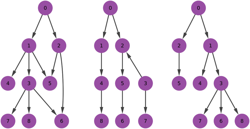
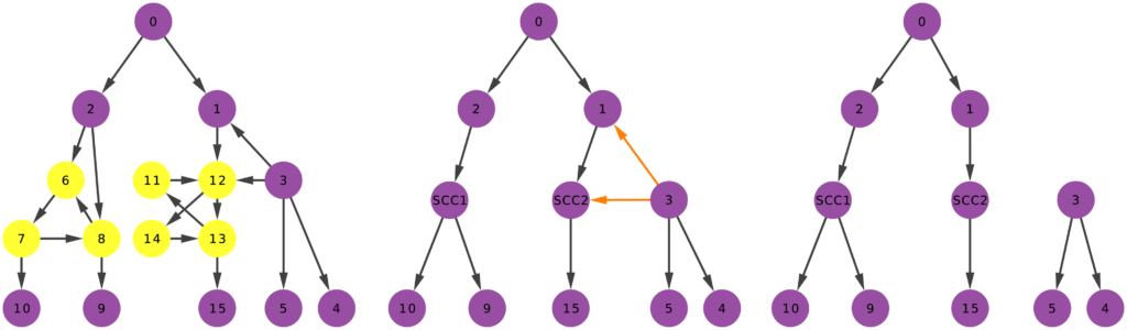
I need to defuse the danger that karma trains represent for my theory, and I do so in two parts, asking two questions. First: is it really true that, in karma trains, content that stays closer to the original post gets more attention and success? Second: is it really true that karma trains contain exclusively unoriginal content? For these questions, I define specifically karma trains to be the collection of posts using a meme after it hit the front page. To answer these questions I focus mainly on Reddit. I use data kindly donated to me by Tim Weninger from the University of Notre Dame (in particular from this paper of his). I look at all catchphrases used frequently — hence the word “protomeme” in the title: my definition is a bit wider than just memes — and I track down how successful they are in each day.

For the first question I have to debunk the notion that unoriginal content is successful in karma trains. First, I check if a meme hit the front page on a particular day. Then I look at all the Reddit posts containing that meme the day after. A karma train implies that more people will use the meme — so, more posts using the catchphrase — and that posts including the meme will be on average more successful. The first part is true: karma trains do exist and, after a meme hits the front page, more people will use it. But the second part is crucially false: on average these posts score poorly. This is not just regression towards the mean: obviously if the meme just hit the front page, its average popularity the day after can only go down. But I control for that. I control for the entire history of the meme. Its average popularity the day after hitting the front page is significantly lower than its regular average popularity, its recent popularity trends, and the average popularity of everything else that day.

So what gives? If the meme is doing poorly, why are karma trains a thing? Because, over those many attempts, a few are going to hit the front page again. Since the front page is very noticeable, we’re tricked into thinking that all posts using the meme are doing well. This transitions nicely into the second part of the paper. Why are those few posts successful? Bell-shaped random distributions teach us that, if you try enough times, one of the attempts is going to be really good. Is that the case? Are we looking at statistical aberrations or is there something interesting? There is: these posts are not ending up on the top randomly. There’s something special about them.

I made up a measure of post originality. Given that a post contains a meme, I want to know if it is repeating it in a boring way, or if it is adding something to the mix. It answers the question: how canonical is the usage of the meme in this post? That is why I called this measure “canonicity”. In practice, for every word that ever appeared in a Reddit title, I calculate the probability that the word is going to be used in a post including that meme. So for every new post I can calculate the average word probability, and ending up with an estimation of how surprising this particular post title is.

You know what I’m going to say next. The more unsuprising a post is, the less likely it is to be successful. A high-canonicity post has roughly half the odds of being widely successful — e.g. hitting the front page — than a low-canonicity one. And the fact that there are low-canonicity posts in karma trains is interesting of itself. It confirms my hunch that, among the posts that jump on the bandwagon of popular memes, there are also original thoughts. This is the evolutionary arms race I mention in the title: when a meme hits the front page, subsequent implementations of it have to constantly innovate, else the meme will be infested by high-canonicity copies, and fade into oblivion. This is generally true for all memes, but it is an effect on steroids for recently successful memes, because they are the ones that are being copied the most in a particular time period.

The story has another interesting turn. Low-canonicity is a double-edged sword. It gives you better odds to hit the front page, but if you fail at it then your performance is going to be atrocious. In that case, high-canonicity posts are actually doing better than low-canonicity ones. In other words, a meme after hitting the front page does a sort of “canonicity sandwich”: the very best AND very worst posts are low-canonicity ones, and in the middle you have high-canonicity posts. Why does this happen? Maybe it’s because of familiarity. Familiar content is reassuring and so people “get it” and upvote. It just does not soar high enough. Or it can be a million other reasons that I haven’t tested yet, so I can only speculate.

What the canonicity sandwich means is that content originality has a varying effect: high canonicity harms you in some cases, but it’s good for you in others. This discovery is important, because other researchers have found that a post’s content doesn’t seem to explain its success very well. The sandwich effect might very well be the cause of our disagreement.

To wrap up, I hope I put on a credible defense of my theory in the face of karma trains. These annoying meme critters are dangerous to my explanation of popularity, because they directly contradict it. Karma trains seems to be a collection of popular unoriginal content: the exact thing my theory says it shouldn’t exist. Upon closer inspection, I noticed that (a) it isn’t really true that karma train posts are particularly successful and (b) it isn’t really true that they only contain unoriginal content. So, my theory is going to die another day, like in all good James Bond flicks**.


* Yes, but I need tenure, so I’ll have to put up a fight.

** Which Die Another Day wasn’t.

25 October 2017 ~ 0 Comments

Nice Transaction Data Clustering Algorithm You Have There. It would be a Shame if Someone were to Misapply it.

I’m coming out of a long hiatus to write a quick post about a nice little paper I just put together with Riccardo Guidotti. The topic today is community discovery: the task of grouping nodes in a network because they connect to each other more strongly than with the other nodes in a network. No, wait, the actual topic is transactional data clustering: the task of grouping customers of a supermarket because they usually buy the same stuff. Wait what? What do these problems have to do with each other? Well, that’s what we concluded: the two things can be the same.

The title of the paper is “On the Equivalence between Community Discovery and Clustering” and it was accepted for publication at the GoodTechs conference in Pisa. The starting point of this journey was peculiar. Riccardo, being the smart cookie he is, published earlier this year a paper in the prestigious SIGKDD conference. In the paper, he and coauthors describe the Tx-means algorithm, that does exactly what I said before: it looks at the shopping carts of people, and figures out which ones are similar to each other. You can use it to give suggestions of items to buy and other nice applications. There is a three-minute video explaining the algorithm better than I can, which incidentally also shows that Riccardo has some serious acting chops, as a side of his research career:

The title of the paper is “Clustering Individual Transactional Data for Masses of Users” and you should check it out. So the question now is: how can I make all of this about me? Well, Riccardo wanted some help to break into the community discovery literature. So he asked my advice. My first advice was: don’t. Seriously, it’s a mess. He didn’t follow it. So the only option left was to help him out.

The main contribution of the paper is to propose one of the possible ways in which transactional data clustering can be interpreted as community discovery. The two tasks are known to be very similar in the literature, but there are many ways to map one onto the other, with no clear reason to prefer this or the other translation. In this paper, we show one of those translations, and some good reasons why it’s a good candidate. Now, the article itself looks like a five year old took a bunch of Greek letters from a bag and scattered them randomly on a piece of paper, so I’ll give you a better intuition for it.

The picture shows you transactional data. Each cart contains items. As the video points out, this type of data can also represent other things: a cart could be a user and the items could be the webpages she read. But we can go even more abstract than that. There is no reason why the items and the carts should be different entity types. A cart can contain… carts. We can define it as the list of carts it is related to, for any arbitrary relatedness criterion you’re free to choose (maybe it’s because they are cart-friends or something).

Once we do that, we can pivot our representation. Now it’s not transactional data any more: it is an edge list. Each node (the cart) lists the other nodes (cart-items) to which it connects. So this is a network — as shown below. What would it mean to find communities in this network? Well, it would mean — as I said at the beginning — to find groups of nodes that connect to each other. Or, in other words, group of carts that contain the same items (carts). Which is what Tx-means does.

This approach is a bit of a bastardization of community discovery because, if we apply it, then the community definition shifts from “densely connected nodes” to “similarly connected nodes.” But that’s a valid community definition — and that’s why community discovery is a mess — so we get a pass. It’s more or less the same thing I did on another working paper I’m sweating on, and so far only one person has called me out on that (thanks Adam), so I call it a success.

Why on Earth would we want to do this? Well, because Tx-means comes with some interesting advantages. First, let’s pitch it against some state of the art community discovery methods. In our experiments, Tx-means was the best at guessing the number of communities in networks of non-trivial size. This came without a big penalty in their Normalized Mutual Information — which measures how aligned the discovered communities are to the “real” communities as we gather them from metadata.

More importantly — as you saw in the video — Tx-means is able to extract “typical carts.” Translated into network lingo: with Tx-means you can extract the prototypical nodes of the community, or its most representative members. This has a number of applications if you are interested in, for instance, knowing who are the leaders, around which the nodes in the community coalesce. They are highlighted in colors in the picture above. You cannot really do this with Infomap, for instance.

So that’s the reason of this little exercise. Other transactional data clustering algorithms can use the same trick to go from carts to nodes, and therefore translate their features into the context of community discovery. Features that might be missing from the traditional algorithms we use to detect communities.


22 May 2017 ~ 0 Comments

Netonets @ Netsci17: Program

As previously announced, this year’s edition of the Netonets event will happen again as a satellite of NetSci. The conference will take place in Indianapolis. The general program of the conference can be found here: http://netsci2017.net/program. I will be there, hosting the satellite just like last year. It will take place Tuesday, June 20th and it will run for the entire day.

We have just completed a tentative program. We are going to have four great invited speakers: Marta C. Gonzales, Romualdo Pastor-Satorras, Gareth Baxter and Paul Hines. We also have five contributed talks. You can find the first draft of the program down here, subject to change in case of conflicting schedules for any of the participants. I will keep up to date in case that happens.

Looking forward to see you in Indianapolis!

Session I

9:00 – 9:15: Room set up
9:15 – 9:30: Welcome from the organizers
9:30 – 10:15: Invited I: Marta Gonzales: “Coupled networks of mobility and energy”

10:15 – 10:45: Coffee Break

Session II

10:45 – 11:30: Invited II: Gareth Baxter: “Critical dynamics of the interdependent network transition”
11:30 – 11:50: Contributed I: Dana Vaknin, Michael Danziger and Shlomo Havlin: “Spreading of localized attacks in spatial multiplex networks”
11:50 – 12:10: Contributed II: Ivana Bachmann and Javier Bustos-Jiménez: “Seven years of interdependent network’s robustness”

12:10 – 14:00: Lunch Break

Session III

14:00 – 14:45: Invited III: Romualdo Pastor-Satorras: “Effects of temporal correlations in social multiplex networks”
14:45 – 15:05: Contributed III: Zhiwei Yang, Jichao Li, Danling Zhao, Yuejin Tan and Kewei Yang: “Operation Loop based Structural Robustness of Combat Networks of Weapon System-of-systems”
15:05 – 15:25: Contributed IV: Shawn Gu and Tijana Milenkovic: “From Homogeneous to Heterogeneous Network Alignment”
15:25 – 15:45: Contributed V: Louis Shekhtman, Michael Danziger, Ivan Bonamassa, Sergey Buldyrev, Vinko Zlatic and Shlomo Havlin: “Secure message passing in networks with communities”

15:45 – 16:10: Coffee Break

Session IV

16:10 – 16:55: Invited IV: Paul Hines: “Increasing interconnectivity between networks can increase network robustness”
16:55 – 17:30: Round table – Open discussion
17:30 – 17:45: Organizers wrap up

21 February 2017 ~ 0 Comments

Netonets @ NetSci 2017: Call for Contributions!

We are delighted to invite submissions for

Network of Networks
7th Edition – Satellite Symposium at NetSci2017

taking place in JW Marriott Indianapolis, Indiana, United States,
on June 20th, 2017.

Submission:
We invite you to submit a 300 word abstract including one descriptive figure using our EasyChair submission link:
https://easychair.org/conferences/?conf=netonets2017

Deadline for submission: April 21st, 2017.
Notification of acceptance will be sent out by April 28th, 2017.

Further Information at: http://www.netonets.org/events/netonets2017

Abstract:
For the seventh time, it is our pleasure to bring together pioneer work in the study of networks of networks. Networks of networks are networks in which the nodes may be connected through different relations, are part of interdependent layers and connected by higher order dynamics. They can represent multifaceted social interactions, critical infrastructure and complex relational data structures. In our call, we are looking for a diversity of research contributions revolving around networks of networks of any kind: in social media, in infrastructure, in culture. We are particularly keen in receiving works raising novel issues and provocative queries in the investigation of networks of networks, as well as new contributions tackling these challenges. How do networks of networks change the paradigm of established problems like percolation or community detection? How are we shifting our thoughts to be ready for this evolution? Running parallel to NetSci, the top network science conference, this event provides a valuable opportunity to connect with leading researchers in complex network science.

Confirmed Keynote:

Marta Gonzales – MIT
Gareth Baxter – University of Aveiro
Romualdo Pastor-Satorras – Universitat Politècnica de Catalunya
Paul Hines – University of Vermont (UNCONFIRMED)

The final program will strive for the inclusion of contributions from different research fields, creating an interdisciplinary dialogue about networks of networks.

Best regards,
The Netonets organizers,

Antonio Scala, La Sapienza – antonio.scala.phys@gmail.com
Gregorio D’Agostino, ENEA – gregorio.dagostino@enea.it
Michele Coscia, Harvard University – michele_coscia@hks.harvard.edu
Przemysław Kazienko, Wroclaw University of Technology – przemyslaw.kazienko@pwr.edu.pl

25 January 2017 ~ 0 Comments

Network Backboning with Noisy Data

Networks are a fantastic tool for understanding an interconnected world. But, to paraphrase Spider Man, with networks’ expressive power come great headaches. Networks lure us in with their promise of clearly representing complex phenomena. However, once you start working with them, all you get is a tangled mess. This is because, most of the time, there’s noise in the data and/or there are too many connections: you need to weed out the spurious ones. The process of shaving the hairball by keeping only the significant connections — the red ones in the picture below —  is called “network backboning”. The network backbone represents the true relationships better and will play much nicer with other network algorithms. In this post, I describe a backboning method I developed with Frank Neffke, from the paper “Network Backboning with Noisy Data” accepted for publication in the International Conference on Data Engineering (the code implementing the most important backbone algorithms is available here).

bb1

Network backboning is as old as network analysis. The first solution to the problem was to keep edges according to their weight. If you want to connect people who read the same books, pairs who have few books in common are out. Serrano et al. pointed out that edge weight distributions can span many orders of magnitude — as shown in the figure below (left). Even with a small threshold, we are throwing away a lot of edges. This might not seem like a big deal — after all we’re in the business of making the network sparser — except that the weights are not distributed randomly. The weight of an edge is correlated with the weights of the edges sharing a node with it — as shown by the figure below (right). It is easy to see why: if you have a person who read only one book, all its edges can have at most weight one.

Their weights might be low in comparison with the rest of the network, but they are high for their nodes, given their propensity to connect weakly. Isolating too many nodes because we accidentally removed all their edges is a no-no, so Serrano and coauthors developed the Disparity Filter (DF): a technique to estimate the significance of one node’s connections given its typical edge weight, regardless of what the rest of the network says.

bb2

This sounds great, but DF and other network backboning approaches make imprecise assumptions about the possibility of noise in our estimate of edge weights. In our book example, noise means that a user might have accidentally said that she read a book she didn’t, maybe because the titles were very similar. One thing DF gets wrong is that, when two nodes are not connected in the raw network data, it would say that measurement error is absent. This is likely incorrect, and it screams for a more accurate estimate of noise. I’m going to leave the gory math details in the paper, but the bottom line is that we used Bayes’ rule. The law allows us to answer the question: how surprising is the weight of this edge, given the weights of the two connected nodes? How much does it defy my expectation?

The expectation here can be thought of as an extraction without replacement, much like Bingo (which statisticians — notorious for being terrible at naming things — would call a “hypergeometric” one). Each reader gets to extract a given number of balls (n, the total number of books she read), drawing from a bin in which all balls are the other users. If a user read ten books, then there are ten balls representing her in the bin. This is a good way to have an expectation for zero edge weights (nodes that are not connected), because we can estimate the probability of never extracting a ball with a particular label.

bb4

I highlighted the words one and two, because they’re a helpful key to understand the practical difference between the approaches. Consider the toy example below. In it, each edge’s thickness is proportional to its weight. Both DF and our Noise Corrected backbone (NC) select the black edges: they’re thick and important. But they have different opinions about the blue and red edges. DF sees that nodes 2 and 3 have mostly weak connections, meaning their thick connection to node 1 stands out. So, DF keeps the blue edges and it drops the red edge. It only ever looks at one node at a time.

bb5

NC takes a different stance. It selects the red edge and drops the blue ones. Why? Because for NC what matters more is the collaboration between the two nodes. Sure, the blue connection is thicker than the red one. But node 1 always has strong connections, and its blue edges are actually particularly weak. On the other hand, node 3 usually has weak connections. Proportionally speaking, the red edge is more important for it, and so it gets saved.

To sum up, NC:

  1. Refines our estimate of noise in the edge weights;
  2. Sees an edge as the collaboration between two nodes rather that an event happening to one of them;
  3. Uses a different model exploiting Bayes’ law to bake these aspects together.

bb6

How does that work for us in practice? Above you see some simulations made with artificial networks, of which we know the actual underlying structure, plus some random noise — edges thrown in that shouldn’t exist. The more noise we add the more difficult it is to recover the original structure. When there is little noise, DF (in blue) is better. NC (in red) starts to shine as we increase the amount of noise, because that’s the scenario we were targeting.

In the paper we also show that NC backbones have a comparable stability with DF, meaning that extracting the backbone from different time snapshots of the same phenomenon usually does not yield wildly different results. Coverage — the number of nodes that still have at least one edge in the network — is also comparable. Then we look at quality. When we want to predict some future relationship among the nodes, we expect noisy edges to introduce errors in the estimates. Since a backbone aims at throwing them away, it should increase our predictive power. The table below (click it to enlarge) shows that, in different country-country networks, the predictive quality (R2) using an NC backbone is higher than the one we get using the full noisy network. The quality of prediction can get as high as twice the baseline (the table reports the quality ratio: R2 of the backbone over R2 of the full network, for different methods).

bb8

The conclusion is that, when you are confident about the measurement of your network, you should probably extract its backbone using DF. However, in cases of uncertainty, NC is the better option. You can test it yourself!